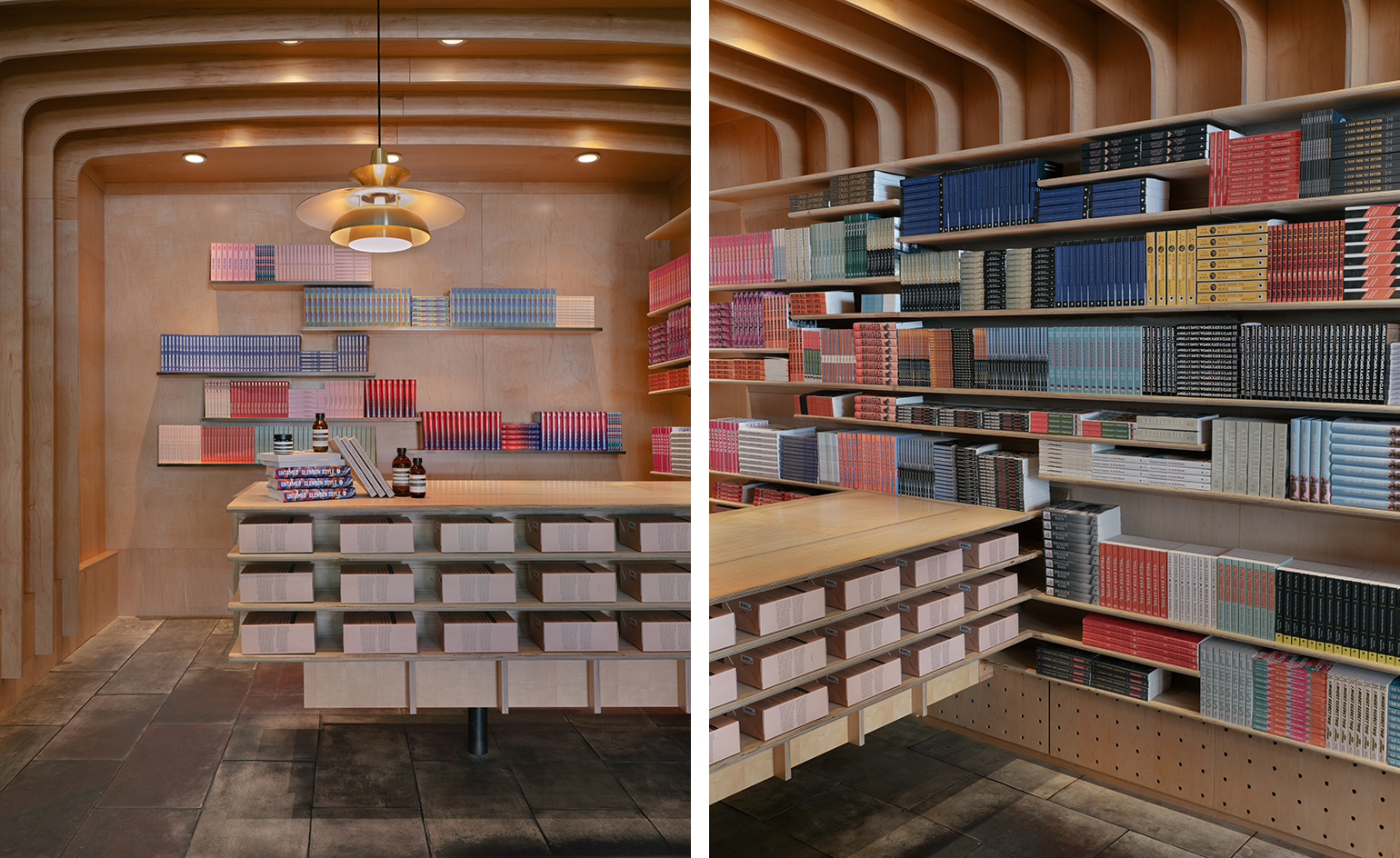
A duo of design boutiques lands in the beachfront Cape Town suburb of Sea Point
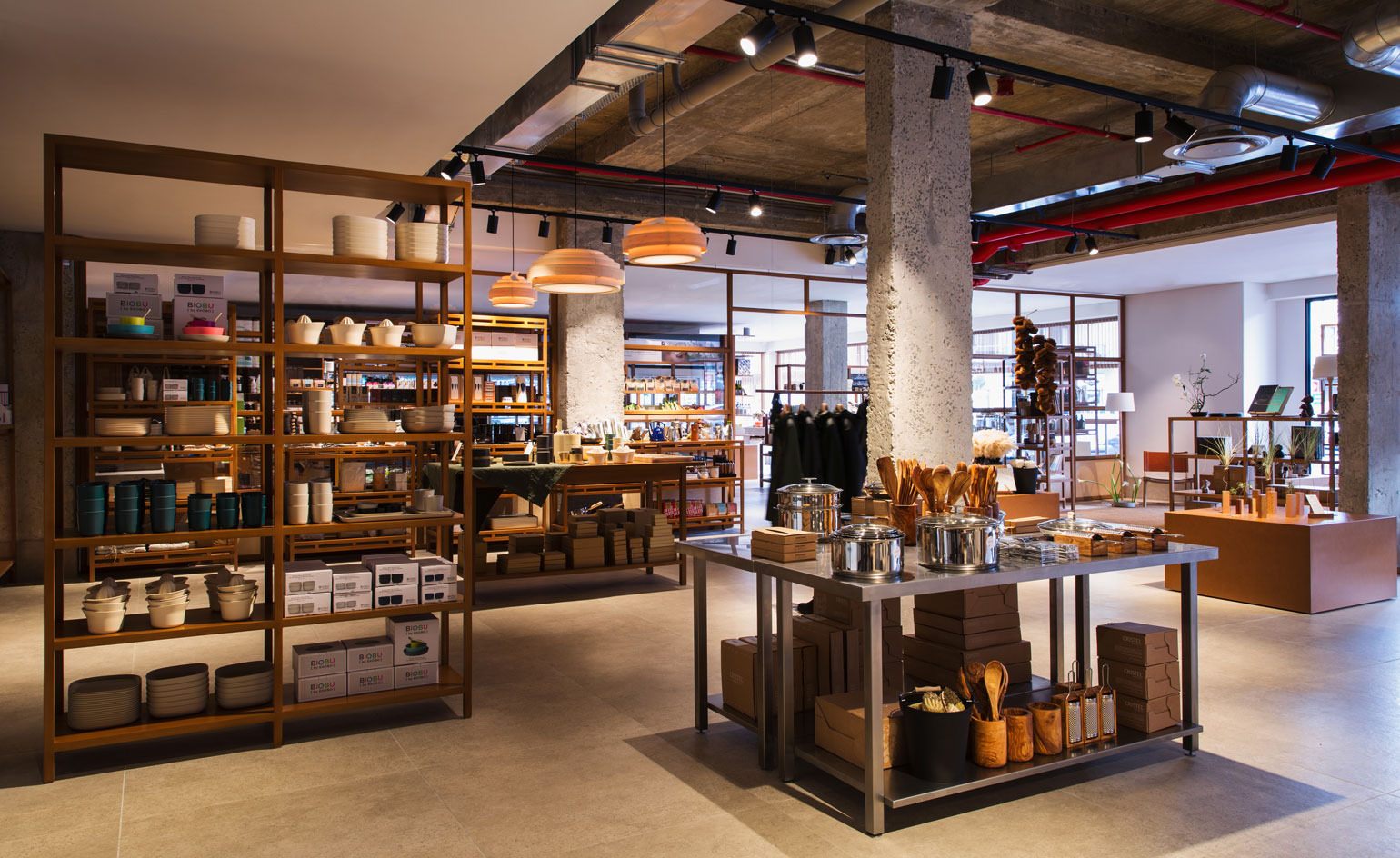
An organic green grocer and coffee shop have been designed by young South African design firm Master Studio, creating a duo of visually connected spots in the emerging Cape Town suburb of Sea Point. Despite their different functions, the design-focused boutiques employ the same material palette, ethos and atmosphere, as envisioned by their steadfast designer.
Yaniv Chen, co-founder of Master Studio, secured the project because of ‘one key principle'. ‘When you’re a young company like we are, you’re on the hunt for an aesthetic that is unique to you,' he explains. ‘It's very easy in today’s age for design to become derivative. What got us in the door was our understanding of the balance between minimalism and warmth, alongside our emphasis on the past, which we translate into a contemporary context.'
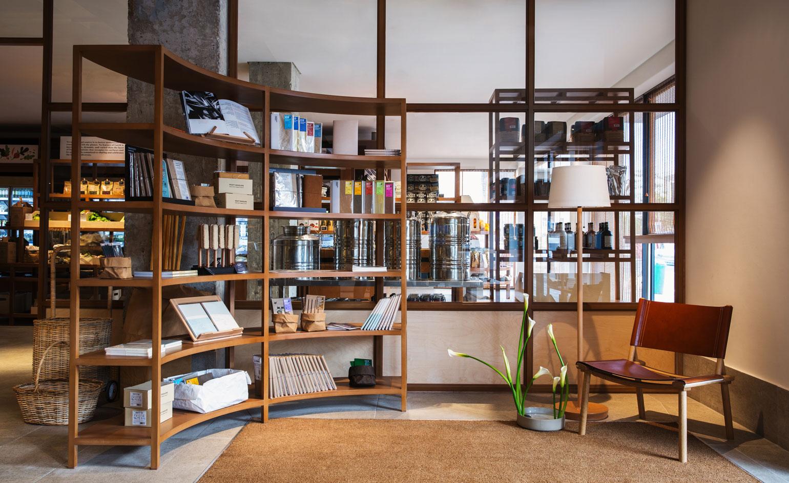
Sans furniture store and organic green grocer
According to Chen (who lives in the area), the locale is changing by the day. ‘The community has become quite young and exciting,' he explains, referencing the growing bicycle commuter-culture, which is ‘great for the city, and obviously our carbon footprint'; a restaurant called The Shop, ‘opened by a lovely husband-and-wife team, with fantastic food and the original 1970s and 80s vernacular of Sea Point instilled in the design'; and Hescheng restaurant, which is ‘not beautiful, but offers the best Chinese food in Cape Town, and has been there forever.’ The influx of foot traffic into the area has allowed businesses like this to thrive; something that makes Chen ‘personally, incredibly happy.’
Paulines, the coffee shop Master Studio has just completed, has attracted coffee culture vultures. ‘On this end of Sea Point there were no coffee shops until Paulines opened,' Chen explains. ‘It has added huge value, and created a fantastic street culture that wasn’t here before.' The narrow, standing-room only coffee bar pairs texturally interesting walls clad in Sisal (a natural fibre from the Agave plant) with the clean, functional lines of a Corian bar, together forming a space you'll want to linger in long after your espresso has been drained.
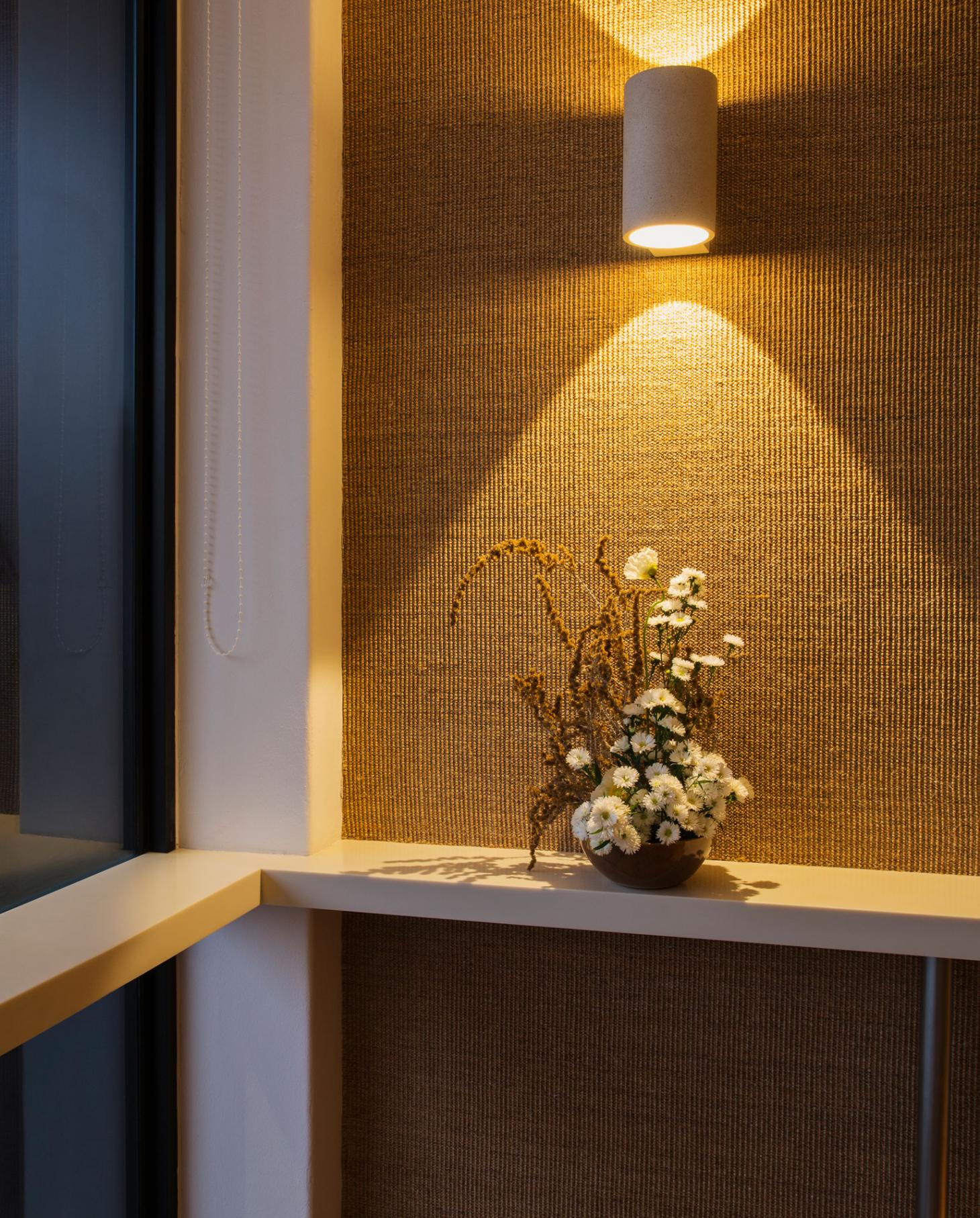
Detail view, inside Paulines standing coffee bar
Chen was keen to reflect the district that he respects and calls home in each of the interiors. ‘Each store integrates the suburb's architectural vernacular into the space’s fabricated forms,' he adds. ‘Throughout Sea Point, there is a strong art deco influence, and we wanted to pay homage to the South African architects of the past by creating curved forms juxtaposed by strong linear elements.'
Chen chose to maintain simplicity, providing a plain vessel for the products to be displayed, opposed to a space with superfluous design elements. Characterful warmth breaks up the clean lines, in the form of Supawood – a hardy substrate made of compressed sawdust. ‘In keeping with the stores' holistic ideology we chose to line the space with this material. No piece is the same, and colours change in accordance with the wood the sawdust comes from.'
Sans (a mini department store and green grocer) is inspired by Japanese woodworking techniques, craft, and tradition; three things upheld by each product stocked inside. Master Studio respected this methodology by creating all of its own joinery, with no screws, nails or bolts, particularly in the architecture of movable shelving units that delineate the multi-purpose space into separate food and furniture sections.
The two, street-facing boutiques are a stone’s throw from each other, and their shared aesthetic gives the district a unique visual identity. But the area remains in flux. ‘Many property development companies are sadly demolishing the old Victorian houses and art deco apartment blocks, building soulless grey apartment buildings in an effort to further gentrify Sea Point,’ Chen explains. Not on his watch. Master Studio is currently on a mission to restore and save a heritage home in the area. If these three Sea Point projects are anything to go by, expect a thoughtful fusion of styles, ages and materials that respect the tradition of this somewhat unlikely Cape Town suburb, while nodding to the potential of its future.
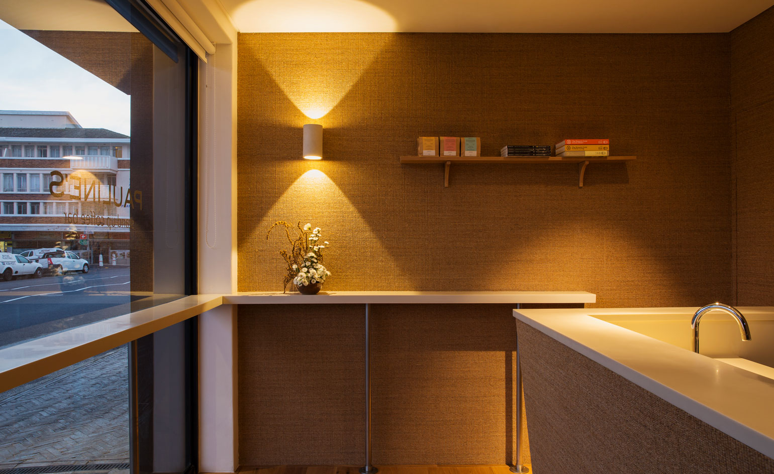
Paulines standing coffee bar
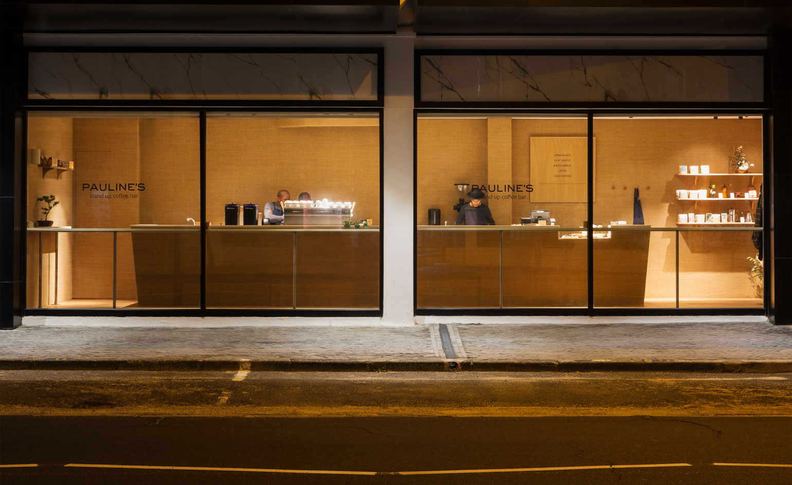
Outside Paulines standing coffee bar
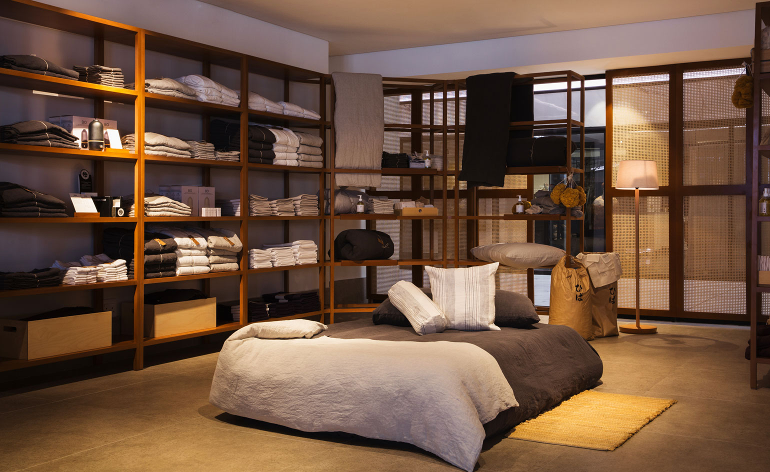
Sans department store and green grocers
INFORMATION
For more information, visit the Master Studio website
Wallpaper* Newsletter
Receive our daily digest of inspiration, escapism and design stories from around the world direct to your inbox.
Elly Parsons is the Digital Editor of Wallpaper*, where she oversees Wallpaper.com and its social platforms. She has been with the brand since 2015 in various roles, spending time as digital writer – specialising in art, technology and contemporary culture – and as deputy digital editor. She was shortlisted for a PPA Award in 2017, has written extensively for many publications, and has contributed to three books. She is a guest lecturer in digital journalism at Goldsmiths University, London, where she also holds a masters degree in creative writing. Now, her main areas of expertise include content strategy, audience engagement, and social media.
-
 Out of office: what the Wallpaper* editors have been up to this week
Some of the Wallpaper* team missed the memo regarding London's heatwave this week, opting for some (very good) gigs, plays and dinners. Others made the most of the weather at a Kentish winery
-
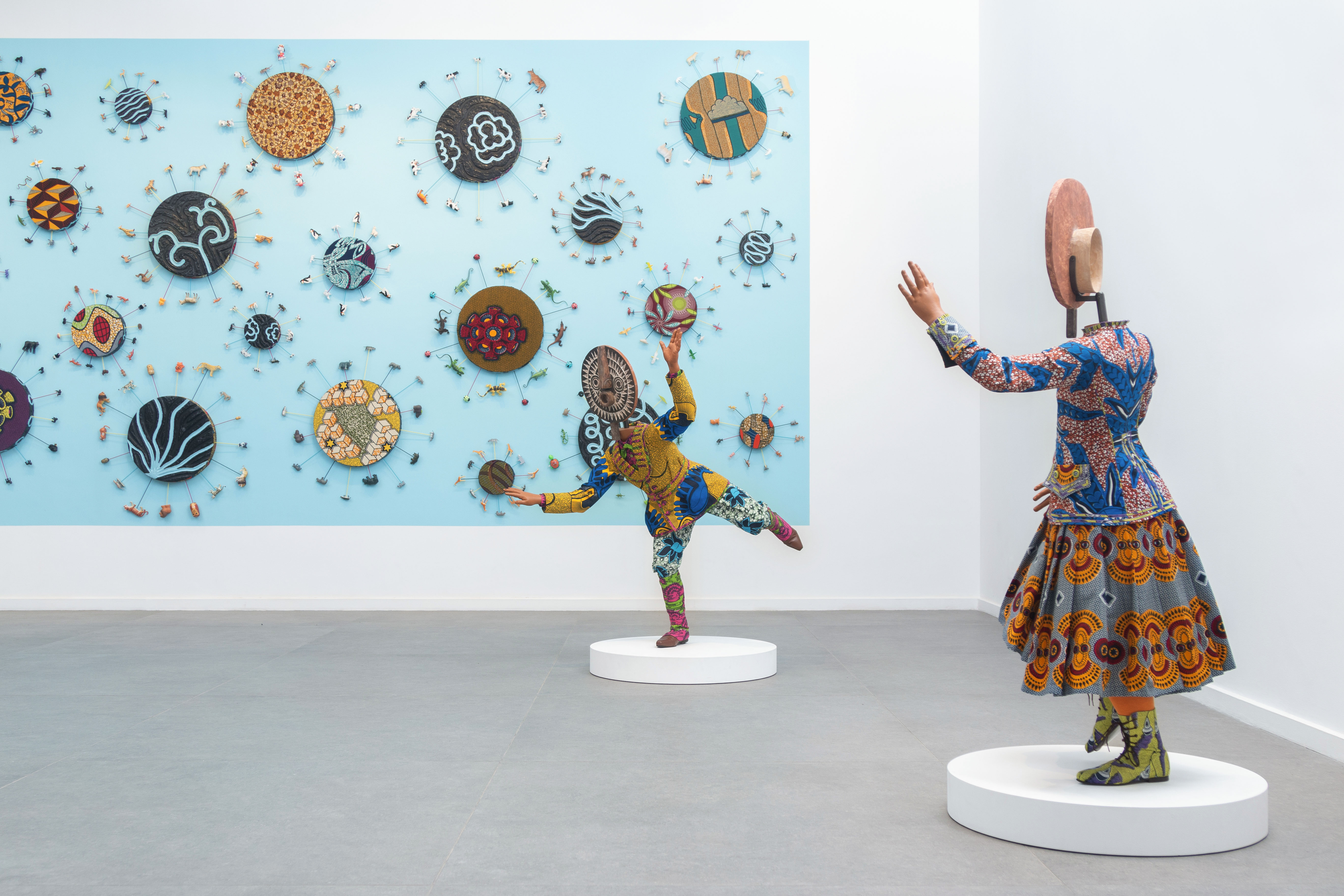 Inside Yinka Shonibare's first major show in Africa
British-Nigerian artist Yinka Shonibare is showing 15 years of work, from quilts to sculptures, at Fondation H in Madagascar
-
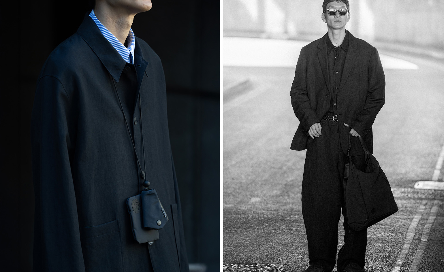 Studio Nicholson deepens its Japanese connection with a Yoshida & Co accessories collection
Using hardwearing Japanese nylon, London-based label Studio Nicholson has united with Yoshida & Co’s POTR line to craft a trio of accessories in founder Nick Wakeman’s favoured hue of ‘darkest navy’
