Apple digs deeper into function, fluid graphics and interactions with the new WatchOS 10
Billed as the biggest update to its wearable interface since the Apple Watch debuted in 2015, WatchOS 10 enhances the function and performance of this essential device
Apple WatchOS 10, set to be released later this year, is the most significant overhaul of the device’s user interface since it debuted almost a decade ago. It it also the latest instalment of Apple’s most intriguing, on-going design story. With a mission to rationalise and clarify the way we use a device far more capable and multi-functional than it was at launch, Apple has dramatically improved the look and user experience of Apple Watch in the process.
Apple Watch’s design, hardware and OS, has always been about the tension between possibility and constraint. As Apple Human Interface designer Gary Butcher explains, the design of the Apple Watch OS has to allow access and control of an ever-increasing arsenal of tricks, tools and capabilities on a small display and to do it with short and intuitive interactions. And while the Apple Watch boasts a touch screen, the ambition has always been to find the optimal balance of screen and hardware controls, without muddying the sleek case design with multiple sticky-out buttons.
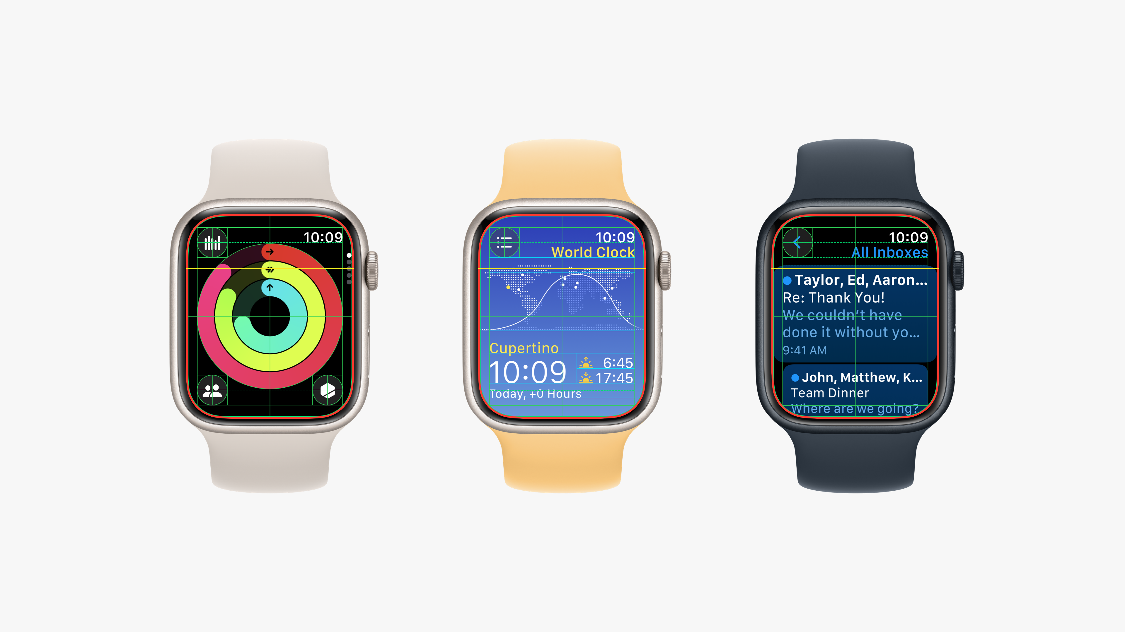
The Apple Watch’s key innovation and functional focal point was and is the Digital Crown. Over time though, the watch’s app ecosystem has grown and grown more complex, as has usable screen real estate, and the mix of touch and crown scroll manoeuvrings has grown more variable and confusing. For OS10 every Apple Watch app has been redesigned to restore order. These redesigned apps now make smarter use of the entire display and corner icons and how have a far more consistent look and interactive logic.
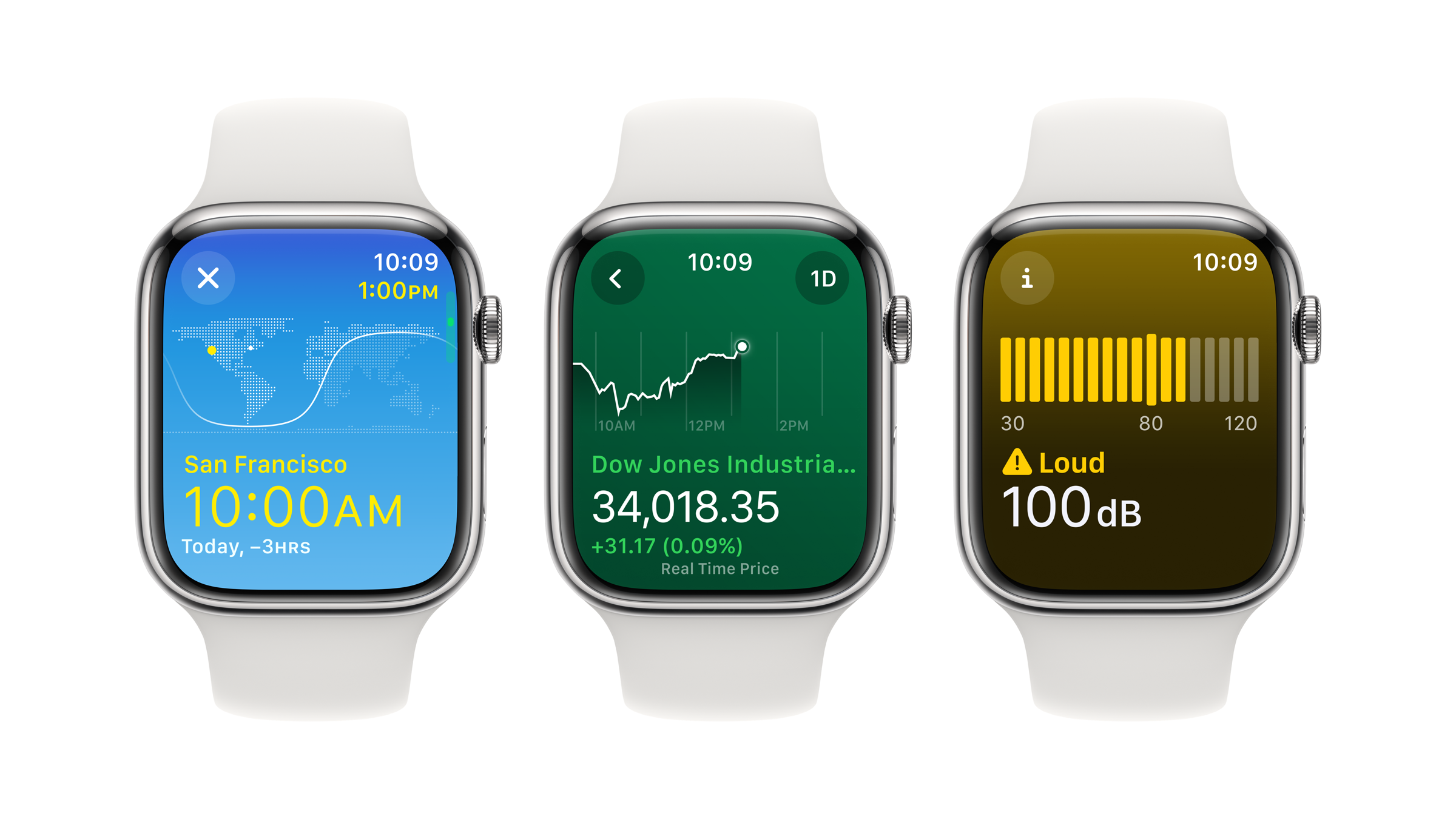
The more information-rich apps, such as Activity, now offer Vertical Pagination which allows you to access distinct and colour-coded infographic screens rather than a fussy infinite scroll. The Weather app in particular has been given a serious upgrade in looks and functionality. In other apps, the Digital Crown now has extra functional oomph. In World Clock you can now scroll through the day - with screen colour helpfully moving from darkness to light - taking the tricky head-maths out of out scheduling inter-continental video conferencing.
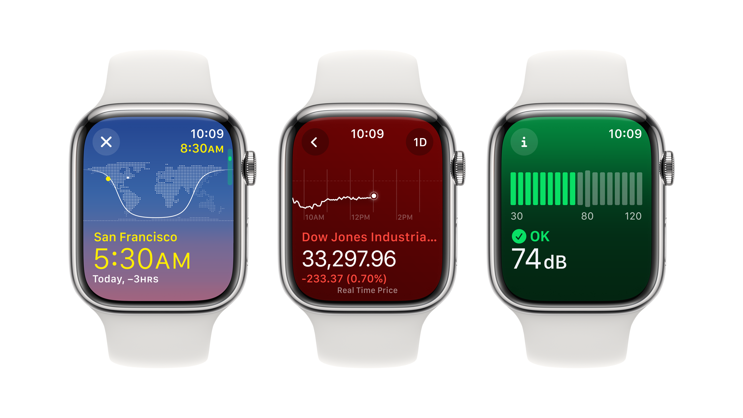
The update also makes smart use of background colour to convey information. If the Noise app is green, it’s all good but if it turns yellow, reach for the ear plugs. And the subtle use of translucency instantly establishes hierarchy of information.
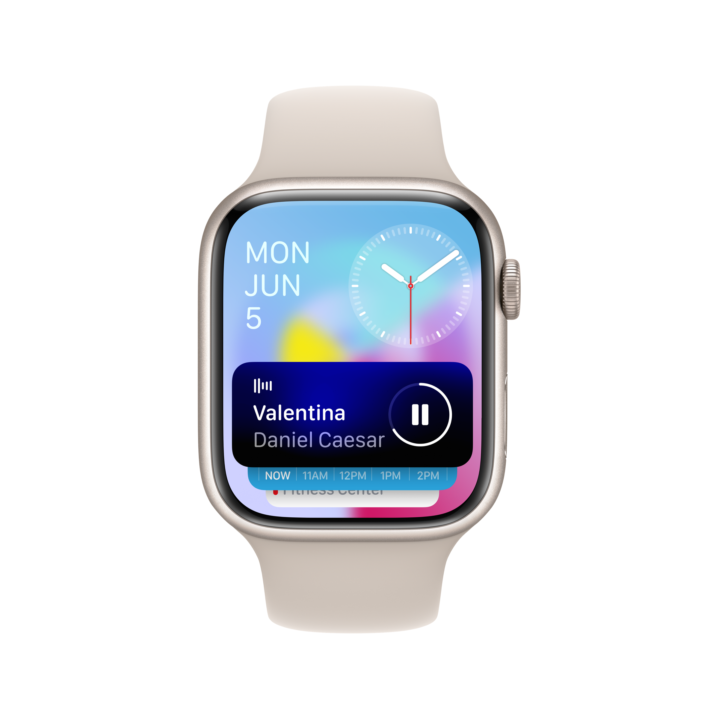
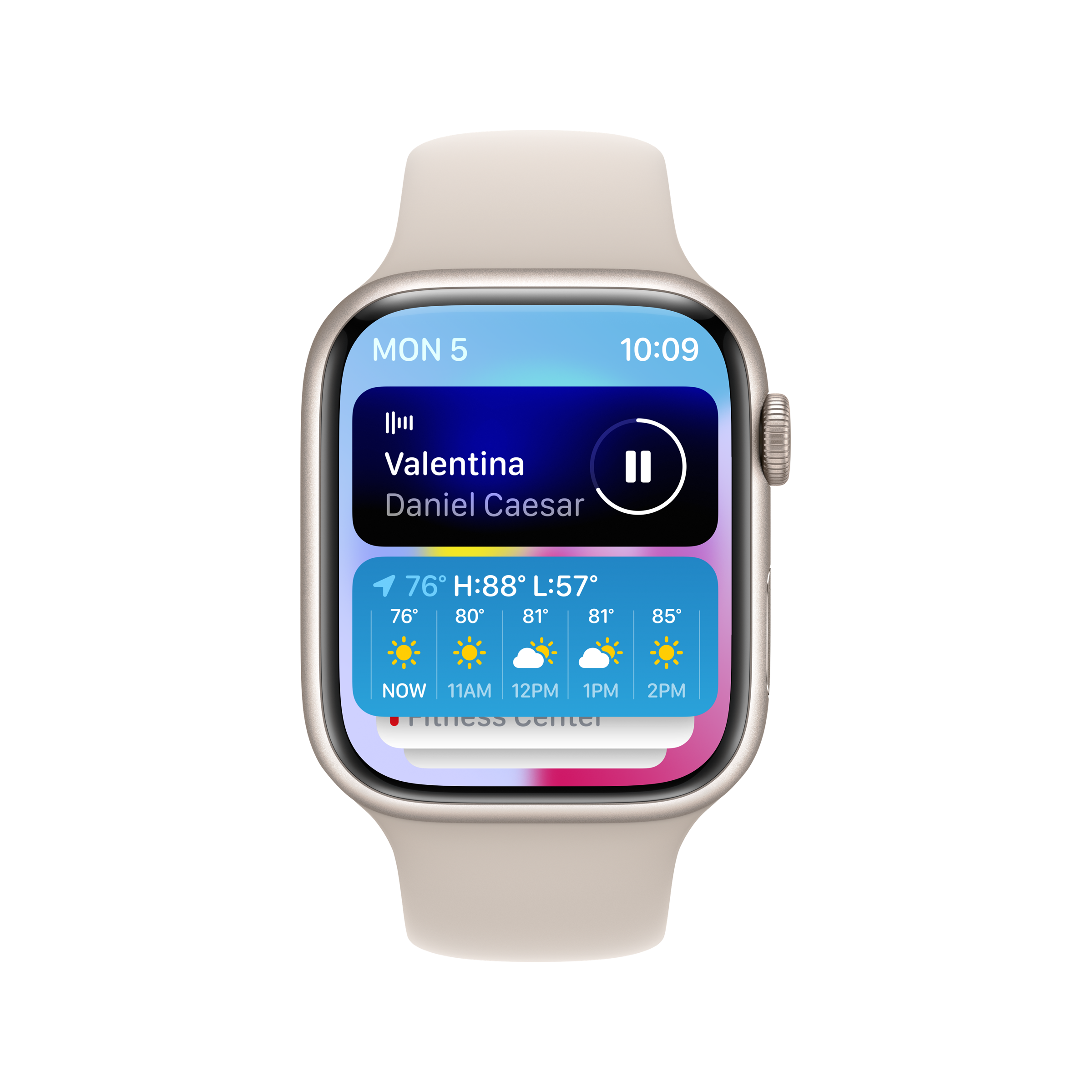
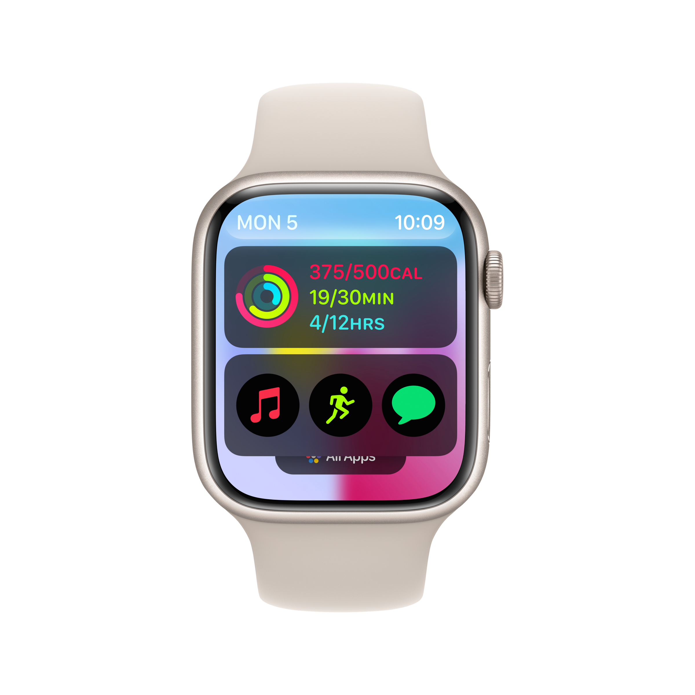
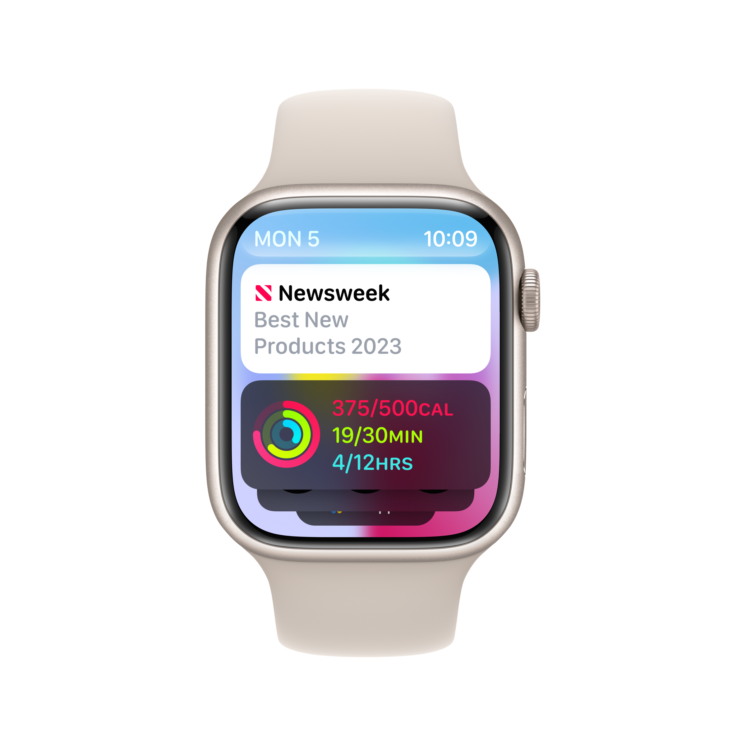
A new feature in Apple Watch OS10 is Smart Stack, a rolling, almost 3d-in-effect display of App widgets that throw up bite-sized chunks of useful and well-timed information. Smart Stack can be surfaced on any watch face with turn of the Digital Crown or a simple up swipe.
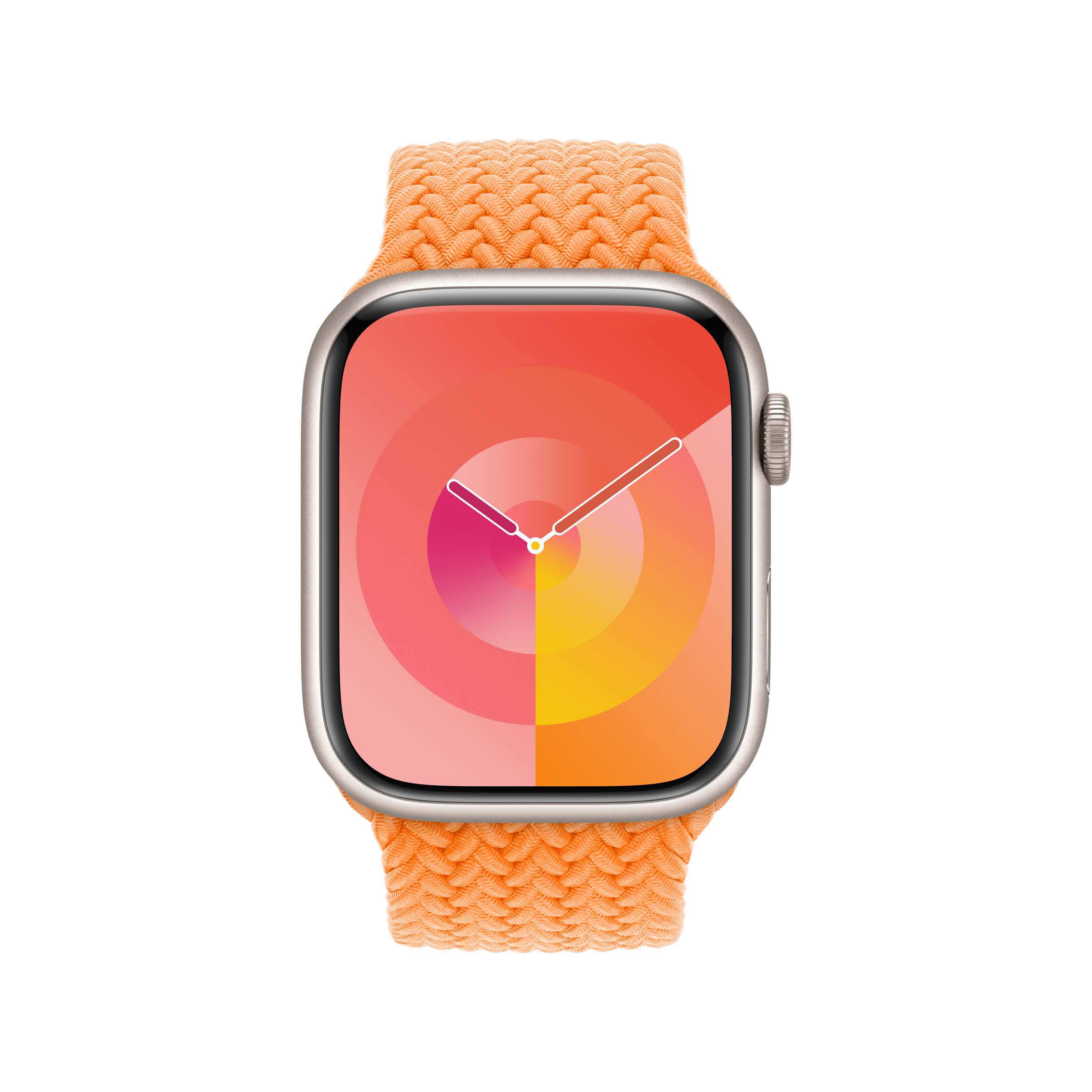
Powered by the ‘relevancy engine’, Smart Stack has been designed to roll out only useful information at a useful time, from morning weather forecasts to calendar reminders and tickets and boarding passes when travelling. It also allows instant access to other apps at work at the same time, such as music or podcasts. You can add your preferred widgets to the information flow and some apps offer alternative widget layouts. The widgets have again been colour-coded while the three-dialled Combo Widget is a useful multi-tasker. (Apple is also offering external developers a choice of six different widget templates).
Wallpaper* Newsletter
Receive our daily digest of inspiration, escapism and design stories from around the world direct to your inbox.
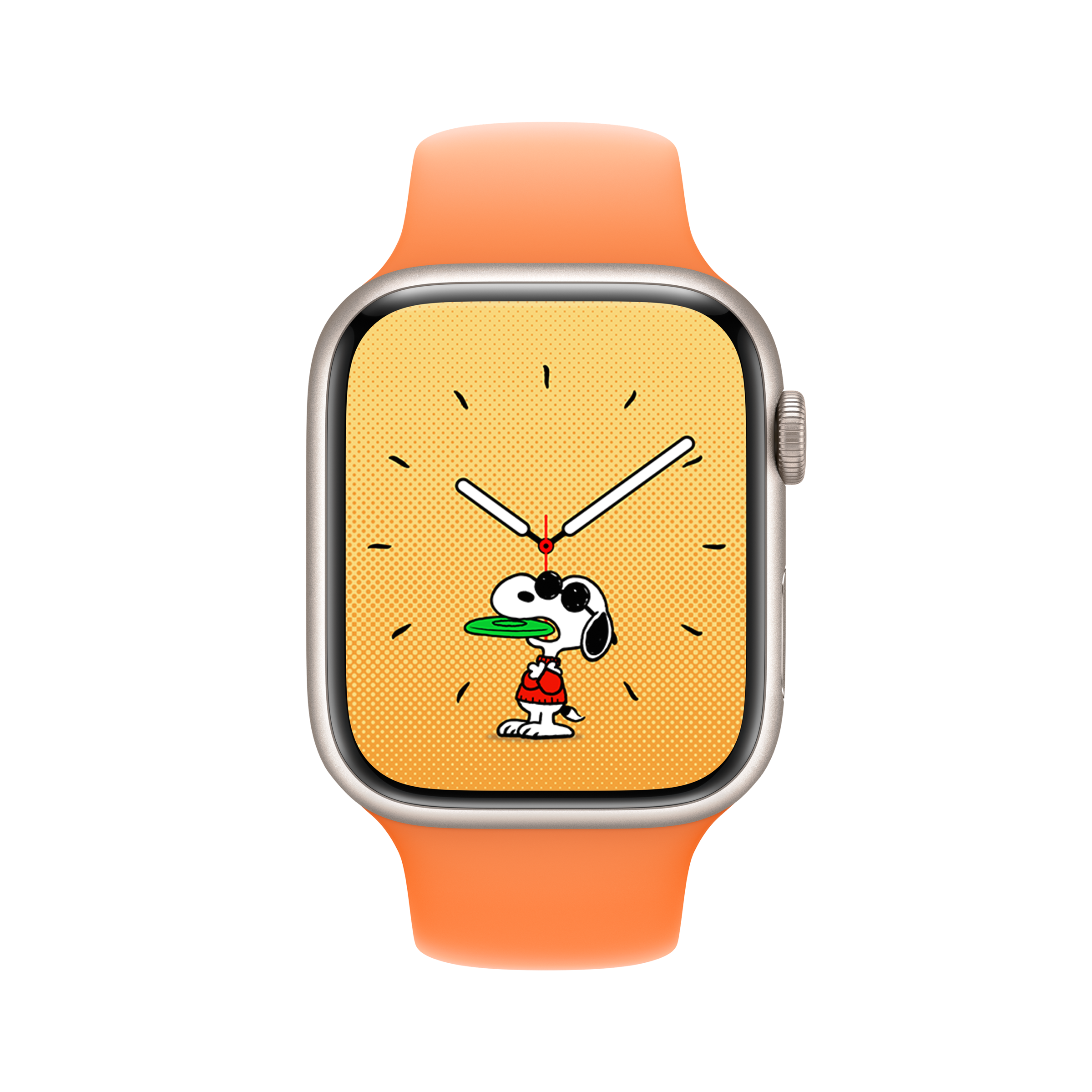
Snoopy and Woodstock have now joined the list of IP with their own Apple Watch face but with new levels of interactive engagement, employing 148 unique animations, which sees them playing with the watch hands, reacting to weather conditions and getting active when you get active.
In what Butcher admits is a ‘super nerdy’ move, the Snoopy face’s default mode is Sunday Surprise which means that the background is a grey halftone Monday through Saturday but bursts with colour on Sunday, a nod to an era when coloured newsprint was a weekend-only treat.
Apple Watch offers other geeky pleasures of course, and WatchOS 10 offers advanced new metrics for cyclists. When a cycling workout is started on the watch, a simple tap will activate a full-screen Live Activity display on iPhone and the upgrade means an Apple Watch can automatically connect to Bluetooth-enabled cycling accessories such as power meters and speed and cadence sensors.
For hikers, the Compass app will now add a Waypoint for the last place on the trail with cellular reception and a Last Emergency Call waypoint will estimate the last connection to any available carrier network. And a new Elevation view offers a three-dimensional view of saved waypoints.
WatchOS 10 also offers more in the way of mental health tracking. Moods and emotions can now be logged in the Mindfulness app. And as of iOS17, the iPhone Health app will track how your state of mind correlates with lifestyle factors such as time spent in daylight, sleep, exercise and ‘mindful minutes’.
Overall, Apple Watch OS10 is a deep and wide rethinking of Apple Watch’s UX. App design is at once richer but cleaner and less cluttered and much closer to iPhone apps in look and feel while the information offered hits the sweet spot between useful and overload.
For the latest from Apple, see our exclusive interview with the Apple Design Team about the development of Apple Vision Pro
-
 Asus chose Milan Design Week as the springboard for its new high-end Zenbooks
Milan Design Week 2025 saw Asus collaborate with Studio INI to shape an installation honouring the slimline new Zenbook Ceraluminum Signature Edition laptop series
By Craig McLean Published
-
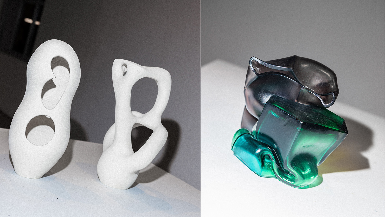 StoneX partners with Wallpaper* for material alchemy at Milan Design Week and beyond
The natural stone purveyor teams up with Wallpaper* for a three-year partnership of material adventures, starting with an exhibition at Triennalo di Milano
By Simon Mills Published
-
 A new show in Saint Louis promises a rare combination of art, cars and elegant fashion
‘Roaring: Art, Fashion, and the Automobile in France, 1918-1939’ celebrates a golden age of creativity, showcasing ten unique cars alongside the cream of the era’s style
By Jonathan Bell Published
-
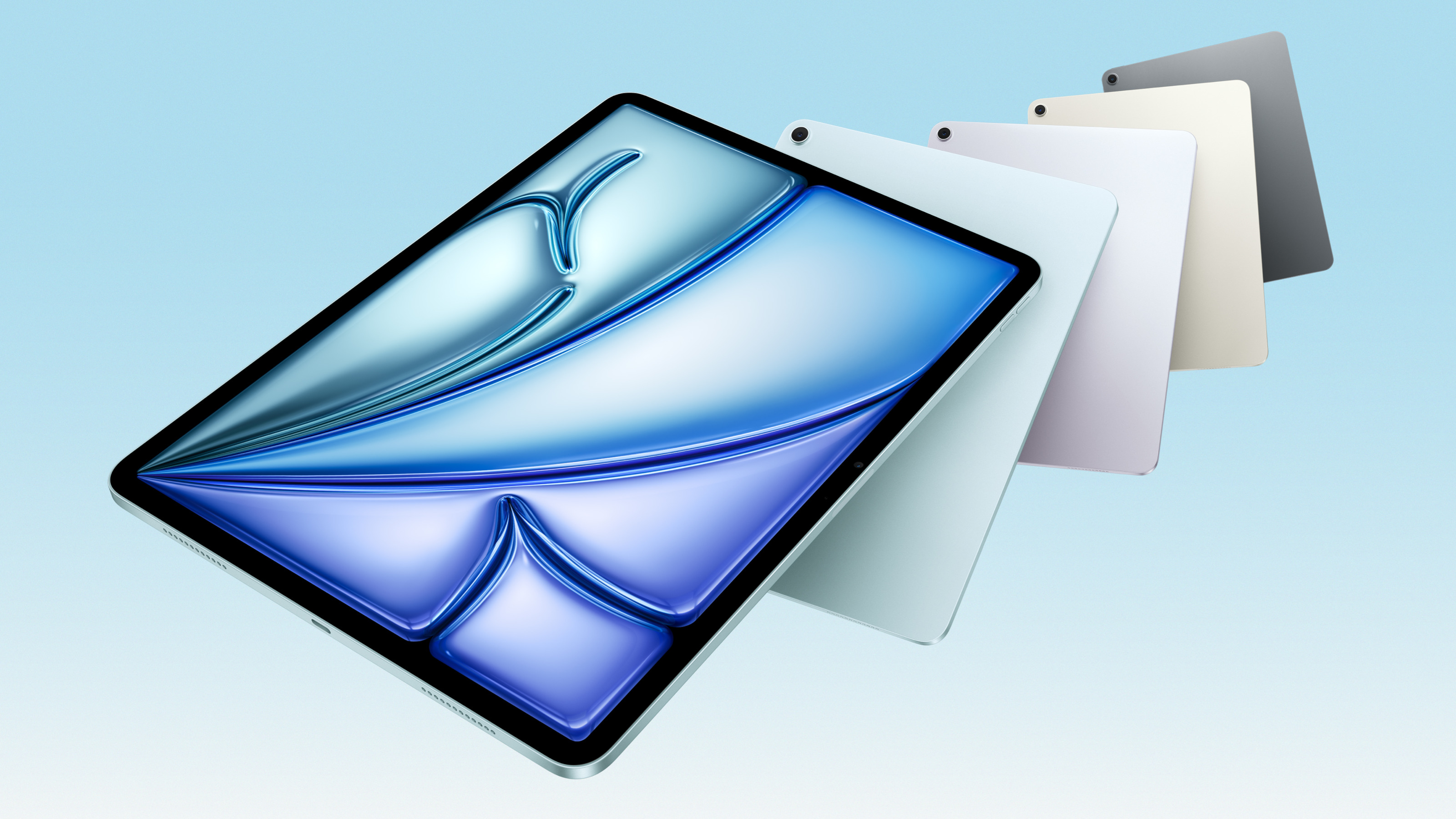 Apple updates the iPad Air with new silicon, new intelligence and new colours
Meet the new M3-powered Apple iPad Air, a compact multimedia tablet built for graphics and AI and capable of outclassing many laptops
By Jonathan Bell Published
-
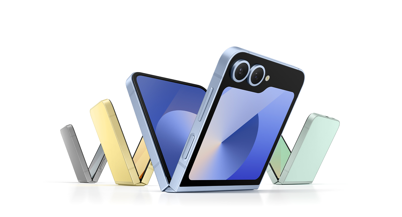 Apple is rumoured to be releasing a foldable iPhone. How should it stand out from the crowd?
The new model is forecast for 2026, but Apple’s competitors have already entered the foldable phone market. Is the tech megabrand late to the party, or can we expect something special from its contribution?
By Anna Solomon Published
-
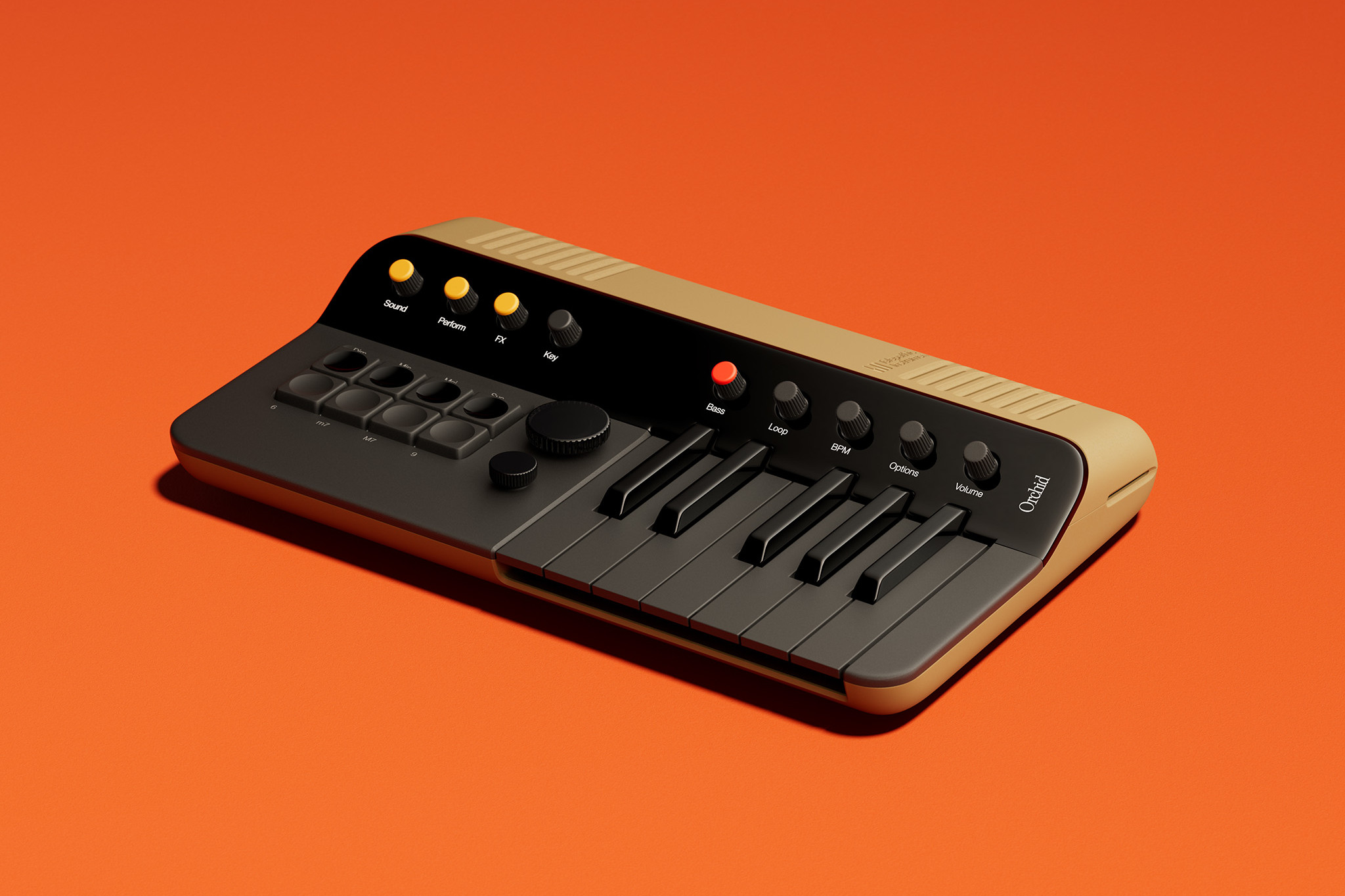 Year in review: top 10 gadgets and tech of 2024, as chosen by technology editor Jonathan Bell
The very best of 2024’s gadget and technology launches and stories, from emerging AI to retro gaming, laser projectors and musician’s side projects
By Jonathan Bell Published
-
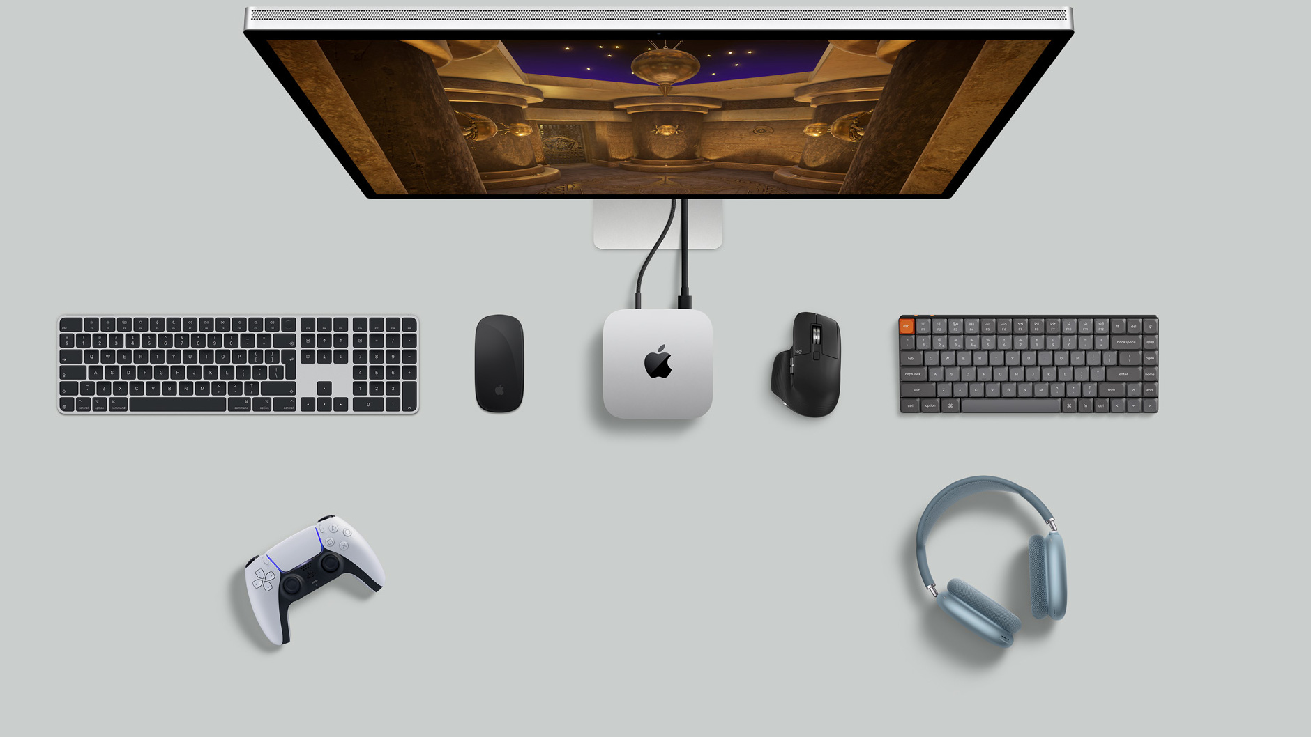 Apple’s new Mac mini is a pocket-sized powerhouse thanks to the M4 processor
With the new Mac mini, Apple has squeezed its M4 and M4 Pro processors into the smallest conceivable footprint, physically and environmentally. Apple insiders tell us how
By Jonathan Bell Published
-
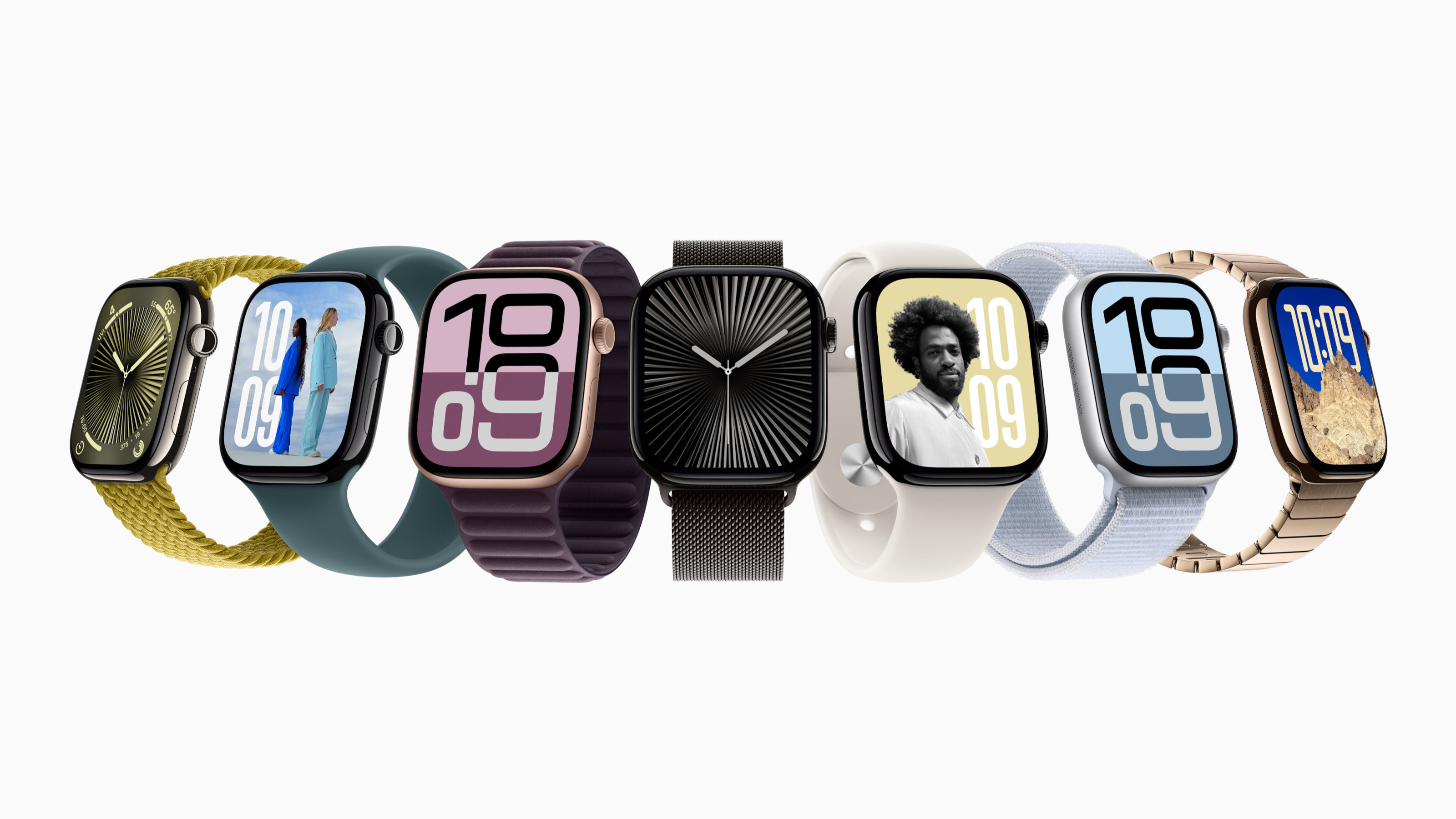 Apple’s Alan Dye and Molly Anderson discuss the design of Apple Watch Series 10
In addition to the Apple Watch Series 10, Apple has also introduced a new black titanium finish for the premium Apple Watch Ultra 2; here’s what’s new
By Nick Compton Published
-
 Nothing explodes its mid-range masterpiece to create the Nothing Phone (2a) Plus
We get our hands on the new Nothing Phone (2a) Plus, an upgraded and enhanced smartphone that promises a better photographic experience, smarter software and more
By Jonathan Bell Published
-
 Watch Steve Jobs give a keynote at the 1983 International Design Conference in Aspen
The latest publication from The Steve Jobs Archive captures Apple’s co-founder giving a typically iconoclastic performance to a 1980s audience of design
By Jonathan Bell Published
-
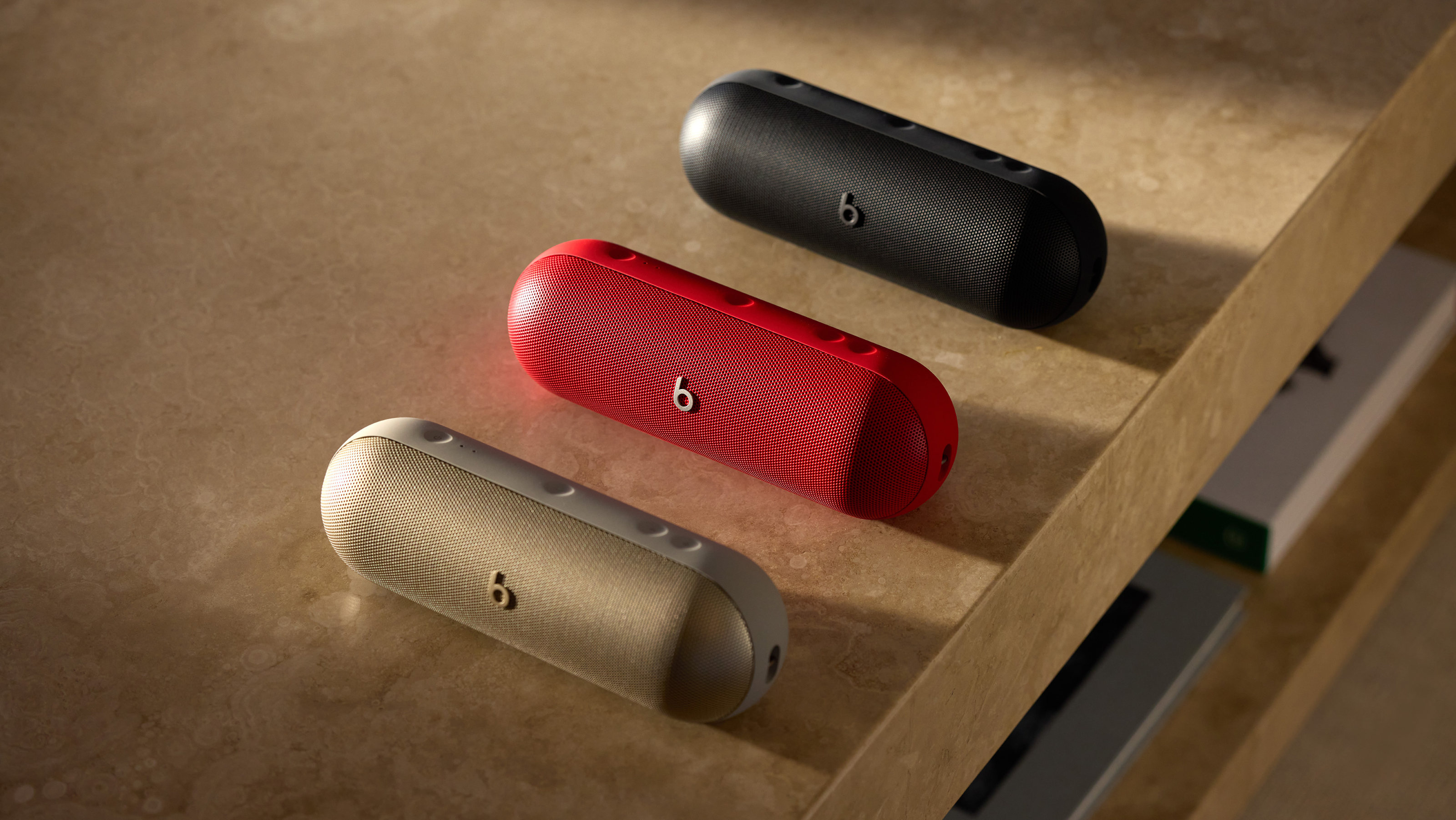 The new Beats Pill: exclusive interview with Apple’s Oliver Schusser
Oliver Schusser, an Apple Vice-President, is in town to talk Pills, thrills and heartaches. We sat down to explore the Beats portable music strategy
By Craig McLean Published