
Imagine you start a research company that swiftly, and largely unexpectedly, becomes a product-focused tech titan, with a controversial tool that finds itself being used by around 300 million people every week. The company’s value has exploded from around $29 billion in 2023, to $157 billion in late 2024, to around $340 billion in early 2025.

OpenAI sets out its mission statement
The company is OpenAI, founded in December 2015 by a group of eleven entrepreneurs, developers and computer scientists of whom the best known are current CEO Sam Altman, one Elon Musk (now absent from the board), Ilya Sutskever and Greg Brockman.

The OpenAI redesign will cover all products and portals
Headquartered in San Francisco, with around 2,000 employees around the world, OpenAI has grown with a rapidity that has surprised even the tech industry. Its best-known product, ChatGPT, is a Large Language Model (LLM) that debuted in 2022 and, after numerous iterations, is currently running the OpenAI o1 model.
Things move so fast in this industry, that this paragraph had hardly been written when the company announced another new model, o3-mini, this time in response to the Chinese firm DeepSeek’s surprise AI model release. Then again, during editing, came news of yet another tool, "Deep Research", powered by the forthcoming OpenAI o3 model.
OpenAI has been there since the beginning, carrying a lot of the weight of building LLM and training datasets in a world that is notoriously blurry about the role of copyright and attribution. Along the way, OpenAI has built their technology into a number of other products, including Sora, a generative AI that can create text, imagery or video, as well as multiple tiers of ChatGPT, each bringing new functions and capabilities depending on your subscription level.

OpenAI Sans, a new bespoke sans serif typeface
Regardless of the potential ins and outs and ups or downs of AI in all its forms, OpenAI is still a tech company, one with a corporate identity, a brand and a visual language. However, thanks to this ultra rapid growth across multiple products, OpenAI in late 2024 was a multi-billion-dollar company untethered from the aesthetic scrutiny found in its peers.

The company's logo and wordmark is rendered in OpenAI Sans
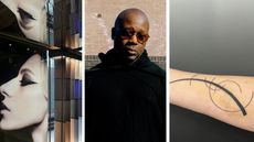
Now that has all changed, thanks to today’s unveiling of a crisp new look for OpenAI and its various products. There’s nothing blurry about this new identity, developed in house by a team led by Head of Design Veit Moeller and Design Director Shannon Jager, working with Berlin-based type foundry ABC Dinamo and motion partner Studio Dumbar in Rotterdam.
Speaking from their HQ in San Francisco, Jager and Moeller admit that up until now, OpenAI has presented itself to the world in a rather haphazard fashion, with a jumble of fonts, marks and colours that lacked the cohesion of a clear strategy or unity.

A circular motif is found throughout the typeface
‘Sam [Altman] asked us to look at the identity just over a year ago,’ says Moeller, whose background includes Creative Director roles at Mercedes-Benz in Berlin, WhatsApp and Instagram.
Explaining that OpenAI’s journey has essentially taken it from a research lab to a company with a global spotlight, Moeller and his team were tasked with creating a visual identity that was ‘more organic and more human,’ without losing the sense of authority, technological sophistication and research-focused underpinnings.

OpenAI Sans was developed with foundry ABCDinamo
The new identity makes its debut on OpenAI.com today and also feeds through into the interface and presentation of ChatGPT in all its forms, from browser to apps. The existing graphic language was broken down into elements and reassembled, starting with a bespoke new typeface, OpenAI Sans, an emphasis on the OpenAI wordmark, a redesigned ‘blossom’ logo, and a new palette and grid. All this culminates in the ‘emotive point,’ a pulsing blue disc that signifies the user’s interaction with the AI itself.

OpenAI Sans
There’s also a new suite of imagery, both by established photographers and textures and patterns created by Sora. As well as the digital assets, the design team has launched a range of merchandise, initially aimed at the in-house team but sure to find its way to the outside world in the months to come.
‘We did a merch store drop earlier this year,’ says Jager, ‘we initiated new designs and merch and it was met with a frenzy by internal employees who loved it so much that they hacked the site to get more – that’s a testament to how things work around here.’

Yes, there's OpenAI merch
This spirit of innovation and boundary pushing is very much in sync with the Silicon Valley ethos, for better or for worse. The same people who are driven to secure a limited-edition corporate T-shirt by any means necessary are also being tasked with developing tools and processes that’ll have an uncertain impact on the world.
OpenAI doesn’t promise to have all the answers, and the rebrand reflects that. ‘We are a research and deployment company,’ Jager says, ‘and our studio has embraced that and reacted to it.’

OpenAI Sans will soon expand across many different languages
As Moller explains, rebrands are often defined by agencies coming to a company or organisation from the outside and re-shaping it. ‘Here, we’re really trying to be curious and use research to influence the design process.’ ‘ChatGPT was never meant to be a product,’ Jager adds, ‘when it was initially released as a research experiment in 2022 it gained a million users in five days.’

OpenAI Sans, in all its forms
As for the perennial question as to how AI will impact and/or detract from or enhance human creativity, the designers have an answer. ‘At OpenAI, we believe technology should amplify, not replace, the depth of human creativity,’ they clarify, ‘Our brand language is built on the nuances of human experience - the way an image evokes memory, how typography carries tone, and how motion breathes life into ideas.’

The 'Point' and the 'Bloom', the two core elements of OpenAI's identity
The central motif is ‘the point’, a black circle that represents the cursor, the origin of ChatGPT’s response and the defining geometry of the letterforms, grid and spacing. ‘The point is the foundation,’ says Jager, ‘it ended up being an integral part of the identity, something that already existing in papers and research, graphs and diagrams.’
Taking this black dot as a starting point for the typeface, OpenAI’s team and ABC Dinamo brought circular forms into the letters and punctuation marks, such as the round ‘O’.

New spacing, new letterforms and a circular theme define OpenAI Sans
‘The point has become a bridge across different products and departments,’ says Moeller, explaining that the four core values of the new identity are ‘simplify, space, imperfection and vivid’. ‘Space is underrated,’ he continues, ‘we want to find the beauty in nothing. There’s also a certain level of imperfection, to counter any robotic precision and make things feel more human.’ For example, while the ‘O’ is perfectly circular on the outside, the interior form is not.
‘OpenAI Sans is a love letter to typography,’ Jager continues, adding that ‘we approached ABC Dinamo with a clear vision of integrating the point into letterforms, and through close collaboration, we brought OpenAI Sans to life.’ They’re continuing to collaborate as they roll out global scripts and a mono version of the font, ultimately consolidating the ‘six or seven’ typefaces that were in use across the company’s various products.

OpenAI's research output will benefit from the new identity
The new visual language is designed to make OpenAI's data presentation clearer and more concise
The redesign will also make its mark on one of OpenAI’s regular and essential outputs, research papers. ‘Data visualisation is a real art in itself,’ Moller says, but the imposition of the new font, grid and palette give this industry-centric publications a real visual lift, with a more playful graphical spirit. There’s also stationery and even more merchandise.

An OpenAI business card using the new identity
The other element to be reassessed and redrawn was OpenAI’s brand mark, known internally as the ‘blossom’. Originally designed in 2016 by a team including in-house designer Ludwig Pettersson and Ben Barry, along with Brockman, this ‘research icon’ is now a clear product identifier. The three intertwined triangles – which can also be read as a flower or bloom – have been lightly upgraded for the new identity, with refined geometry and differently weighted versions.
‘We’ll be more careful as to how we use it,’ says Moeller, pointing out that the ‘OpenAI’ wordmark is going to be much more prominent going forward. The underlying grid of six interlocking circles is also known as the ‘seed of life’, another tie-in to organic, humanist underpinnings.

The redrawn OpenAI 'Blossom' logo

The geometry underpinning the redrawn OpenAI 'Blossom' logo
I have to ask – was ChatGPT’s generative powers used at all in the processes? According to Moeller, the software was helpful when making calculations for different type weights, but other than that the process was entirely traditional.
Later, the designers elucidate on this often-fraught relationship. ‘We collaborate with leading experts in photography, typography, motion, and spatial design while integrating AI tools like DALL·E, ChatGPT, and Sora as thought partners,’ they add in an email, ‘This dual approach - where human intuition meets AI’s generative potential - allows us to craft a brand that is not just innovative, but profoundly human.’

Newly commissioned photography supports the launch of the OpenAI redesign
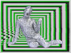
Human creativity is very much in evidence in the photography that launches the rebrand. The result of direct commissions to several contemporary practitioners, the imagery ranges from landscape to still life, to more abstract forms. ‘It was for us and Sam to work with photographers and honour their craft,’ says Moeller.
Sora has been used to create otherworldly textures that can then be paired with the ‘real imagery’. ‘It will always be a mix,’ he continues, drawing a comparison between the early adoption of the Apple Mac in graphic design and how, in skilled hands, it’s just another tool.

Newly commissioned photography supports the launch of the OpenAI redesign
The human curation of imagery remains essential. ‘We’re trying to find a way to research the world and find things that are both human and surprising,’ says Moeller, ‘although we don’t have a rule that AI can’t produce this element of levity, imperfection and introspection – we’re trying not make up too many rules. Using AI as a tool and a partner is something that’s interesting.’ ‘We’re using AI as a thought partner,’ Jager adds, ‘what’s great about this balance is how it creates different perspectives.

Newly commissioned photography works hand in hand with imagery generated by OpenAI's Sora
This imagery is aligned with a new colour palette, starting with a base of greys and blues that evoke horizons, skies and expansive space, coupled with primary contrasting colours.
Finally, there’s the ‘Emotive Point,’ a pulsing disc with a ‘watercolour-inspired’ background of swirling blue abstract forms. ‘It’s a design device that people will use when interacting with AI,’ says Moeller, pointing out that it is deliberately ‘non-human’, with no discernible character or emotions.

OpenAI's animated 'Emotive Point'
Rather than a simple motion file, the Emotive Point is coded, so the patterns and movement can respond to your inputs. Capable of being deployed across OpenAI’s products at a variety of scales, this pulsing crystal ball-like device is a visual representation of ChatGPT’s ‘voice’.
However, text will continue to be a primary output. ‘At its base, typography is how you interact with everything,’ says Moeller, ‘it’s the anchor point for ChatGPT. Every interaction, every visual, and every detail is designed to feel alive, resonant, and deeply connected to the people who experience it.’

A sampling of the new OpenAI identity

A sampling of the new OpenAI identity

A sampling of the new OpenAI identity
AI is growing up fast, amidst fascination, scrutiny and uncertainty. OpenAI’s value might be hugely overstated, or it might become as essential and inescapable as Meta or Google. What’s clear is that the company is working hard to present itself with a friendly authority, a unified image that ties up the knotty, complex and ever-shifting processes that drive their products.
And that's not all. The kind of AI we've come to know and use is just a stepping stone to the company’s stated goal of creating ‘AGI that benefits humanity’. OpenAI wants to usher in a world that's currently unknown, one where the subtle and expressive human creativity shown throughout this new rebrand could be even more imperilled.

OpenAI sets out its mission statement
OpenAI.com, @OpenAI, ChatGPT.com, @ChatGPT
StudioDumbar.com, @StudioDumbar

The structure of OpenAI Sans
-
 London's coolest design-led coffee shops for your Fashion Week fix
Coffee shops are the heart of London’s neighbourhoods, discover those fusing speciality beans and stylish interiors for the perfect brew
-
 Martine Rose’s first gallery show celebrates the radical queer energy of Bronski Beat
Taking place at Sadie Coles over London Fashion Week, ‘Everything Must Change’ centres on a 2016 short film by menswear designer Martine Rose and image-maker Sharna Osborne starring Bronski Beat frontman Jimmy Somerville
-
 Out of office: what the Wallpaper* editors have been doing this week
A taste of the dolce vita in London, some permanent artwork and a new eyeshadow palette – it's our editors' picks of the week


-
 Layer conceptualises a next-gen AI-powered device: introducing the PiA
PiA, the Personal Intelligent Assistant, is a conceptual vision of how AI might evolve to dovetail with familiar devices and form factors
-
 Yves Béhar describes his approach to design, built around a core of sustainable processes and positive social impact
Yves Béhar is the Swiss-born American founder of Fuseproject, a San Francisco-based multidisciplinary design studio with an outpost in Lisbon. Béhar's work is held in collections at both MoMA and SFMoMA and includes everything from mobility design to medical technology, robotics and high tech start-ups
-
 Wallpaper Design Awards 2025: In tech, we’re worshipping at the altar of inanimate objects, not smart devices
The very best contemporary technology, as celebrated by the 2025 Wallpaper* Design Awards and detailed by tech editor Jonathan Bell – watch the video
-
 At CES 2025, Nvidia accelerates towards an AI-driven, robotic-powered autonomous future
Nvidia reveals a personal AI supercomputer, digital replicants of the physical realm, and chips to give cars and robots their long-awaited true autonomy
-
 Year in review: top 10 gadgets and tech of 2024, as chosen by technology editor Jonathan Bell
The very best of 2024’s gadget and technology launches and stories, from emerging AI to retro gaming, laser projectors and musician’s side projects
-
 Is Google’s Gemini AI the best way of getting the most out of our machines?
From summaries to lists of suntan lotion and swimsuits, Google reckons Gemini can save us all time and effort. We dig into new uses for AI
-
 Apple Intelligence has landed, giving Siri the ChatGPT treatment and adding new AI-powered features and functions
Apple’s 2024 Worldwide Developers Conference marked the debut of Apple Intelligence, the company’s long-awaited riposte to Silicon Valley’s current AI obsession
-
 Torment Nexus or social revolution? Google’s I/O 2024 was all about AI integration
We sift through the revelations and revolutions from Google’s I/O conference, where its Gemini AI model was pushed to the fore for searching and making. The future is how you find stuff, and Google thinks it has the answer to everything


