Inside the design of the new Apple suite
Design details of the latest Apple drop include key updates to the internal architecture of the iPhone and HomePod mini, alongside refreshing new gemstone-inspired colourways
When the iPhone 12 debuted on 13 October it offered up a number of firsts for Apple. Not only was the new flagship based around an all-new chipset, A14, but it also appeared as a complete family right out of the box, with all sizes, accessories and colours catered for from day one. With the ‘regular’ iPhone 12 joined by the 12 Pro and 12 Pro Max, along with a new iPhone 12 mini, there’s a size for everyone, all benefiting from core additions to the 12 range that include the arrival of 5G, a LiDAR scanner and a case that is thinner and sleeker than ever before.
This ‘instant family’ approach is a significant departure for the Cupertino-based company. It reflects a growing desire to create an all-encompassing ecosystem that reflects how their phones are used in day to day life, usage that embraces charging, protecting and even the ability to put your screen out of sight, out of mind. The 20-strong Industrial Design Group is at the core of Apple’s creative process and typically works at least two years out. This suite of products revealed in October were still at prototype stage back in 2018, long before Chief Design Officer Jony Ive stepped back from the company after 27 years. This level of foresight is essential, allowing time for the vast global mechanism of mass production, assembly and distribution to gear up for the next generation.
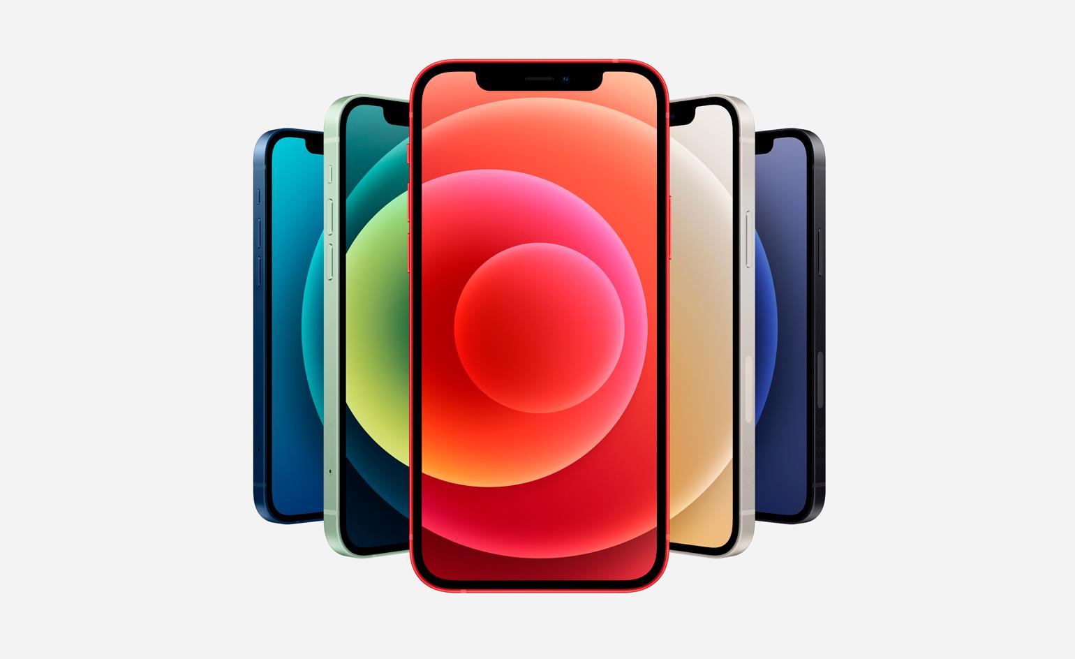
The five core hues of the iPhone 12
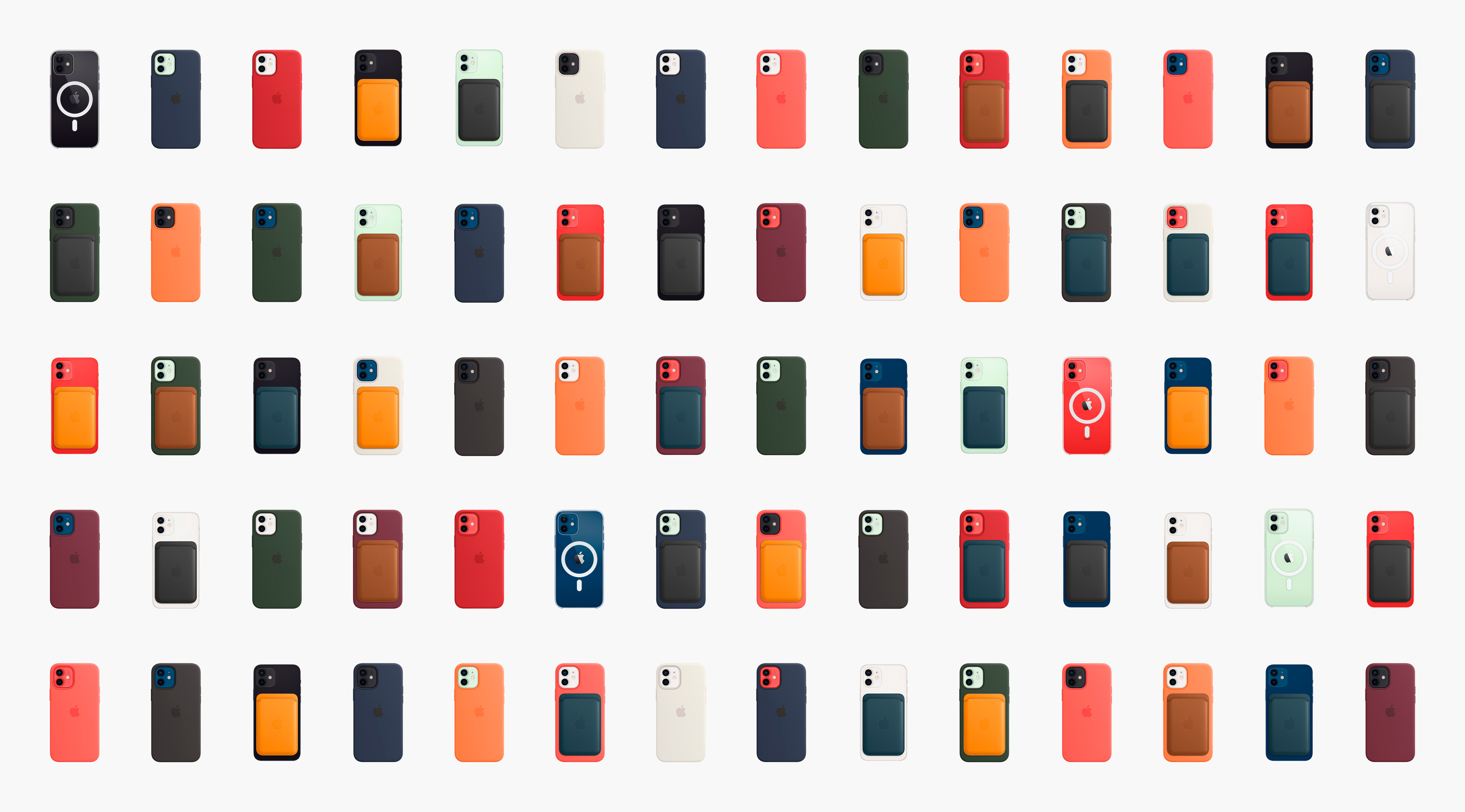
The first thing you notice about the iPhone 12 family portrait are the colours. For all its historical association with monochrome minimalism, there has also been a strong polychromatic streak running through Apple, from the candy-coloured iMac G3s to the subtle array of hues available today. The iPhone 12 comes in an impeccably contemporary palette, with five core hues, black, white, red, green and blue. These are supplemented by an array of new colours for the innovative MagSafe casing design.
MagSafe will be a familiar feature to Mac aficionados; it originally denoted the clip-on power cables that snapped into and out of place and stopped you accidentally dragging your MacBook to the floor when you tripped over it. Now it has been refined for a new era of portability, and denotes the discrete ring of ultra-thin magnets embedded in the back of the phone to create a snap-to wireless dock for a range of cases and chargers. Wireless charging uses the Qi standard, allowing for ultra-fast battery refresh speeds.
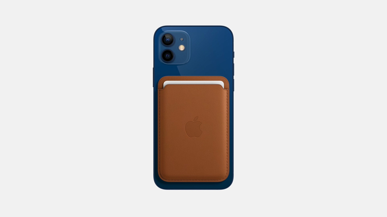
MagSafe leather wallet
There’s a sense that Apple considered the form factor of iPhones 10 and 11 as having reached a sort of zenith, the purist expression of the object. The 12 family is rather more diverse. Now that iOS 14 has opened the door to hitherto unknown levels of home screen customisation, MagSafe promises to make swapping out cases, attaching accessories like the beautifully detailed leather card wallet, and putting on to charge a seamless, wire-free experience.
The range of colours, which embraces blues, oranges, browns and reds, amongst others, tone perfectly with one another, emphasising the fact that an iPhone can be snapped into a MagSafe case with a wallet attached to the back, all in different but complimentary colours. ‘We’ve always gone extremely wide in our colour choices,’ says Evans Hankey, the company’s VP of Industrial Design, ‘this palette was an exploration that started around gemstones – we loved the depth of colour and the way the colours appeared through the cases.’
We also detect a touch of Le Corbusier’s earthy mid-century palette, while the Pro palette has a slightly more metallic edge. The two disc-like chargers – one which folds neatly and contains a dock for the Apple Watch alongside a phone charger – will dramatically cut down on cable clutter and strongly imply a future where the millions of miles of cables that fill our lives are finally banished.
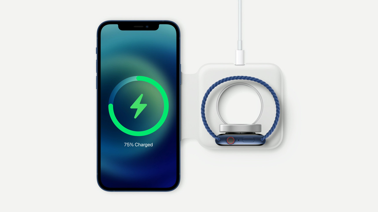
MagSafe Duo charger
This palette was an exploration that started around gemstones – we loved the depth of colour and the way the colours appeared through the cases
Evans Hankey, Apple's Vice President of
As ever, the details go far beyond what you see on the surface — the iPhone team had to tweak the internal architecture — already a literal miracle of packaging – to accommodate the magnetic coil. The cardholder wallet is sprung so that a single card is still held as tightly as three. The passive NFC field ensures the iPhone detects when an accessory is docked, a feature demonstrated best by the sleeve which leaves a small slot for the time display. Putting away your phone will also change the display colour to match the sleeve’s. ‘This connectivity to the MagSafe eco system is what drove the final form,’ explains Apple designer Eugene Whang. ‘We designed the phone and the accessories as a single cohesive family,’ continues Jeremy Bataillou, another long-time Apple designer.
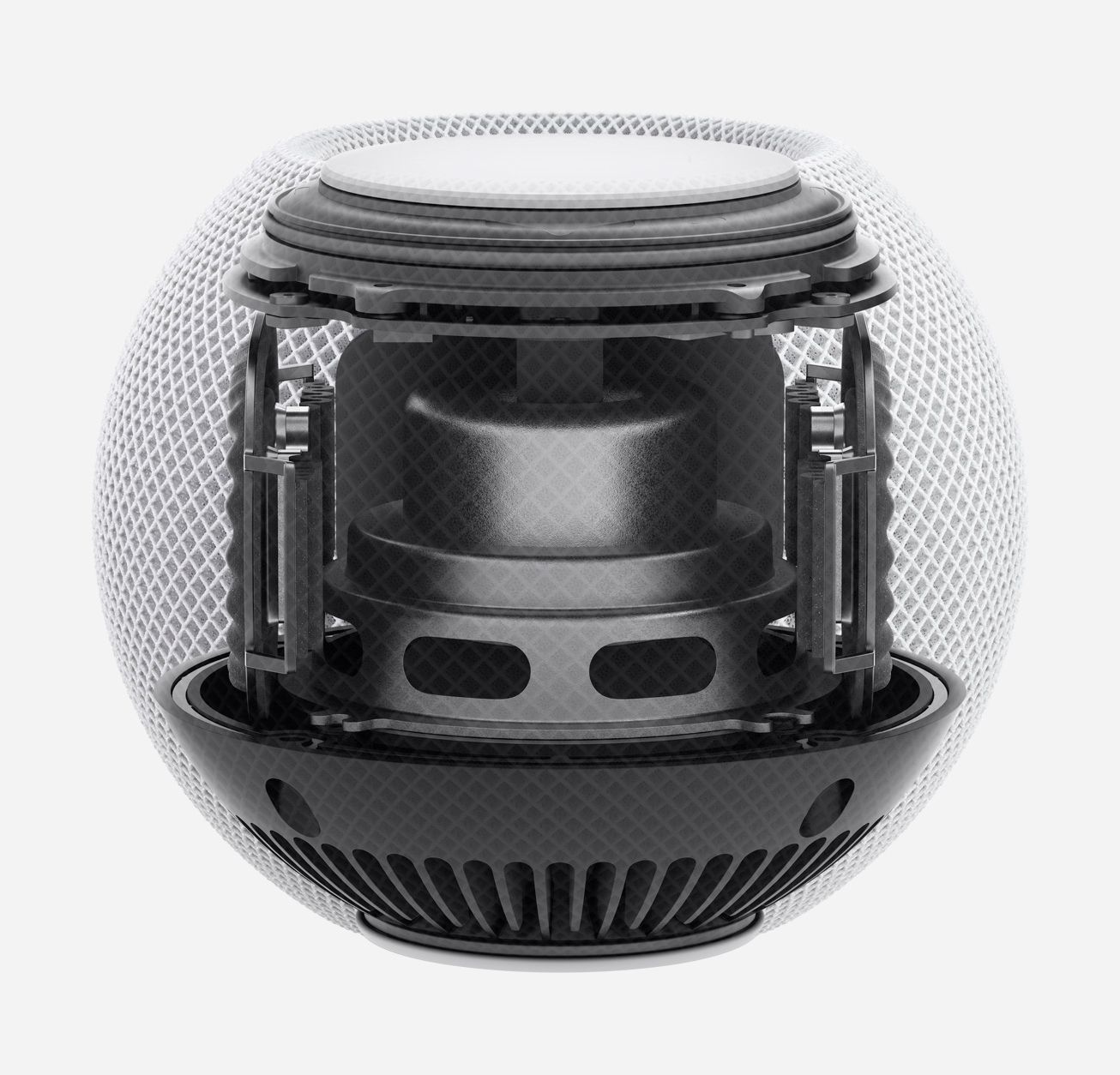
The internal hardware of the new HomePod mini
The emphasis on utility and personalisation runs throughout, making this the most curated iPhone collection yet. Interestingly, the company will no longer ship devices with EarPods or charging blocks, reasoning that many of us have these things already and their absence will be more than outweighed by the reduced environmental impact.
Apple’s massive volumes also allow for other innovations. The new HomePod mini is one of the most affordable Apple products ever, at $99 (£99). A scaled down version of the HomePod speaker system, it is also a command hub for HomeKit, as well as an interface with Siri and a portal to myriad streaming services. With the same geometric mesh covering, proximity sensors that detect your approach and the same levels of high-fidelity as its larger sibling, the mini is destined to enter millions of homes over the next few years. ‘We’re happy there’s an ecosystem around our products,’ says Hankey. ‘As a design team, we are always exploring how we can add specific new values and make them more personal.’ As with all things from Apple, an ethos of surprise and delight is baked into every single detail.
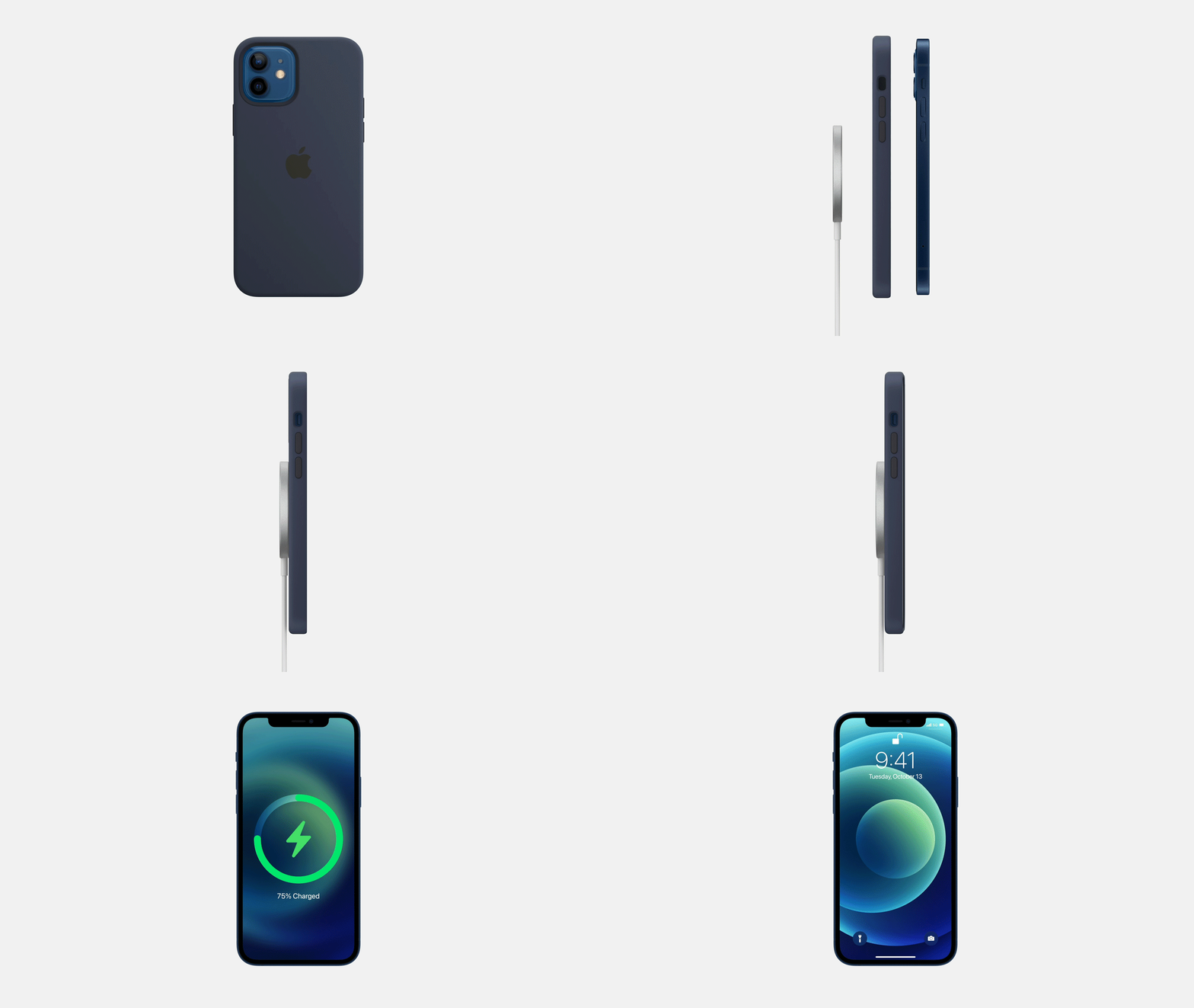
MagSafe casing design
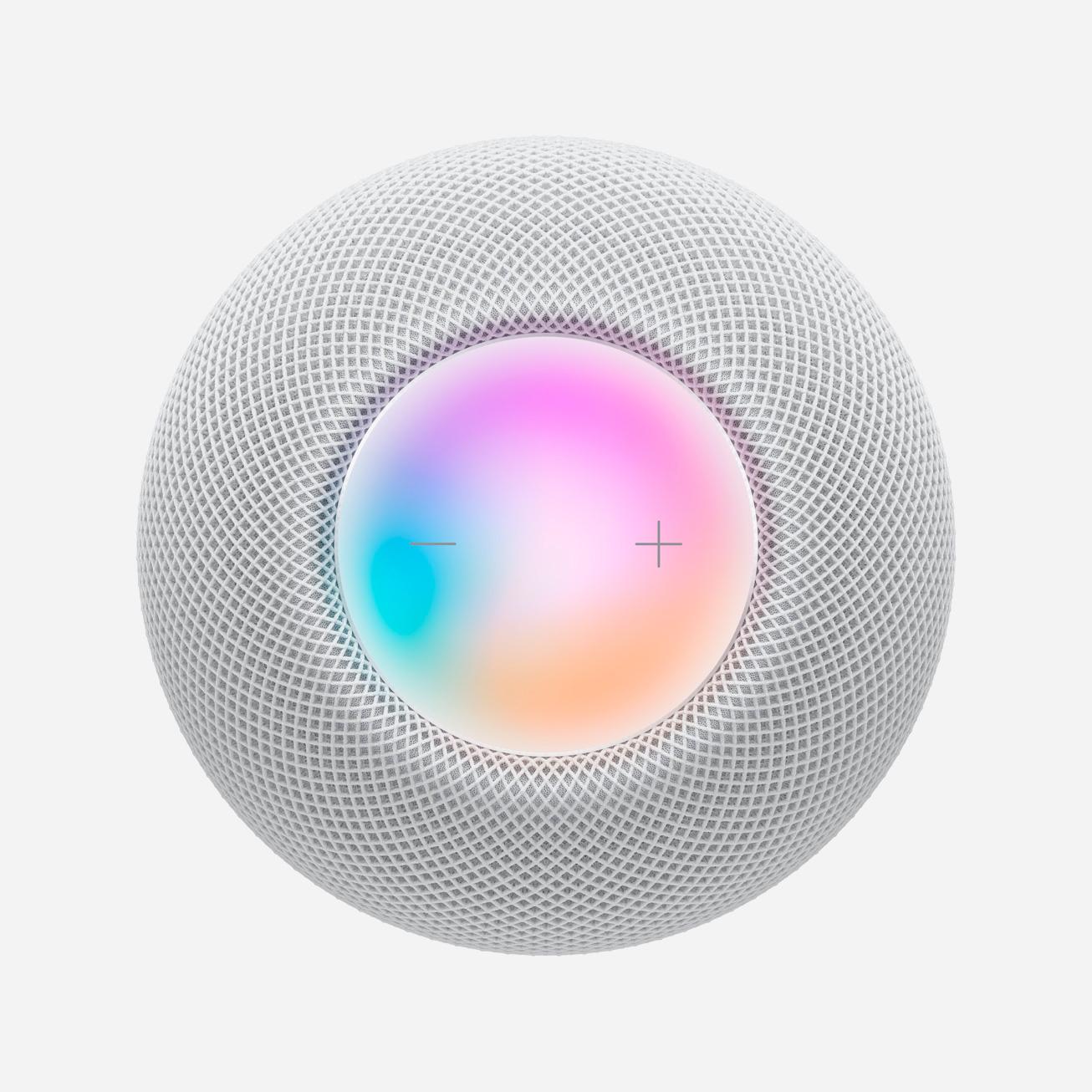
HomePod mini
INFORMATION
Wallpaper* Newsletter
Receive our daily digest of inspiration, escapism and design stories from around the world direct to your inbox.
Jonathan Bell has written for Wallpaper* magazine since 1999, covering everything from architecture and transport design to books, tech and graphic design. He is now the magazine’s Transport and Technology Editor. Jonathan has written and edited 15 books, including Concept Car Design, 21st Century House, and The New Modern House. He is also the host of Wallpaper’s first podcast.
-
 Australian bathhouse ‘About Time’ bridges softness and brutalism
‘About Time’, an Australian bathhouse designed by Goss Studio, balances brutalist architecture and the softness of natural patina in a Japanese-inspired wellness hub
By Ellie Stathaki
-
 Marylebone restaurant Nina turns up the volume on Italian dining
At Nina, don’t expect a view of the Amalfi Coast. Do expect pasta, leopard print and industrial chic
By Sofia de la Cruz
-
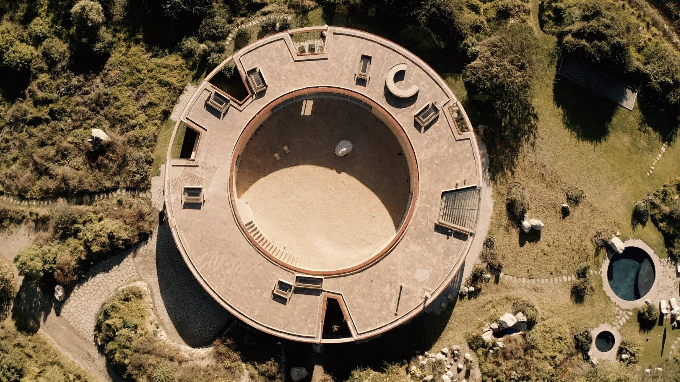 Tour the wonderful homes of ‘Casa Mexicana’, an ode to residential architecture in Mexico
‘Casa Mexicana’ is a new book celebrating the country’s residential architecture, highlighting its influence across the world
By Ellie Stathaki
-
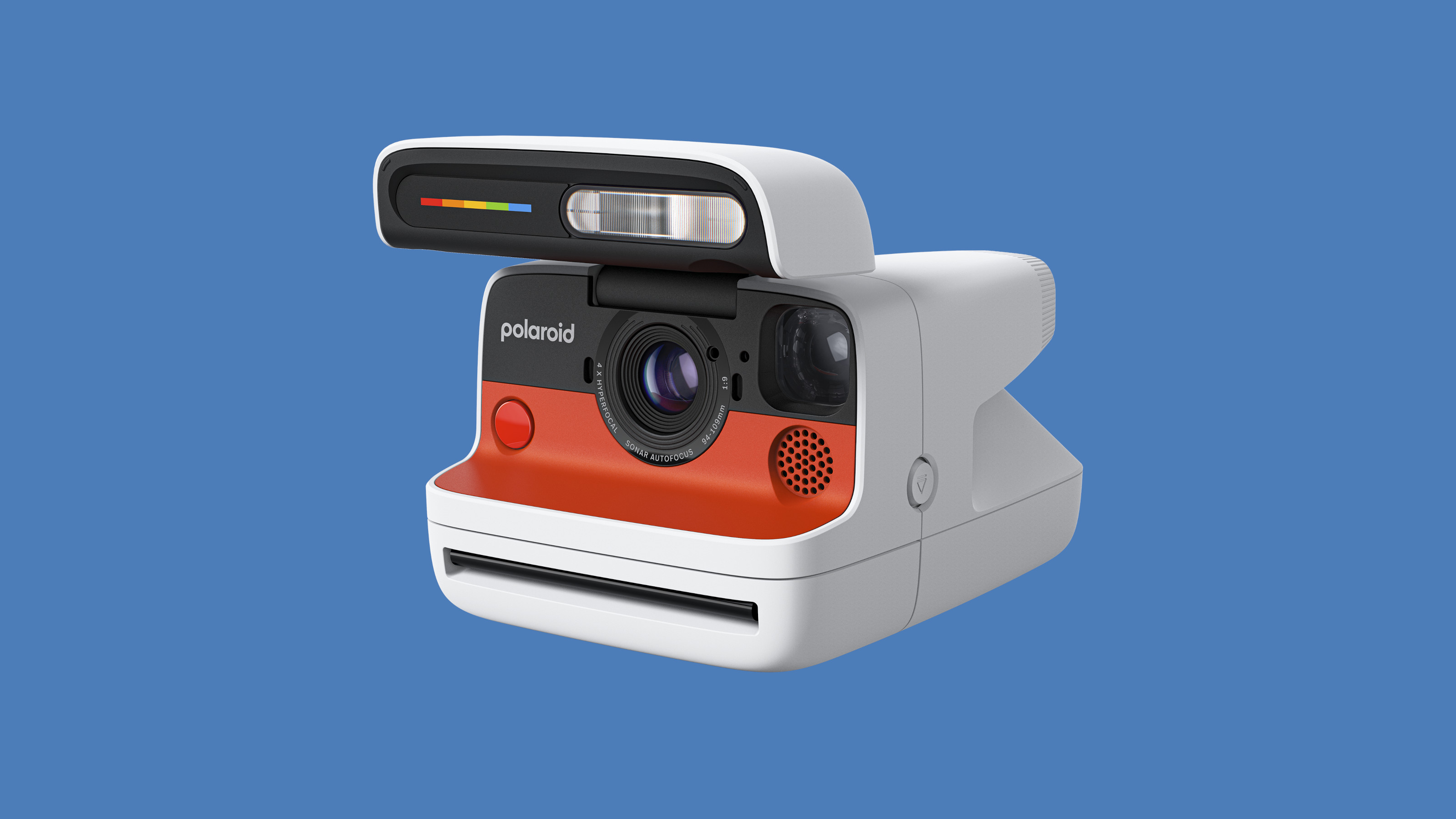 The new Polaroid Flip unfolds to bring you pin-sharp instant photography
Polaroid announces the Flip, an instant camera that blends its evergreen film technology with better results and more control
By Jonathan Bell
-
 Could putting pen to reMarkable’s Paper Pro tablet make you more creative and less stressed?
Design Museum director Tim Marlow extols the power of ‘scribbling’, and is backed up by new research from reMarkable on the benefits of its paper tablet
By Simon Mills
-
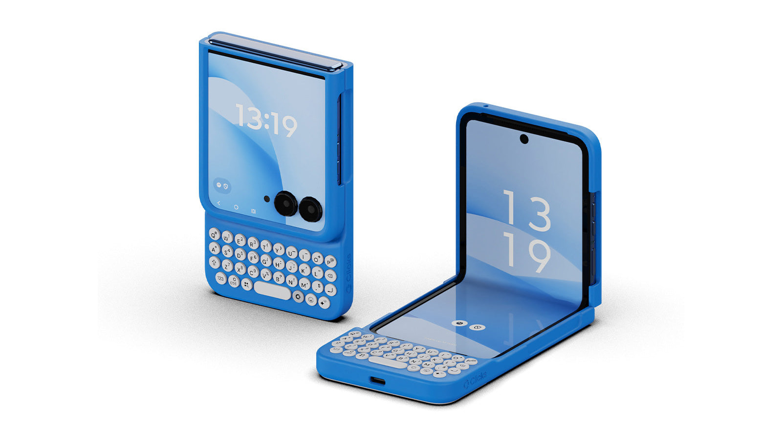 Clicks creates keyboard cases for iPhones – now they're also available for three Android flagships
Smartphones get a new lease of life with Clicks, which brings a Blackberry-style keyboard to today’s cutting-edge Apple and Android devices
By Jonathan Bell
-
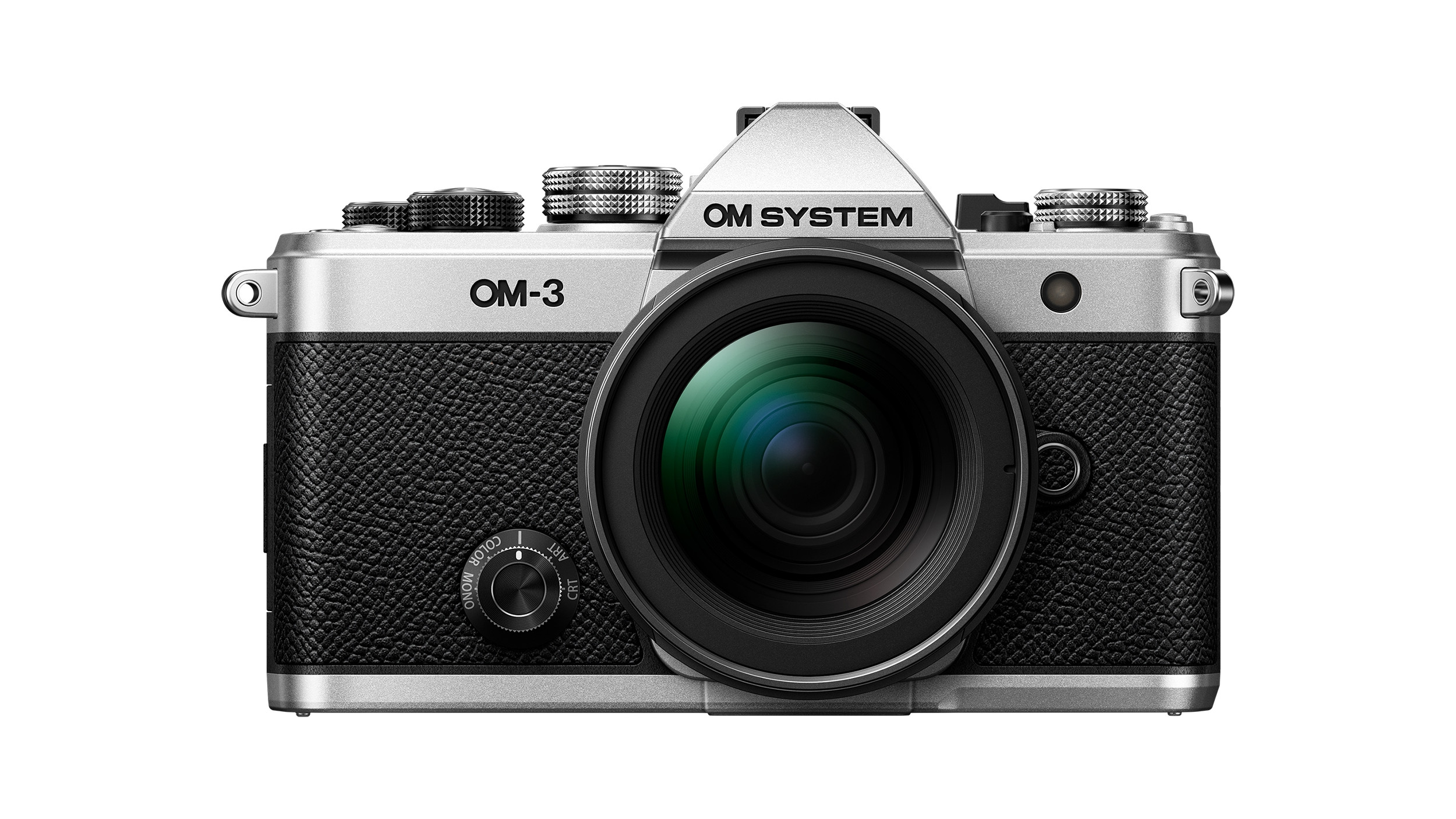 The OM System OM-3 camera blends heritage design with cutting-edge technology
The OM-3 from OM System is the newest must-have mirrorless camera design, classically styled and comprehensively equipped to create the ultimate contemporary digital camera
By Jonathan Bell
-
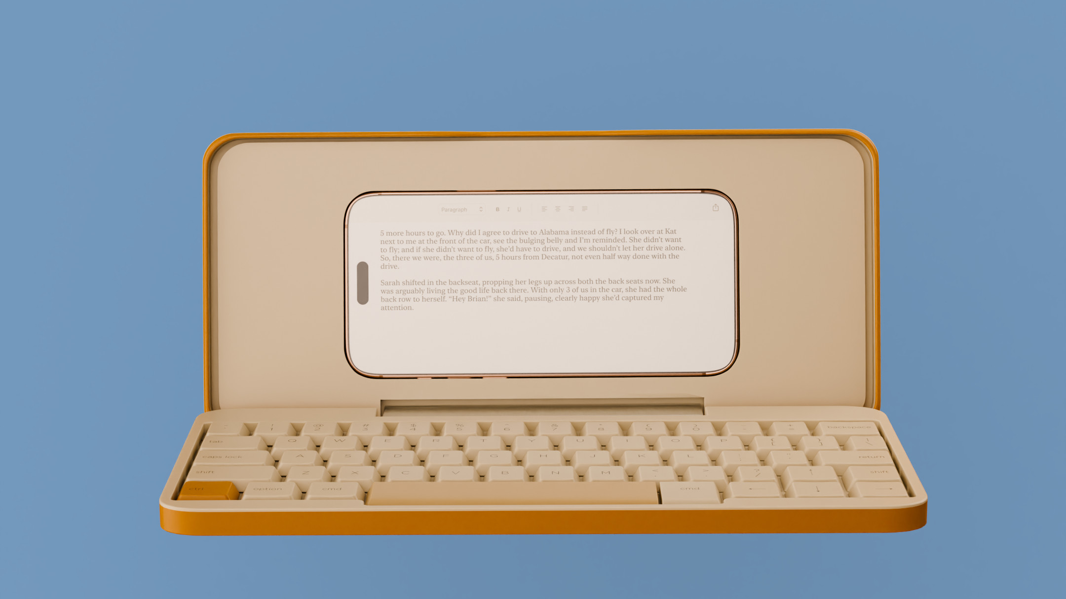 Type without the tyranny of distractions: eight new ways to get the words out
Looking for a way to divert you from doom-scrolling? This selection of eight distraction-free typing devices will keep you offline and away from the socials to help you meet that deadline
By Jonathan Bell
-
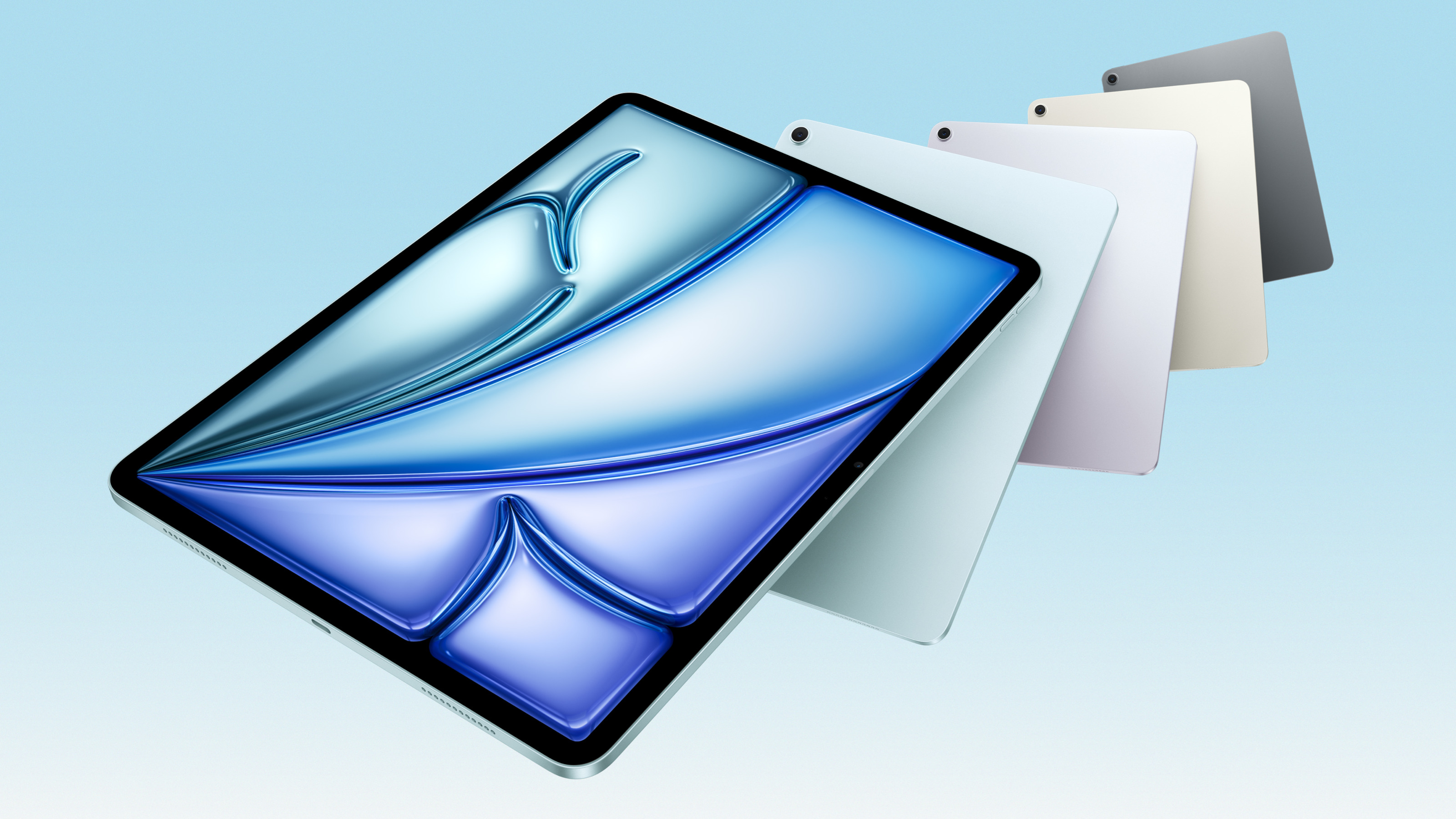 Apple updates the iPad Air with new silicon, new intelligence and new colours
Meet the new M3-powered Apple iPad Air, a compact multimedia tablet built for graphics and AI and capable of outclassing many laptops
By Jonathan Bell
-
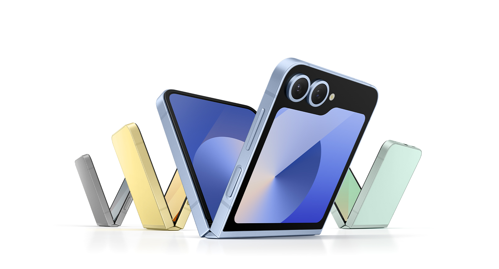 Apple is rumoured to be releasing a foldable iPhone. How should it stand out from the crowd?
The new model is forecast for 2026, but Apple’s competitors have already entered the foldable phone market. Is the tech megabrand late to the party, or can we expect something special from its contribution?
By Anna Solomon
-
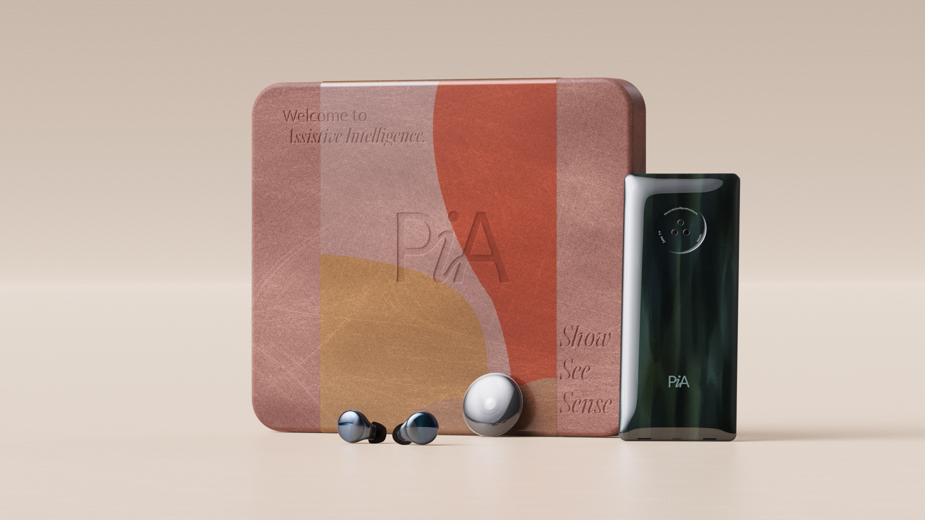 Layer conceptualises a next-gen AI-powered device: introducing the PiA
PiA, the Personal Intelligent Assistant, is a conceptual vision of how AI might evolve to dovetail with familiar devices and form factors
By Jonathan Bell