Microsoft’s new Windows 11 opens up a new era of OS design
‘Windows is the largest Swiss Army knife you can imagine,’ says Ralf Groene, head of design for Windows & Devices
Receive our daily digest of inspiration, escapism and design stories from around the world direct to your inbox.
You are now subscribed
Your newsletter sign-up was successful
Want to add more newsletters?
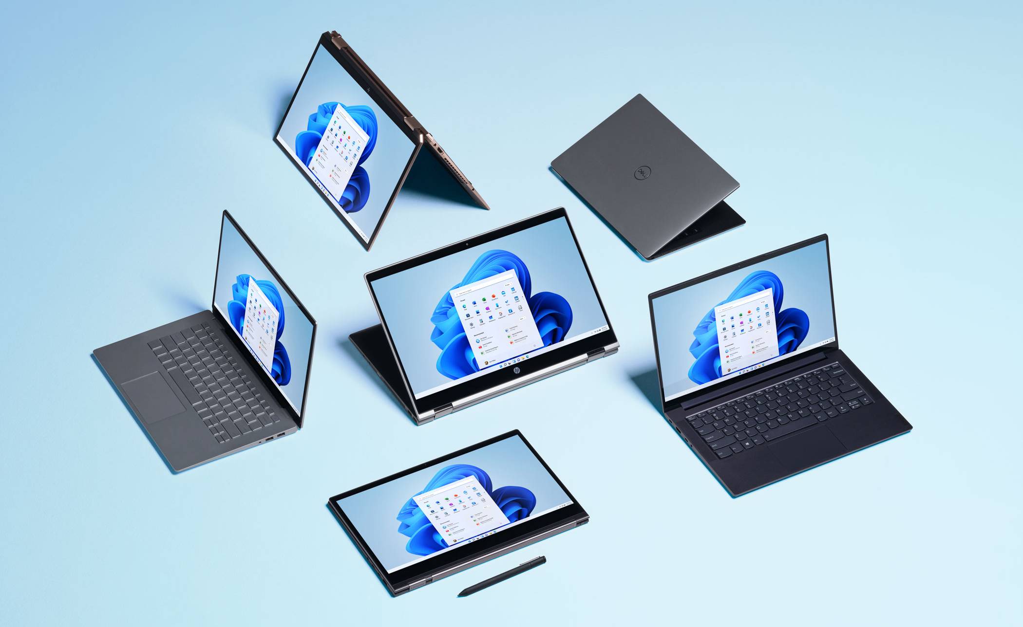
Windows 11 is nearly here. Microsoft’s new operating system is currently out in beta form with a public release expected later this year. Every iteration of Microsoft Windows is a milestone of sorts, but there’s a definite feeling that Windows 11 marks some of kind of significant transition. Our increasing dependence on mobile devices, Apple’s perennial role as the more creative platform and the rise and rise of Google’s Chrome OS have all chipped away at Windows’ dominance. Will Windows 11 be the ultimate evolution of the software before something else comes along?
Microsoft: a history
Windows is one of the most widely used pieces of software in history. Introduced in November 1985, Windows was originally seen as a less sophisticated contender to the ground-breaking Mac OS. However, through the global popularity and low price of the IBM PC clone and Bill Gate’s persistence, Windows evolved to dominate the personal computer market. The OS truly came of age with Windows 3.0 in 1990, when it could finally stand neck and neck with Mac OS in terms of look and feel. What followed was a couple of decades of back and forth between the tech giants, a hotly contested rivalry that is now deeply embedded in our culture, for better or for worse. Those bad old days of binary distinctions that turned your OS choice into some kind of political allegiance are long gone.
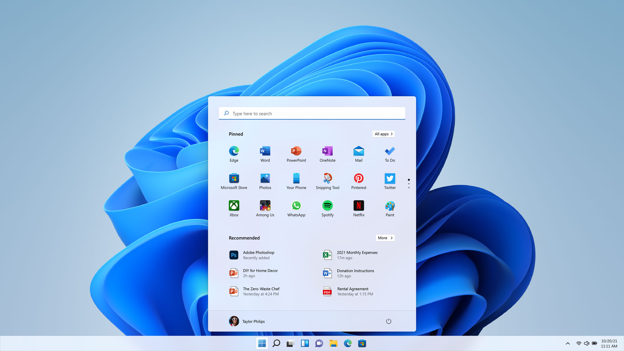
Windows 11 has a new central focus and a smoother design language
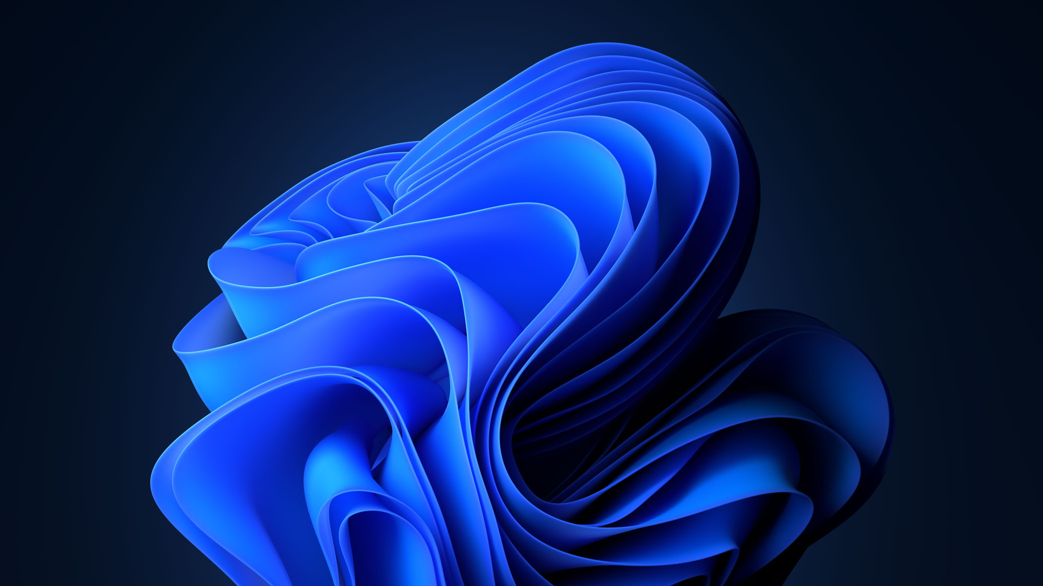
The 'bloom' is a central motif for Windows 11, an algorithmically-generated animated object
With Windows 11, the graphical user interface steps up with a more open, fluid and welcoming approach. As well as a visual overhaul, there’s a new Microsoft Store, a Widgets feed that promises AI-driven curation of your interests, much tighter integration with gaming and the whole Xbox eco-system, as well as an easier way of carrying your desktop and current screen configuration between different devices.
‘Windows 11 has been 35 years in the making,’ says Ralf Groene, head of design for Windows & Devices. ‘I’ve personally been with Microsoft for 15 years, most of which time I’ve spent on Surface devices. We’ve been embedded alongside the Windows team for a decade, so when the opportunity came long to work on Windows 11 and combine the design team with the software team it was extremely interesting.’ Groene’s team consists of industrial designers, material designers and UX designers. ‘We have a really diverse set of disciplines, but the goal is to bring all the cultures together.’
As Groene notes, with well over a billion Windows users around the world, it’s essentially impossible to consider a single user type. ‘Human centric design is the only way to make a great product,’ he says. Like any OS, Windows is characterised by its flexibility, and 11 is no different. Groene and his team have focused on creating a much closer symbiosis between hardware and software. ‘The OS should not be in the way. I use the analogy of a musician,’ he says. ‘When they play music, the instrument feels like it dissolves. We have the same approach when you use the OS. It should not be distracting.’ The most obvious innovation is the OS’s new concentration on a centralised theme. The start menu and taskbar are now centred by default, a response, according to Groene, to the trend for increasingly bigger and wider screens. ‘We have a deep belief that human needs come first,’ he says, ‘you were having to reach half a metre to the left to access a bit of the UI.’
The evolving design language of Windows
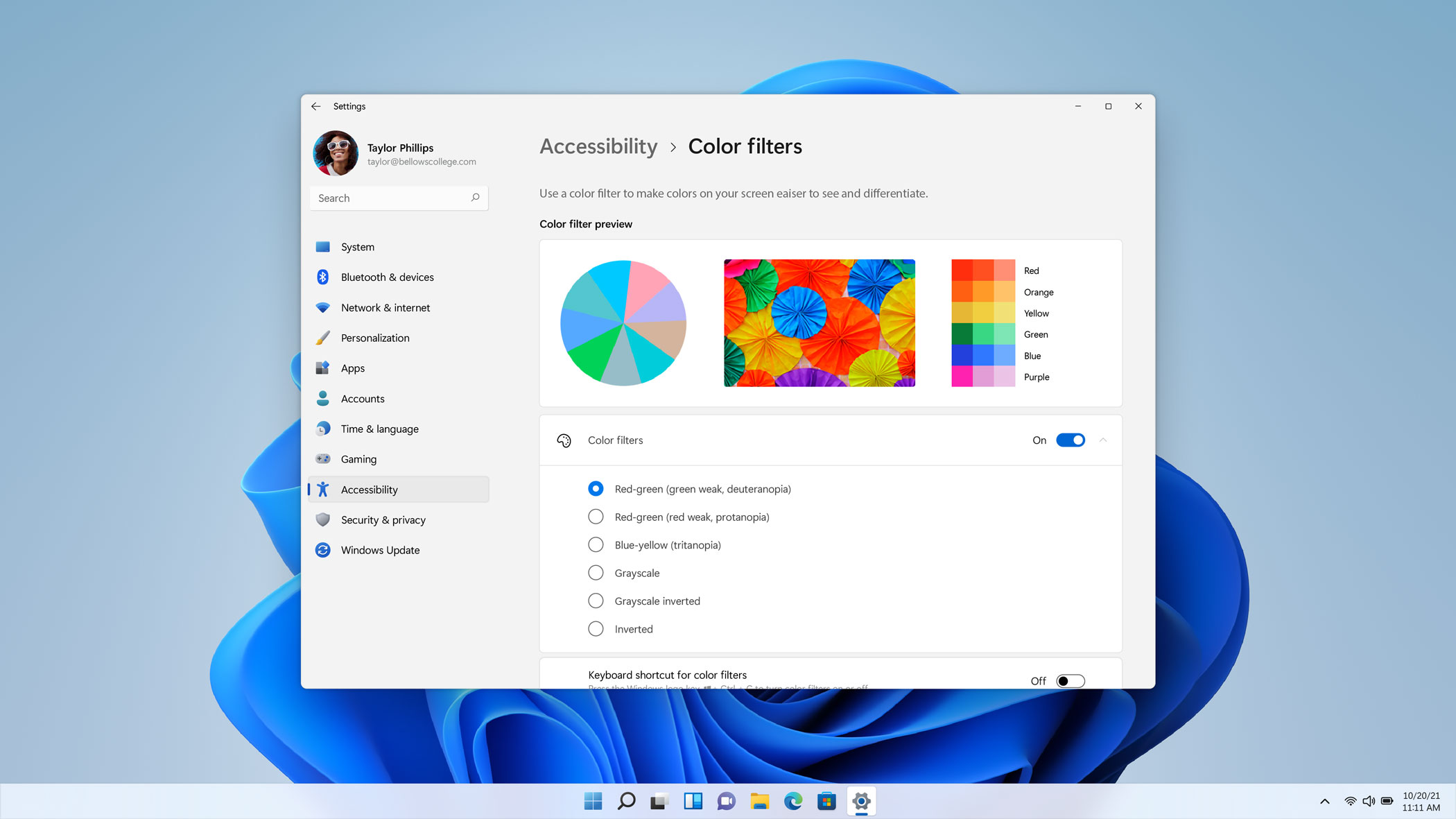
Windows 11 has a greater focus on accessibility than ever before
The levels of backward compatibility are mind-boggling. ‘Windows is the largest Swiss Army knife you can imagine,’ Groene acknowledges, Windows has always played cat and mouse with constantly changing hardware and peripherals, ever faster chips and ever more demanding users. ‘A Windows computer is something you work on and play on. It needs to be simple by default but complex by demand. We live in an age of hyperconnectivity.’
Giving shape to these fundamental design decisions was Christina Koehn, principal design director for Windows. Koehn was part of a 60-strong team of designers, typographers, and iconographers charged with creating Windows 11’s fresh look and feel, improving accessibility and increasing the sense of connectivity between OS and hardware. ‘This is a product that’s been around for over three decades,’ she explains, ‘Windows’ different design languages have always expressed the available technology.’ She cites the major innovations of Windows 95 and XP, then the transparent effects of the ‘Aero’ design language introduced for Windows 7, which was followed by the flat visual identity of ‘Metro’, with its same-coloured icons, used in Windows 8.
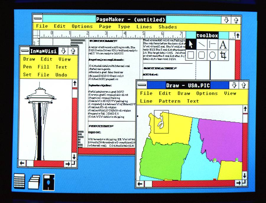
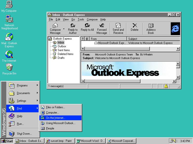
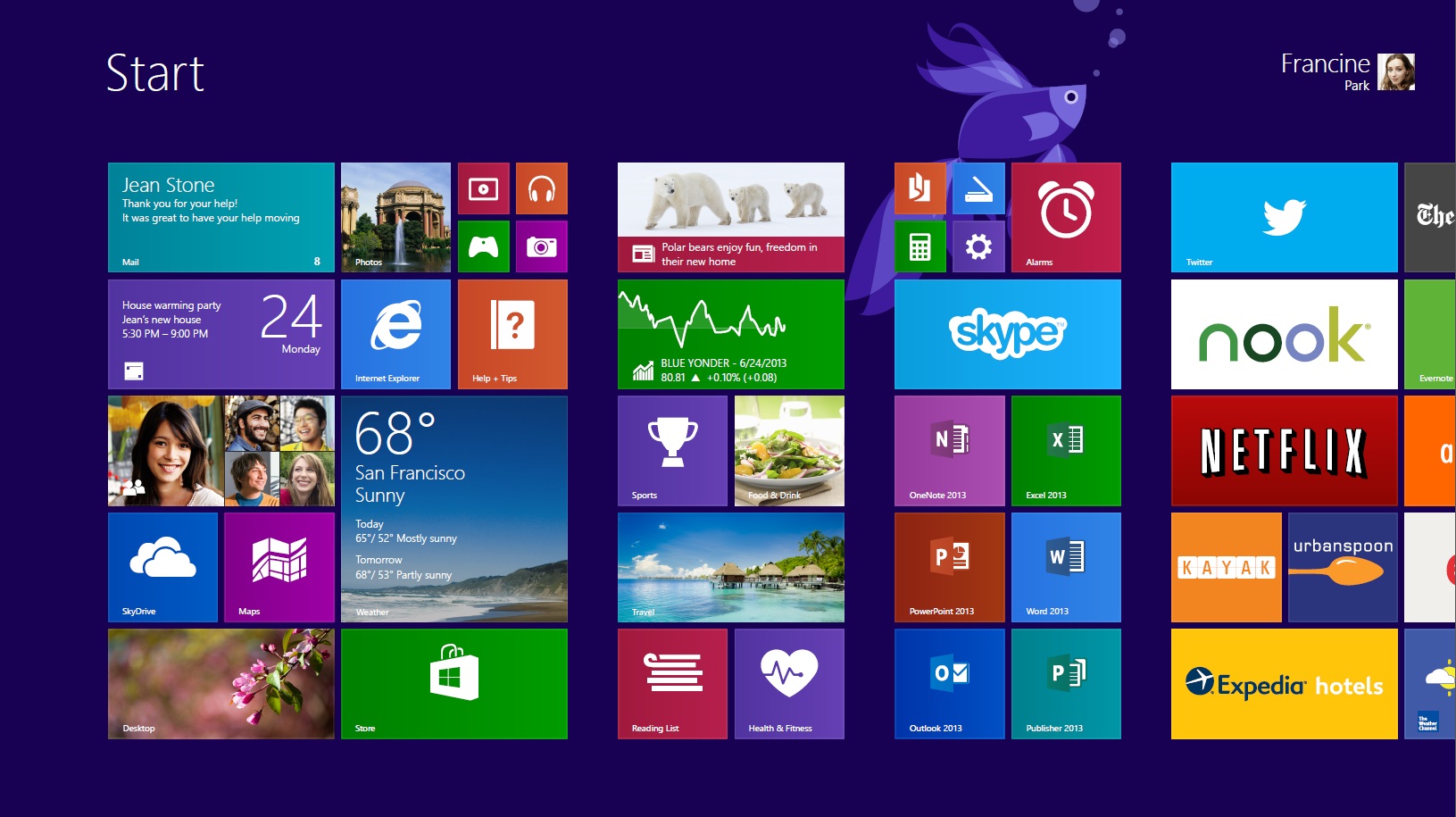
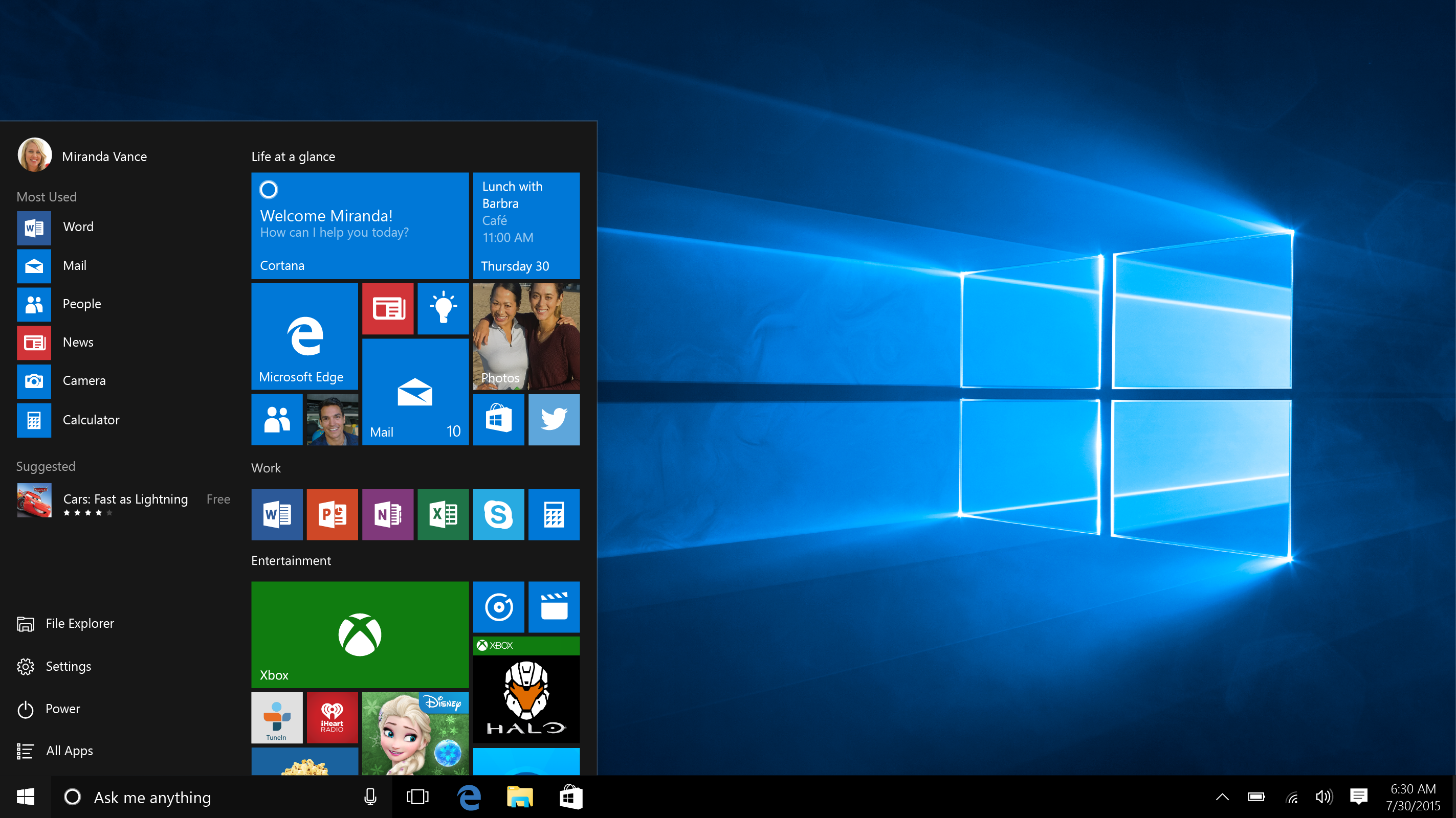
From top, Windows 2.0, introduced in December 1987, Windows 95 (August 1995), Windows 8 (August 2012) and Windows 10 (July 2015).
Windows 11 uses Microsoft’s current ‘Fluent’ identity, marking a return to more skeuomorphic icons, greater emphasis on depth and bolder visual cues for selected items. ‘It’s less ‘one-size-fits-all’ than before, but it can bend and flex depending on your needs and accessibility,’ Koehn explains, ‘Windows 10 became softer and more welcoming, and this is an evolution of that multi-year journey.’ As well as the central focus, there are typographic tweaks as well, giving Microsoft’s primary font family, Segoe UI, a softer approach with true dynamic scalability, depending on the device and resolution.
The icons are also fresh. ‘We audited all the different icons we’ve used over the years,’ says Koehn, ‘We made a huge effort to go back and touch every single pixel and they feel more cohesive,’ she says, ‘we’re removing as much complexity as we can. There’s depth and dimension to the icons.’ Even elements like default wallpapers and opening screens are approached through the lens of a coherent materials palette. ‘Materials set an emotional aesthetic tone,’ says Koehn, ‘the materials we use in software feel as real as the ones we use in our hardware. For Windows 11, we dialled in the use of mica, which has translucent properties. You also have to be mindful of processor speeds and fluidity – it’s about finding the balance points.’

Windows 11's redesigned notification icons
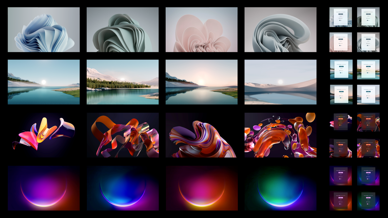
Windows 11 wallpaper selection
This is where the cross-pollination between hardware and software teams comes to the fore. ‘Wallpapers are one of the hardest things to design,’ Groene says. ‘In Windows 10 we had the logo with the light shining through it. For Windows 11 we’re focusing on this ‘bloom’ image, which is a still from a series we created. It looks organic, like a flower, yet it was created using an algorithm. It blends the human touch with technology.’ Koehn notes how these new assets also help focus the eye on the centre of the screen. ‘When you log in, the bloom animates, unfurling from the bottom centre of the screen. It symbolises this new era for Windows.’
Putting together an all-new iteration of such a sophisticated product is an exercise in collaboration. Sound design was also tweaked, softening the waveforms, and bringing back a revised version of the familiar start-up sound, initiated by Microsoft's former audio creative director Matthew Bennett and completed by the Phi Bui agency. ‘Humans engage with software using all their senses,’ says Groene, ‘Matthew has a real talent for turning our graphics into sound waves.’ Koehn stresses how important audio cues are for people with low visibility and these accessibility demands also flow through into the different modes Windows 11 will be used in. One of Windows 11’s big promises is a seamless, functionalist approach. ‘For example, switching between tablet and desktop modes costs the user a lot of thinking time,’ says Groene, ‘so instead the software understands its context, whether a keyboard has just been detached for example. It’s hugely advantageous if Windows can understand how you’re using it. Why make things complicated when you can just make them simple and clear?’
Receive our daily digest of inspiration, escapism and design stories from around the world direct to your inbox.
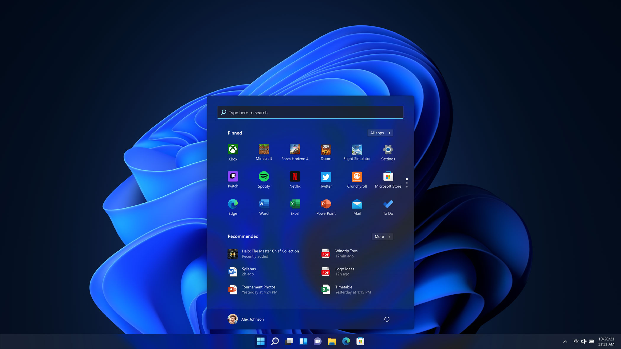
The new Windows 11 in dark mode
INFORMATION
Jonathan Bell has written for Wallpaper* magazine since 1999, covering everything from architecture and transport design to books, tech and graphic design. He is now the magazine’s Transport and Technology Editor. Jonathan has written and edited 15 books, including Concept Car Design, 21st Century House, and The New Modern House. He is also the host of Wallpaper’s first podcast.