Microsoft Surface Duo offers a slick two-screen experience
Two screens: twice as good as one? Microsoft Surface Duo says so
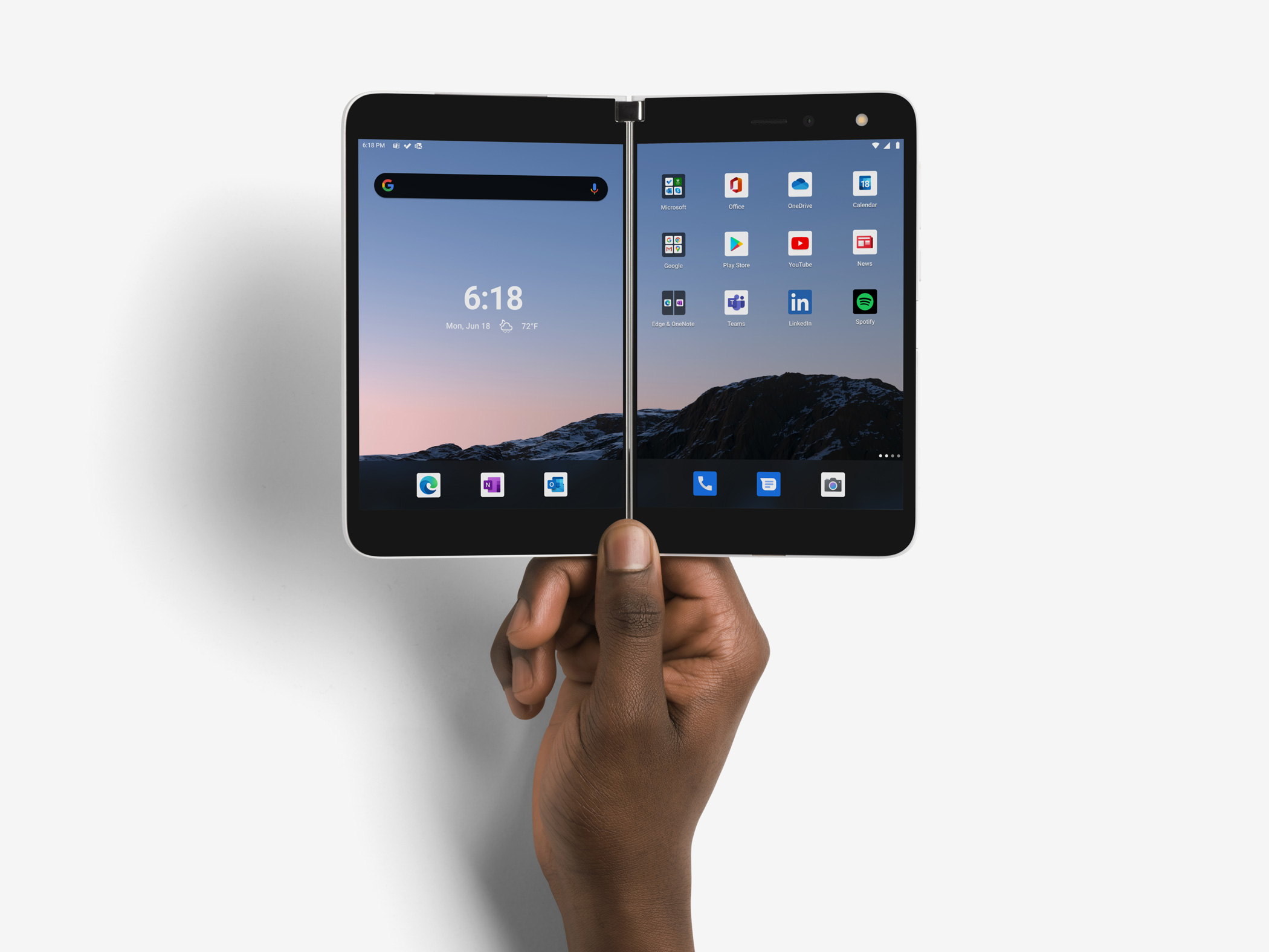
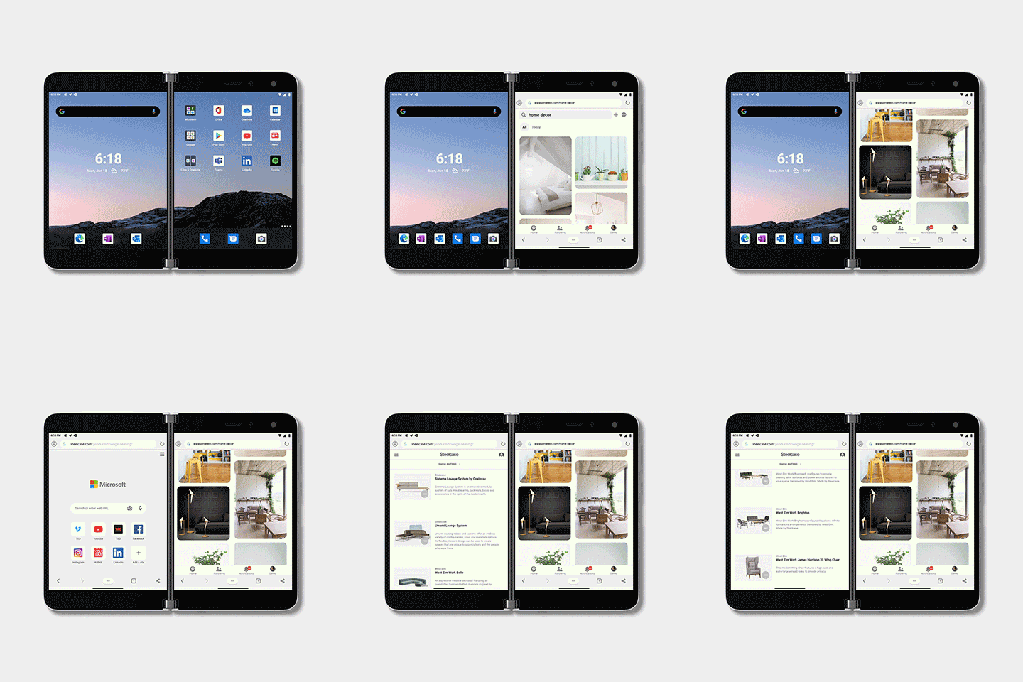
We’re all re-thinking the way we work, where we work and how we work. Microsoft’s new Surface Duo is a premium mobile product with a very specific pitch; people who want to get things done. To that end, the Duo sports twin 5.6” screens and is designed to be used in a myriad number of ways. ‘Things are getting faster and better – that’s the nature of technology,’ says Tim Escolin, Microsoft’s director of industrial design. ‘With the Duo, we wanted to get more productivity from a two-screen device. However, we didn’t want it to feel like two phones combined. Instead, we took inspiration from a physical notebook – like a Moleskine – something you carry around and dip into.’
There’s an old visual joke about the inevitable outcome of the safety razor arms race. First one manufacturer adds a second blade to their cartridge – ‘for a smoother cut’ – then their competitors follow suit by adding a third. No prizes for guessing where this is going; according to Wikipedia, a South Korean company currently manufactures a seven-blade shaving cartridge. At one point, phones looked set to go down a similar path. Twin screen phones were briefly all the rage back in the flip phone era when a closed clamshell device made every call a surprise. However, folding and rolling displays are becoming more practical by the month. Samsung is already into the second iteration of its Galaxy Fold, Huawei’s Mate X2 is also around the corner, as is the FlexPai 2 from US-based Royole. Motorola’s Razr 5G rebooted the classic flip format with a folding screen, and there’s even talk of a folding iPhone in the years to come. Nevertheless, the consumer jury is still deliberating the merits and endurance of a fold point which is integrated with the actual display.
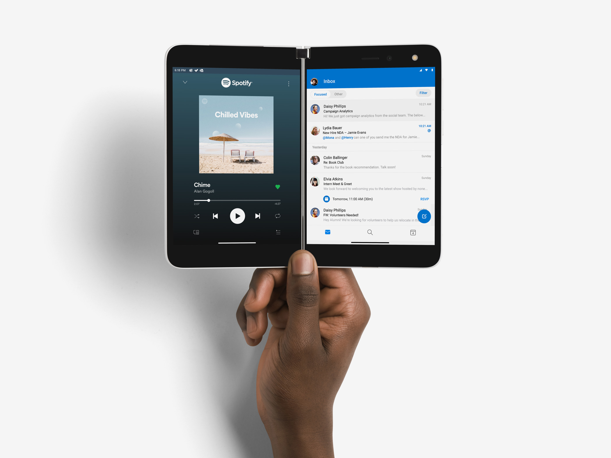
Microsoft's Surface Duo lets you do two things at once without compromise
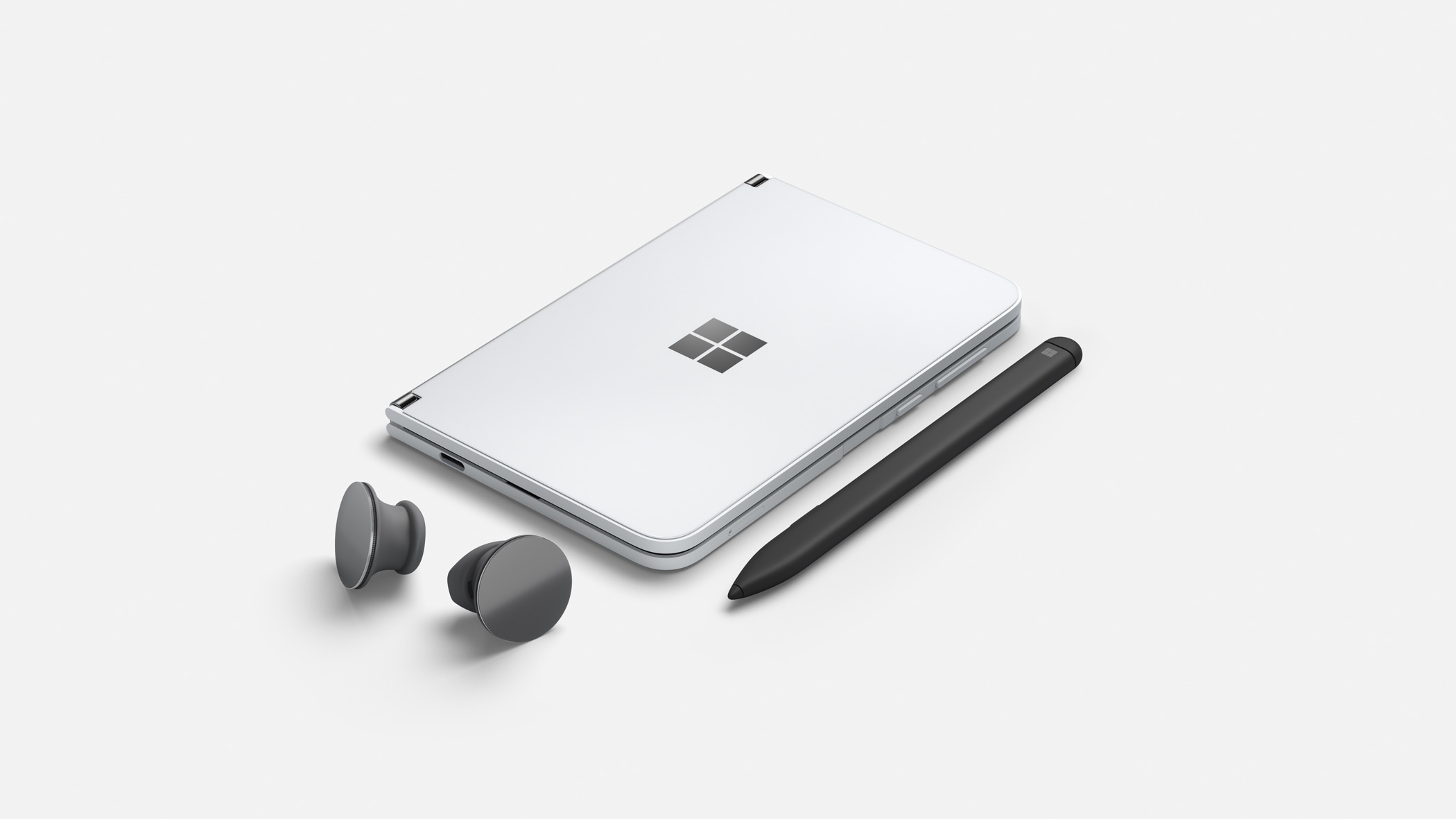
Microsoft Surface Duo with accessories, Surface Pen and Surface Earbuds
Microsoft hope to sidestep these concerns with the Surface Duo with its independent twin displays. The company’s industrial design team spent a long time exploring the form factor. Scott Schenone, Principal Design Manager in Microsoft’s Surface mobile team, explains how the 360-degree hinge was a crucial part of the design. ‘To start with we just taped two pieces of waterjet cut aluminium together to explore how they felt,’ he says. The device has a welcome solidity that only a mechanical hinge can create. The 360-degree hinge can stop at any angle, allowing the device to be used like a mini laptop, propped up like a tent or folded back on itself to resemble a conventional device. Inside, the components have been strategically located within the device, each ‘leaf’ of which is substantially thinner than a regular phone, to create better balance in the hand. ‘The weight is spread around so you have a good centre of gravity,’ says Escolin.
For the Surface designers, the blend of hardware and software has been the biggest challenge, working hand in glove with Microsoft’s 365 team, to ensure the Duo has distinct user benefits, even though the operating system is based on a stock Android build. For apps like Outlook, for example, you can compose in one pane and search the message list in the other. Or you can have two browsers windows open simultaneously or simply watch a video while you work. Once you get the hang of the UI you can ‘fling’ apps between the panels or swap the dominant screen. The form factor facilitates and even encourages a new approach. ‘It’s easy to make comparisons between the duo and a book. You start on one screen and move to the other, then move back and forth depending on what you’re doing,’ says Escolin. ‘We even went as far as measuring the average muscle strength in people’s thumbs,’ says Scott, just so we could ensure that it wasn’t too much of a stretch to use it when full open.’
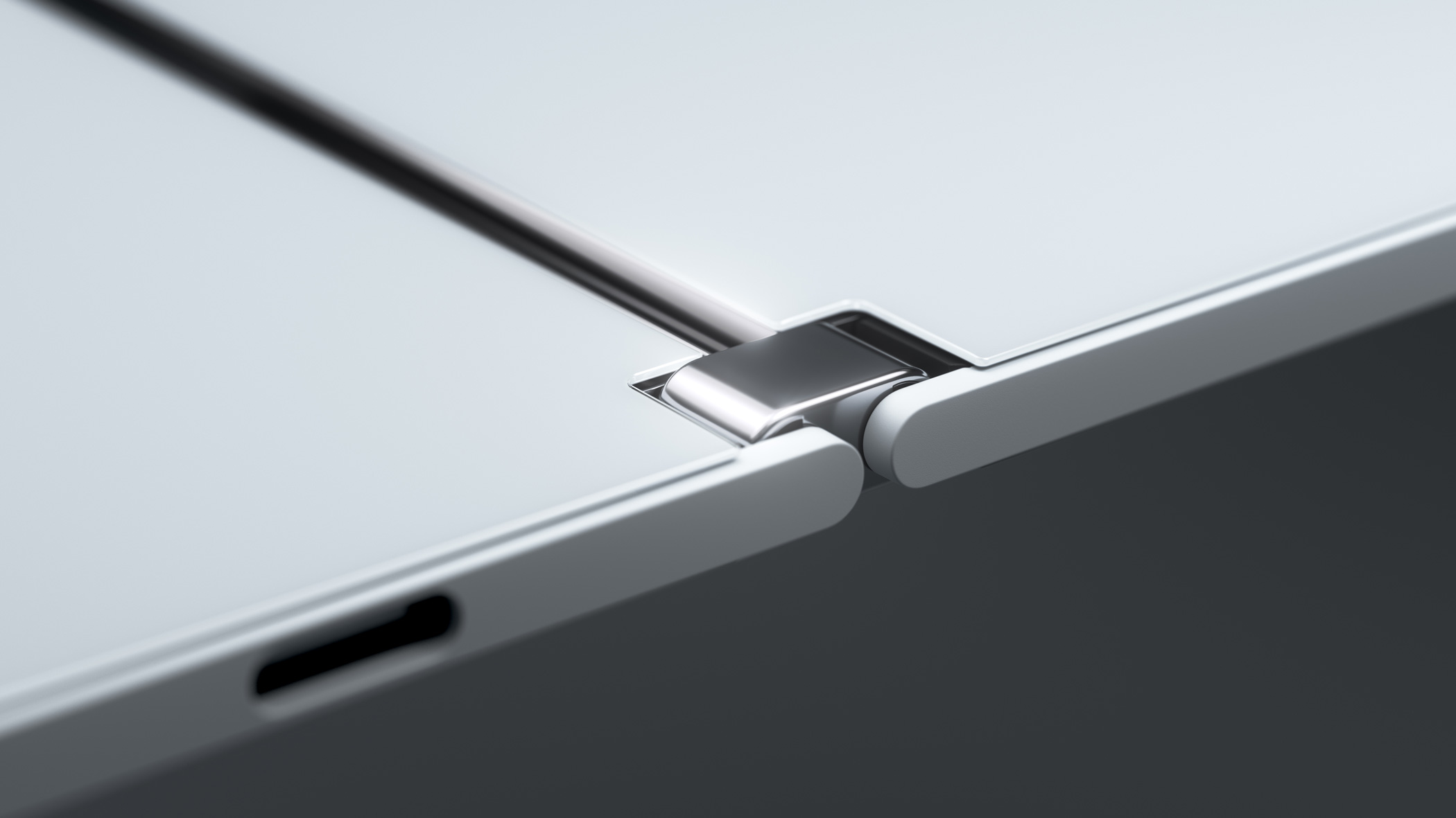
Microsoft Surface Duo's 360-degree hinge in detail
INFORMATION
Microsoft Surface Duo, from £1,349 (128GB version).
Wallpaper* Newsletter
Receive our daily digest of inspiration, escapism and design stories from around the world direct to your inbox.
Jonathan Bell has written for Wallpaper* magazine since 1999, covering everything from architecture and transport design to books, tech and graphic design. He is now the magazine’s Transport and Technology Editor. Jonathan has written and edited 15 books, including Concept Car Design, 21st Century House, and The New Modern House. He is also the host of Wallpaper’s first podcast.
-
 Naoto Fukasawa sparks children’s imaginations with play sculptures
The Japanese designer creates an intuitive series of bold play sculptures, designed to spark children’s desire to play without thinking
By Danielle Demetriou
-
 Japan in Milan! See the highlights of Japanese design at Milan Design Week 2025
At Milan Design Week 2025 Japanese craftsmanship was a front runner with an array of projects in the spotlight. Here are some of our highlights
By Danielle Demetriou
-
 Tour the best contemporary tea houses around the world
Celebrate the world’s most unique tea houses, from Melbourne to Stockholm, with a new book by Wallpaper’s Léa Teuscher
By Léa Teuscher
-
 The new Polaroid Flip unfolds to bring you pin-sharp instant photography
Polaroid announces the Flip, an instant camera that blends its evergreen film technology with better results and more control
By Jonathan Bell
-
 Could putting pen to reMarkable’s Paper Pro tablet make you more creative and less stressed?
Design Museum director Tim Marlow extols the power of ‘scribbling’, and is backed up by new research from reMarkable on the benefits of its paper tablet
By Simon Mills
-
 Clicks creates keyboard cases for iPhones – now they're also available for three Android flagships
Smartphones get a new lease of life with Clicks, which brings a Blackberry-style keyboard to today’s cutting-edge Apple and Android devices
By Jonathan Bell
-
 The OM System OM-3 camera blends heritage design with cutting-edge technology
The OM-3 from OM System is the newest must-have mirrorless camera design, classically styled and comprehensively equipped to create the ultimate contemporary digital camera
By Jonathan Bell
-
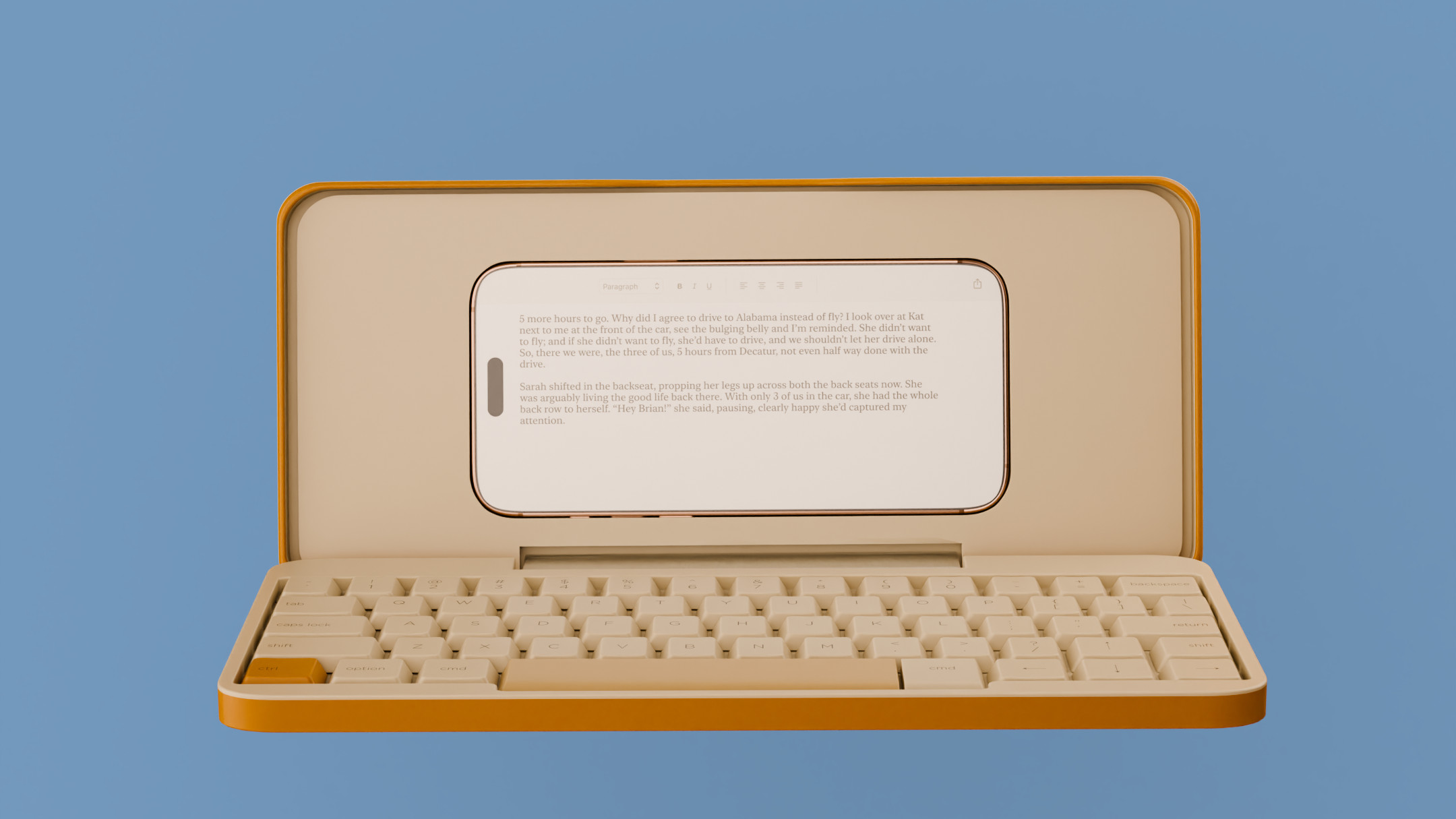 Type without the tyranny of distractions: eight new ways to get the words out
Looking for a way to divert you from doom-scrolling? This selection of eight distraction-free typing devices will keep you offline and away from the socials to help you meet that deadline
By Jonathan Bell
-
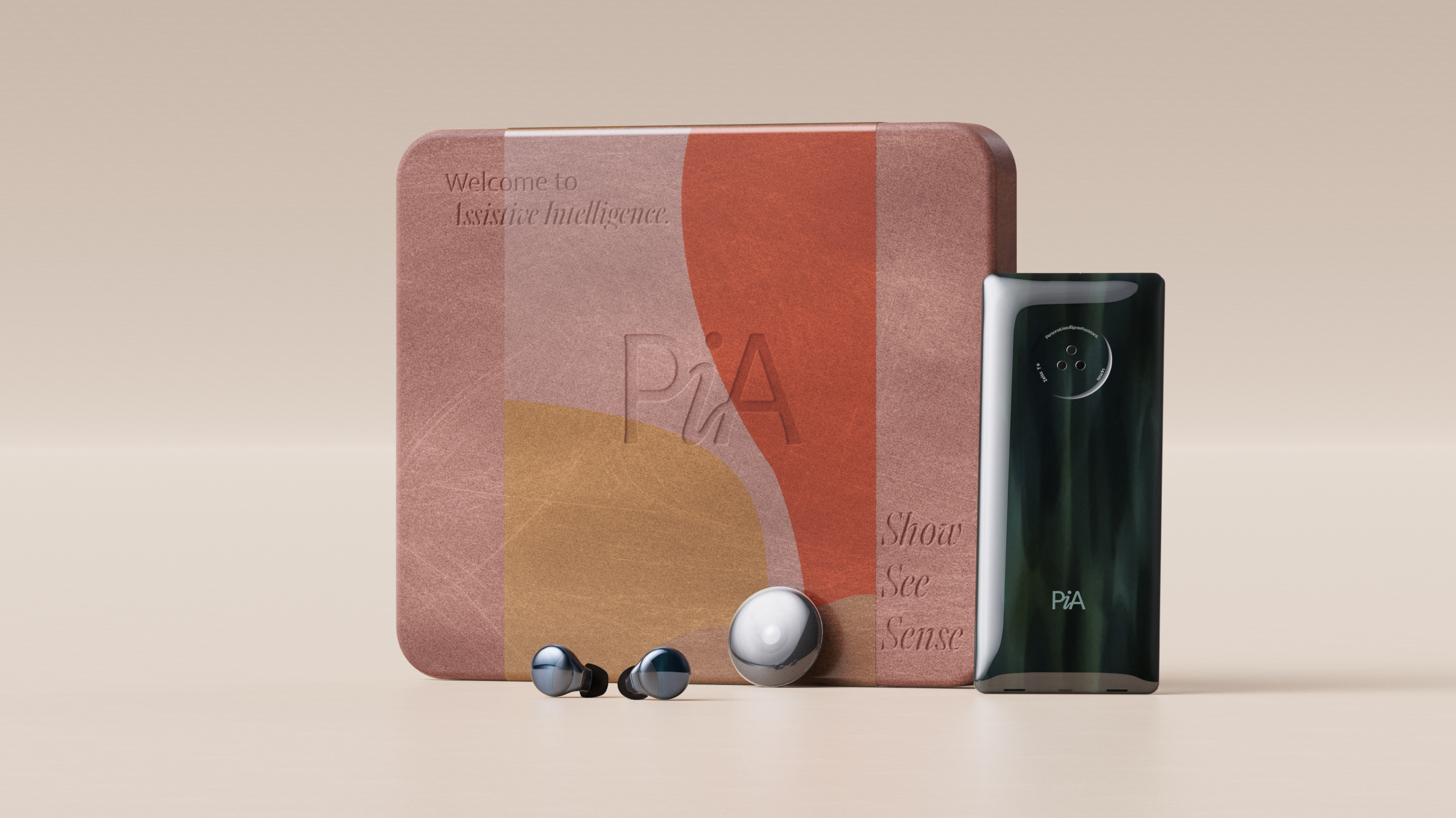 Layer conceptualises a next-gen AI-powered device: introducing the PiA
PiA, the Personal Intelligent Assistant, is a conceptual vision of how AI might evolve to dovetail with familiar devices and form factors
By Jonathan Bell
-
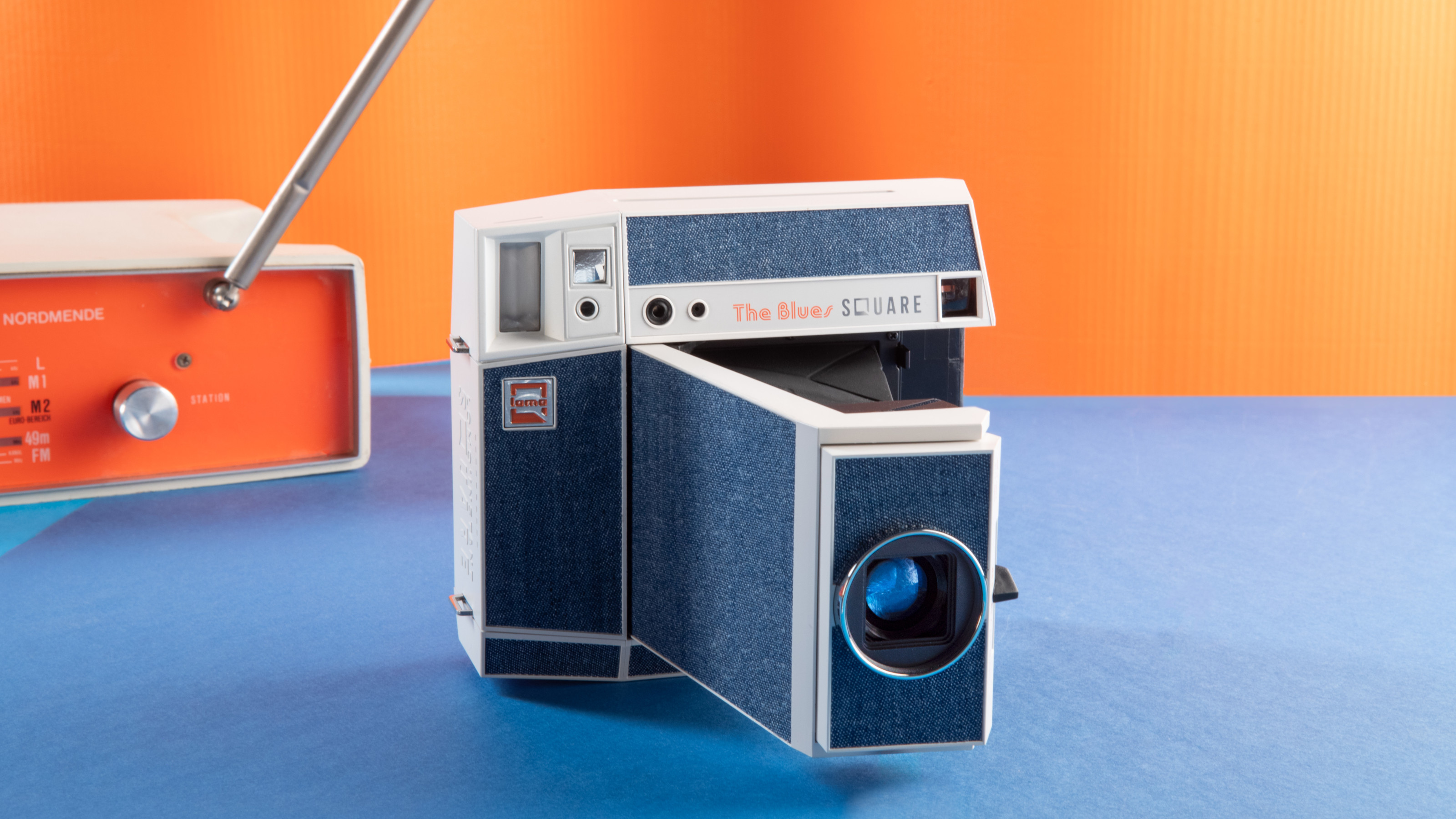 Point, shoot and process with Lomography’s two new colourful Instax camera editions
With the Pemberley and The Blues editions, the Lomo’Instant Square Glass camera provides stylish and pocketable analogue photography
By Jonathan Bell
-
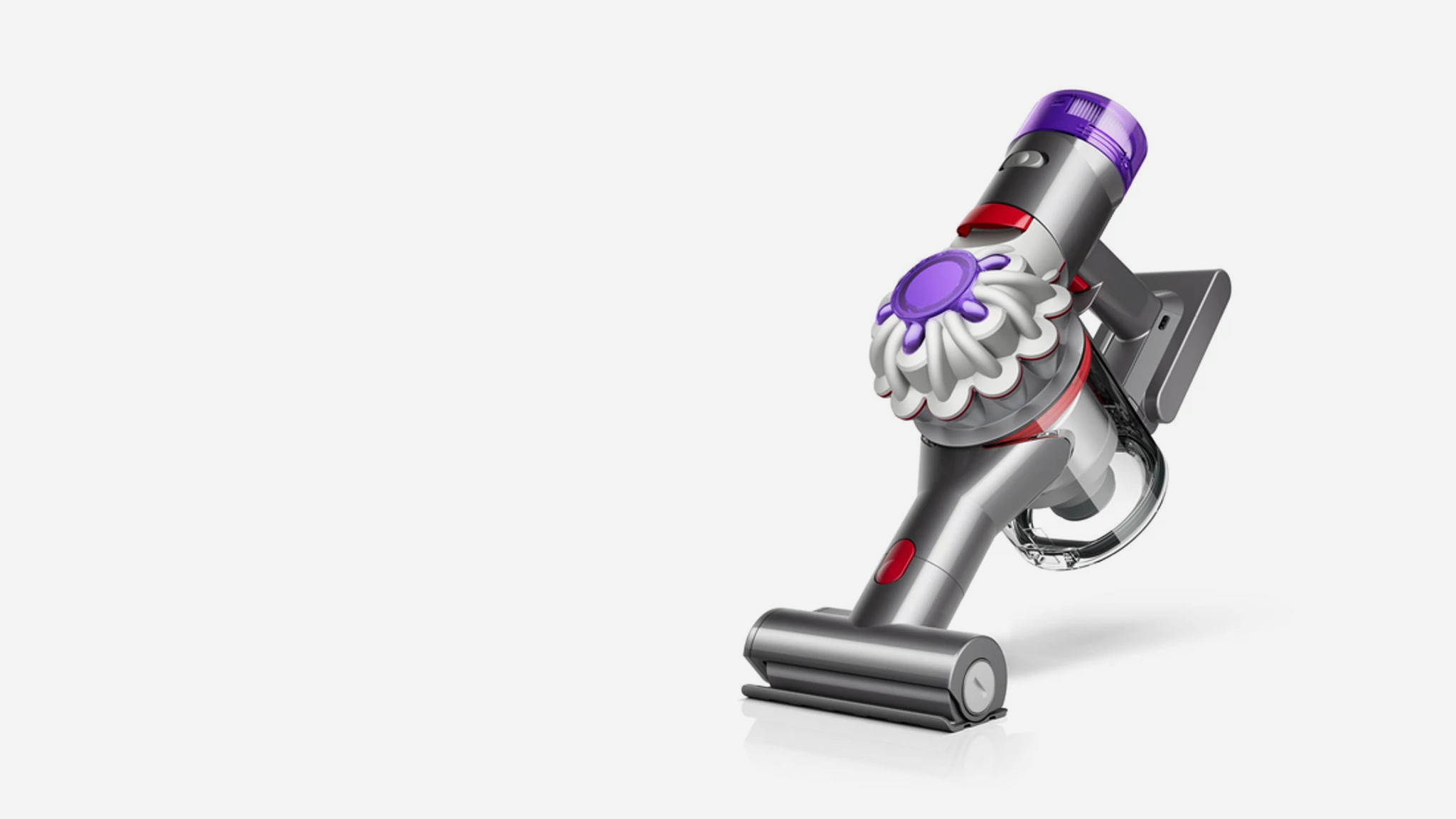 We put the new ultra-compact Dyson Car+Boat handheld vacuum through its paces
A cordless handheld vacuum pitched at a plethora of tasks, Dyson has tasked the new Car+Boat with far-reaching functionality without compromising performance
By Jonathan Bell