Hands on with new Nothing Phone (1): a clearly different smartphone
Nothing Phone (1) launches, hitting the sweet spot between price, performance, and efficiency, and promoting the simplification of your smartphone life
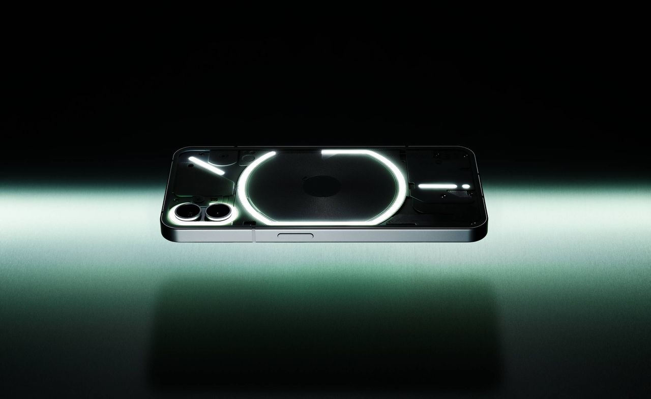
We’ve been following Nothing’s journey into the mobile realm – culminating with the unveiling of the Nothing Phone (1) today – with fascination. The London-based start-up has masterfully managed its inception and ethos from the start, clearly setting out its stall as a tech company that does things differently. CEO Carl Pei, working closely with design director Adam Bates (ex-Dyson) and designer Thomas Howard (also vice head of design at cult Swedish audio master Teenage Engineering), set out to make a phone that doesn’t so much as disrupt, but divert.
It would be a stretch to claim that the new Nothing Phone (1) is the salve that soothes and banishes all these very contemporary problems, but it's the first time a new device feels like a step in the right direction, not merely an object built to placate the gods of consumption.
Nothing Phone (1): clearly different
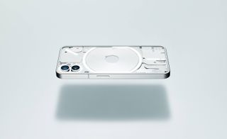
As you can see, the Android-based device takes a different design direction to 99 per cent of its competitors. Gone is the inscrutable sheen of a glass, metal, or plastic body, and in its place is a transparent Gorilla Glass back cover that lays bare the remarkable packaging of a modern consumer technology project.
Woven around these components is a graphical light interface, the ‘Glyph’, a multifunctional display that’s embedded in the Phone (1)’s operating system.
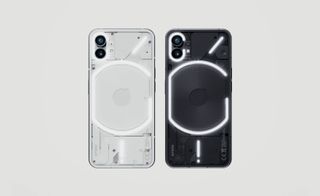
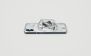
The Glyph isn’t the key selling point, but it’s a refreshing way of doing things differently. When you place your phone face down on a flat surface, the Glyph can be programmed to display different light patterns for different contacts, subtly alerting you to calls that need to be taken and those that can be safely ignored. The 900 LEDs emit a fair dose of brightness and can be used in place of the built-in camera flash for a softer, more enduring light, while the individual lights also have their own associations. The ‘G’ -like primary element indicates the conductive charge pad, for example, which not only charges the phone but allows you to charge the company’s acclaimed Nothing Ear (1) earbuds simply by setting them atop the device.
Another light curves around the twin lens camera set-up, and the diagonal slash indicates the position of the antenna. Finally, there is the bottom ‘exclamation mark’, which roughly corresponds to the location of the cable socket and doubles up as a charge indicator. A separate red LED is also mounted on the rear, lighting up to indicate when you’re filming, camcorder-style.
A streak of retro puritanism runs through all of Nothing’s hardware, graphic identity, and bespoke interfaces and apps. Their dot matrix font logo is faithfully reproduced on screen, and even elements like the bespoke ring tones have a gritty, 8-bit sound that evokes Teenage Engineering’s Pocket Operator series of synthesisers.
Wallpaper* Newsletter
Receive our daily digest of inspiration, escapism and design stories from around the world direct to your inbox.
Other details impress. The bespoke Recorder app has a similar aesthetic to the cult OP-1 synthesiser’s recorder screen, or the ‘Tape’ function of the OB-4 ‘magic radio’, although it’s missing the transcription function that has become an essential element of this kind of app. Otherwise, the phone’s eco-system and bespoke apps and wallpapers showcase the linear graphics, clear icons, and smooth animations that Nothing hopes will become synonymous with its brand.
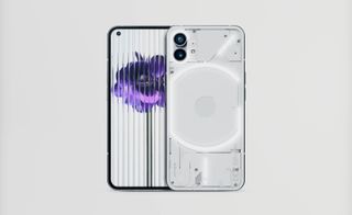
Most importantly, the Phone (1) feels different. It’s lighter than its competitors, and – despite having relatively high-end specifications – it’s aggressively priced to undercut the increasingly premium models from Samsung, Apple, Google, et al. The frame is forged from 100 per cent recycled aluminium, whilst 50 per cent of the plastics used are also recycled. Packaging is paper, and the company promises at least three years of software updates to lengthen its lifespan.
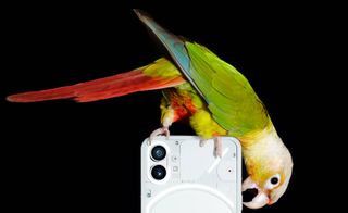
Eschewing the fashion for adding extra cameras, the Phone (1) makes do with two excellent ones from Sony and Samsung, both 50 megapixels and the latter offering a wide-angle view. The selfie camera has 16 megapixels and nestles at the top left of the 6.55in OLED screen (capable of displaying a billion colours). By not going for the latest and dearest tech, Nothing has hit the sweet spot between price, performance, and efficiency. The Snapdragon chipset is responsive and fast, and although the screen might not stretch to the far corners of the device, the bezel is crisply and satisfyingly equally weighted all the way around (a detail that took some major engineering to achieve).
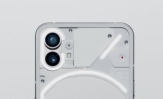
New hardware always brings out the early adopters, eager to have the fastest, smoothest, and most sophisticated machine in their sweaty paws. Nothing’s approach is rather different – what if the latest device isn't all about speed or power, but about the simplification of your smartphone life?
The Phone (1) pares back the digital cruft, the sheer weight of data and the inescapable feeling that we are somehow being completely ruled by the innocuous black slab in our pockets. For one thing, if you’re paying less than four figures for a phone, you feel somehow less beholden to constantly marvel at the device.
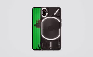
The Phone (1) was unveiled before an audience of tech influencers, expert unboxers, corporate investors, and the odd crypto bro, alongside the usual industry media, Pei offered up a modest launch spiel, mirroring the quiet confidence oozed by the device itself (the phone’s own cameras were used to shoot the video).
Nothing’s ambition has always been to build an ecosystem of products, although the range currently stands at a grand total of two. Like the Ear (1), Phone (1) mixes quality tech with competitive pricing, all wrapped up in a package that shows real attention to detail. Will sufficient numbers of Nothing nuts emerge to keep the company aloft for long enough to make it a bona fide challenger? Perhaps. Phone (1) is a likeable and competent device, an object that looks and feels like a lot of thought has gone into it. It might not be a radical tech revolution, but it demonstrates that light sprinkle of imagination is all you need to make a difference.
INFORMATION
Nothing Phone (1), available in black or white
128GB storage, 8GB memory, £399
256GB storage, 8GB memory, £449
256GB storage, 12GB memory, £499
Available at nothing.tech
Jonathan Bell has written for Wallpaper* magazine since 1999, covering everything from architecture and transport design to books, tech and graphic design. He is now the magazine’s Transport and Technology Editor. Jonathan has written and edited 15 books, including Concept Car Design, 21st Century House, and The New Modern House. He is also the host of Wallpaper’s first podcast.
-
 MoMA names Christophe Cherix its new director
The Swiss-born curator has worked in the Museum of Modern Art’s drawings and prints department since 2007
By Anna Fixsen Published
-
 The Yale Center for British Art, Louis Kahn’s final project, glows anew after a two-year closure
After years of restoration, a modernist jewel and a treasure trove of British artwork can be seen in a whole new light
By Anna Fixsen Published
-
 How Le Corbusier defined modernism
Le Corbusier was not only one of 20th-century architecture's leading figures but also a defining father of modernism, as well as a polarising figure; here, we explore the life and work of an architect who was influential far beyond his field and time
By Ellie Stathaki Published
-
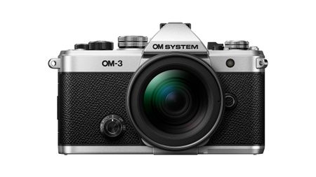 The OM System OM-3 camera blends heritage design with cutting-edge technology
The OM-3 from OM System is the newest must-have mirrorless camera design, classically styled and comprehensively equipped to create the ultimate contemporary digital camera
By Jonathan Bell Published
-
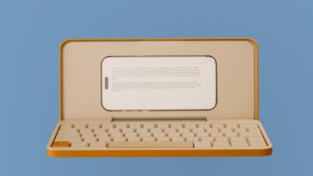 Type without the tyranny of distractions: eight new ways to get the words out
Looking for a way to divert you from doom-scrolling? This selection of eight distraction-free typing devices will keep you offline and away from the socials to help you meet that deadline
By Jonathan Bell Published
-
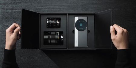 MWC 2025: 6 of the best conceptual phone designs and future facing tech
Barcelona’s Mobile World Congress has become the phone industry’s major hotspot for launches and new technology. Here are six of the best conceptual designs from this year's event
By Jonathan Bell Published
-
 Hands on with the new Phone (3a) Series, Nothing's smartest smartphones to date
Nothing has launched the Phone (3a) Pro and (3a), featured boosted camera power and the ability to deploy AI for good
By Jonathan Bell Published
-
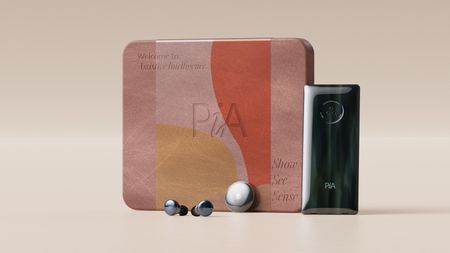 Layer conceptualises a next-gen AI-powered device: introducing the PiA
PiA, the Personal Intelligent Assistant, is a conceptual vision of how AI might evolve to dovetail with familiar devices and form factors
By Jonathan Bell Published
-
 Point, shoot and process with Lomography’s two new colourful Instax camera editions
With the Pemberley and The Blues editions, the Lomo’Instant Square Glass camera provides stylish and pocketable analogue photography
By Jonathan Bell Published
-
 We put the new ultra-compact Dyson Car+Boat handheld vacuum through its paces
A cordless handheld vacuum pitched at a plethora of tasks, Dyson has tasked the new Car+Boat with far-reaching functionality without compromising performance
By Jonathan Bell Published
-
 The Century Series, Philips goes retro to celebrate over 100 years of audio innovation
Dutch audio brand Philips has drawn on its extensive archive to shape the form of the five Century devices, all of which offer stylish ways to enjoy vinyl, radio and more
By Jonathan Bell Published