Nothing Phone (1) preview: a radical reinterpretation of mobile tech
There’s much ado about the forthcoming Nothing Phone (1). In our exclusive interview, the minds behind the device tell us what to expect from a design that will ‘bring the inside out’
Nothing admitted it was working on a phone back in March this year, with a mooted launch date at some point during summer 2022. The London-based start-up is predicated on the bold ambition to transform our relationship with tech, or ‘making tech fun again’, rather than the epitome of overbearing corporate omnipotence that it seems to have become in recent years. The company’s first product, the Ear (1) earbuds, was well-reviewed and is exceeding expectations in the marketplace. Building a Nothing phone, however, has exposed the team to the challenges of design, engineering, and supply like never before.
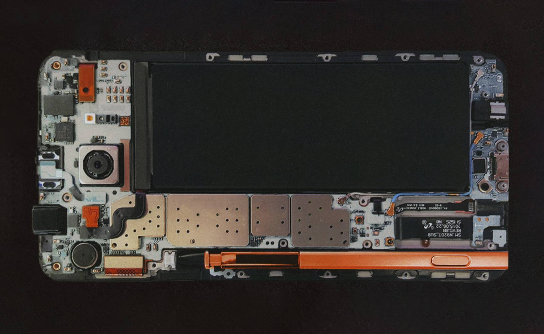
Under the covers: the interior components of a typical Android phone
Nothing Phone (1): what to expect
We spoke to CEO Carl Pei and head of design Tom Howard about the forthcoming Nothing Phone (1) and what customers might expect.
For a start, the phone is expected to follow the aesthetic approach established by Ear (1), with a translucent case that reveals the device’s inner workings. ‘When you look inside almost any Android phone, they’re almost all exactly the same,’ Howard notes, ‘Of course, the industry is optimising everything they do, year on year, trying to squeeze the most performance they can out of the smallest space.’
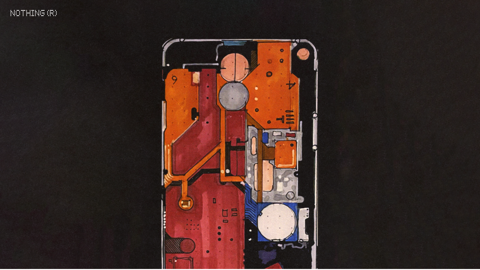
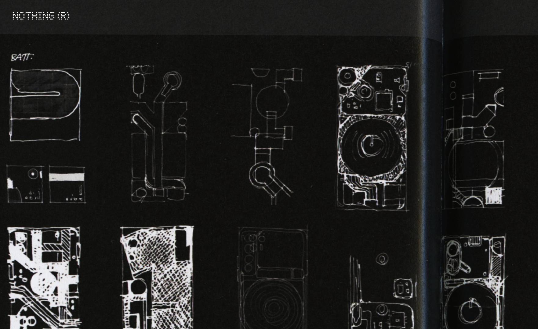
One of many design sketches for the new Nothing phone, developed in close collaboration with the engineering team
Taking a new approach wasn’t straightforward. ‘From a design perspective, we really wanted to bring the inside out, and that meant working with the engineers to start from first principles,’ Howard continues. ‘There are over 400 components in a smartphone, assembled in layers. We wanted to celebrate the “good ones”, the things we thought were really interesting to emphasise.’
These included elements like the camera and the wireless charging coil, but practically every avenue the design team explored turned into a journey all of its own. ‘From an industry perspective, you’re looking at components that the end user normally never sees, so you almost have to overhaul the entire manufacturing process in order to highlight them,’ he says.
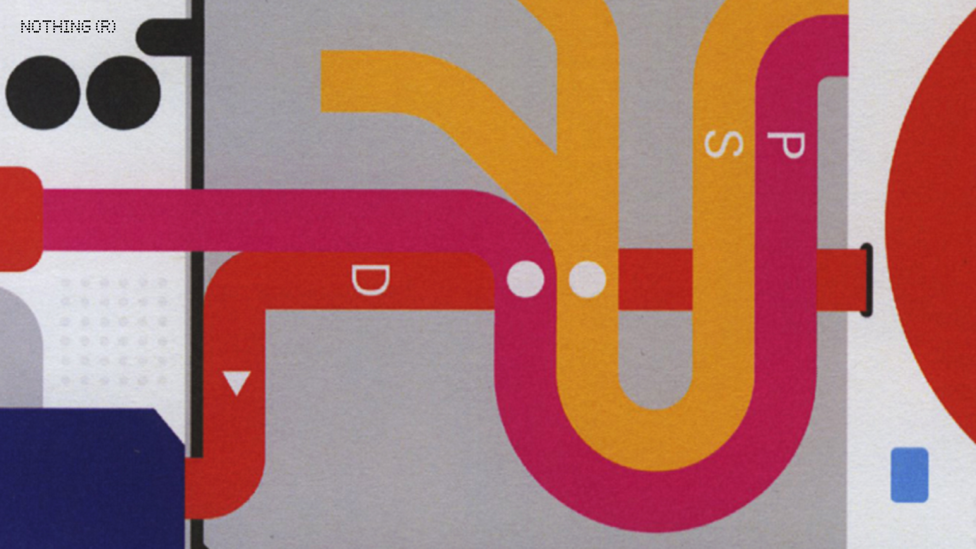
A close-up detail of Vignelli and Noorda's 1972 New York Subway map, a key reference point
Howard describes the resulting process as a ‘jigsaw puzzle’. To help visualise how they were going to lay bare the innards of the device, his team looked at a classic diagrammatic reference point, the 1972 New York Subway map by Massimo Vignelli and Bob Noorda. ‘This did a really, really good job of organising a very, very complex system and figuring out how to illustrate that in a beautiful way,’ Howard enthuses. ‘We looked at a lot of other subway maps as well.’
There’s a circularity at play here. The progenitor of all modern transit maps is the 1933 London Underground map created by Harry Beck. Beck was a technical draughtsman and his original map – drawn in his spare time – was partly inspired by the schematic view of electrical circuits, emphasising the importance of connections and clarity above all else.
Wallpaper* Newsletter
Receive our daily digest of inspiration, escapism and design stories from around the world direct to your inbox.
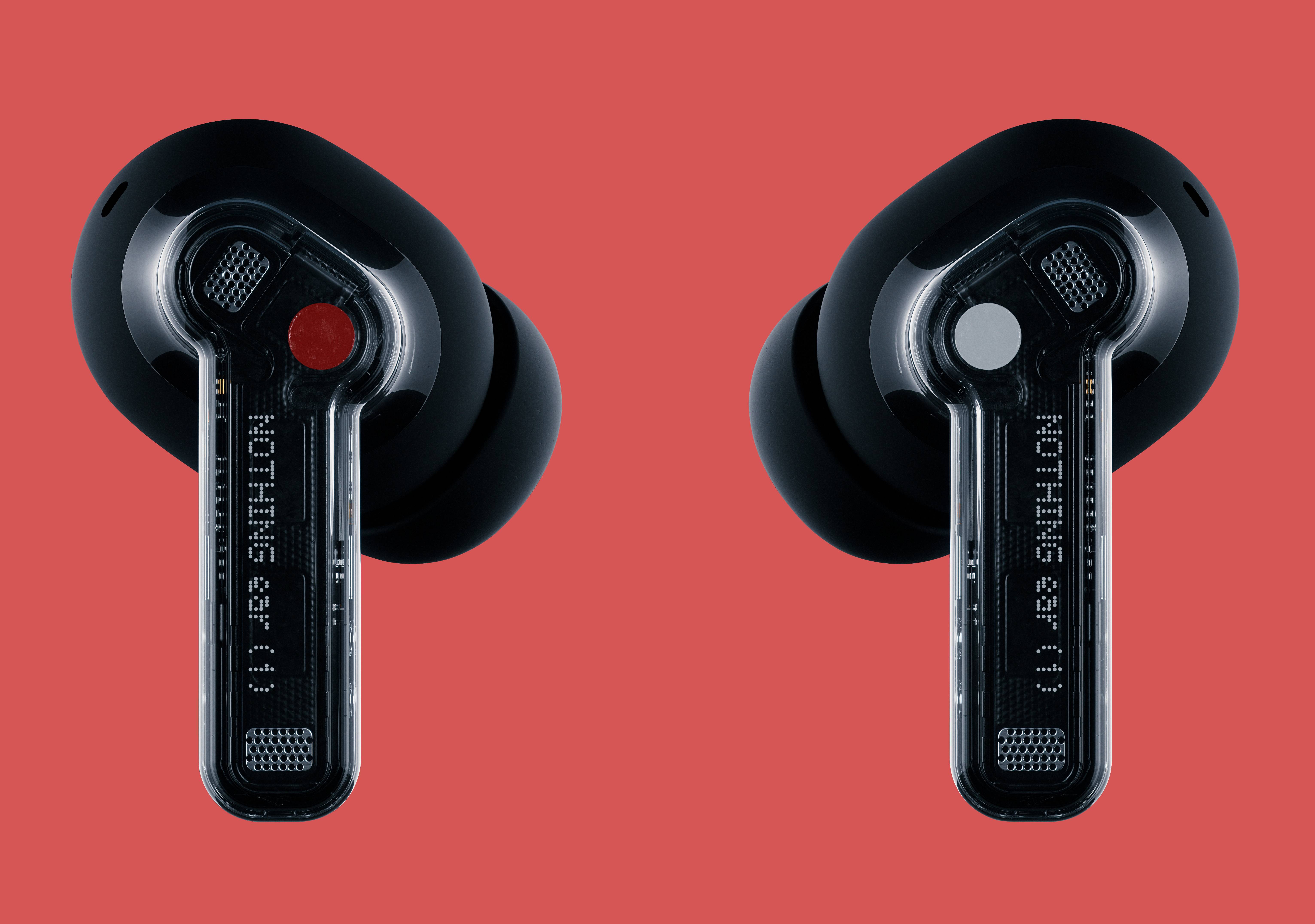
The Nothing Ear (1) earbuds, shown here in black, have been a great success
So will the Phone (1) redraw our mental perception of what a phone is and how it works? For Nothing, the unifying power of design is a crucial part of its brand.
‘One of the issues we saw with the tech industry was that nobody had a consistent way of designing products,’ says Pei. ‘Apart from Apple – you can see their coherent vision. But if you had a table full of products from another manufacturer, you don’t really see that. From the very start, we wanted to have a very distinct and iconic design language of our own.’
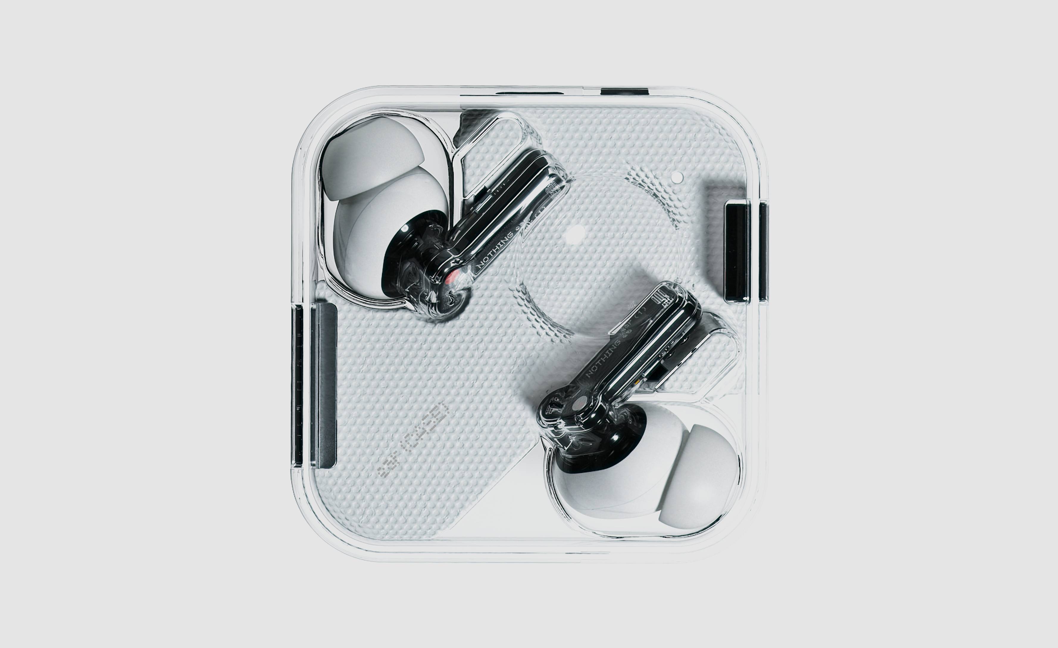
Ear (1) set the baseline for the Nothing aesthetic
The launch of Nothing was preceded by a period of intense research into visual and creative language, with the design team studying everything from cinema to fashion design. ‘Phone (1) and Ear (1) will clearly be from the same family,’ Pei enthuses, ‘and as we fill in the rest of our product portfolio, we will maintain the same philosophy.’
Howard believes that one key USP of Nothing’s approach is the intrinsic beauty and intricacy of consumer electronics. ‘Our philosophy is that products should be simple at a glance, but the more time you spend with them, the more they give back.’
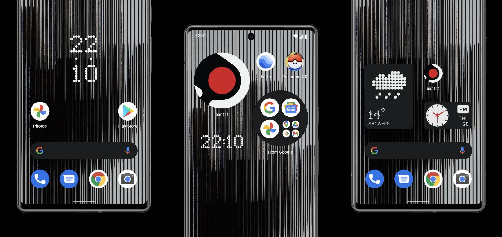
Early iterations of the Nothing OS
The Phone (1) will run Android on Qualcomm’s Snapdragon mobile platform, not least because the ecosystem is mature, polished, and familiar to a substantial chunk of the market. ‘We believe Google is already doing a great job,’ Pei admits, ‘but we’re focusing on the underlying connectivity, so your phone becomes a control centre for your digital life.’
That’ll also include bespoke wallpapers, widgets, and sounds, giving ‘Nothing OS’ a distinctive feel that dovetails perfectly with the hardware. ‘Part of our job is to tell the story of how things work,’ says Howard. ‘I think a really strong principle that we have is that design is not just ornament but that there needs to be marriage between form and function.’
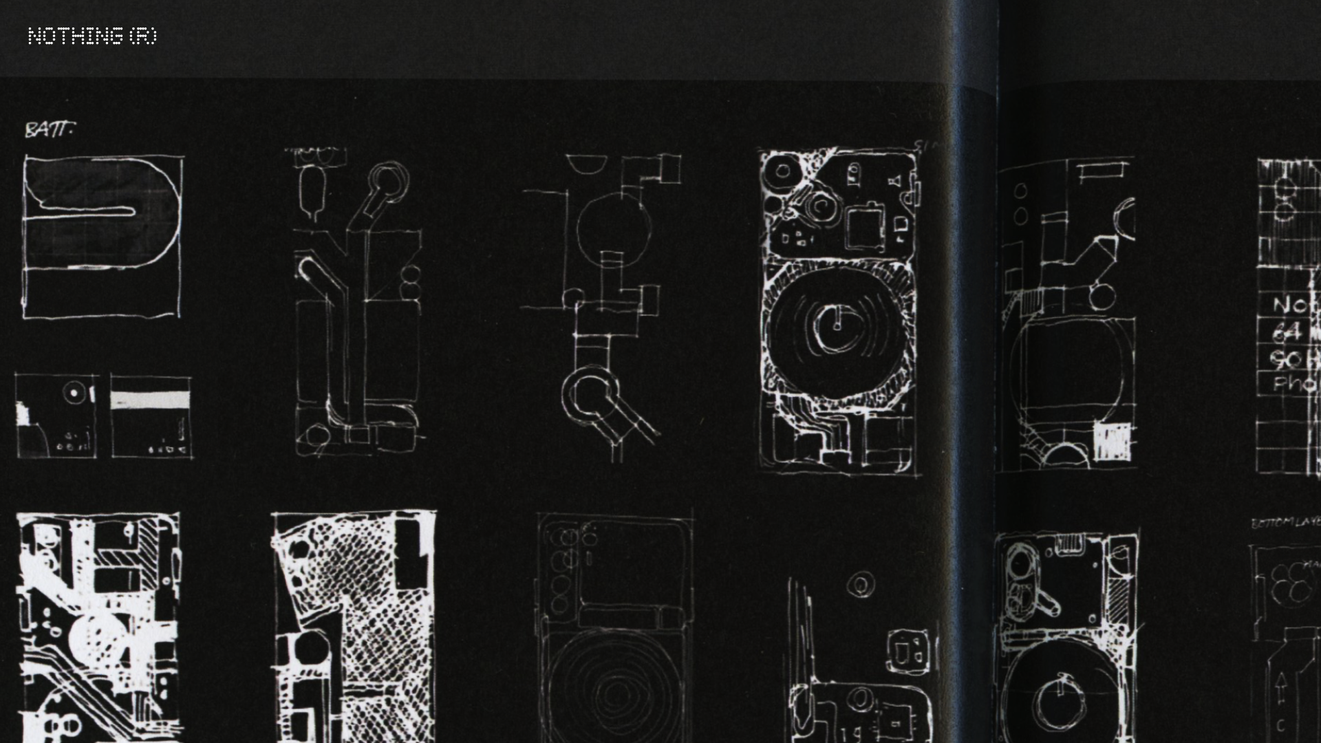
Early design sketches of the Nothing Phone (1)'s circuitry
On top of everything else, there is the question of not just how we use our devices, but how we dispose of them. Perhaps by lifting the veil on the inner workings of something we’ve learnt to take almost entirely for granted, Phone (1) users might be encouraged to take better care of their device, treasuring it for the myriad complexities within.
Nothing is staying fairly tight-lipped about how it’s approaching this increasingly essential aspect of tech design, save for the fact that the Phone (1)’s frame will be made from recycled aluminium to reduce its initial carbon footprint. Watch this space for more details.
Since this article was first published the new phone has been launched. See our Nothing Phone (1) review here
INFORMATION
Nothing.tech
Jonathan Bell has written for Wallpaper* magazine since 1999, covering everything from architecture and transport design to books, tech and graphic design. He is now the magazine’s Transport and Technology Editor. Jonathan has written and edited 15 books, including Concept Car Design, 21st Century House, and The New Modern House. He is also the host of Wallpaper’s first podcast.
-
 Put these emerging artists on your radar
This crop of six new talents is poised to shake up the art world. Get to know them now
By Tianna Williams
-
 Dining at Pyrá feels like a Mediterranean kiss on both cheeks
Designed by House of Dré, this Lonsdale Road addition dishes up an enticing fusion of Greek and Spanish cooking
By Sofia de la Cruz
-
 Creased, crumpled: S/S 2025 menswear is about clothes that have ‘lived a life’
The S/S 2025 menswear collections see designers embrace the creased and the crumpled, conjuring a mood of laidback languor that ran through the season – captured here by photographer Steve Harnacke and stylist Nicola Neri for Wallpaper*
By Jack Moss
-
 Could putting pen to reMarkable’s Paper Pro tablet make you more creative and less stressed?
Design Museum director Tim Marlow extols the power of ‘scribbling’, and is backed up by new research from reMarkable on the benefits of its paper tablet
By Simon Mills
-
 Clicks creates keyboard cases for iPhones – now they're also available for three Android flagships
Smartphones get a new lease of life with Clicks, which brings a Blackberry-style keyboard to today’s cutting-edge Apple and Android devices
By Jonathan Bell
-
 The OM System OM-3 camera blends heritage design with cutting-edge technology
The OM-3 from OM System is the newest must-have mirrorless camera design, classically styled and comprehensively equipped to create the ultimate contemporary digital camera
By Jonathan Bell
-
 Type without the tyranny of distractions: eight new ways to get the words out
Looking for a way to divert you from doom-scrolling? This selection of eight distraction-free typing devices will keep you offline and away from the socials to help you meet that deadline
By Jonathan Bell
-
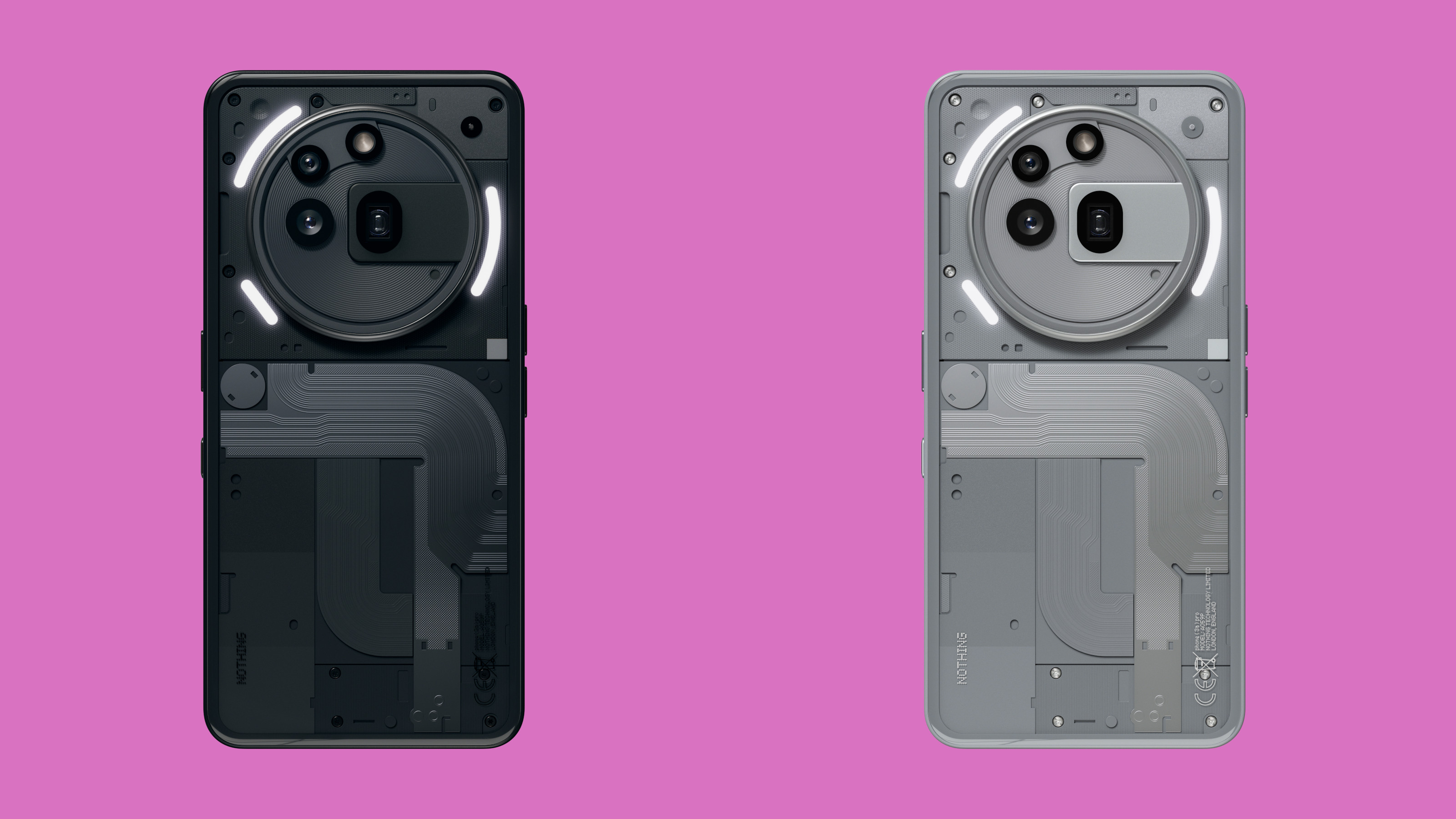 Hands on with the new Phone (3a) Series, Nothing's smartest smartphones to date
Nothing has launched the Phone (3a) Pro and (3a), featured boosted camera power and the ability to deploy AI for good
By Jonathan Bell
-
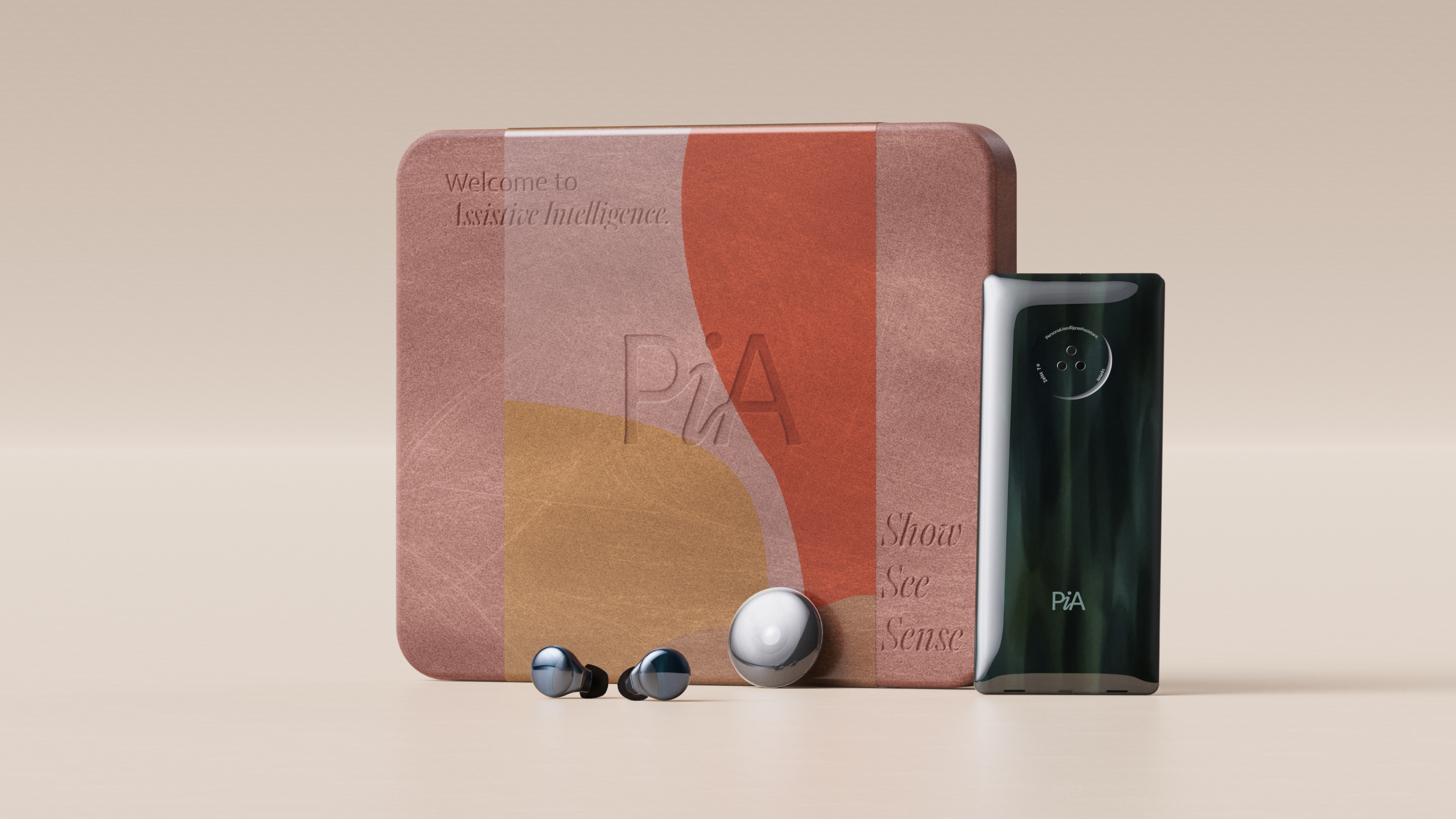 Layer conceptualises a next-gen AI-powered device: introducing the PiA
PiA, the Personal Intelligent Assistant, is a conceptual vision of how AI might evolve to dovetail with familiar devices and form factors
By Jonathan Bell
-
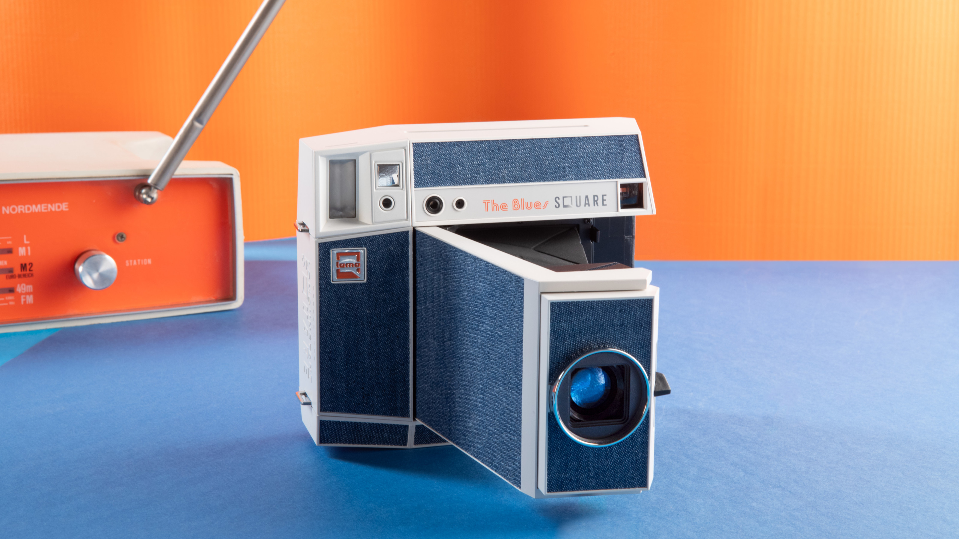 Point, shoot and process with Lomography’s two new colourful Instax camera editions
With the Pemberley and The Blues editions, the Lomo’Instant Square Glass camera provides stylish and pocketable analogue photography
By Jonathan Bell
-
 We put the new ultra-compact Dyson Car+Boat handheld vacuum through its paces
A cordless handheld vacuum pitched at a plethora of tasks, Dyson has tasked the new Car+Boat with far-reaching functionality without compromising performance
By Jonathan Bell