The Xbox has been transformed into a highly designed object
Microsoft designers Carl Ledbetter and Chris Kujawski on their new approach to Xbox design
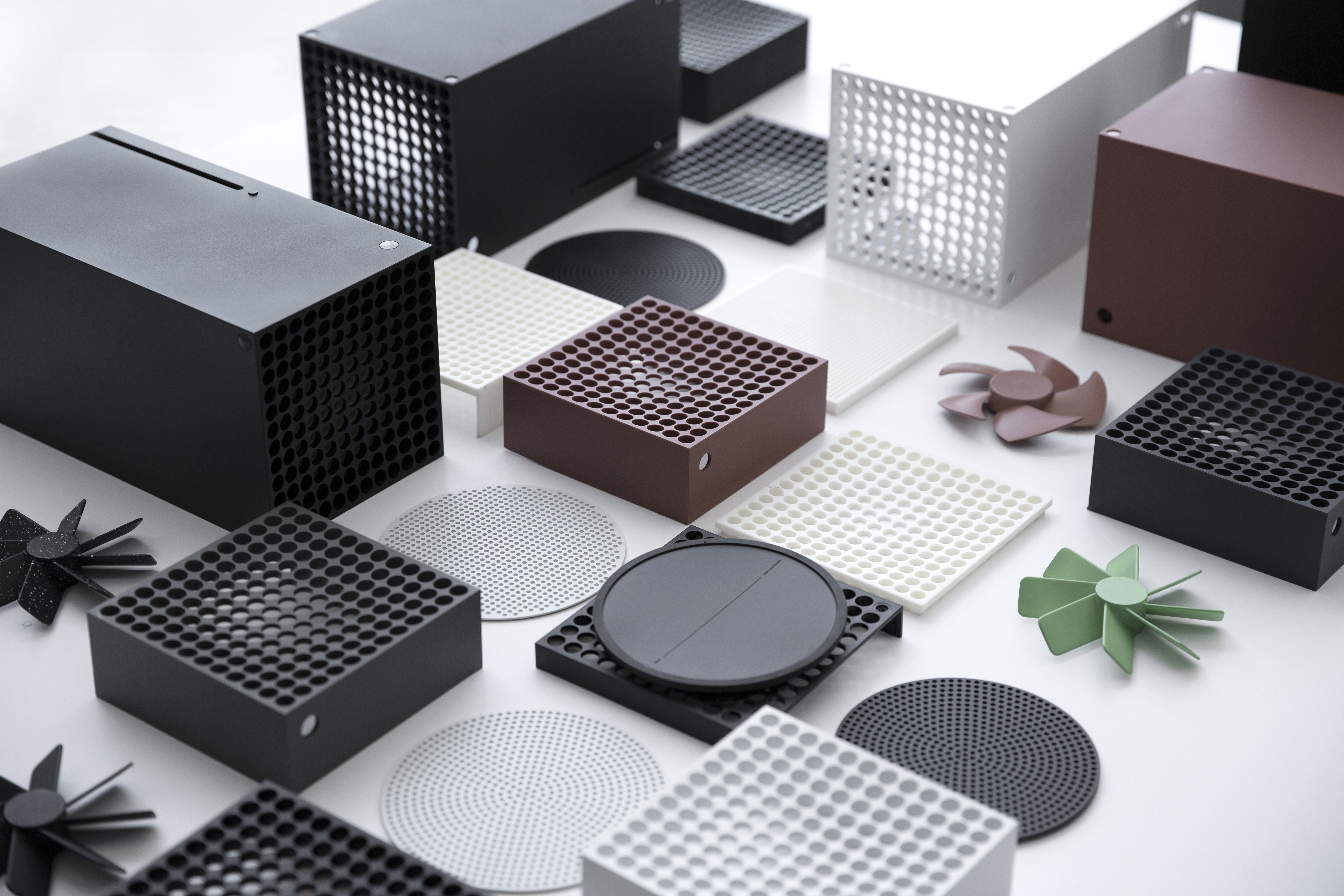
The last quarter of 2020 saw the global launch of two major next gen products, Sony’s PlayStation 5 and Microsoft’s Xbox Series X, together with the new ‘lightweight’ Series S. In a crowded consumer market where smart speakers, soundbars, digital assistants and endless portable devices are all vying to bring a new tech aesthetic into the home, mainstream gaming has been largely left behind. With the Series X, Microsoft has transformed its flagship console into a monolithic, highly designed object. How did the company’s design team help gaming come of age?
We spoke to Microsoft’s Carl Ledbetter, director of design at Microsoft’s Device Design Team, and Chris Kujawski, the principal designer who led the new generation Xbox team, about their approach.
Wallpaper*: What is Microsoft’s design philosophy?
Carl Ledbetter: I've been at Microsoft as an industrial designer for a quarter of a century now, starting with designing mice and keyboards. Over that entire time, we have continued to evolve and use design to bring hardware and software together. The Xbox is no different since the original model was launched in 2001.
Wallpaper*: Who do you design these products for, first and foremost?
CL: We have a couple of perspectives but they both start with the gamer at the centre. A console can stay around for many years, maybe five or six, and then they often get sold or given to someone else. We look at how we can optimise the form and the performance so that the console is robust and reliable. For the design itself, the approach is designing from the inside out. We start with thermal performance and end up with something that can fit easily into people’s homes. The form is almost architectural – what we call ‘intelligent geometry’ – an approach that we feel will hold up over time.

W*: And what about the controller? That’s surely very different.
CL: Exactly. It’s the opposite. We go from the outside in. We optimise the design for ergonomics.
W*: Tell us when the Series X programme started.
Wallpaper* Newsletter
Receive our daily digest of inspiration, escapism and design stories from around the world direct to your inbox.
Chris Kujawski: Back in 2017, all we really had for what would become the Series X was the theoretical specs for the chip that we were designing – no shape, no engineering, nothing. An Xbox is like designing a lot of consumer electronics equipment; it creates heat that you have to dissipate within an enclosure that is both efficient and beautiful.
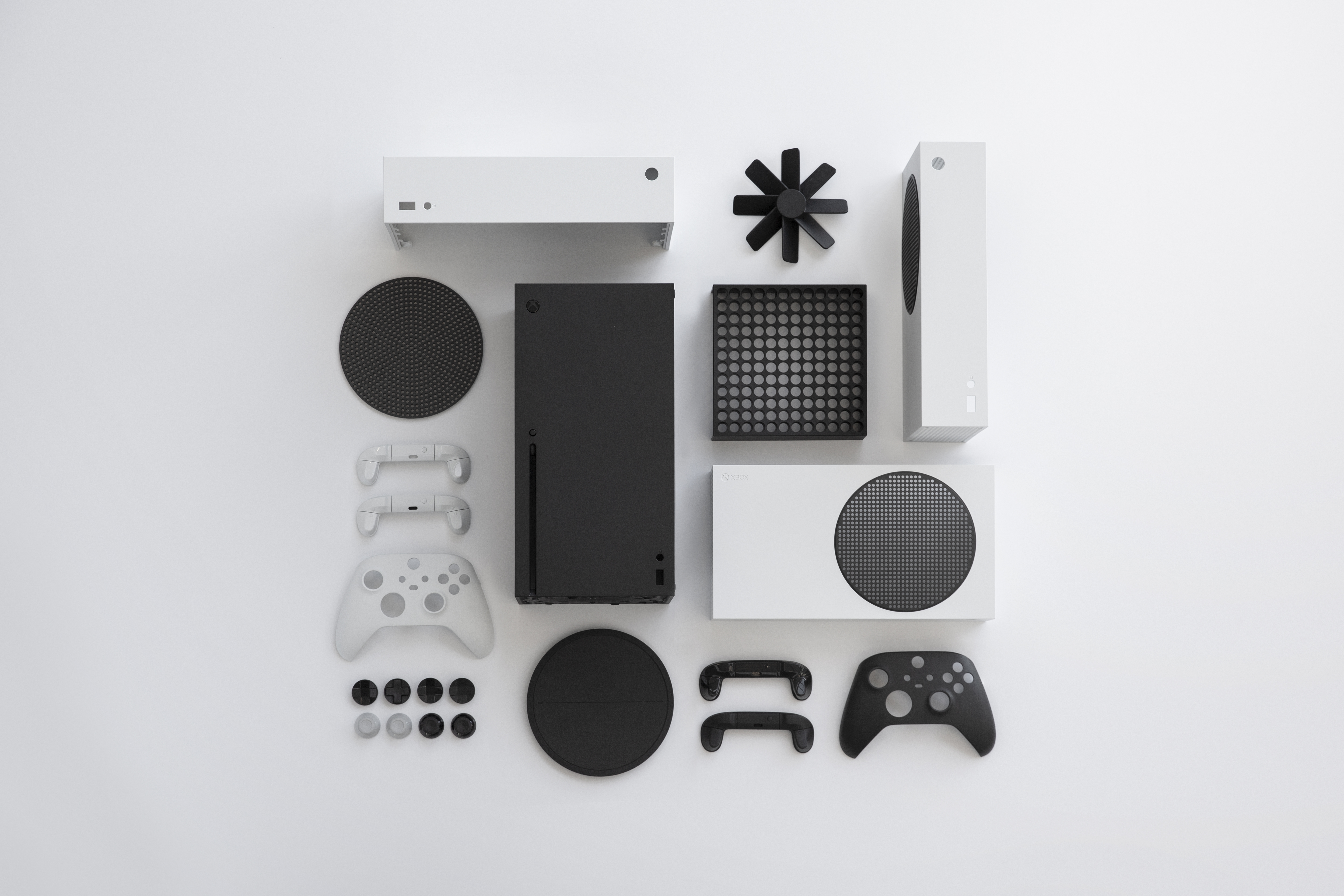
So we always start with designing a thermal solution. We spent that year trying to figure out the packaging to achieve the cooling we needed. Pretty soon, we ended up with what we call the ‘tower’ form factor. It has a much smaller footprint, so it gives you more placement options for a start.
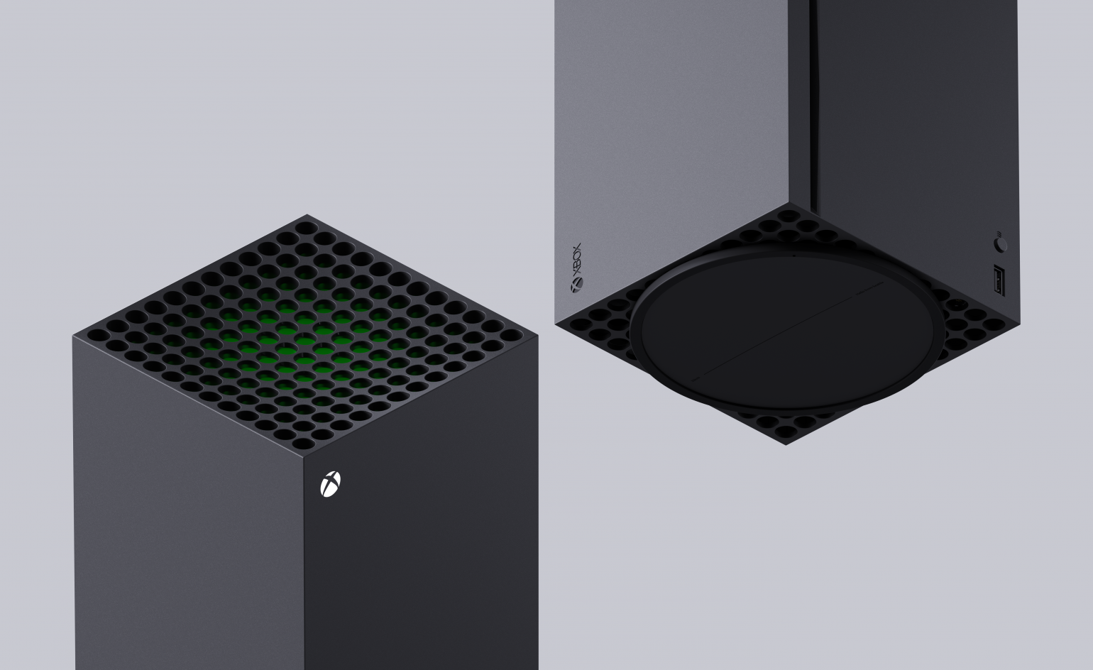
We still had to figure out how to make it happen. Our engineering team came up with this creative idea of splitting the motherboard in half and mounting them vertically. Then we could put one fan on top and quietly pull a ton of air through the whole system. It’s very efficient and logical, although it seemed quite risky at the time.
W*: What about the smaller Series S?
CL: In technical terms, the way it has been described to me is that you imagine the silicon in the Series X is a floorplan for a house; the Series S has the same floor plan, but it has less rooms. Both consoles share a lot of components and features, but the X is true 4K and the S is 1440p resolution, for example. It has a third of the processing power, but still has the special architecture that allows fast loading and quick resume of your games.
W*: Games machines went through a phase of being quite toy-like. The Series X is a real departure for a console. How much are you trying to appeal to purists who love the technology and how much to those who don’t really want to signal to the world that they’re a gamer?
CK: Those are quite different worlds, but what we’ve found is that they can often coexist within the same household. We are conscious about creating something that is visually interesting and conveys power to one person, but perhaps their partner would never want to see it outside of the living room. An Xbox has to be visually quiet and acoustically quiet, but also has the visual interest that people seek out.
CL: As technology has become a bigger part of people’s lives it can also be intrusive. We’re really conscious about how we make products more innocuous – they should just fit into people's homes. If you look at the trend in televisions and screens, for example, everything is becoming lighter and thinner.
W*: I notice your Teams background is a project by Olson Kundig.
CL: Yes, they’re fellow Seattle designers! I'm a huge fan of their work and we’ve talked together about ways to bring technology into the modern home. How do you create technology that’s purposeful but yet isn’t over-powering? We haven’t collaborated on anything yet, but it’s important to think about these things. At Microsoft our design teams are always looking at the way we interact with technology.
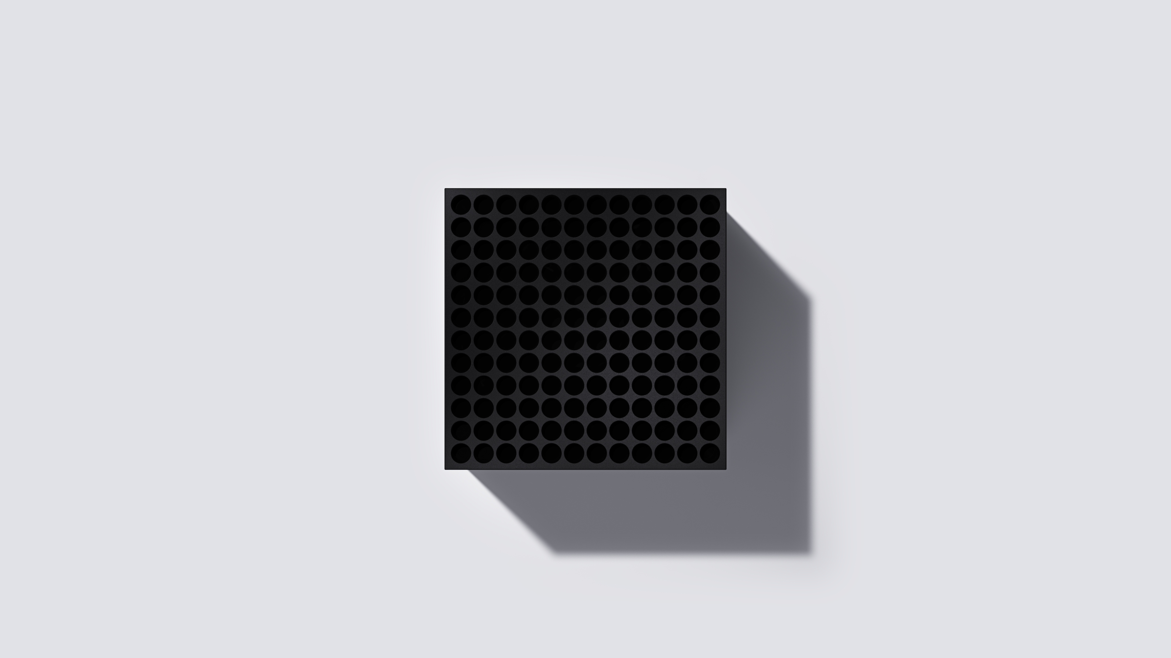
CK: There are very expressive elements to the Series X. We focused on the top surface with the holes. They need to be that size because of the volumes of air moving around, but we’re also creating an interesting visual story. It’s a 12 by 12 grid, with holes in the corner that are slightly deeper than the ones in the centre. The curve of green inside is subtly revealed as you move around the device. The result is almost an optical illusion, which is really fun to design.
W*: How much of what you do is defined by what already exists?
CK: There has to be a lot of continuity. The interface design team has the mindset of making experiences more efficient and cleaner, with a simple information hierarchy. They’re always refining. We have backwards compatibility as well with the games. You want something familiar. With the X we’re introducing better ways of connecting with your friends – a ‘share’ button, for example.
W*: How does the new controller relate to this approach?
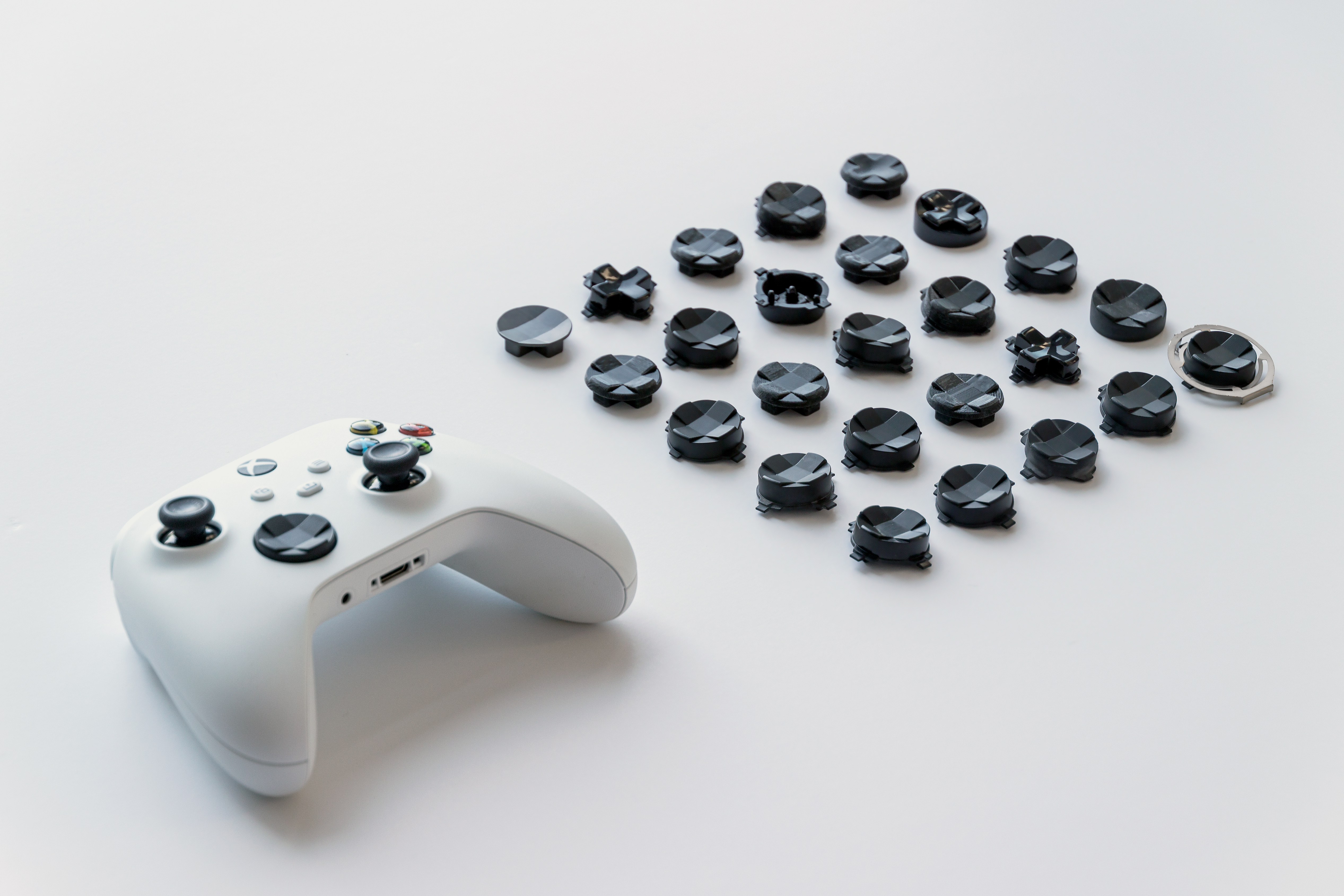
CL: The gaming controller has become such a paradigm – it’s ingrained in the way people play. We've made it just slightly smaller, effectively opening it up to more players. The ‘d-pad’ is also re-shaped. These are subtle changes – size, texture, etc. – but they make for a better experience. You need to be very conscious about any change to the way people play their games.
CK: We learned a lot from building out the Adaptive controller a few years ago – that is also compatible with the new Xboxes.
W*: Ten to 15 years ago a device with this much power – 12 teraflops – would almost have been a super-computer. Today we’re surrounded by so much processing power that we take it for granted – is there still a need to express power in a futuristic way?
CL: I think the visual perception of power is changing. Electric cars can blow away most gas engine cars, but they are quiet and subtle. Chris and the engineers worked hard to keep the Series X quiet, for example.
CK: In technology there is constant evolution – you can’t keep one-upping yourself. I think we’re getting very close to the point where people won’t think about where their computing power is coming from. You don’t have to hold it in your hand to know that it is there. Ultimately, we’re about delivering seamless experiences.
INFORMATION
Jonathan Bell has written for Wallpaper* magazine since 1999, covering everything from architecture and transport design to books, tech and graphic design. He is now the magazine’s Transport and Technology Editor. Jonathan has written and edited 15 books, including Concept Car Design, 21st Century House, and The New Modern House. He is also the host of Wallpaper’s first podcast.
-
 Marylebone restaurant Nina turns up the volume on Italian dining
At Nina, don’t expect a view of the Amalfi Coast. Do expect pasta, leopard print and industrial chic
By Sofia de la Cruz
-
 Tour the wonderful homes of ‘Casa Mexicana’, an ode to residential architecture in Mexico
‘Casa Mexicana’ is a new book celebrating the country’s residential architecture, highlighting its influence across the world
By Ellie Stathaki
-
 Jonathan Anderson is heading to Dior Men
After months of speculation, it has been confirmed this morning that Jonathan Anderson, who left Loewe earlier this year, is the successor to Kim Jones at Dior Men
By Jack Moss
-
 The new Polaroid Flip unfolds to bring you pin-sharp instant photography
Polaroid announces the Flip, an instant camera that blends its evergreen film technology with better results and more control
By Jonathan Bell
-
 Could putting pen to reMarkable’s Paper Pro tablet make you more creative and less stressed?
Design Museum director Tim Marlow extols the power of ‘scribbling’, and is backed up by new research from reMarkable on the benefits of its paper tablet
By Simon Mills
-
 Clicks creates keyboard cases for iPhones – now they're also available for three Android flagships
Smartphones get a new lease of life with Clicks, which brings a Blackberry-style keyboard to today’s cutting-edge Apple and Android devices
By Jonathan Bell
-
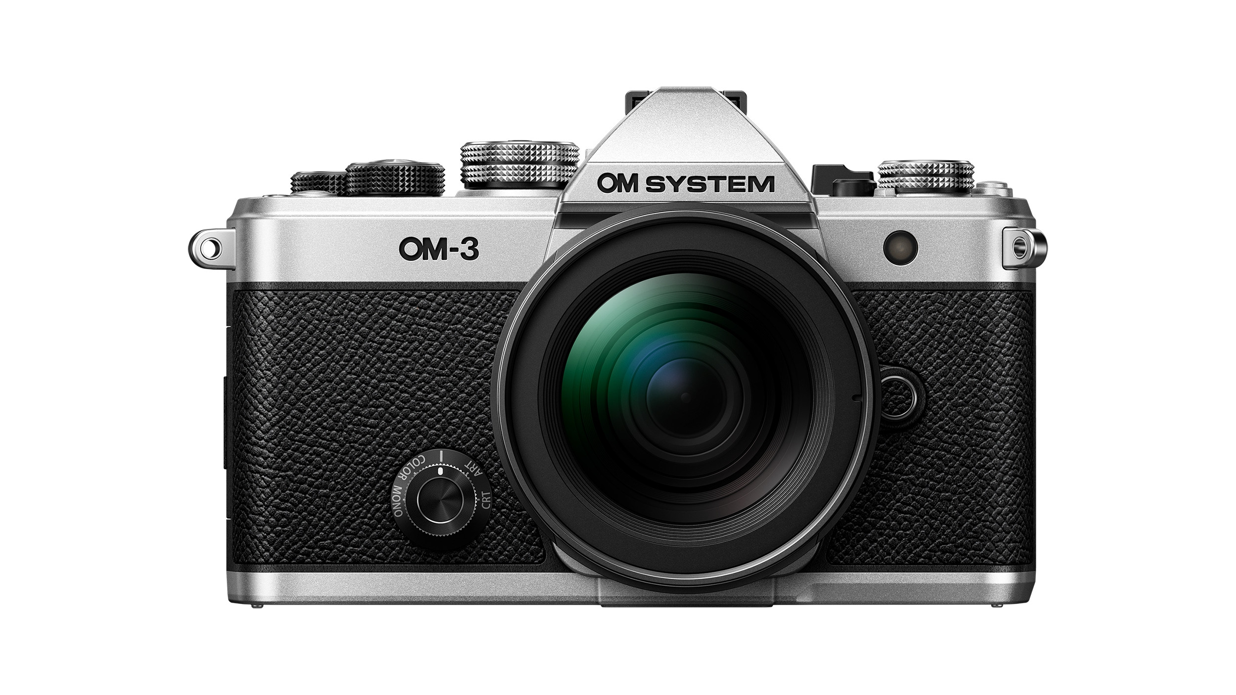 The OM System OM-3 camera blends heritage design with cutting-edge technology
The OM-3 from OM System is the newest must-have mirrorless camera design, classically styled and comprehensively equipped to create the ultimate contemporary digital camera
By Jonathan Bell
-
 Type without the tyranny of distractions: eight new ways to get the words out
Looking for a way to divert you from doom-scrolling? This selection of eight distraction-free typing devices will keep you offline and away from the socials to help you meet that deadline
By Jonathan Bell
-
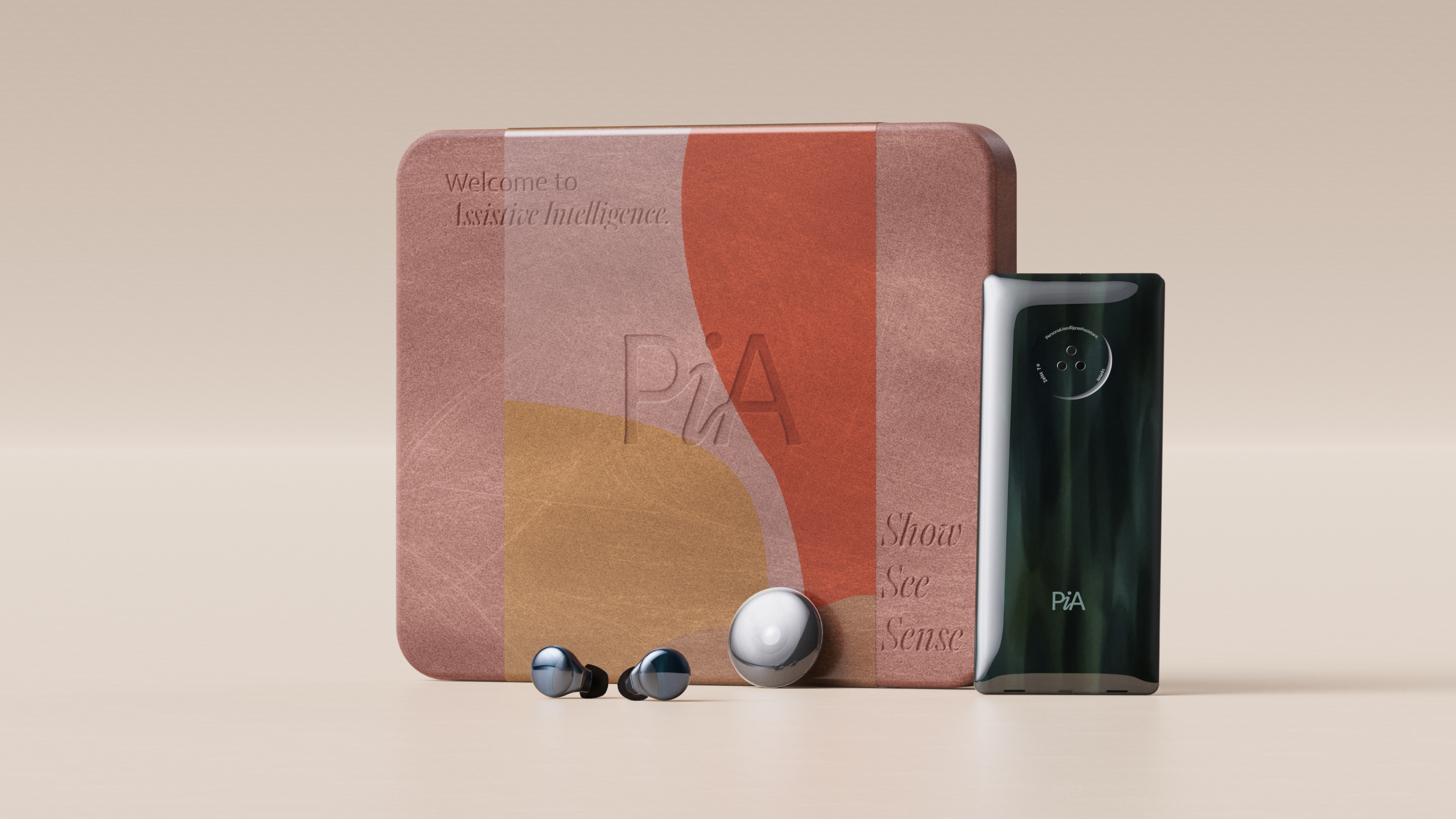 Layer conceptualises a next-gen AI-powered device: introducing the PiA
PiA, the Personal Intelligent Assistant, is a conceptual vision of how AI might evolve to dovetail with familiar devices and form factors
By Jonathan Bell
-
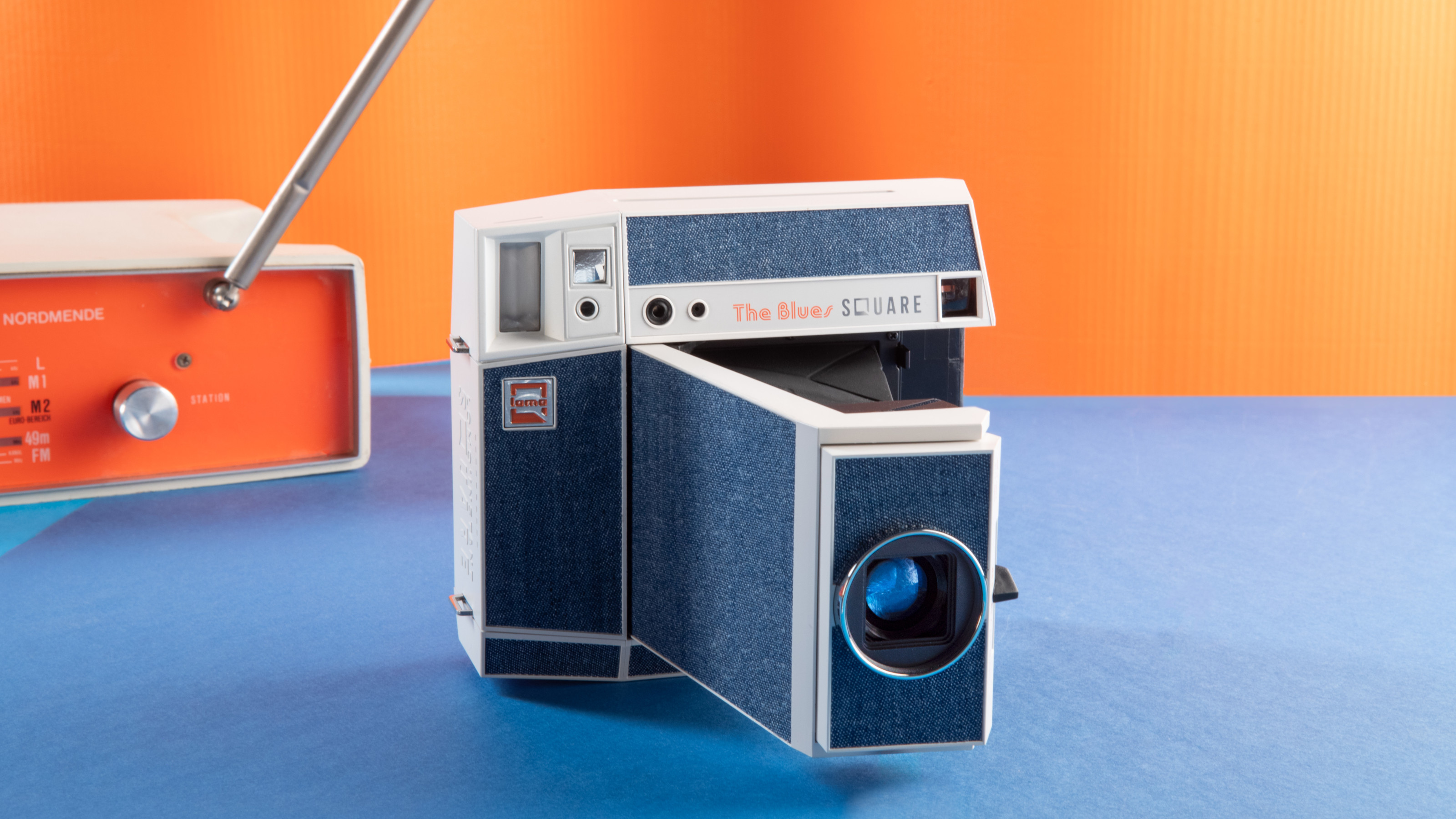 Point, shoot and process with Lomography’s two new colourful Instax camera editions
With the Pemberley and The Blues editions, the Lomo’Instant Square Glass camera provides stylish and pocketable analogue photography
By Jonathan Bell
-
 We put the new ultra-compact Dyson Car+Boat handheld vacuum through its paces
A cordless handheld vacuum pitched at a plethora of tasks, Dyson has tasked the new Car+Boat with far-reaching functionality without compromising performance
By Jonathan Bell