Kengo Kuma on making The Tokyo Edition, Ginza ‘warm, intimate, and spiritual’
The new Tokyo Edition, Ginza, designed by Kengo Kuma and Ian Schrager, marks the brand’s second chapter in Japan
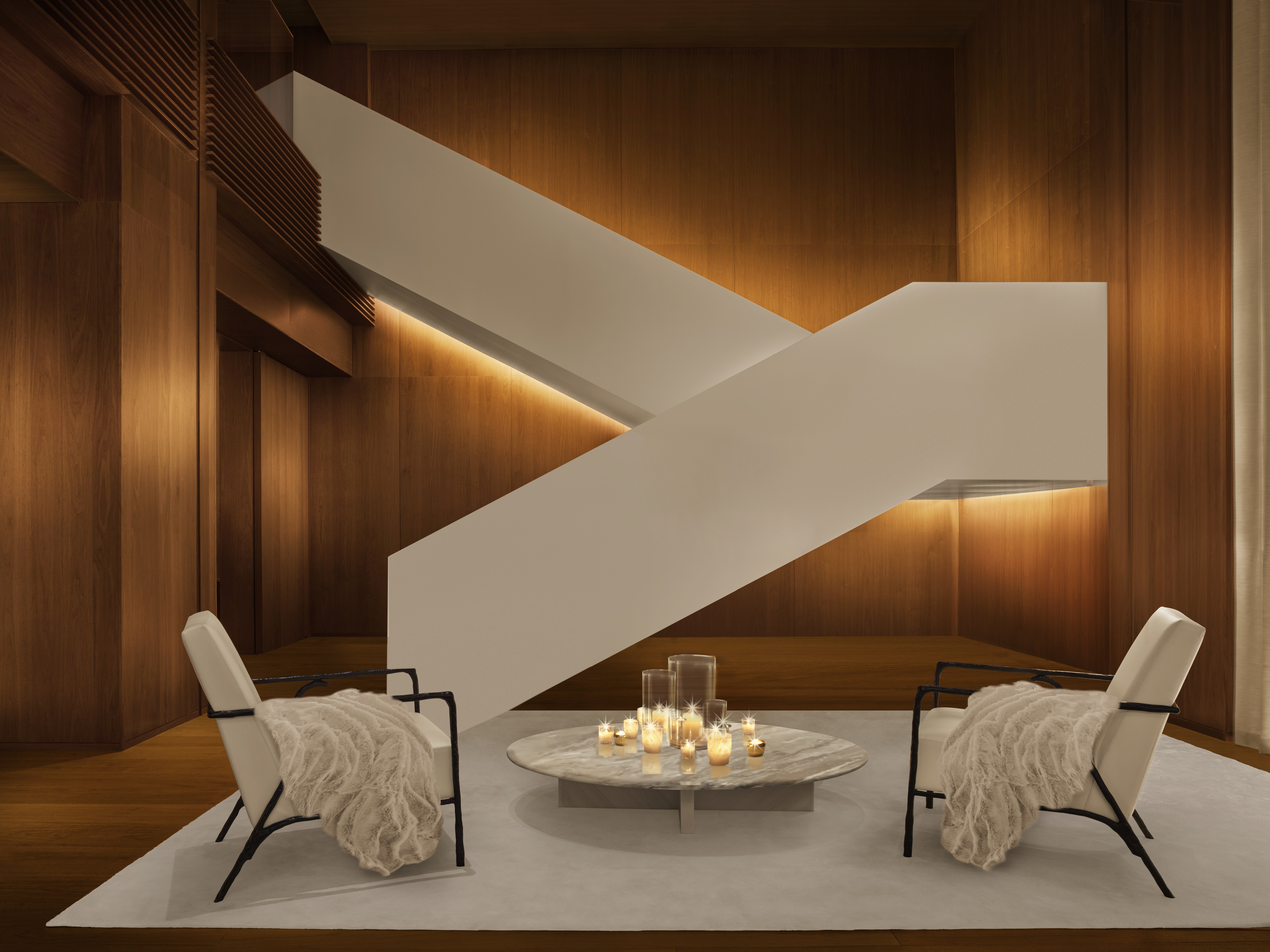
The idea of evoking the atmosphere of a private residence lies at the core of architect Kengo Kuma’s latest hotel project, The Tokyo Edition, Ginza – which he likens to a Japanese home, ‘warm, intimate and spiritual’. The new hotel flows through a 14-level structure on a quiet corner spot in the Ginza district, mixing a material warmth and a minimalist simplicity with edgy Edition touches in a network of intimate spaces.
The new Ginza hotel is the 19th global opening for The Edition brand – hot on the heels of The Singapore Edition, and chapter two for its Japan journey. It opens three years after the brand debuted in Japan with The Tokyo Edition, Toranomon, also designed by Kuma alongside Edition creator Ian Schrager. The latest outpost boasts expanses of deep-toned walnut juxtaposed with ivory textiles; 86 guest rooms with low-rise city views; a lobby with a gold bar and white scissor staircase; Japan’s first Punch Room; a modern brasserie; and a rooftop natural wine bar.
The Kengo Kuma-designed Tokyo Edition, Ginza

Kengo Kuma at The Tokyo Edition, Ginza
A similar design language – woods mixed with minimalist lines and a luxe material palette – underpins both hotels, yet each retains a unique identity. The Toranomon hotel floats 36 floors above the ground in a cloud-brushing skyscraper, with a buzzy jungle-like lobby inspired by temple architecture, light oak wood and 206 guest rooms. In contrast, The Tokyo Edition, Ginza has a deeper palette and ambience, reflected in its comparatively human-scale proportions.
In an interview with Wallpaper*, Kuma explains: ‘Toranomon is mainly oak wood while Ginza is walnut – this is because Toranomon is a contemporary skyscraper, and I wanted to show lightness in the sky. But in Ginza, connectivity to the street is most important. In this way, it reminds me more of a traditional building.’

The Tokyo Edition, Ginza Exterior
‘The Ginza location is key,’ says Kuma. More precisely, it’s the district’s uradori (back streets), where a grid of low-rise lanes with countless layers encloses generations-old businesses, galleries, restaurants, and bars. He explains, ‘There are many big shops on the main street of Chuo Dori. But the back streets, or uradori, are more vibrant and active, often only wide enough for humans. That kind of hidden feeling is the basis of Ginza.
‘The Edition Ginza faces these back streets, so the life and activity of the uradori and the Edition are very much connected. We tried to bring this into the interior to create a continuity with the exterior. That’s the basis of my design.’ The idea of ‘weaving’ together the different elements of Ginza is embodied in the fabric-inspired façade: interwoven ‘threads’ of extruded aluminium in three colour tones flow irregularly across the building, both horizontally and vertically, among vertical gardens.
‘I wanted to show some randomness – it’s not an industrial product, it’s handwoven,’ notes Kuma. ‘Fabric used to be in an important business in Ginza, so we thought the woven image would fit well. We wanted to show our respect for the cultural context of Ginza.’
Wallpaper* Newsletter
Receive our daily digest of inspiration, escapism and design stories from around the world direct to your inbox.
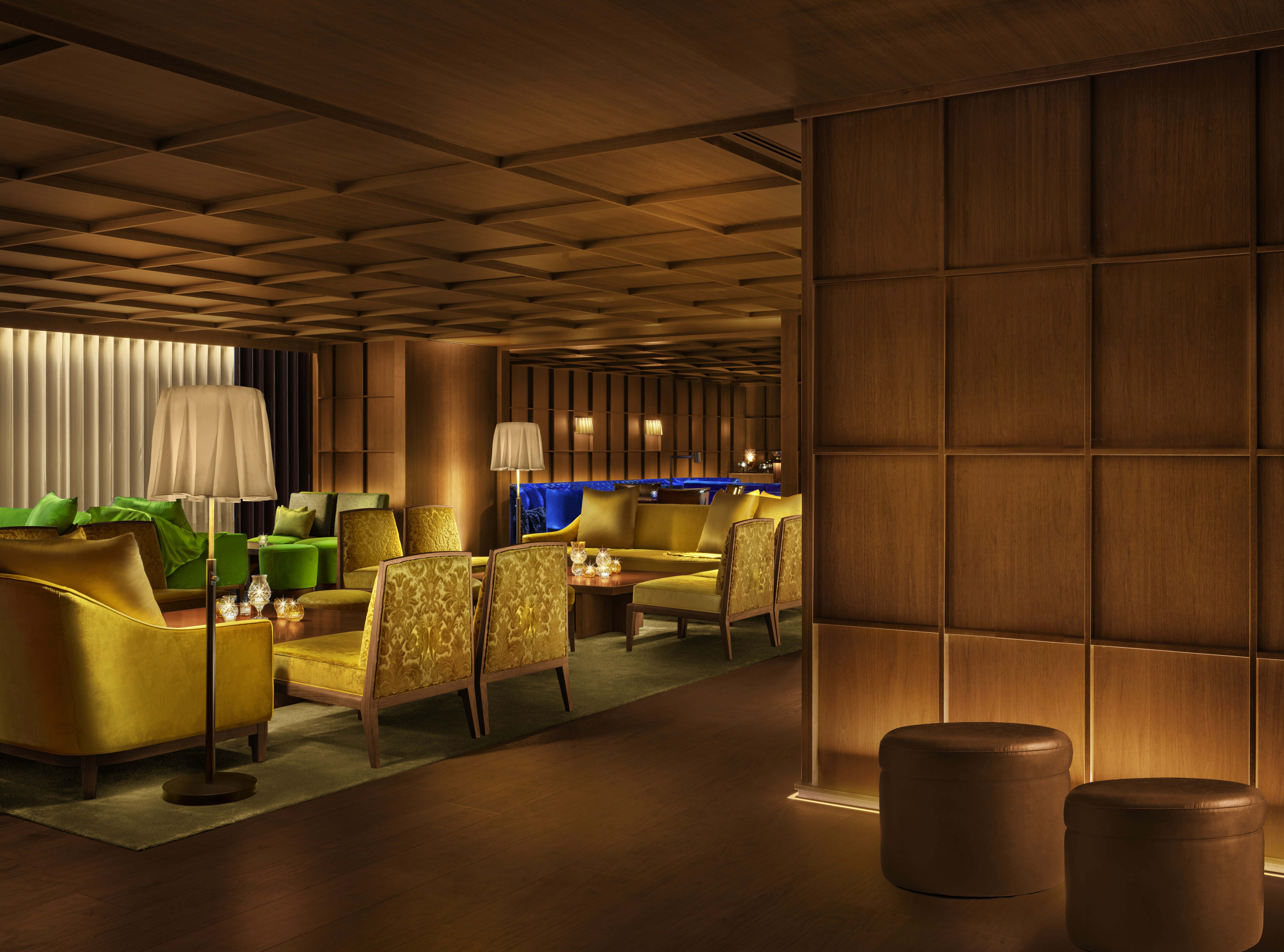
The Tokyo Edition, Ginza Punch Room

The Tokyo Edition, Ginza Bar
Diaphanous white curtains flutter as the ground floor doors open onto the lobby – an intimately scaled space with warm walnut walls; the contemporary lines and curves of bespoke seating in ivory and soft lavender; and a scallop-edged gold bar, serving pastries, craft coffees and cocktails. A highlight is the strong lines of a white metal scissor staircase, contrasting sharply with the dark wood, while a discreet check-in desk sits on the side.
‘This atmosphere is like being invited to a private home,’ says Kuma. ‘The entrance is very subtle. The conversation is very intimate. Creating this kind of intimacy is important to us. That’s why, compared to Toranomon, the wood is darker, there are fewer plants, and the furniture is like what you would find in a home. Scale-wise, it’s also very different from a normal hotel. Hotels often like big spaces. But a key concept of Edition is intimacy – especially as we are in Ginza, I wanted to show the intimacy of the location.’
He adds: ‘Besides, walking into the lobby reminds me of a traditional Ginza shop. Many shops have a long history, often over 100 years old. My father loved Ginza very much. He had some favourite shops. There was one shop master whom my father had a long relationship with. That kind of human relationship happens often in Ginza.’ The intimacy continues at the top of the strong-lined white lobby staircase, which flows into the Punch Room.

The Tokyo Edition, Ginza Punch Room

The Tokyo Edition, Ginza Punch Room
The mezzanine-style space is wrapped in grid-like woodwork inspired by Japanese lattices known as koshi – alongside an eclectic array of furniture, from long leather Chesterfields to a jolt of electric blue sofas, with modern lantern-like lighting. The atmosphere hovers somewhere between traditional Japanese house and the heritage-rooted eccentricity of an old-school British gentleman’s club – as the Edition’s signature Punches (with a Japanese twist) are served from silver bowls with traditional ladles.
‘Koshi [lattices] is the vocabulary for Japanese private homes,’ says Kuma. ‘Koshi can also represent different types of shops – shops selling cakes have a different koshi pattern in contrast to shops selling fabrics. In Ginza, the type of koshi is crucial.’
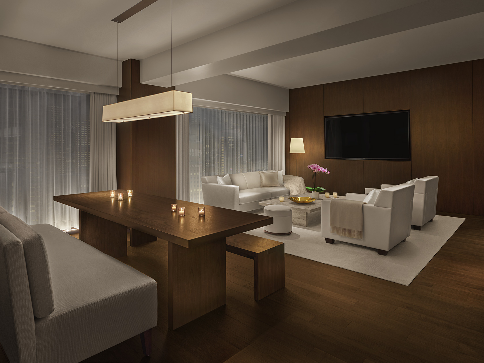
The Tokyo Edition, Ginza Penthouse

The Tokyo Edition, Ginza Premier Suite Living Room
The weaving theme continues in the plaited leather-wrapped handrails in the lifts. Minimalist yet warm, the rooms are wrapped in walnut panelling alongside crisp ivory textiles, travertine tables, cream leather, and white faux fur throws. Sharply framed monochrome photography by Japanese artists Sayaka Maruyama and Takay Photography hangs on the walls. Meanwhile, bathrooms have solid sweeps of dark green marble beneath circular mirrors on walnut walls, with clean-lined white standalone bathtubs in ten suites. Windows capture a completely different Tokyo atmosphere compared to its skyscraper sister in Toranomon – a low-rise patchwork of blocks, the skies above and shoppers flowing steadily below along the neat back streets.

The Tokyo Edition, Ginza Premier Suite Bedroom
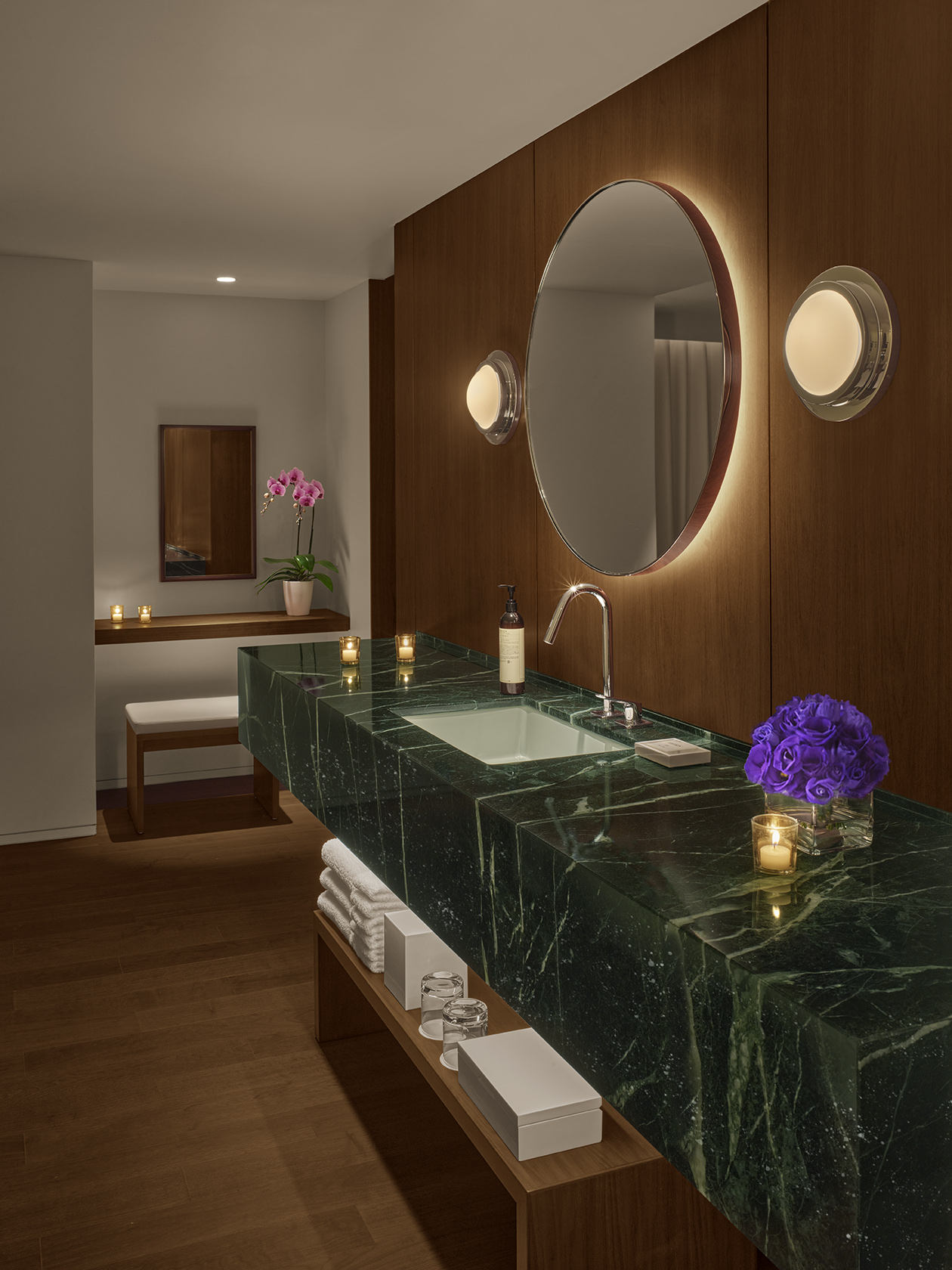
The Tokyo Edition, Ginza Premier Suite Bathroom
According to Kuma, the spaces evoke the Meiji era – a time of seminal modernisation in Japan (from 1868 to 1912): ‘I imagine an old house in the Meiji era, a time when brick buildings started lining Ginza’s streets, and Western lighting arrived. Meiji-era homes are a mix of Western and Japanese styles.’
The palette lifts in the 14th-floor modern brasserie Sophie at Edition – home to a buzzy atmosphere and a menu rooted in local ingredients (from Tokyo-made miso, burrata cheese and soy sauce to honey made by bees on nearby Ginza rooftops). The two-level space is open and bright, with shades of white and citrus bursts in its curved seating, light wood lattices, scatterings of plants and a wall of framed Tokyo street photography.
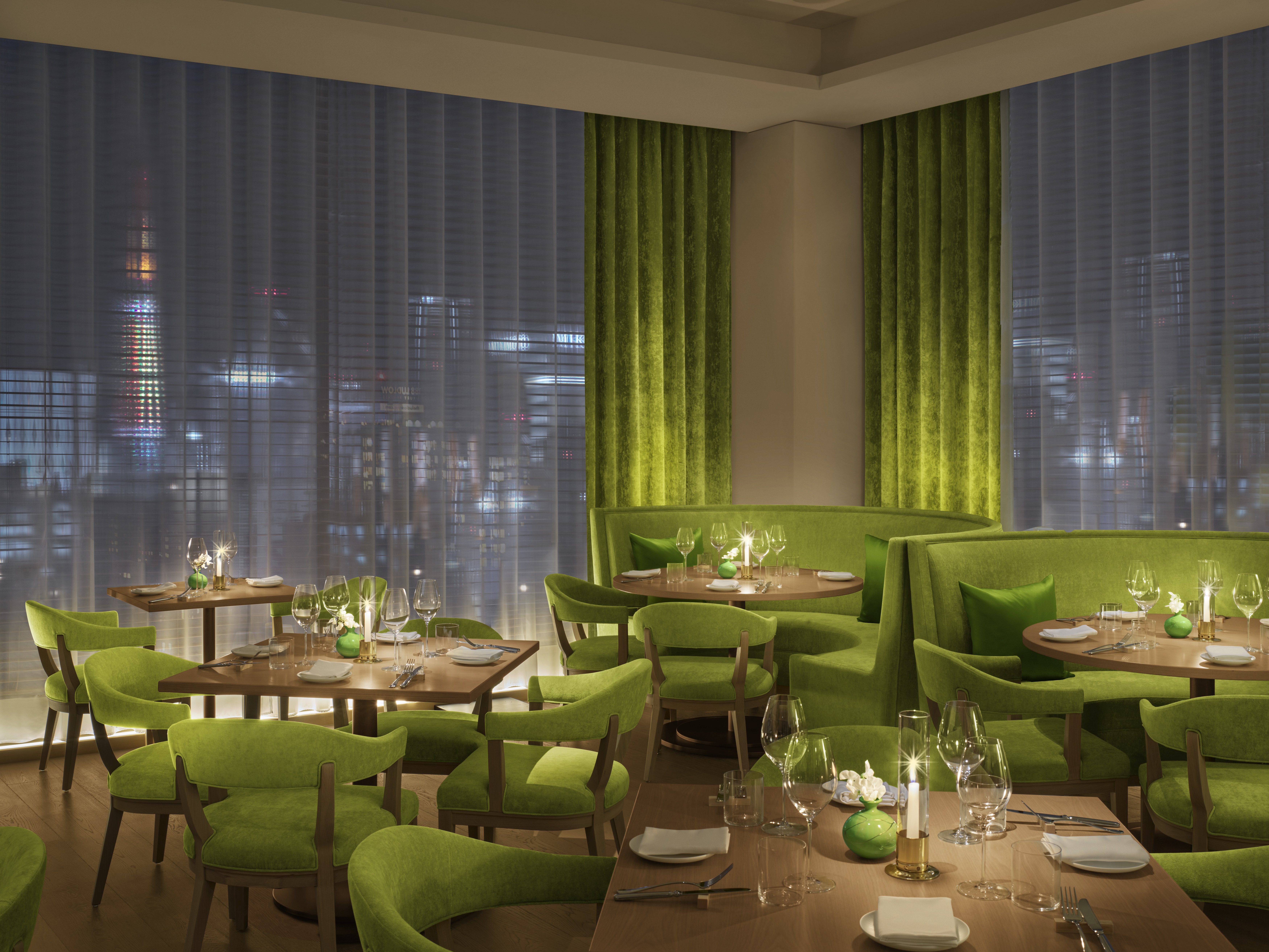
The Tokyo Edition, Ginza Sophie Restaurant
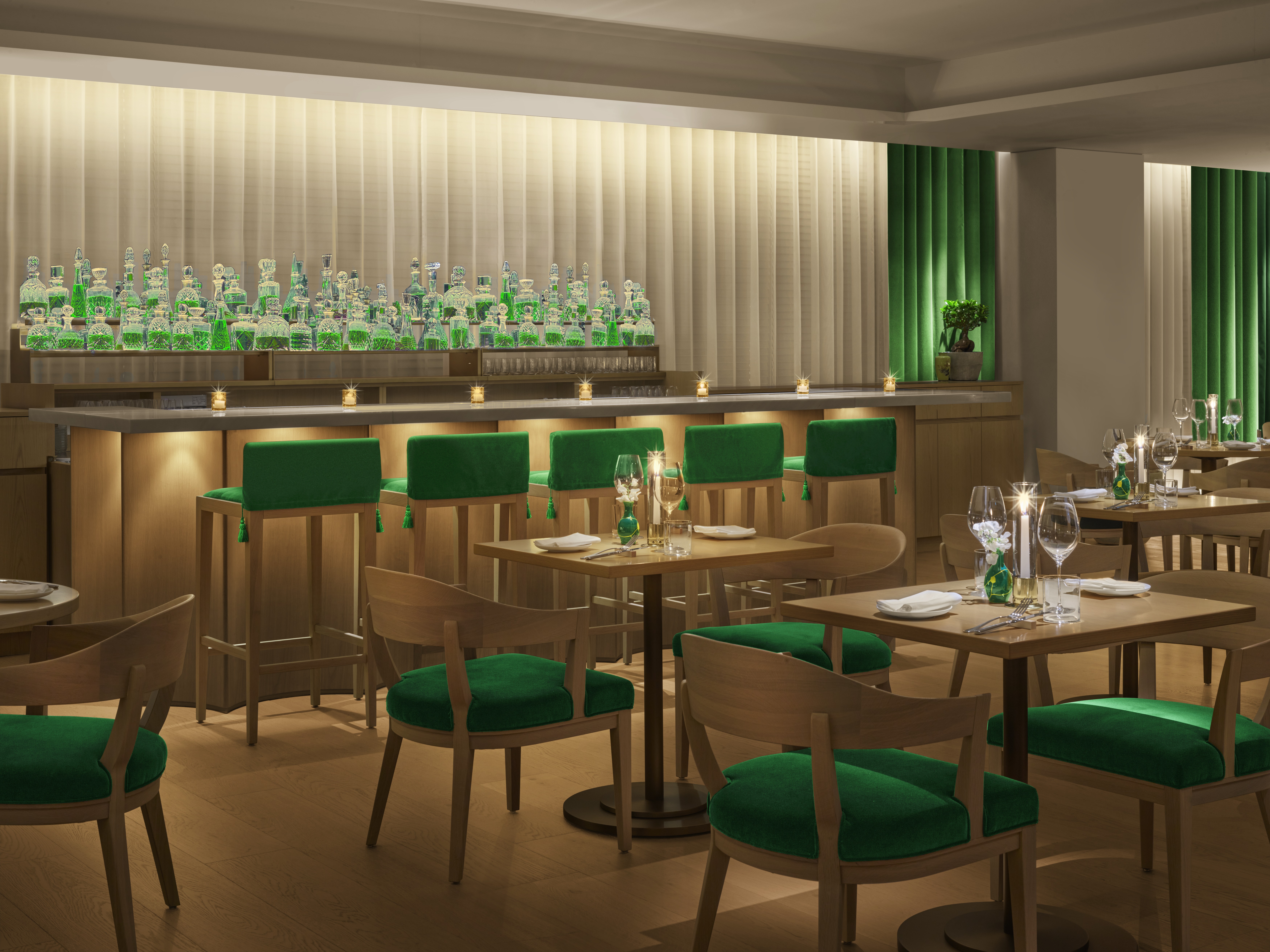
The Tokyo Edition, Ginza Sophie Bar
A highlight is the rooftop terrace, which serves natural wines when springtime temperatures rise. The space bursts with greenery, creating an unusual connection with nature despite the locations. This touch of nature is – according to Kuma – a vital ingredient: ‘After the pandemic, people want to go back to nature. I feel there is too much development in the city centre of the city’s centre, many skyscrapers, tower mansions. But without going back to nature, we can’t survive.
‘The roof terrace is open but intimate, with a sense of protection and privacy – but we can still feel the breeze and see the stars. I think our concept of Ginza is fitting for a post-Covid period. It is a real oasis in a big city.’
Danielle Demetriou is a British writer and editor who moved from London to Japan in 2007. She writes about design, architecture and culture (for newspapers, magazines and books) and lives in an old machiya townhouse in Kyoto.
Instagram - @danielleinjapan
-
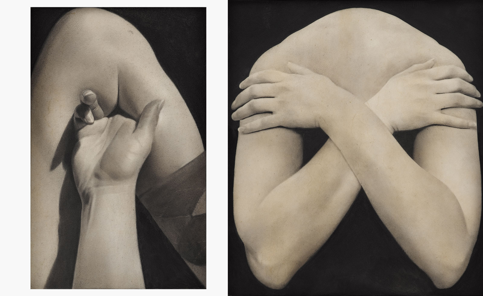 Put these emerging artists on your radar
This crop of six new talents is poised to shake up the art world. Get to know them now
By Tianna Williams
-
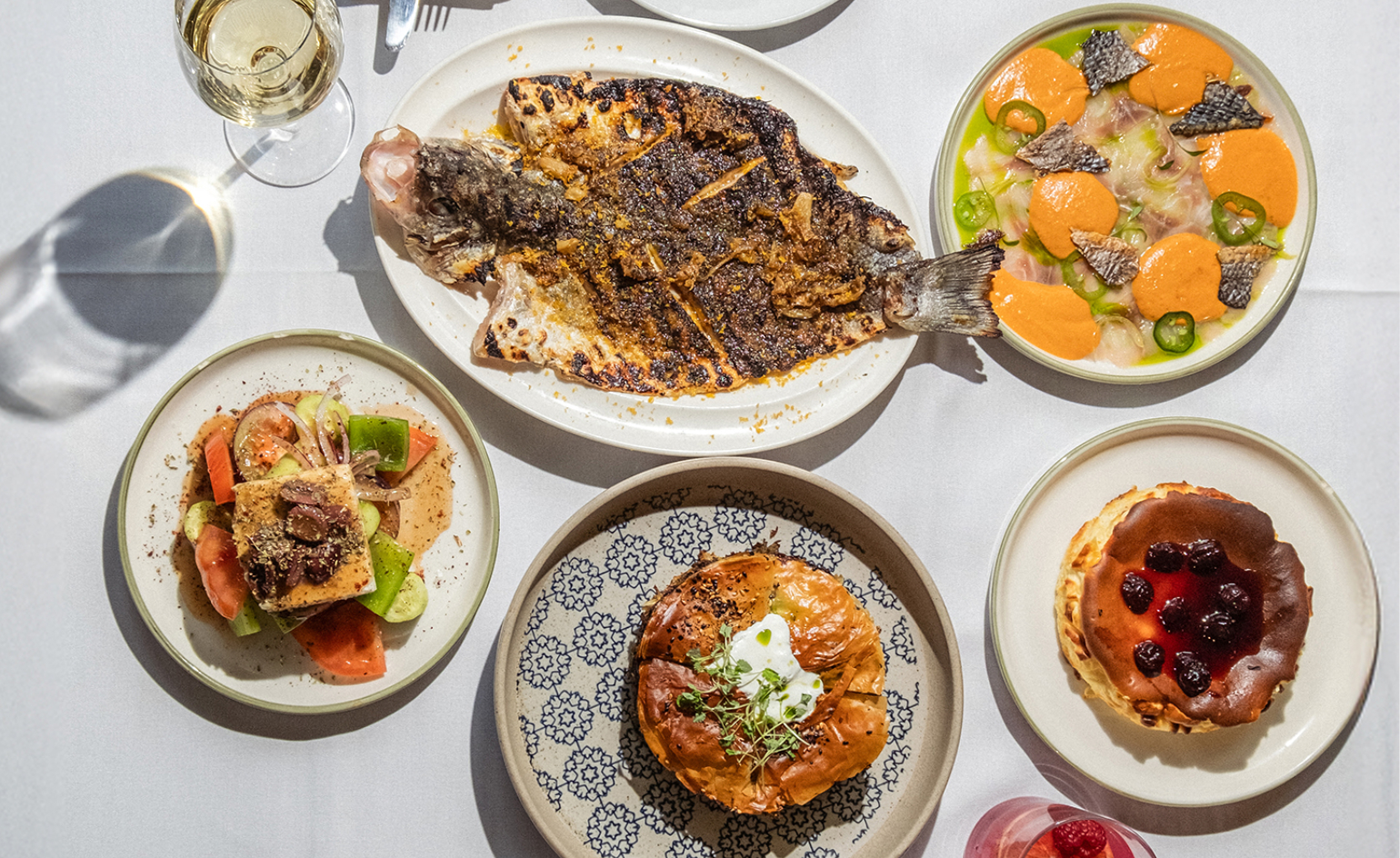 Dining at Pyrá feels like a Mediterranean kiss on both cheeks
Designed by House of Dré, this Lonsdale Road addition dishes up an enticing fusion of Greek and Spanish cooking
By Sofia de la Cruz
-
 Creased, crumpled: S/S 2025 menswear is about clothes that have ‘lived a life’
The S/S 2025 menswear collections see designers embrace the creased and the crumpled, conjuring a mood of laidback languor that ran through the season – captured here by photographer Steve Harnacke and stylist Nicola Neri for Wallpaper*
By Jack Moss
-
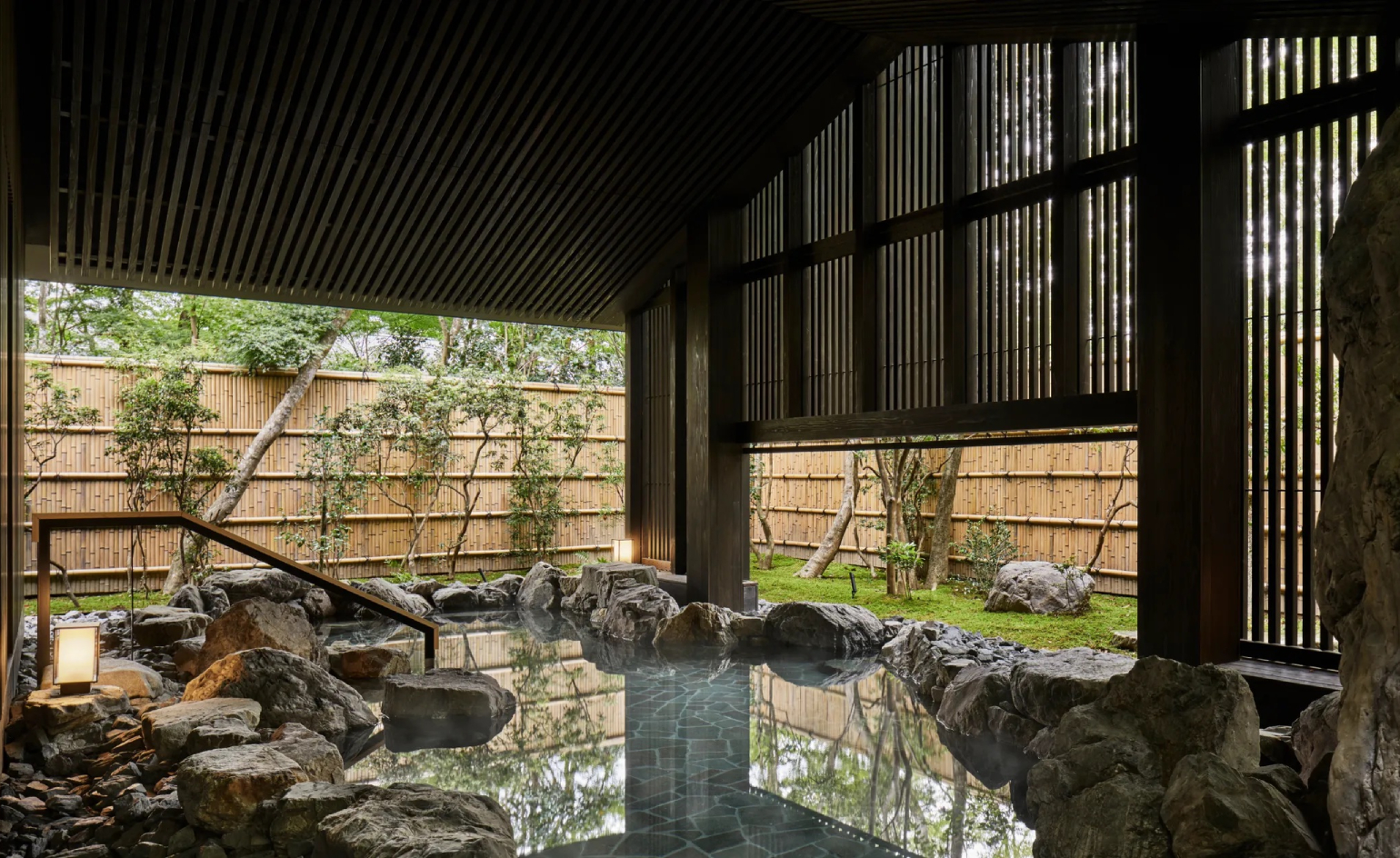 Shake off the winter chill at these design-led onsen hotels in Japan
Whether you’re heading to the mountains of Hokkaido or the alleys of Kyoto’s Gion district, these immaculately designed onsen hotels will keep the shivers at bay
By Jen Paolini
-
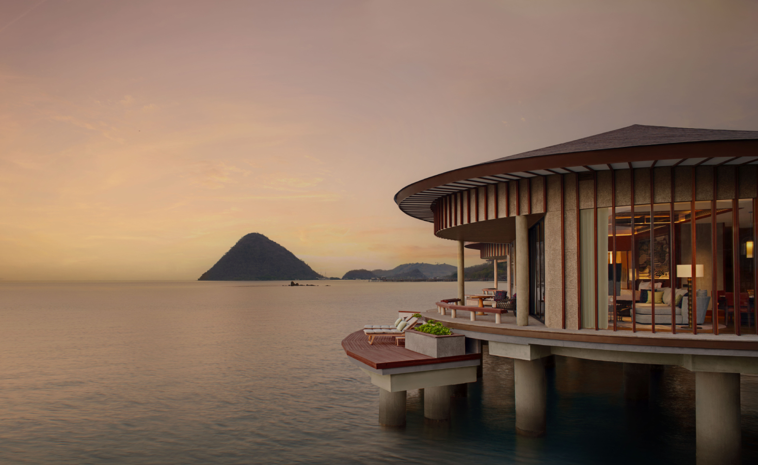 The new hotels you’ll want to stay at in 2025
Where to stay in 2025? Let six of the most-read-about hotel openings of the past 12 months inspire your escape – from a tiny Tokyo bolthole to a Tanzanian safari retreat
By Sofia de la Cruz
-
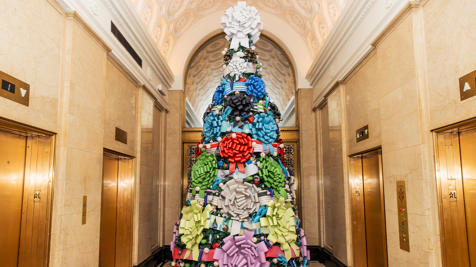 The most whimsical hotel Christmas trees around the world
We round up the best hotel Christmas tree collaborations of the year, from an abstract take in Madrid to a heritage-rooted installation in Amsterdam
By Tianna Williams
-
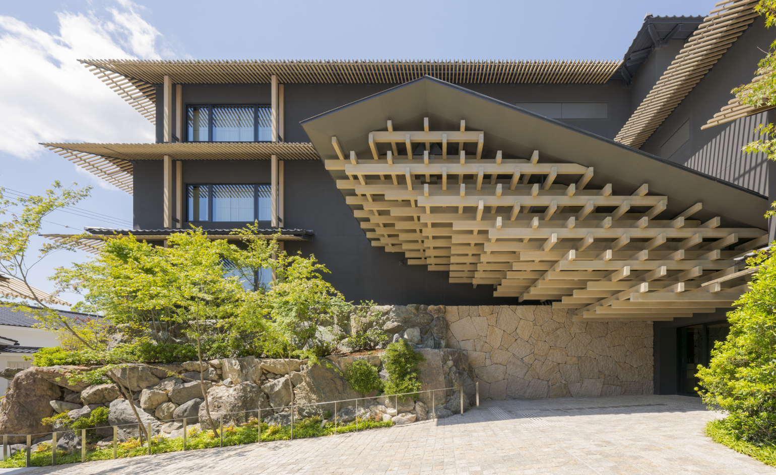 Kengo Kuma’s new Kyoto hotel is ‘a sanctuary of ethereal beauty’
A former ryokan inn, Banyan Tree Higashiyama Kyoto offers onsen rooms equipped with natural hot spring water, and a contemporary take on a Noh theatre
By Danielle Demetriou
-
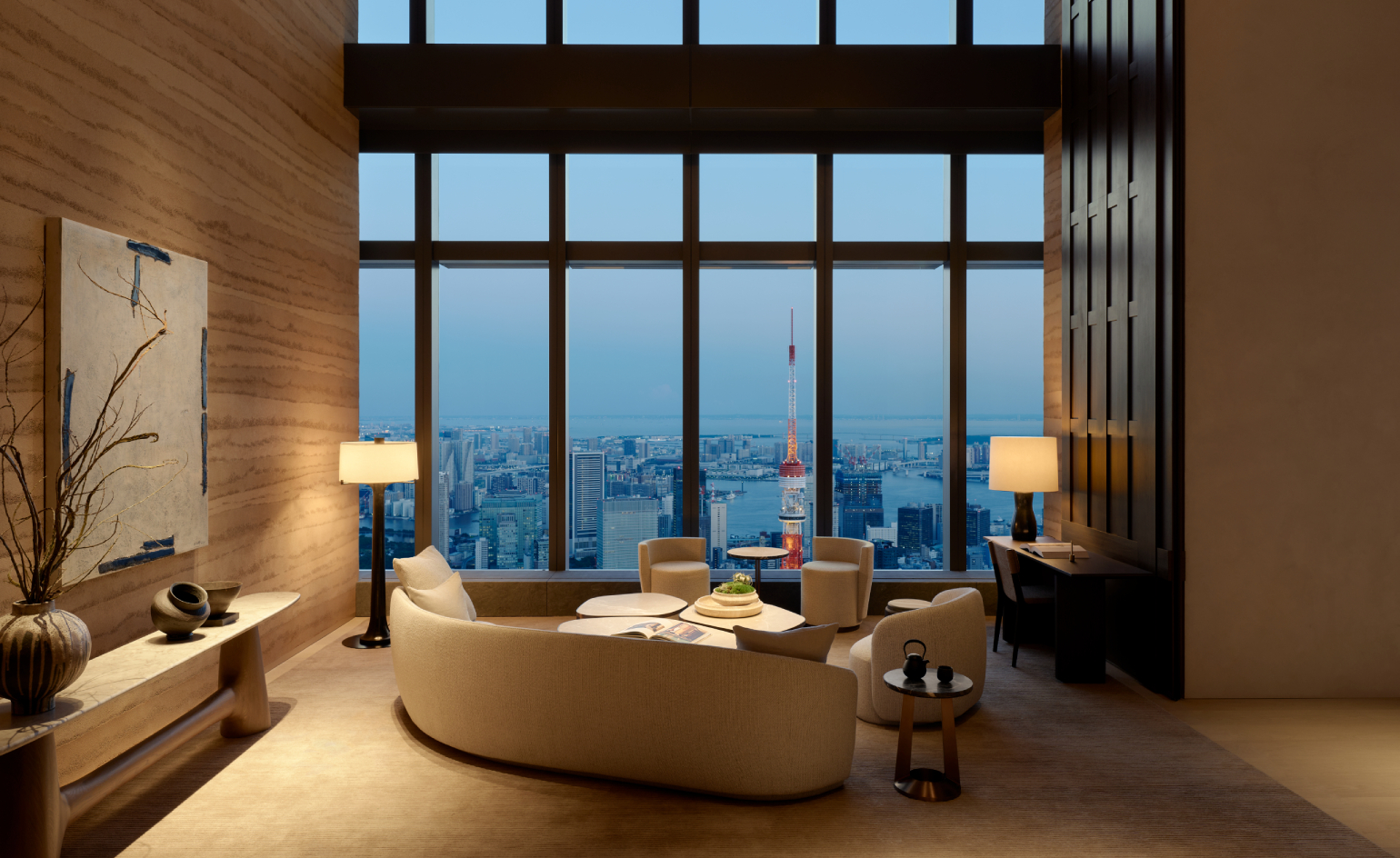 Aman Residences Tokyo float high above the Japanese capital
Aman Residences Tokyo, Aman Group’s first standalone branded residences, feature dramatic yet serene interiors by Yabu Pushelberg
By Dan Howarth
-
 Take off with Wallpaper* June 2024: The Travel Issue
The Wallpaper* June 2024 Travel Issue is on sale now, ready to whisk you to the best of Ho Chi Minh City, Caracas’ modernist marvels, classy Canadian cabins, a Swiss sleep retreat, and more
By Bill Prince
-
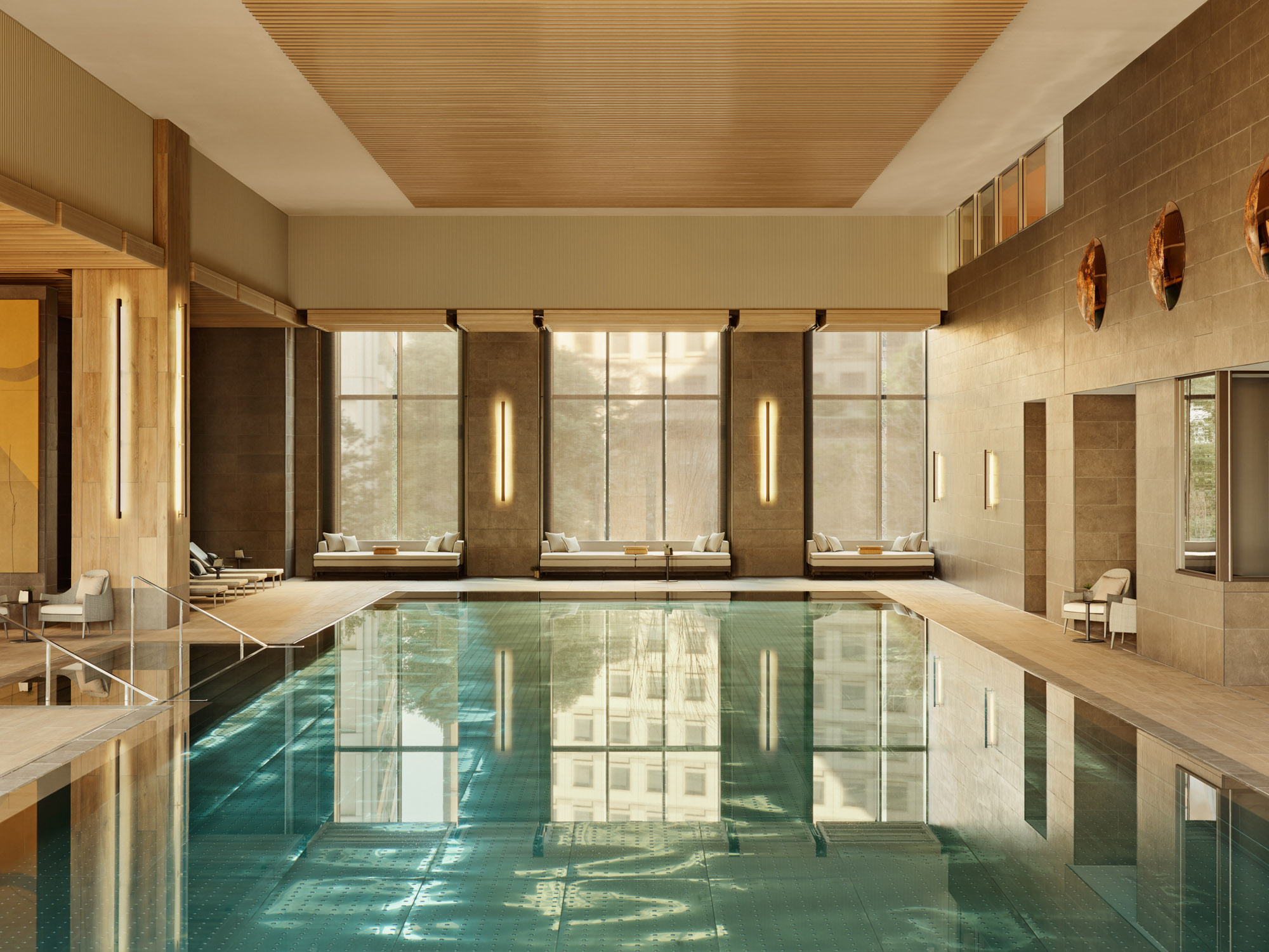 Dip into Janu Tokyo hotel, Aman’s sociable new sibling brand
Step inside the Jean-Michel Gathy-designed Janu Tokyo and discover its state-of-the-art wellness facilities
By Jens H Jensen
-
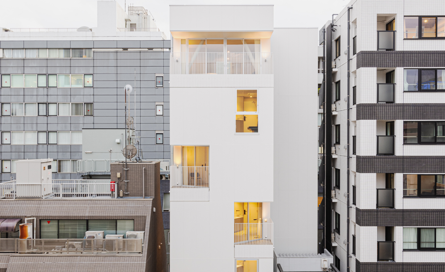 Hotel Rakuragu is a tiny but mighty modern escape in Tokyo
Hotel Rakuragu, brought to life by Kooo Architects, lies within an 80 sq m plot in the area of Chuo-ku
By Danielle Demetriou