Qantas’ Airbus A350 cabins make non-stop to Australia a dream ticket
Explore Qantas’ slick new Airbus A350 cabins, designed by David Caon, including minimalist first class suites
Receive our daily digest of inspiration, escapism and design stories from around the world direct to your inbox.
You are now subscribed
Your newsletter sign-up was successful
Want to add more newsletters?
Designing an aircraft that ensures 238 people feel as good as can be expected after spending the best part of a day at 39,000ft could be something of a daunting challenge. It was a task set for David Caon, who was commissioned by Qantas to design the new cabins on its Airbus A350 jets, which, from 2025, will fly for up to 21 hours non-stop from London and New York to Sydney and Melbourne.
Caon recently redesigned Qantas’ Airbus A380s, adding a bar, but his work on the A350 jets, 12 of which the airline has ordered at a combined cost of almost half a billion dollars at list prices, could not be more different. Its cabins need to be as lightweight as possible to minimise fuel consumption on their 11,000-mile journeys or, as he puts it, ‘You’ve got to be trim to go the distance’. This means no bars with heavy tables because ‘hydration, exercise and sleep are more important on these flights than alcohol, slap-up meals and socialising’. No full leather seats because
‘leather weighs more than fabric’. No fancy detailing or frills. Luckily, these guard rails suit his purposes.
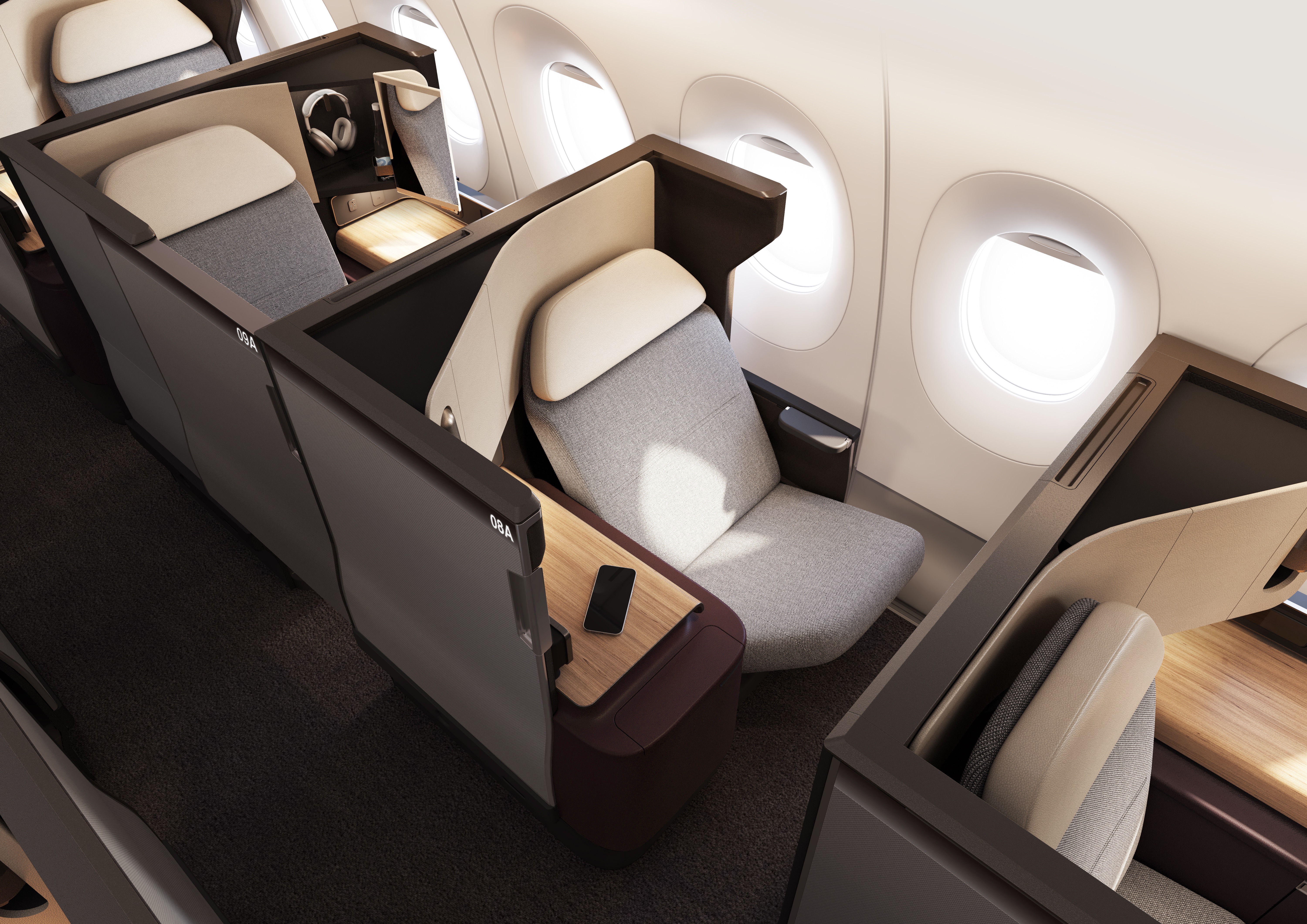
Business class suites come with sliding doors for privacy and feature a seat that folds down into a flat bed
‘My main aim is to create, as much as possible, a sophisticated, residential feel,’ says Caon. ‘Most of the time, you get on a plane and it looks like a plane. I don’t want the cabins to look like they are on a plane. I want it to look more like you’re at home.’ Fabric seat covers in all classes help to create a homely feel and, he adds, ‘it performs better because, unlike leather, it breathes, which helps to maintain constant body temperature’. To help travellers to relax, he’s removing ‘as many visual distractions and interruptions as possible. I’m trying to get rid of the clutter to create considered, understated luxury’. The result is the most minimalist long-haul jet interior of any commercial carrier.
Pulling it off is an ongoing challenge because, as Caon explains, ‘design for aerospace is a complex ecosystem with a lot of safety, certification, testing and weight issues. This means aircraft interior manufacturers tend to do things in a certain way, with certain materials. We have different ideas, but we can’t impose them. We have to work very closely with suppliers to achieve our own unique style. It’s a rolling negotiation.’
Qantas first class: a new standard
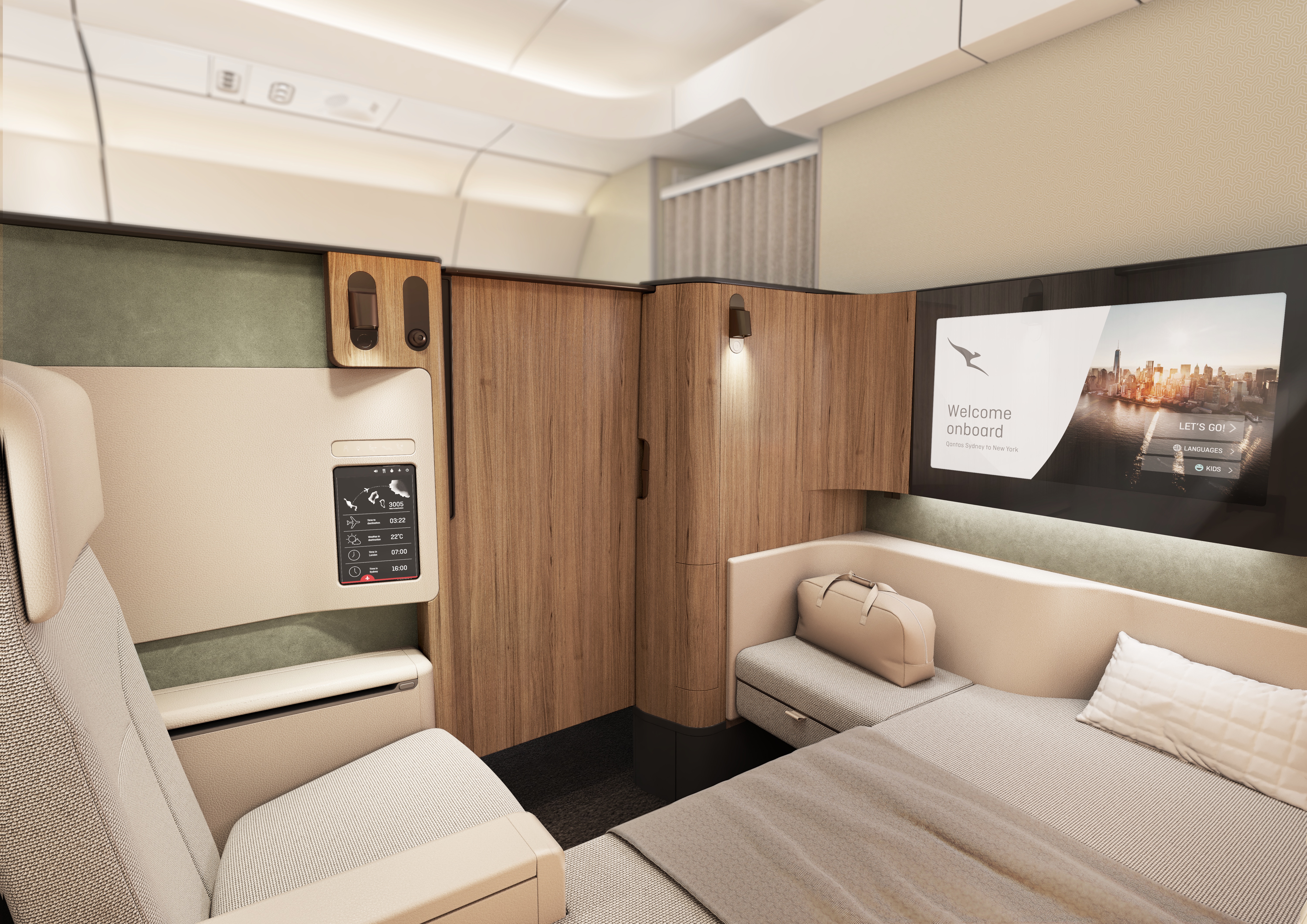
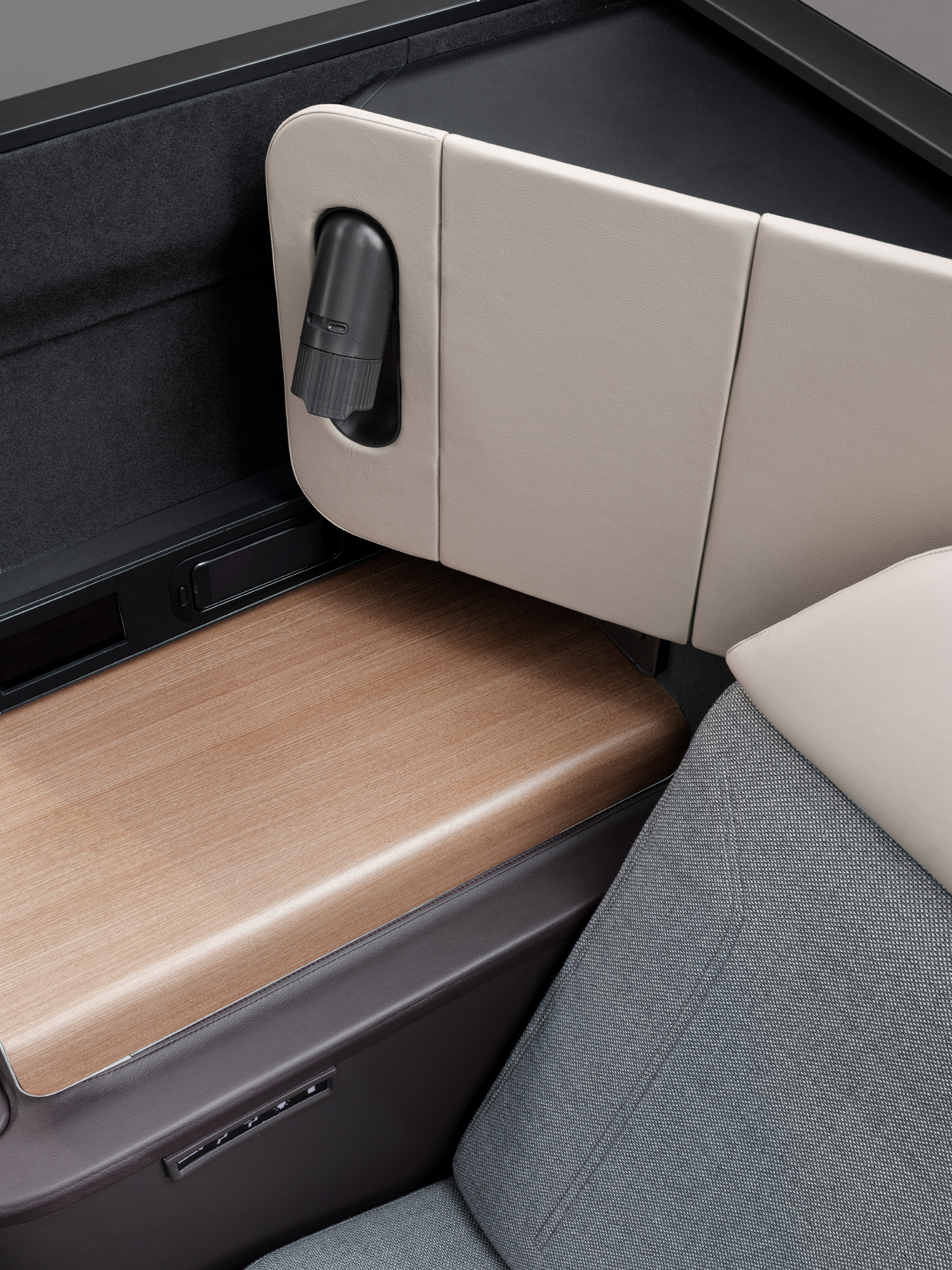
First class suites are equipped with touchscreen controls, wireless charging, TVs and bespoke lighting
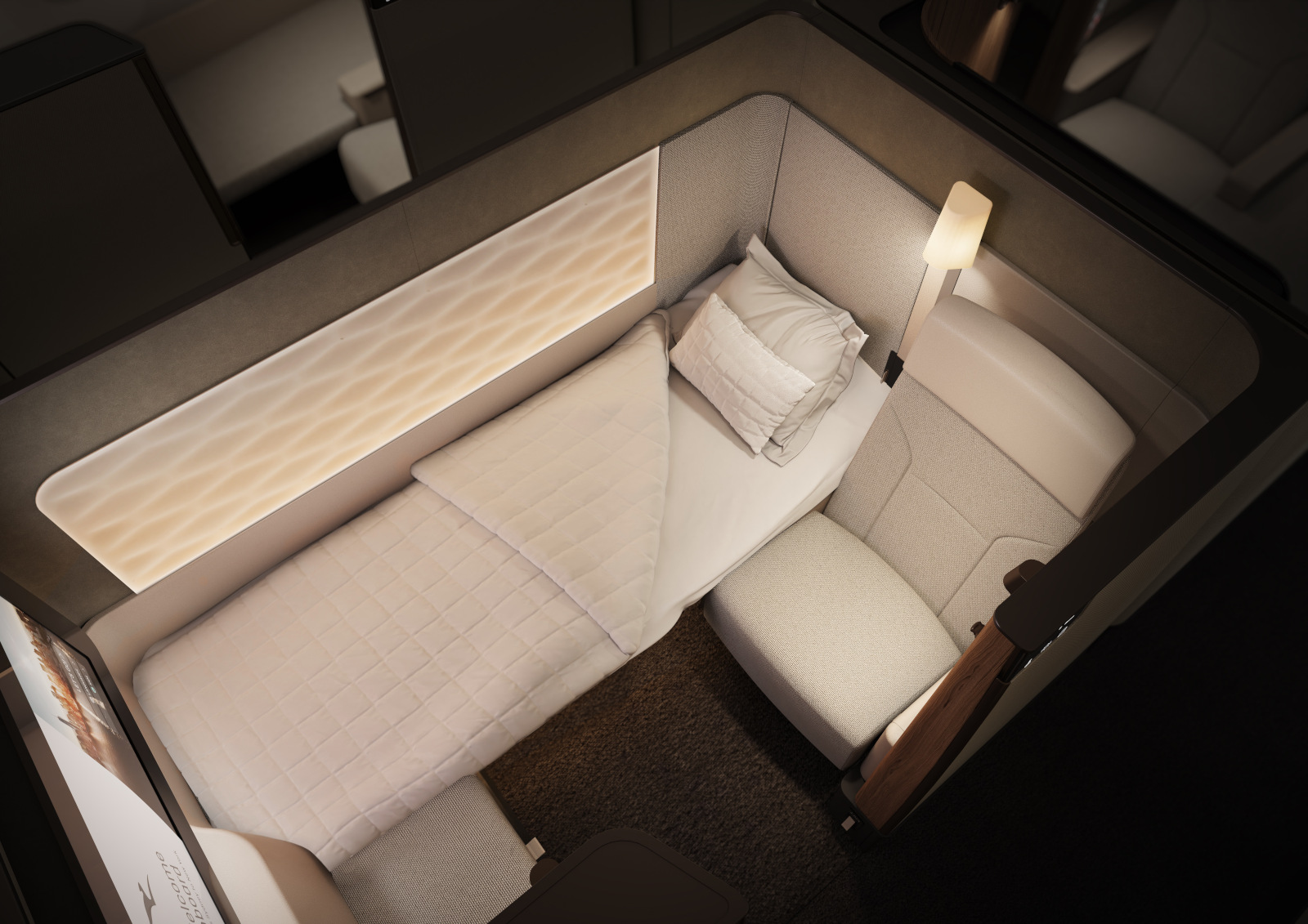
Caon’s first class cabins will set new standards. Comprising six large enclosed suites, arranged in a 1-1-1 formation, each comes with reclining seat, separate 2m-long bed, wardrobe, dining table and 32in TV. The colour palette is lighter than in the other cabins, as it is on Qantas’ A380, with eggshell seat fabrics ‘because first class is treated with kid gloves by passengers’. Wrapping around the wall and door, making the suite feel warm and organic, is what looks like European oak, but is, in fact, synthetic, ‘because real wood is hard to refinish and maintain’.
The touchscreen controls for the seat position and in-suite temperature are simple to use and discreetly mounted in the wall, and there’s wireless charging built into the surface storage areas. Each of the six stowage compartments is integrated into the surfaces and closes flush. ‘I want everything to fold away completely to create visual calm.’ Seatside stowage for hand luggage has allowed Caon to do away with overhead bins, creating a very open, high-ceilinged cabin ‘that transforms the experience’.
Business class, primed for privacy
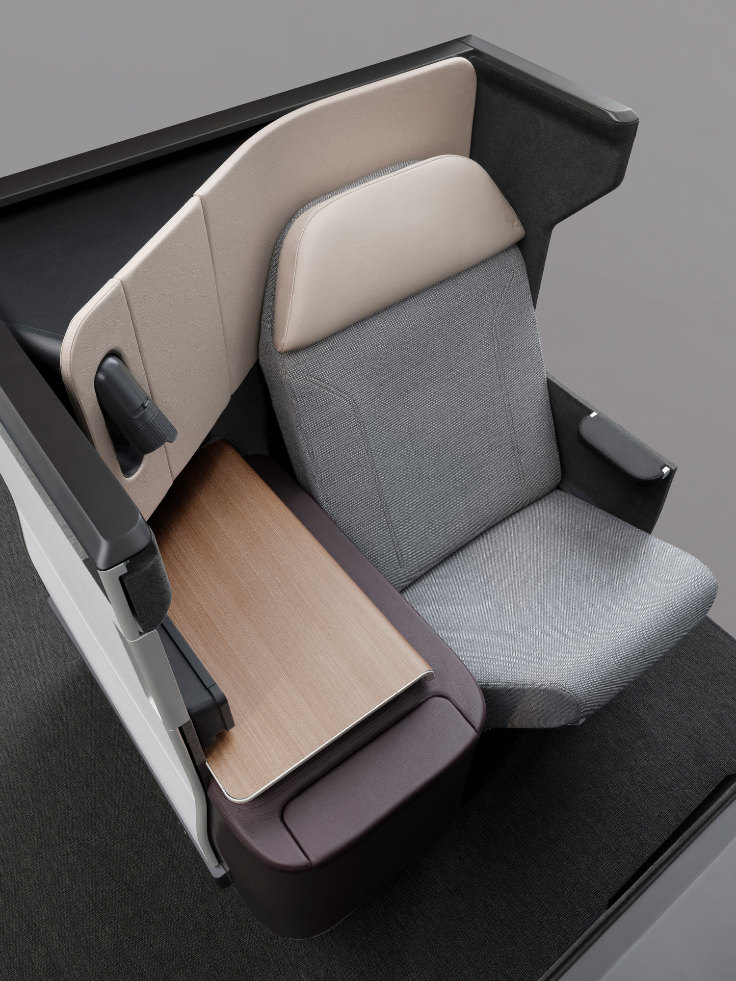
Business class
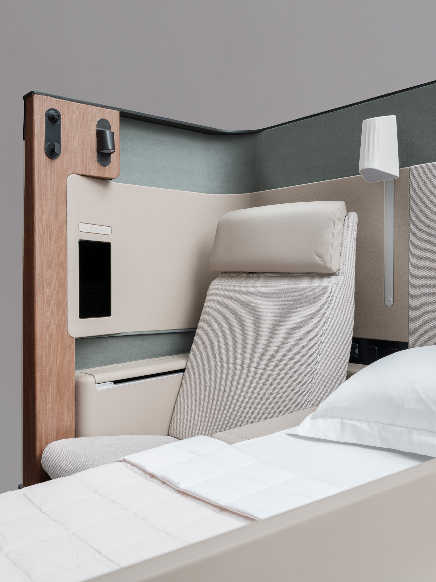
After years spent eschewing ‘cubicles’ in business class, Caon has opted for platinum-coloured doors on the 52 business-class cabin suites as Qantas reckons passengers will appreciate a little extra privacy on such long flights. However, the door height is similar to that found on the suites used by British Airways and Etihad, which means passengers can ‘see and read’ the entire cabin when they are sitting up, rather than feeling completely enclosed.
Receive our daily digest of inspiration, escapism and design stories from around the world direct to your inbox.
Each seat, which folds down into a flat bed, is laid out in a 1-2-1 formation, with Caon describing the central pairs as ‘the romance seats’ as they’re ideal for travelling couples. There are overhead bins on each side of the cabin, but not in the middle, resulting in a ‘cathedral-like’ ceiling. Caon is particularly proud of the mood lighting and bespoke reading lamps. ‘You’ve got to have the right beam angle and brightness. We work really hard to prototype this stuff early and get it right. No chandeliers!’
Premium economy: 40in pitch and a ‘better recline’
The premium economy cabin will have 40 seats, arranged in a 2-4-2 configuration, and these will be a step up from those Qantas currently offers on its A380 and Boeing 787 jets. The 40in pitch (the leg room measure) is 2in more than the airline’s current premium economy and the same as Emirates’, currently the industry leader in the category. ‘We’re also redesigning the headrest to create a more pronounced wingback chair, offering more visual privacy, which is great if you’re travelling alone.’
The new seat should aid sleep. ‘You get a better recline, because the bottom of the seat tracks forward and juts up, giving you more of a ‘slung’ position. Combined with the footrest, it’s like the old cradle seats that airlines used to have in business class.’ Caon is also refining ‘a special pillow that integrates with the headrest and becomes
part of the seat’, which will also be offered in economy.
Economy: 33in pitch and ergonomic seating
Qantas’ decision to include a large economy class cabin is something of a commercial gamble. Singapore Airlines decided not to bother with these seats on its 19-hour non-stop flight from its home to New York after reckoning its customers were unwilling to sit cheek-to-cheek for that long. The 140 economy seats, arranged in a 3-3-3 configuration, will have a 33in seat pitch – 1-2in more than Qantas’ existing product, but less than the best economy seats (Emirates offers 34in). However, Caon insists that ‘the ergonomics make it a more comfortable seat than anything currently flying at the moment in economy. The lower back area is more shaped and bolstered, which makes it more comfortable. And there’s greater movement up and down in the headrest so that it cradles your neck better.’
Tray tables and storage pockets are designed to maximise space. ‘The bi-fold table that you pull down from the back of the seat in front sits up a little bit higher to give more space under the knees. Also, the seatback in front of you is sculpted, so even when the pockets are stuffed full of your books, it does not impinge on your space.’ A new flip-down shelf on the seatback for iPads will make it easier to watch a film on your own device.
Flying colours
Business class
First class
The colours, trims and other details are consistent throughout all cabins and were chosen early. ‘You can’t just slap the colours on at the end,’ says Caon. ‘We start choosing right at the beginning because we want the cabin to be a visually coherent experience from nose to tail. We know people fly sometimes in business, sometimes premium, sometimes economy. I want them to know instantly that they are on one of the ultra-long-haul jets.’
When it comes to reducing the risk of deep vein thrombosis, first and business class passengers will be encouraged to move around and stretch in their suites. Premium economy and economy travellers will be able to use a small exercise and stretching area between the premium economy and economy cabins called a Wellness Zone. Passengers in all cabins will be encouraged to drink less alcohol on the ultra-long-haul services than they might on shorter flights, and hydration stations will offer soft drinks only. Upgrades to the passenger experience extend to the cabin lighting: flyers will wake up to a brightening blueish tinge. When it’s time to sleep, the lights take on an orange hue.
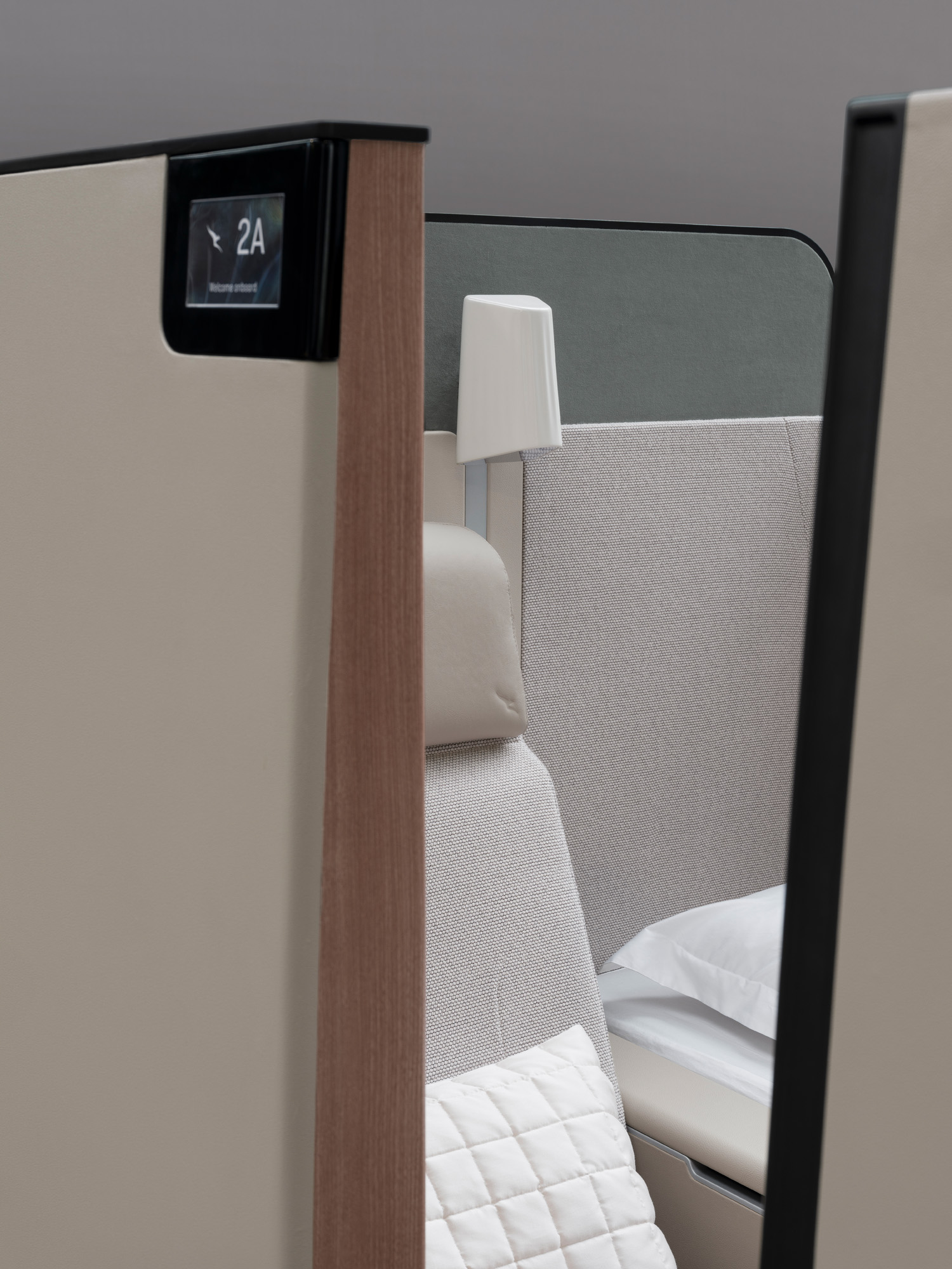
First class
It’s no surprise that the new A350 interior looks so innovative. Caon learnt his trade working alongside Sydney-born designer Marc Newson in Paris, and he eventually took over from Newson as Qantas’ chief designer. Newson, who now works with Jony Ive on LoveFrom, wanted everything at Qantas to be bespoke and uniquely Australian, right down to the cutlery. Caon, whose Sydney-based studio is independent of Qantas and designs products for the likes of Schneider Electric, Woolmark, Noritake and Neil Perry restaurants, continues that tradition. ‘A bespoke approach is what should define a premium airline,’ he says. ‘I hate being in a business or first class cabin and seeing an off-the-shelf reading light.’
He uses the fabrics to drive his point home. ‘We get a fabric supplier to come into the studio and we do a workshop. I’d love to show you the thousands of sample fabrics we look at. We choose fabrics and then they go for testing to analyse how they feel, how much they weigh, and the comfort of the surface finish. That’s all engineered by us. Nothing’s coming off the shelf.’
caondesignoffice.com, qantas.com
A version of this story appears in the June 2023 Travel Issue of Wallpaper*, available now in print, on the Wallpaper* app on Apple iOS, and to subscribers of Apple News +. Subscribe to Wallpaper* today