Alexis Bittar and Scott Pask’s theatrical New York jewellery store design
New York jewellery designer Alexis Bittar has collaborated with Tony Award-winning theatrical designer Scott Pask for his New York store design
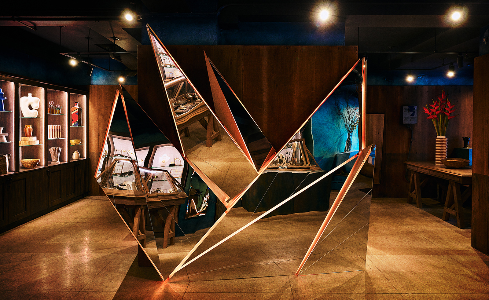
New York jewellery designer Alexis Bittar relaunched his three-decade-old company in September 2021 after a five-year hiatus from its helm (he bought back his company from Brooks Brothers in 2020, having previously sold it to focus on raising his children). His return ushered in a whole new look for the business, including an expansion into home décor and accessories, plus several new stores. ‘I wanted to reconstruct the complete vision of the brand,’ he says. Five boutiques in New York and a sixth to follow in San Francisco have been designed in collaboration with Tony Award-winning theatrical designer Scott Pask.
Renowned for his stage set design, Pask has forayed into other arenas, such as exhibition design, including several at the New York Botanical Garden, as well as a fashion show for Bottega Veneta and even a dalliance into retail design with Bergdorf Goodman’s menswear boutique B Shop.
This is the first time Bittar and Pask have worked together. ‘I was watching the documentary on Studio 54, how Steve Rubell and Ian Schrager worked with Broadway set decorators to design the changing sets,’ says Brooklyn-born Bittar, who cites 1980s cult indie film ‘Liquid Sky, with traces of Sleep No More, Saw II and Black Mirror’ as inspirations for the store design. ‘It seemed like such a great marriage, bringing in a set designer who understood theatrics with the ability to look at retail in a new perspective and bring nuance.’
Alexis Bittar and Scott Pask on their store design
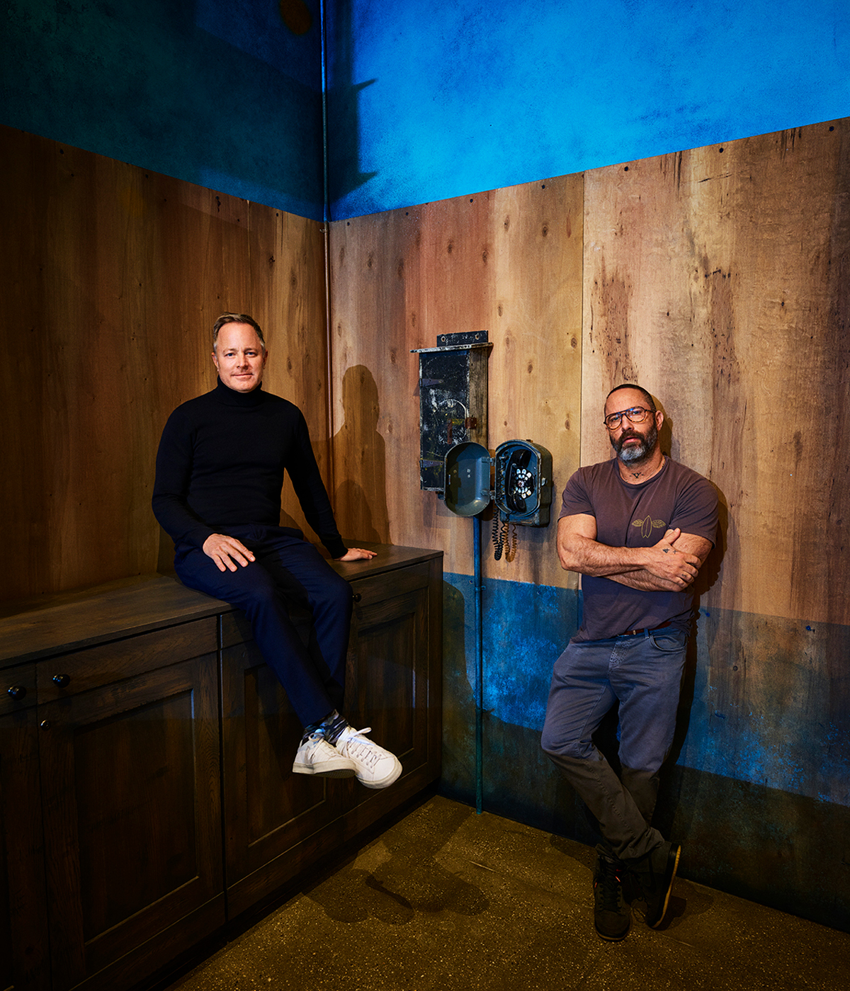
Set designer Scott Pask (left) and jewellery designer Alexis Bittar
Wallpaper*: Alexis, how does the new look of your stores play into your rebrand?
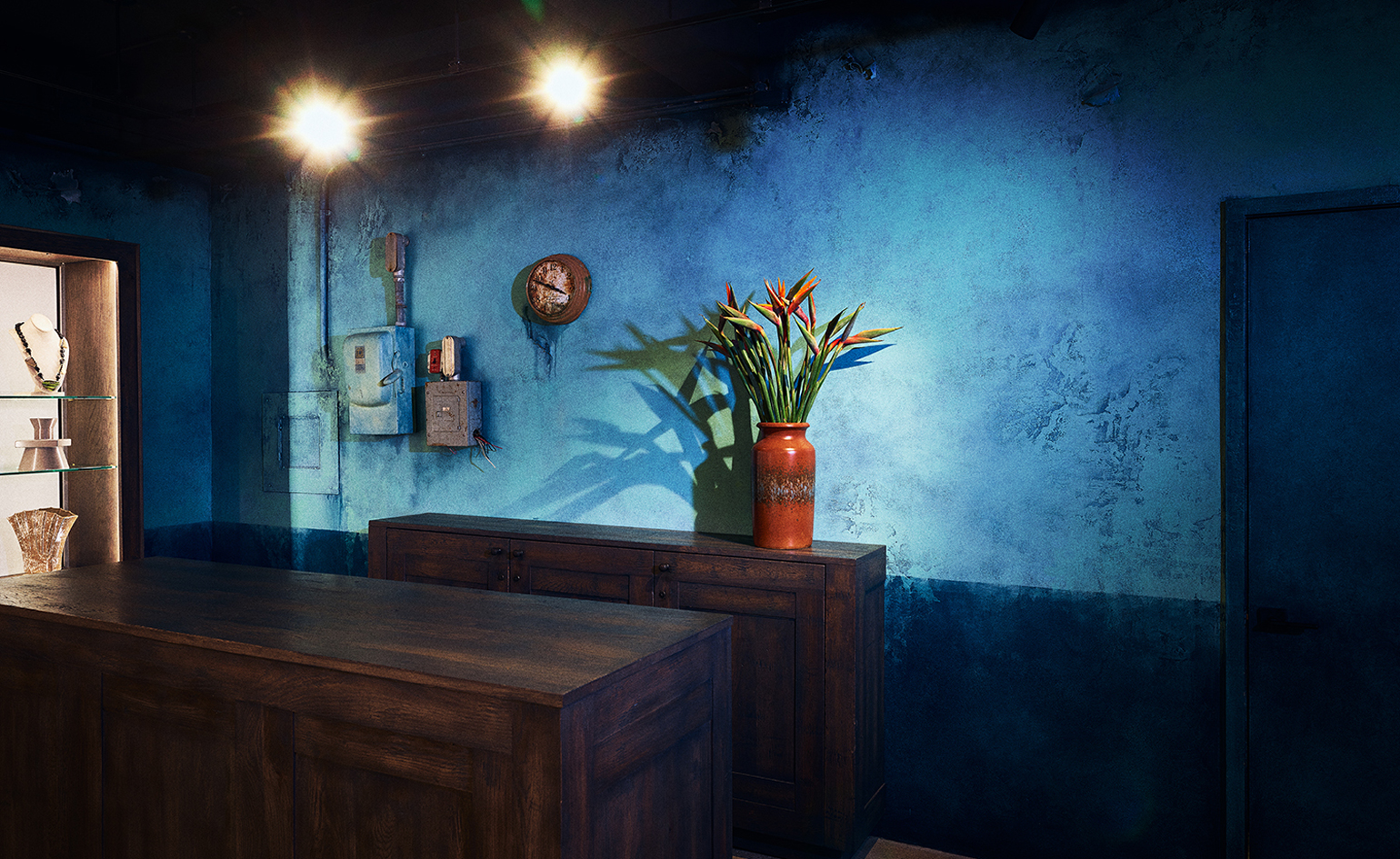
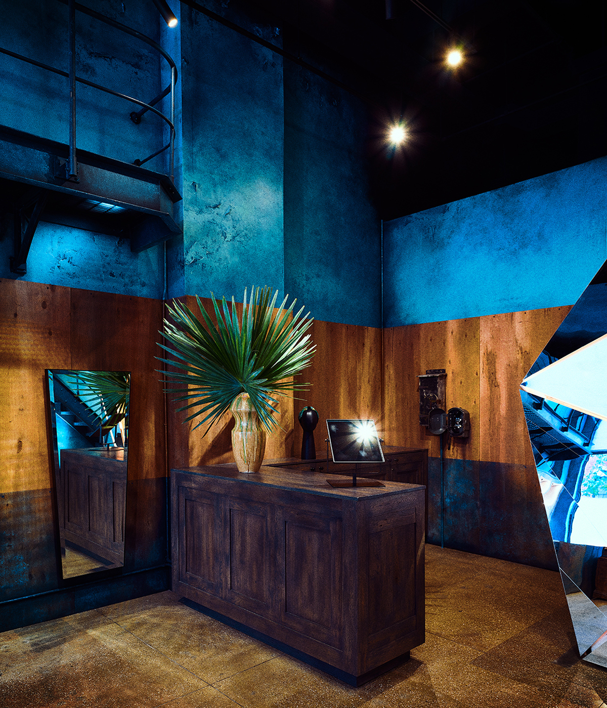
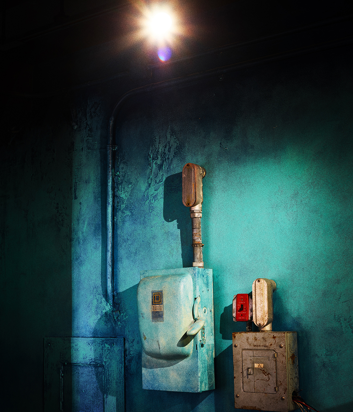
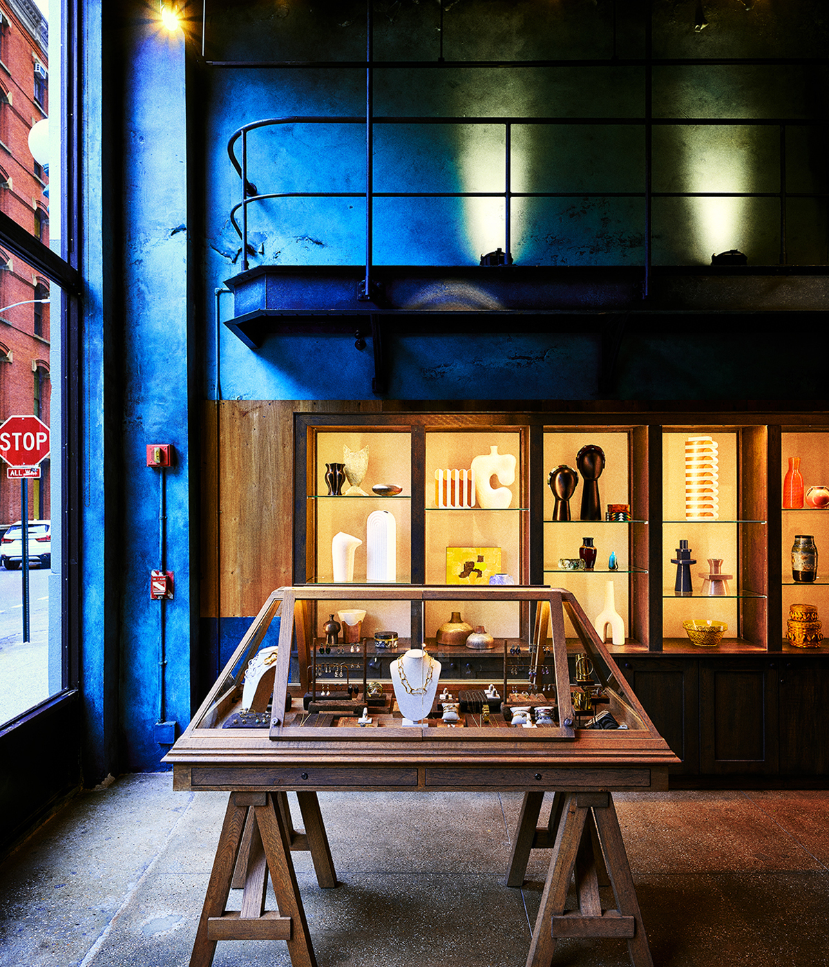
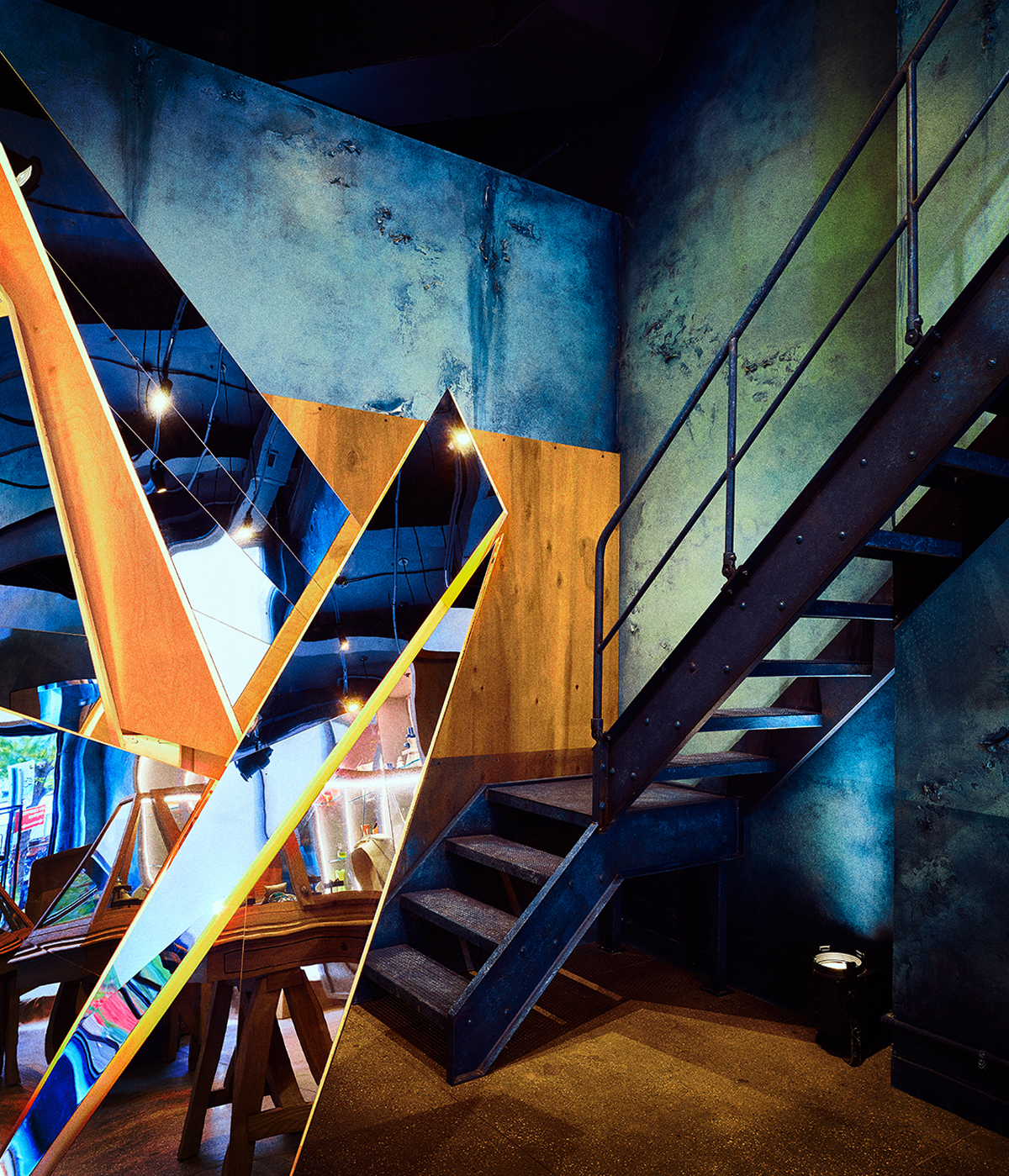
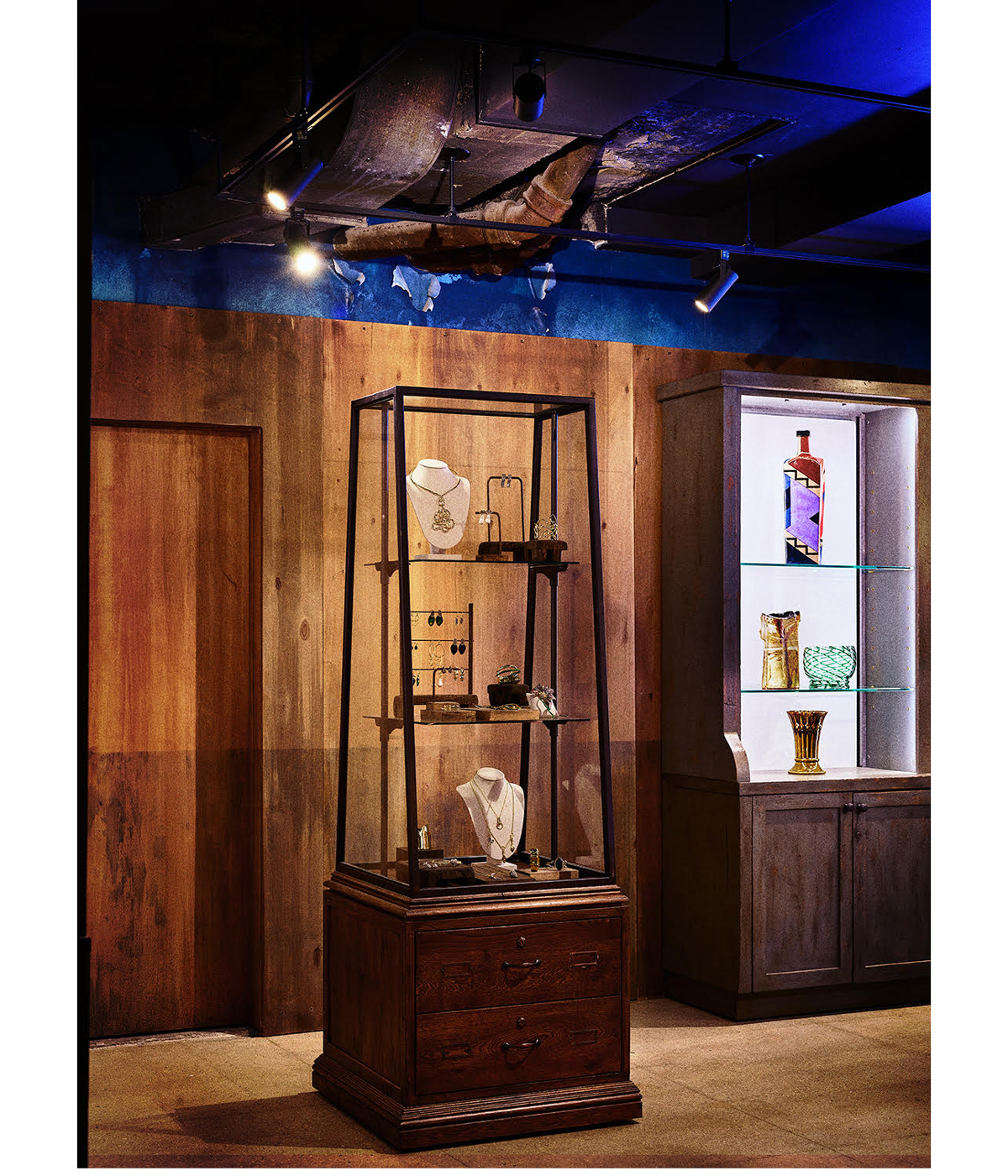
Alexis Bittar: The stores are an integral part of the image of the company, and I wanted to make them more interesting for customers and myself. I fell in love with the idea of mixing eras. Fusing the idea of the abandoned institution from the 1970s with a slice of forward-thinking from the future. I like the feeling of the store not seeming perfect, that there’s chipped paint on the wall and the custom jewellery cases are on saw horses. The store gives an emotive sense of comfort and complexity.
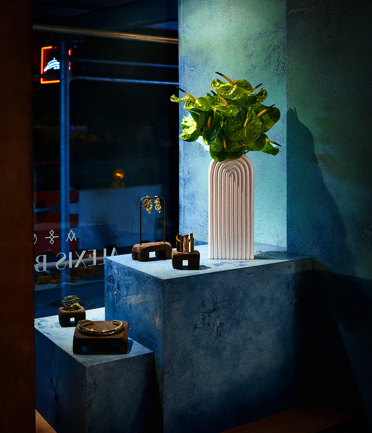
Scott Pask: Every detail supports the overall concept for the retail environments – spaces captured and utilised in their states of decay, abandonment, and disrepair, along with retro-futuristic elements layered within each space.
W*: Why was it important for you to create this bricks-and-mortar, in-store experience for jewellery customers?
AB: Stores give the customer an immersive experience they can’t get online. I believe that once the pandemic subsides, people will want to come out of their turtle shells and explore in an effervescent way. I think customers want to see and experience new things in all the arts.
W*: What mood did you want to create in the stores?
SP: I always think it’s important to start with the desired goals for the atmosphere – what is unique about it, and what will engage customers, and intrigue them. I have designed architectural projects for myself – a home in Tucson, my New York apartment – and consulted on others, and I’m constantly interested in exploring the potential of building materials and processes to create and enhance a mood.
Wallpaper* Newsletter
Receive our daily digest of inspiration, escapism and design stories from around the world direct to your inbox.
And I’m always interested in lighting, whether it’s natural or enhanced, its ability to transform a space throughout the day and evening, and how that can enhance one’s perception of a space.
W*: Are there items that you sourced or built that are your favourites? Are there different items in each store?
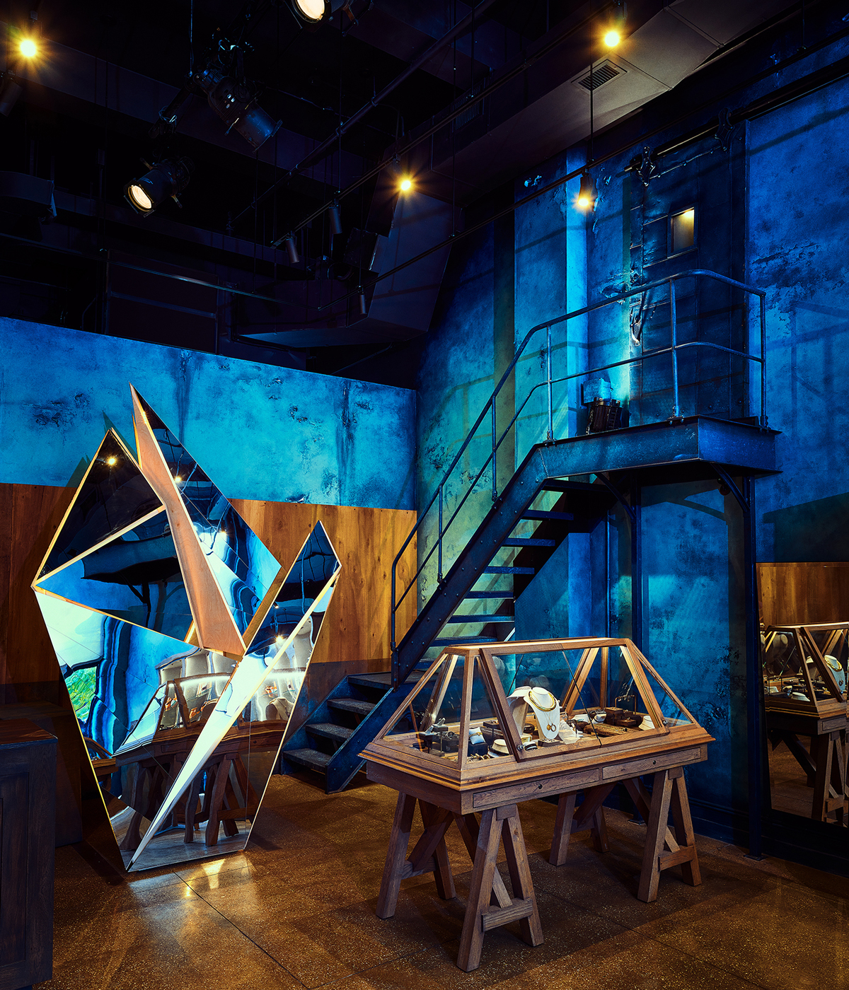
SP: I love the mirror sculptures a lot, and they are different in each location. In Court Street in Brooklyn, [the sculpture] reaches up to the tin ceiling then turns downward to avoid marring that surface. At Greenwich Street in Manhattan, it wraps a stained and aged volume of plywood that divides the space. Each of the mirror sculptures and the plywood walls were created by a theatrical fabrication company, Empire, which is used to very tight deadlines and excelled here in execution and timeline. I based the display vitrines’ shape on a display case that I found in a museum in Italy, and exaggerated its shape, and then propped them up on saw horses, so they have a temporary, almost improvised quality. I love how Alexis’ jewellery is displayed in these glass cases, in the way that antiquities and precious objects are showcased in a museum.
W*: How did you achieve that look of abandonment?
SP: Where we could preserve concrete floors with a little work, we did so – lightly grinding and buffing them to bring more prominence to the aggregate within. We chose a deep, saturated colour palette for the walls, and powerfully infused those surfaces with the passing of time. The walls in each location are all beautifully painted by an incredible team of artists from Scenic Art Studios, who work primarily on theatrical projects to create the spirit of decay and age. In the Columbus Avenue location, we even created the ghostly trace of a former staircase painted on the wall, as though it had been removed many years before.

W*: Alexis, how has the retail landscape changed since you opened your first store in 2004?
AB: The retail landscape has completely changed as of right now. It really started to change in 2015, the pandemic just intensified it. Customers saw no need to shop in stores if they were purely a white box with marble, with poor customer service and sales interactions. I think going forward, retailers need to up their game and provide immersive experiences that fit their brand, with great customer service and interesting products. What remains the same, I think, is the experience of someone wanting to check out for 30 minutes, walk into a store and lose themselves.
W*: Does your self-taught approach to jewellery design give you freedom and resilience in business and creativity? Without knowing the rule book, are there fewer restrictions?
AB: I think I struggled feeling insecure when I was younger because I didn’t have formal training. As an adult and seasoned designer, I found that I had more freedom and it came across in very different ways. One of them being the use of different materials, and understanding the intrinsic value was more important than the design aesthetic and the components, such as hand-sculpting lucite. Another example is the most recent ad campaign, with Ericka Hart, Sylke Golding and Kiara Marshall. Specifically with Ericka Hart, my impulse to not be afraid of being thought-provoking and showing a woman with a double mastectomy was such an automatic, intuitive feeling.


INFORMATION
Tilly is a British writer, editor and digital consultant based in New York, covering luxury fashion, jewellery, design, culture, art, travel, wellness and more. An alumna of Central Saint Martins, she is Contributing Editor for Wallpaper* and has interviewed a cross section of design legends including Sir David Adjaye, Samuel Ross, Pamela Shamshiri and Piet Oudolf for the magazine.
-
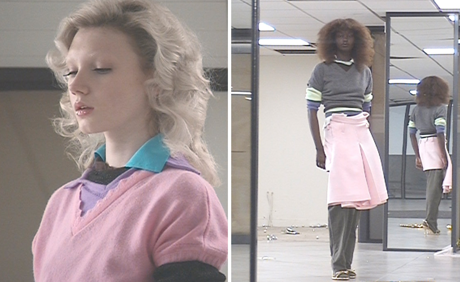 All-In is the Paris-based label making full-force fashion for main character dressing
Part of our monthly Uprising series, Wallpaper* meets Benjamin Barron and Bror August Vestbø of All-In, the LVMH Prize-nominated label which bases its collections on a riotous cast of characters – real and imagined
By Orla Brennan
-
 Maserati joins forces with Giorgetti for a turbo-charged relationship
Announcing their marriage during Milan Design Week, the brands unveiled a collection, a car and a long term commitment
By Hugo Macdonald
-
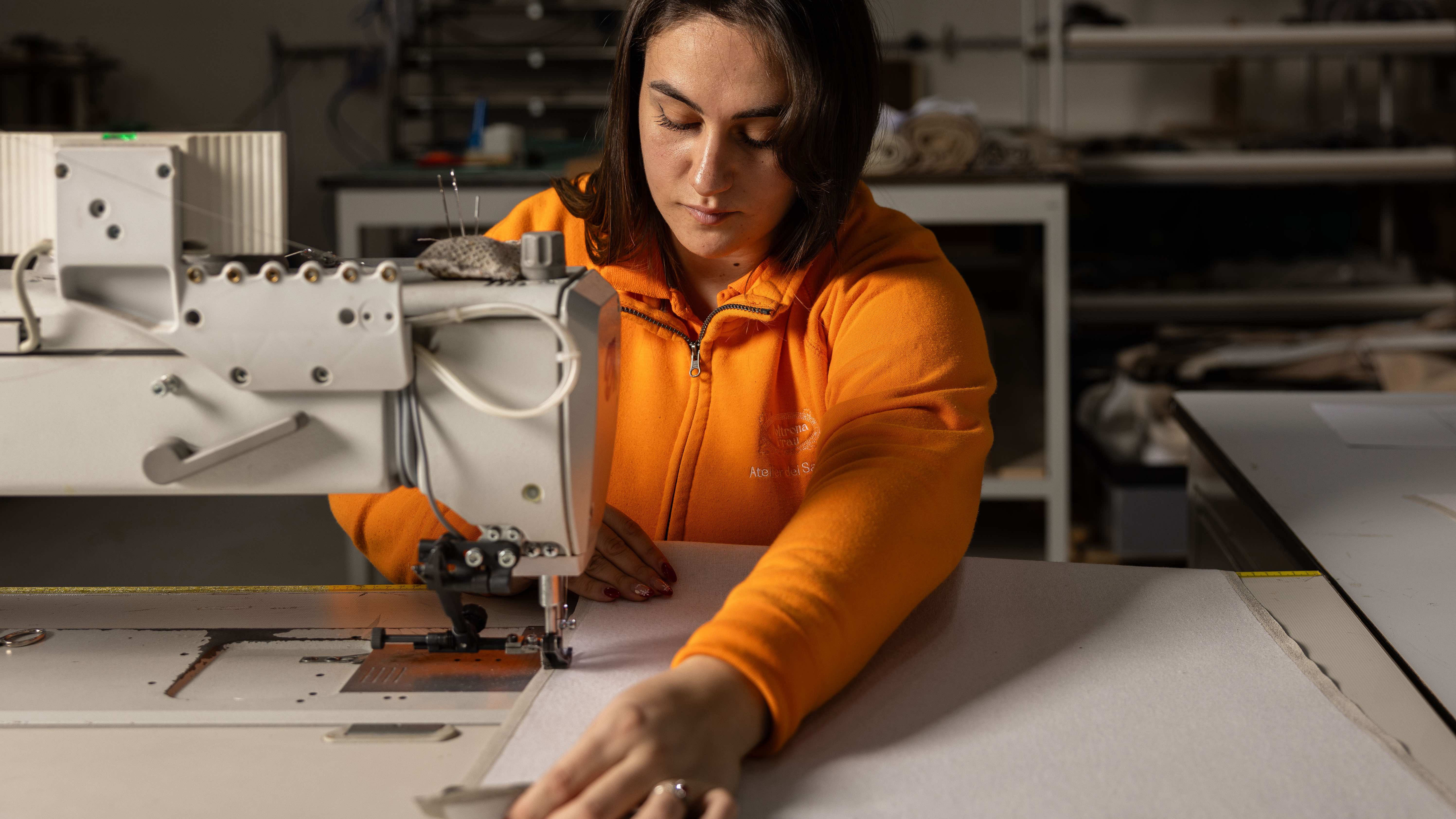 Through an innovative new training program, Poltrona Frau aims to safeguard Italian craft
The heritage furniture manufacturer is training a new generation of leather artisans
By Cristina Kiran Piotti