Get the glow: Eéra’s fine jewellery mixes neon with diamonds
Eéra’s new jewellery collection coats gold in matte black, and edges diamond pieces with a fluorescent piping

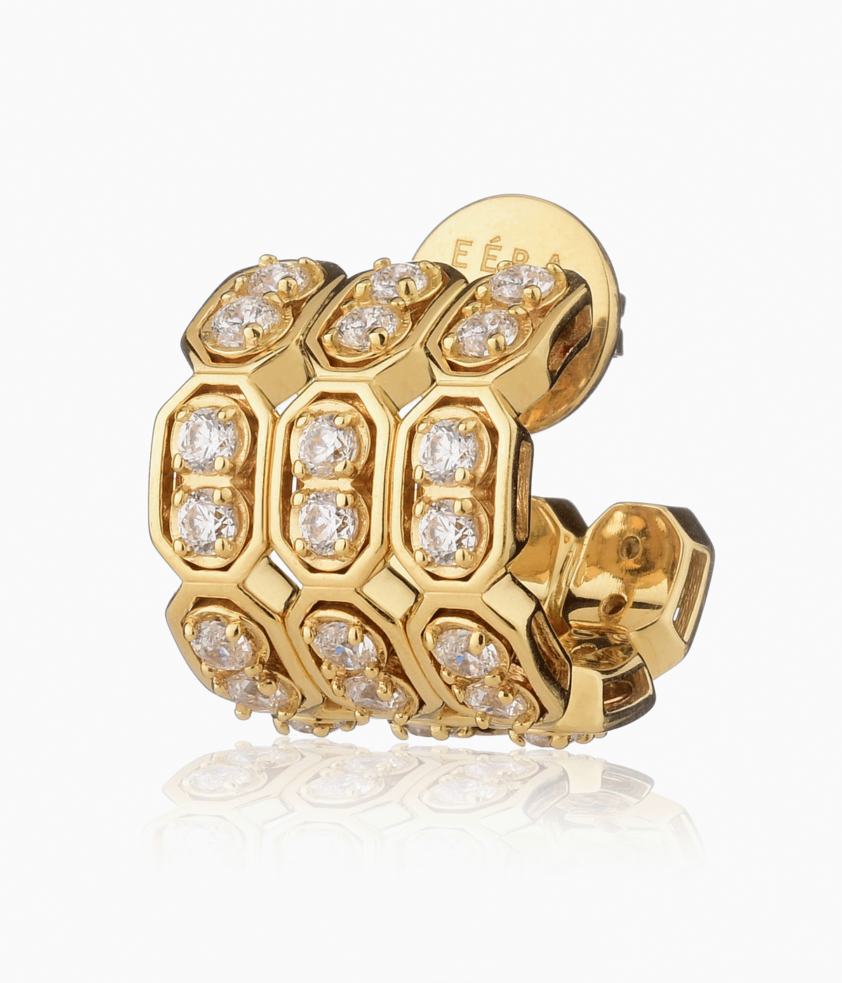
Italian fine jewellery brand Eéra experiments with bold colour combinations and mischievous motifs in its new jewellery collection. ‘We’ve incorporated colour into our work since the very beginning,’ note founders Chiara Capitani and Romy Blanga, acknowledging that they have always flirted with fluorescence. ‘At the start, we experimented with a variety of shades and really loved the way that the vibrant neon colours contrasted with the gold and diamonds. Since then we’ve been evolving our palette to include many more hues.’
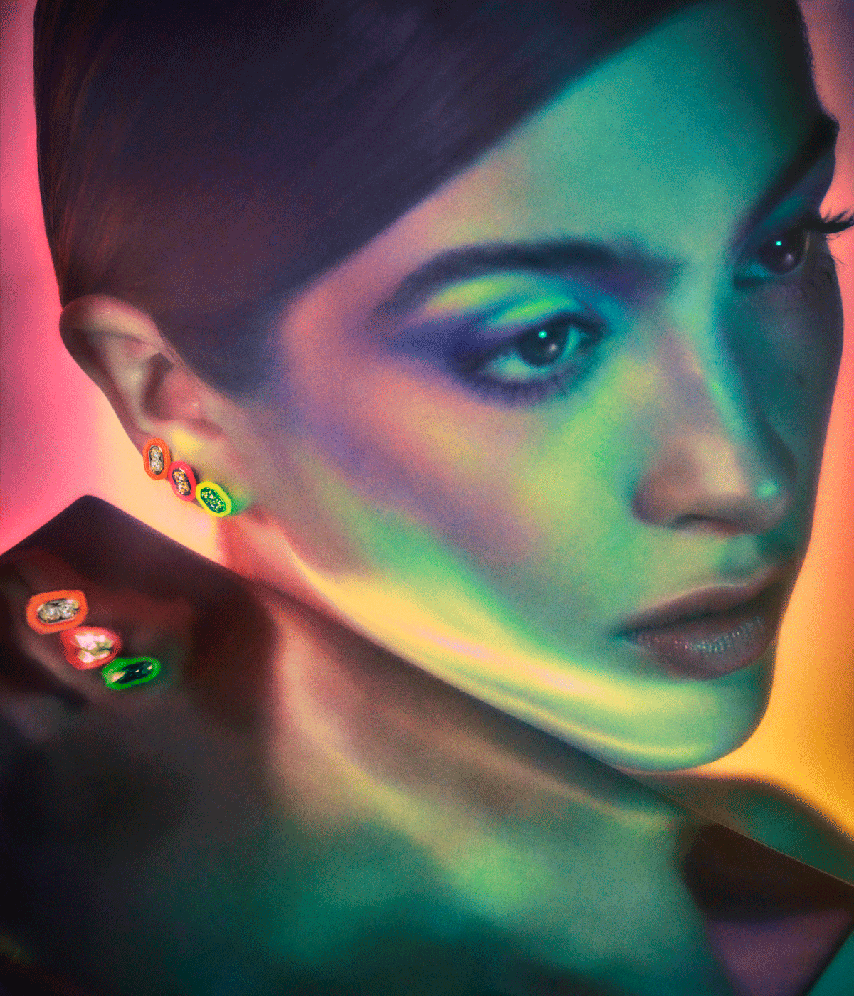
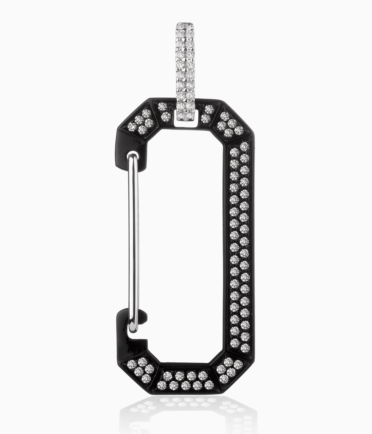
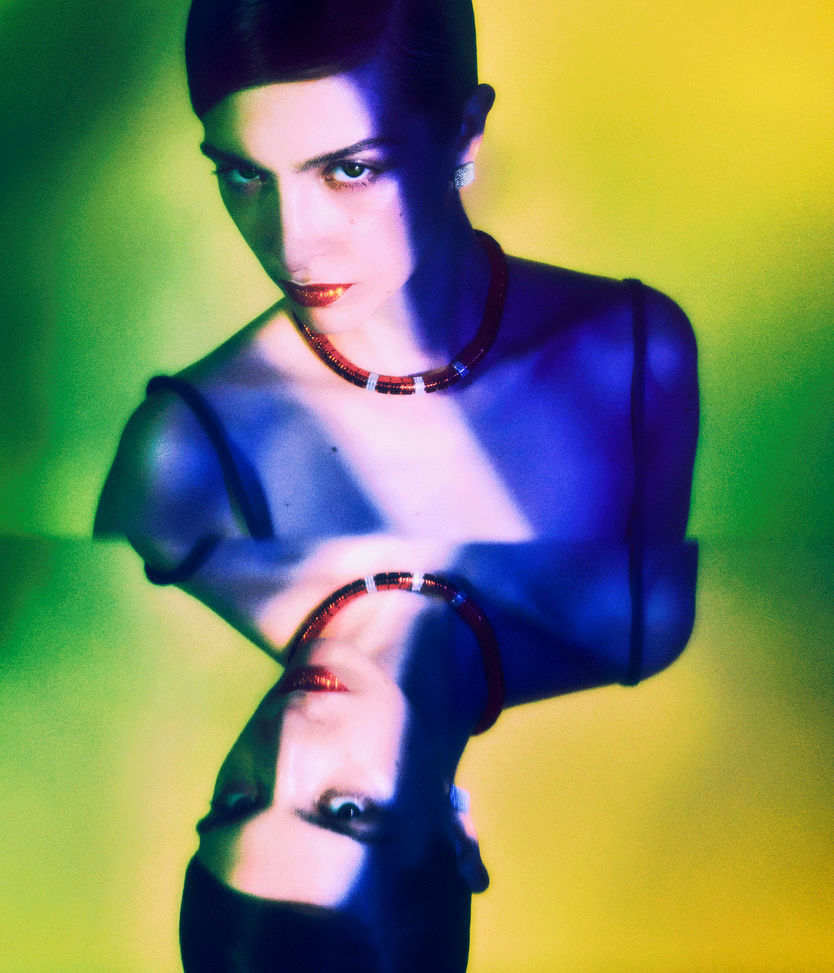
Precious materials are given a tough edge in new pieces that paint gold in matte black or outline ring links in vivid fluorescence. The new ‘Candy’ collection rethinks the natural formations of links, stacking them so they rest above your collarbone – although they appear immobile, they are designed as a fluid loop that hugs the curves of its wearer.
‘We wanted to design fine jewellery that combined both traditional and contemporary elements,’ the duo add. ‘So, we looked to create unexpected colour combinations and design pieces that can be customised. Many of our earrings have functioning hinges that allow the wearer to customise them according to their personal style.’
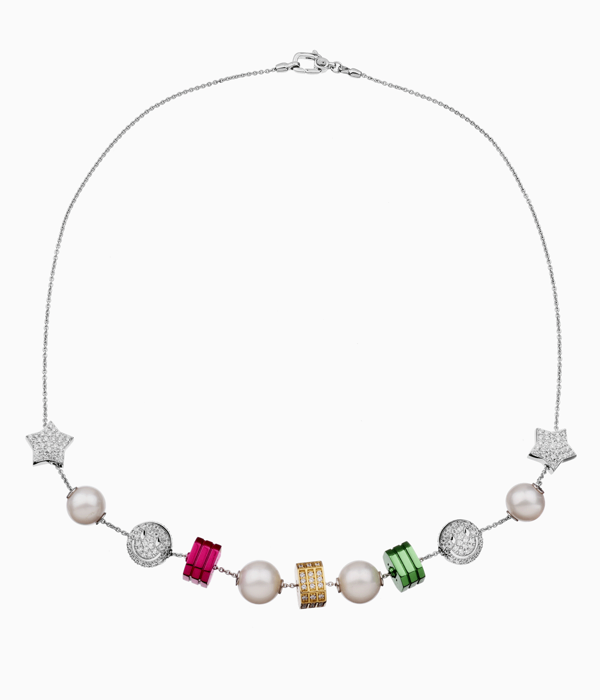
The snap hooks, which now come in a rainbow of colours, can be worn piled along the ear for maximum impact. Other pieces are more playful – think diamond-studded smiley faces and classic diamond studs embraced in thick and undulating curves of neon. In necklaces, tradition takes a backseat; irregularly strung pearls are interspersed with graphic neon forms on an unconventional pearl necklace, while the hinges on earrings invite endless customisation. Capitani and Blanga work closely with the design team to ensure the fluorescence perfectly zings, and the colours are a bold enough foil for the gleam of the precious metal.
‘We think of Eéra as having a graphic, utilitarian aesthetic,’ they say. ‘It is a culmination of our inspirations – a key one of that is traditional hardware. As a result, an angular design approach has come to define our pieces.’
INFORMATION
Wallpaper* Newsletter
Receive our daily digest of inspiration, escapism and design stories from around the world direct to your inbox.
Hannah Silver is the Art, Culture, Watches & Jewellery Editor of Wallpaper*. Since joining in 2019, she has overseen offbeat design trends and in-depth profiles, and written extensively across the worlds of culture and luxury. She enjoys meeting artists and designers, viewing exhibitions and conducting interviews on her frequent travels.
-
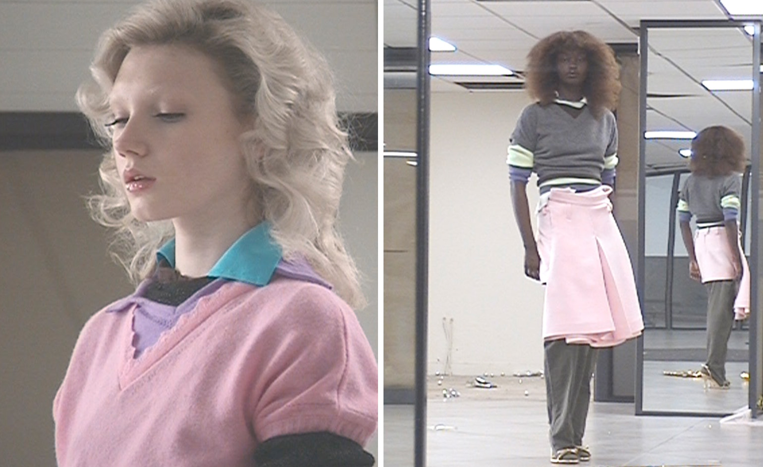 All-In is the Paris-based label making full-force fashion for main character dressing
Part of our monthly Uprising series, Wallpaper* meets Benjamin Barron and Bror August Vestbø of All-In, the LVMH Prize-nominated label which bases its collections on a riotous cast of characters – real and imagined
By Orla Brennan
-
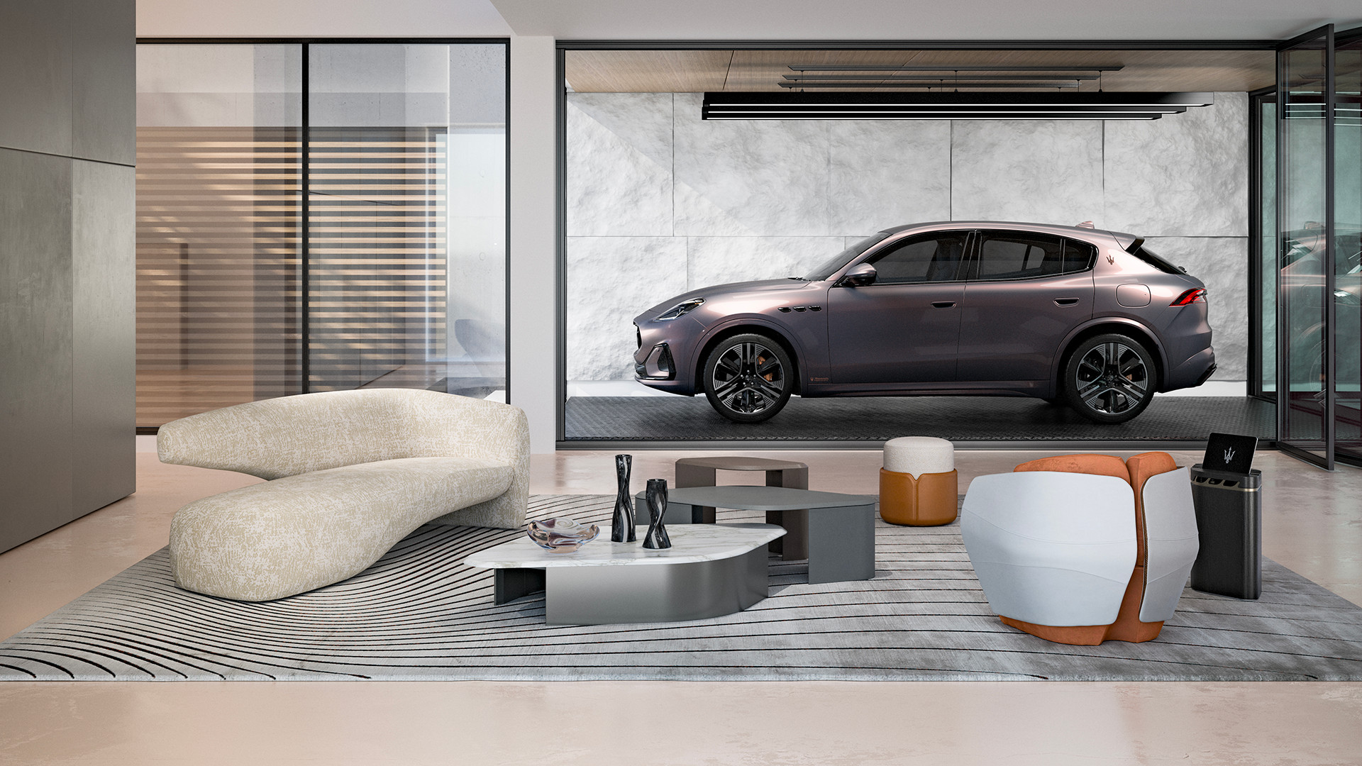 Maserati joins forces with Giorgetti for a turbo-charged relationship
Announcing their marriage during Milan Design Week, the brands unveiled a collection, a car and a long term commitment
By Hugo Macdonald
-
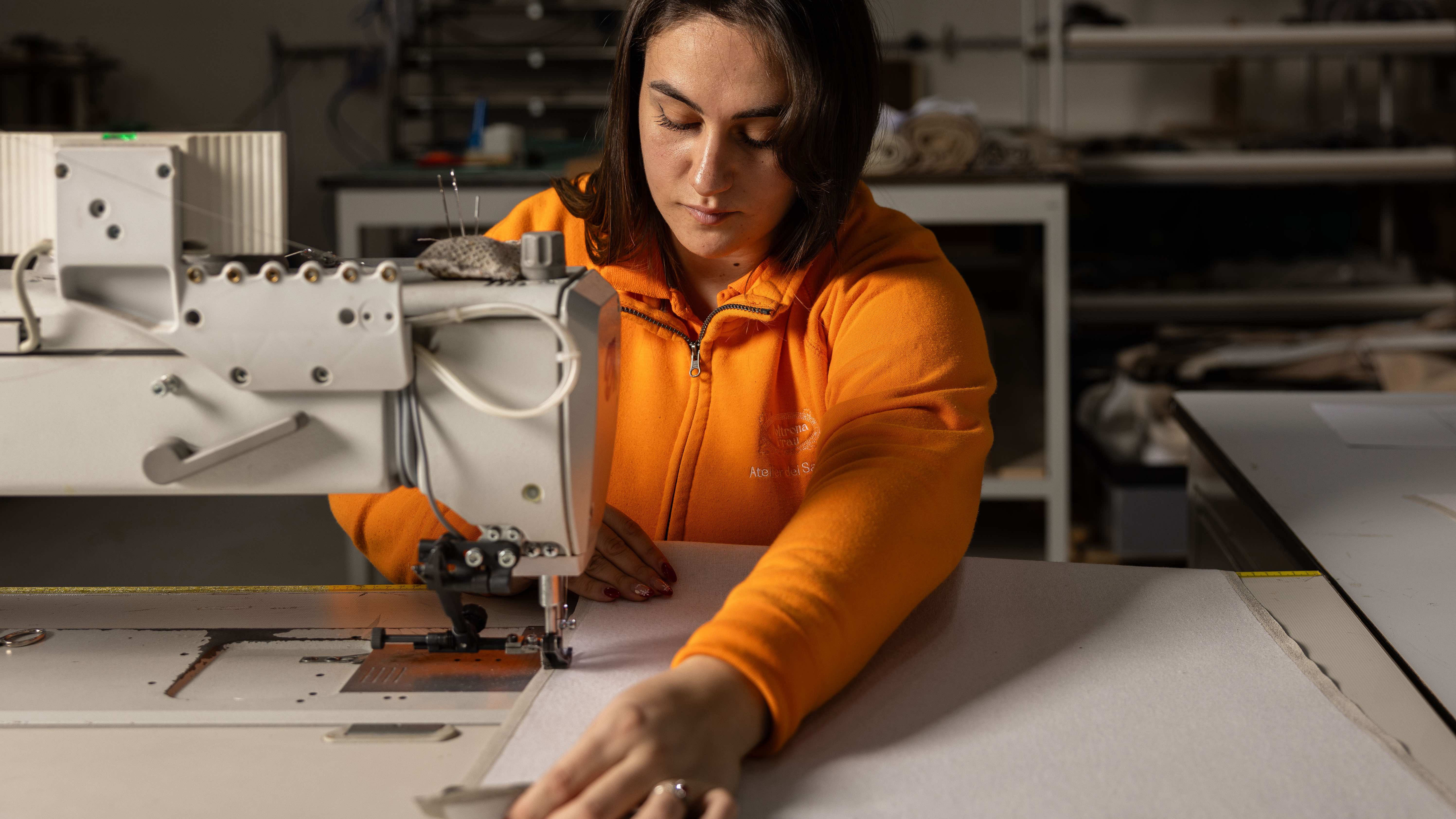 Through an innovative new training program, Poltrona Frau aims to safeguard Italian craft
The heritage furniture manufacturer is training a new generation of leather artisans
By Cristina Kiran Piotti