Wonder walls: how Van Cleef & Arpels stays ahead of the curve

Receive our daily digest of inspiration, escapism and design stories from around the world direct to your inbox.
You are now subscribed
Your newsletter sign-up was successful
Want to add more newsletters?
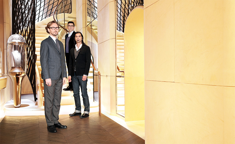
Architect-designers Patrick Jouin and Sanjit Manku have been defining the architectural character of the legendary French jewellery maison Van Cleef & Arpels since 2006, at the behest of the house’s president and creative director Nicolas Bos. This month, the ambition of this unique decade-long collaboration moves up a gear: a new flagship Van Cleef & Arpels boutique has just been unveiled at Place Vendôme, Paris, while the Jouin-Manku designed exhibition 'Van Cleef & Arpels – the Art of Science and Gems' opens at Singapore’s ArtScience museum.
We took a quick jaunt to Paris find out more about what makes their unique, decade-long partnership tick...
What sets the Jouin-Manku vision of modernity apart?
Nicolas Bos: I’d say that it is in the way Sanjit and Patrick have a strong signature but yet they don’t feel the need to apply that straight away. Here there are unexpected and different materials, colours and shapes that we did not use in previous boutiques.
Which design codes did you pick to reflect the evolution of Van Cleef & Arpels?
Sanjit Manku: There is almost no paint in this boutique. Instead we have focused on stone, cloth and wood: a 21st century stone with a unique identity; smoked oak, velvet cord on the walls, gold leaf and a soft colour palette. Our last Place Vendôme store for VCA made more use of wood and plaster. Sometimes we just do what we feel and add extra codes as we go. There is sequencing here, for instance: the front door leads to the staircase. We have to create chapters then, so as you move through, you get pulled in deeper.
Tell us about the starting point of your idea for the new boutique design?
Patrick Jouin: We designed it in a way that you can feel but you can’t see; approaching it as someone who knows nothing about Van Cleef & Arpels so that they have entered that world in the first few steps. There is an approach to identity that is specifically to provoke. Our design is an in-between mix – historical, modern and new – but without being ironic.
It sounds like the perfect mix…
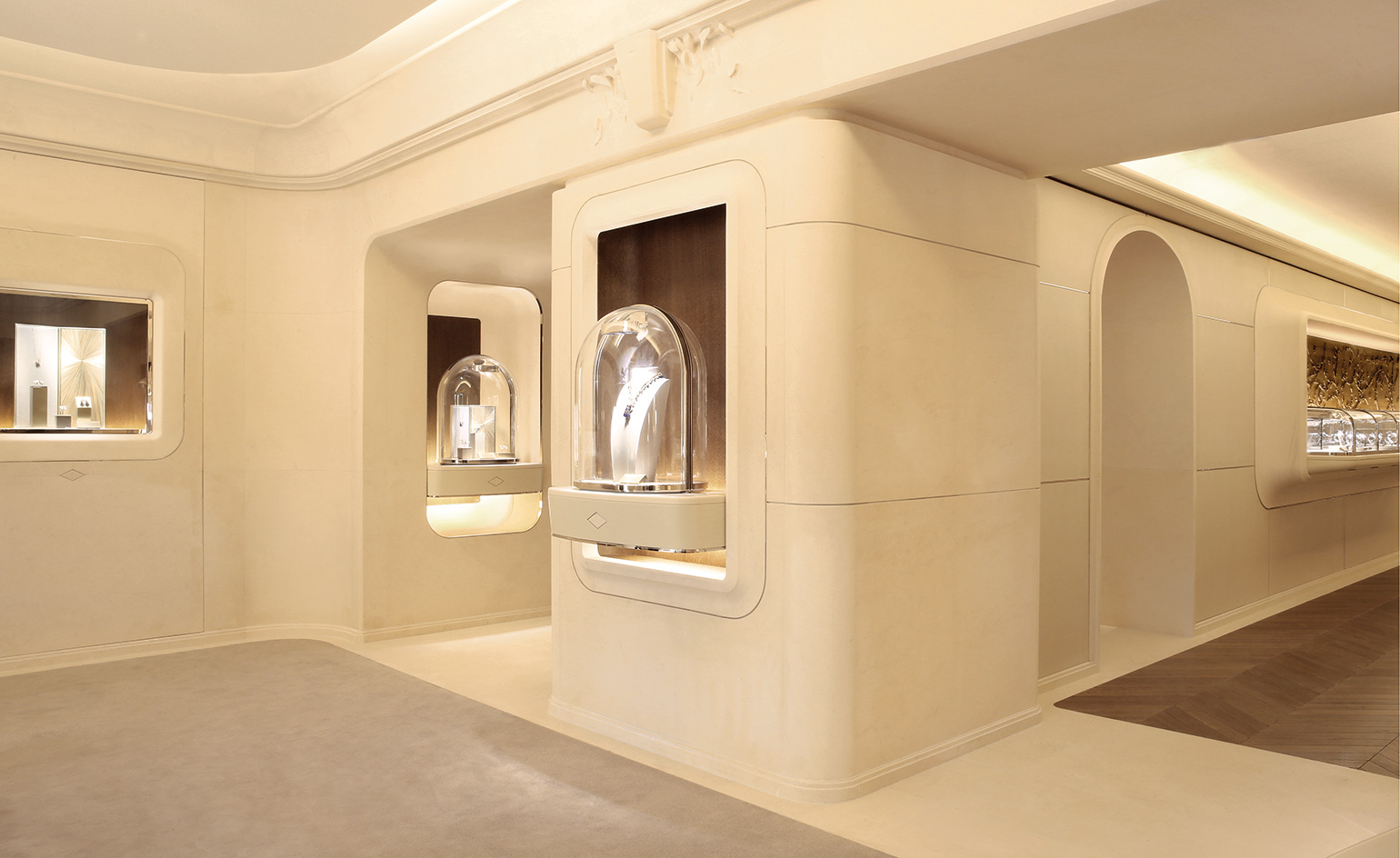
PJ: When you push the door you want to feel the history but then open to something modern. Luxury 10 years ago was all about branding – now it is all about quality. Because the Place Vendôme is a fusion of military and luxury – that’s its history – it results in a kind of emptiness and that made us decide to design the boutique like a domestic house. The tradition was reflected in our use of hard stone –the creamy, chalky limestone known as ‘the Stone of Paris’, which we reinterpreted it with the spirit of Van Cleef. So, when you walk in to the boutique, that vestibule leads you to grander floors; like the entrance to another world.
Do you create a master plan and adapt the design to suit different territories?
SM: We could replicate what we have done before in cities across the globe but when we design a new boutique we want to give people an individual gift. The atmosphere here is important and it’s our job is to create a feeling; to make people feel a certain way when they step out of the Place Vendôme and into the boutique.
How do you overcome the restrictions of light and scale to create new ways of displaying jewellery?
PJ: The expression of VCA pushes the limits of savoir-faire in everything. They have a rich culture; our job is to develop that culture.
SM: It takes energy and purpose to build to this spec, so it does not make sense to make the boutique a museum of VCA.
NB: Harmony. The starting point is scale. We are not selling handbags or clothes. Jewellery is small – the whole environment must serve that but still be harmonious and consistent. The idea is to create something strong and memorable without obvious factors. The private salon is like the family jeweller; personal – a democratic environment. We don’t want to impose a forest of contours and windows on them, so here we have neutral tones; soft shapes. It’s subtle; it’s the spirit of the house. This is a store; it’s a special store for the people who come here to make it their space.
As originally featured in the May 2016 issue of Wallpaper* Time Supplement (W*206)

The main showroom is clad in creamy Paris stone and defined by the smooth curved lines of the walls and glass vitrines

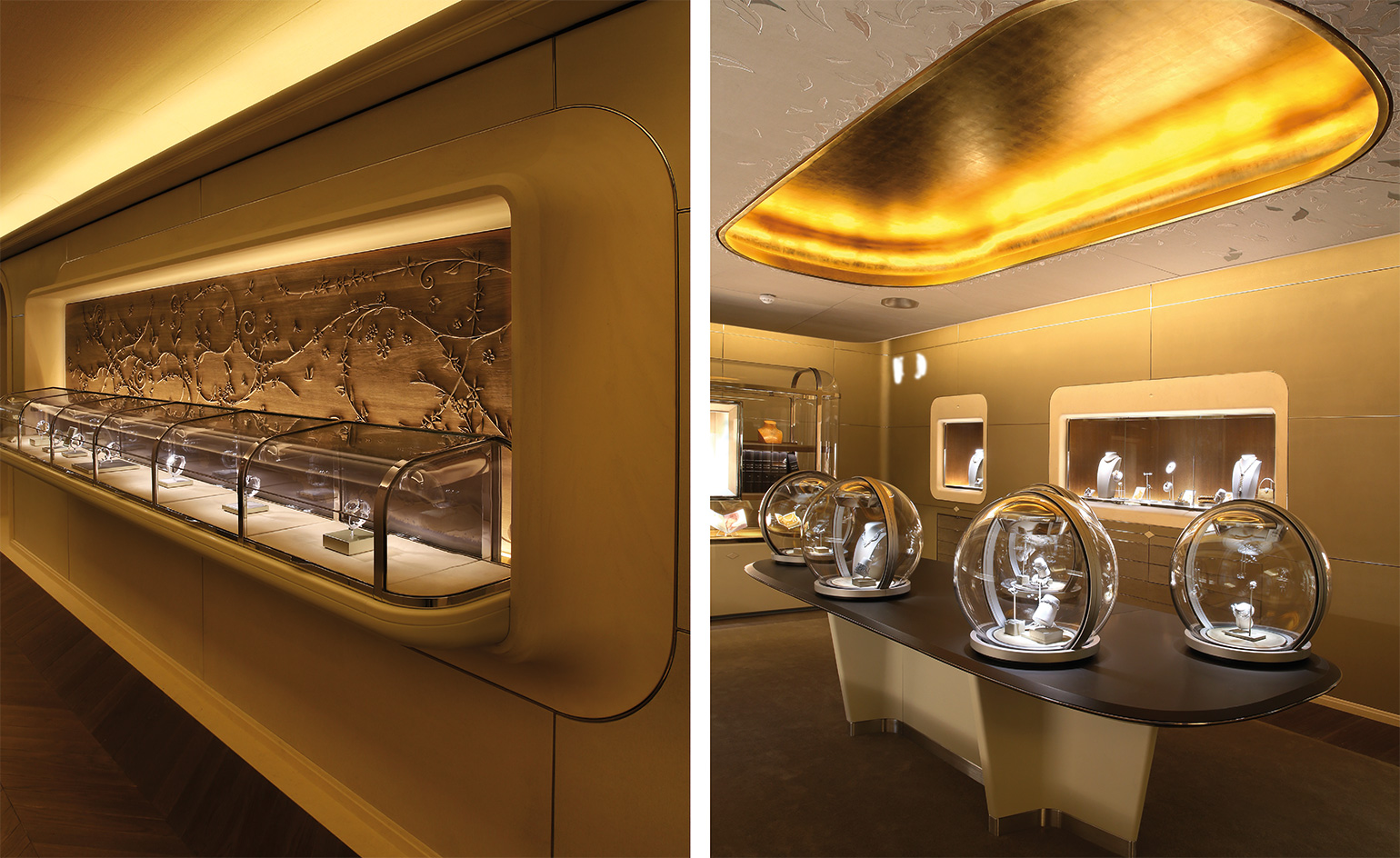
Pictured left: in the hallway, a cabinet with a carved floral relief houses Van Cleef & Arpels’ ’Complications Poétiques’ watch collection. Right: the room dedicated to heritage and specially curated exhibitions
INFORMATION
For more information, visit the Van Cleef & Arpels website
Receive our daily digest of inspiration, escapism and design stories from around the world direct to your inbox.
Caragh McKay is a contributing editor at Wallpaper* and was watches & jewellery director at the magazine between 2011 and 2019. Caragh’s current remit is cross-cultural and her recent stories include the curious tale of how Muhammad Ali met his poetic match in Robert Burns and how a Martin Scorsese Martin film revived a forgotten Osage art.