London bijou brand Studio Uribe joins Paris Fashion Week’s expanding jewellery showcase
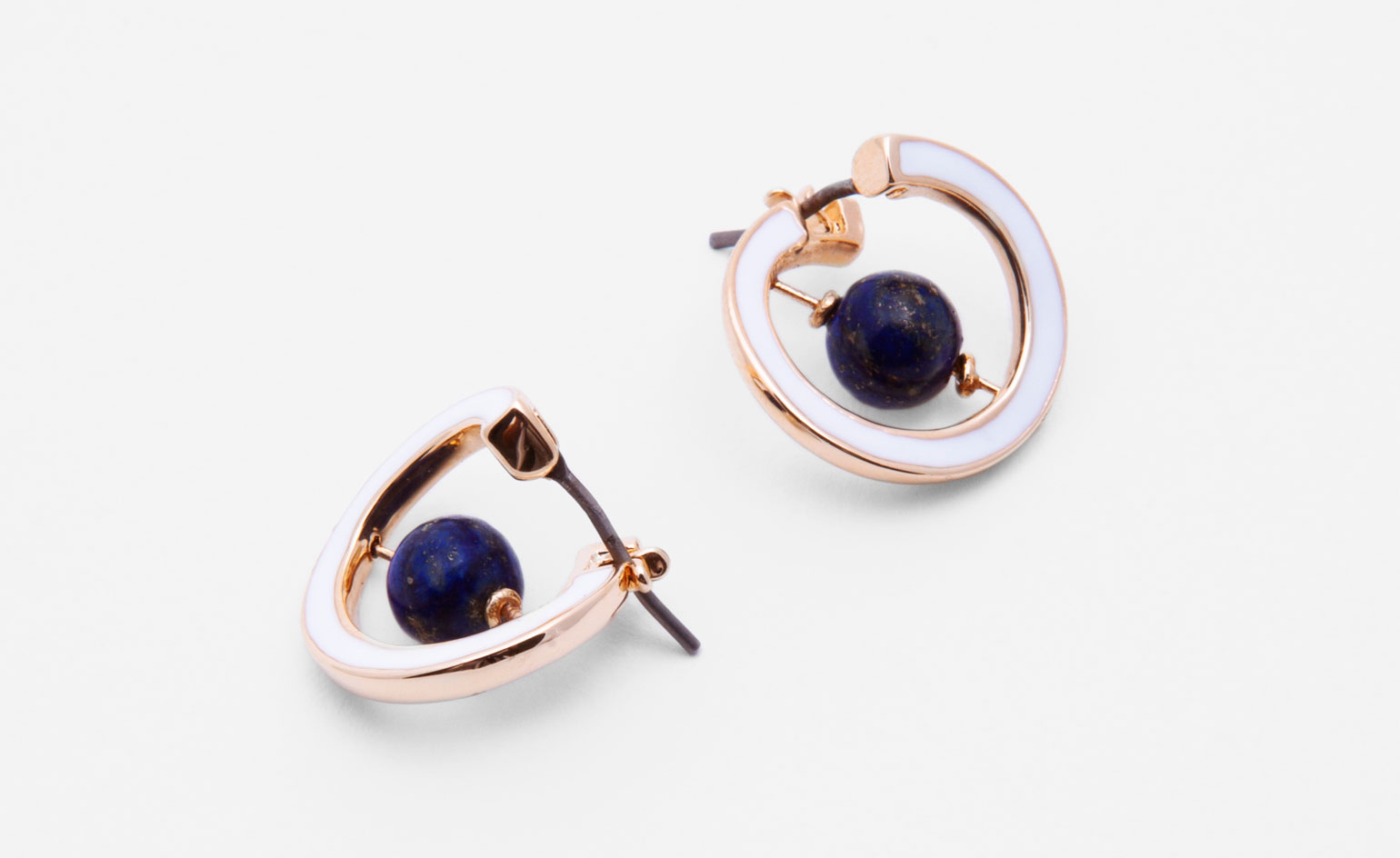
Conceived by partners Sion and Tiffany Phillips, jewellery brand Studio Uribe is a bold amalgamation of their respective upbringings in Wales and Chile, and of their professional backgrounds in advertising and fashion.
‘The starting point for our brand was to make a blend, a mélange of our tastes,’ says Tiffany, having decamped to Paris to present their latest collection during the show circuit. ‘We’re a couple, we’re both designers, and we have very different tastes. In a way, I’m very eccentric, while Sion is very graphic. The mix of those two is the foundation for Uribe.’
A look at the three previous Uribe collections that they’ve created seasonally over the past year and a half, reveal a focus on contrasts, movement and bold shapes, and a very conceptual approach to design.
Each collection starts with a list of the things that surround and influence them: from movies to music, to a colour picked up from a documentary. That list is then transformed into a private mood board on Pinterest. ‘We spend about three to four weeks doing that and fine-tuning exactly what our concept is going to be. This part is really the two of us together.’
Uribe’s S/S 2016 summer collection, though it involves colourful spherical designs and spinning beads much like the previous A/W 2015 collection, feels a lot more abstract than those space-inspired pieces. ‘This collection was a real departure from that,’ agrees Sion. ‘This is more grown up.’
Taking cues from Carol Bove and Barbara Hepworth sculptures, Tiffany and Sion explored the idea of dissecting their signature shapes. They returned to structural pieces that are functional, but are at the same time dynamic. Surprise tactile facets make sure there is always something to look at. An earring that is flat from the front reveals moving beads from the back; a bracelet hinge is an integral part of the design and the toggle fastenings at the back of Uribe necklaces are unique, identifiable elements of the Uribe aesthetic.
‘You have to look a bit closer to see the details. We want to keep the decoration hidden. It’s like when you buy a beautiful jacket and you look inside and the lining is really something else. That’s design,’ continues Tiffany. ‘You really want to take each piece and consider every corner, every millimetre.’
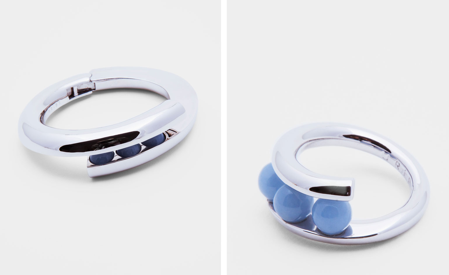
Each collection starts with a list of the things that surround and influence them: from movies to music, to a colour picked up from a documentary. Taking cues from Carol Bove and Barbara Hepworth sculptures, the pair explored the idea of dissecting their signature shapes for S/S 2016
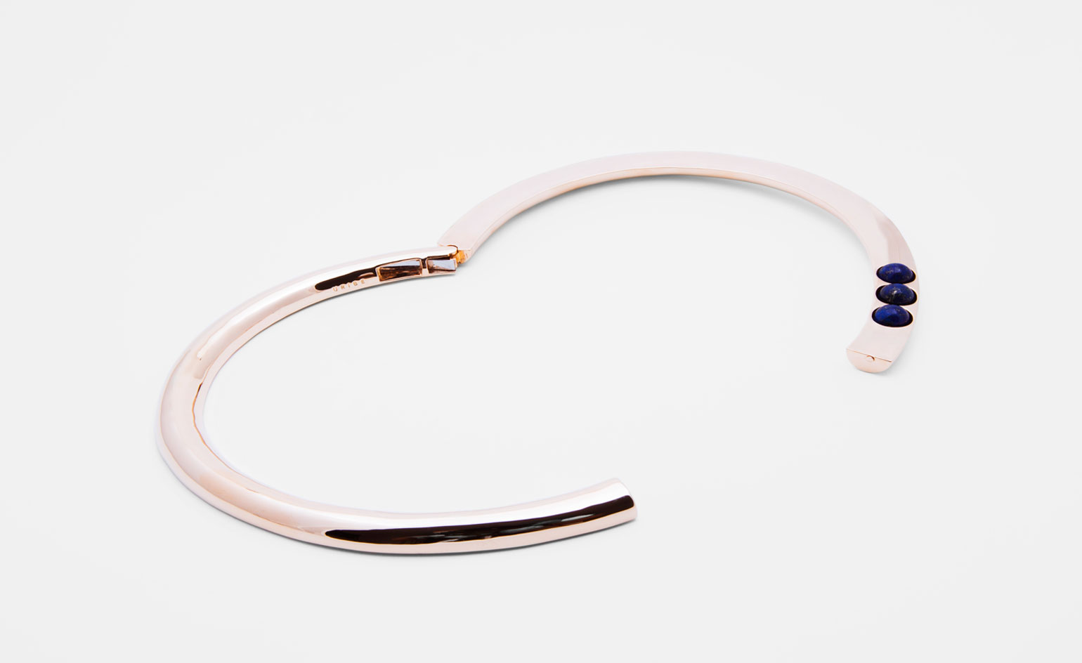
‘You have to look a bit closer to see the details. We want to keep the decoration hidden. It’s like when you buy a beautiful jacket and you look inside and the lining is really something else. That’s design,’ says Tiffany. ‘You really want to take each piece and consider every corner, every millimetre’
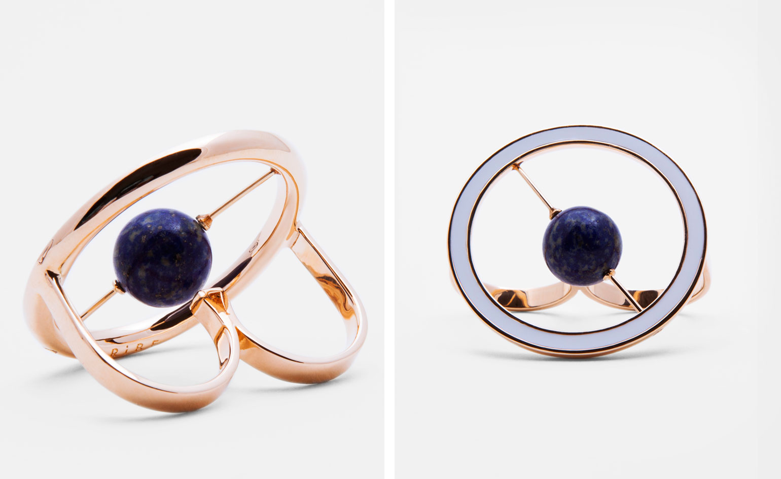
Central to Uribe’s oeuvre are colourful spherical designs and spinning beads
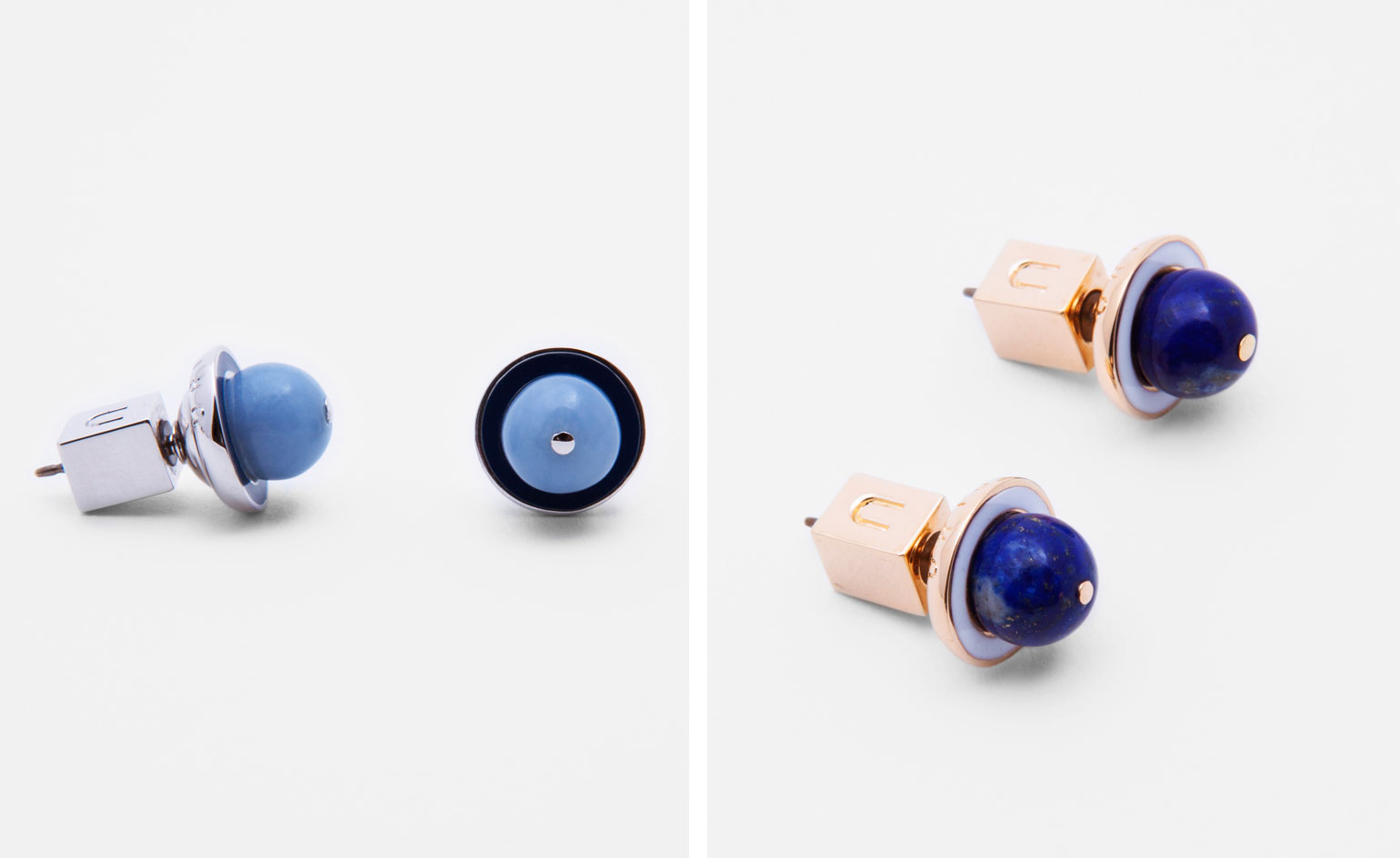
The jewellery brand is a bold amalgamation of the duo's respective upbringings in Wales and Chile, and of their professional backgrounds in advertising and fashion
Wallpaper* Newsletter
Receive our daily digest of inspiration, escapism and design stories from around the world direct to your inbox.
Siska Lyssens has contributed to Wallpaper* since 2014, covering design in all its forms – from interiors to architecture and fashion. Now living in the U.S. after spending almost a decade in London, the Belgian journalist puts her creative branding cap on for various clients when not contributing to Wallpaper* or T Magazine.
-
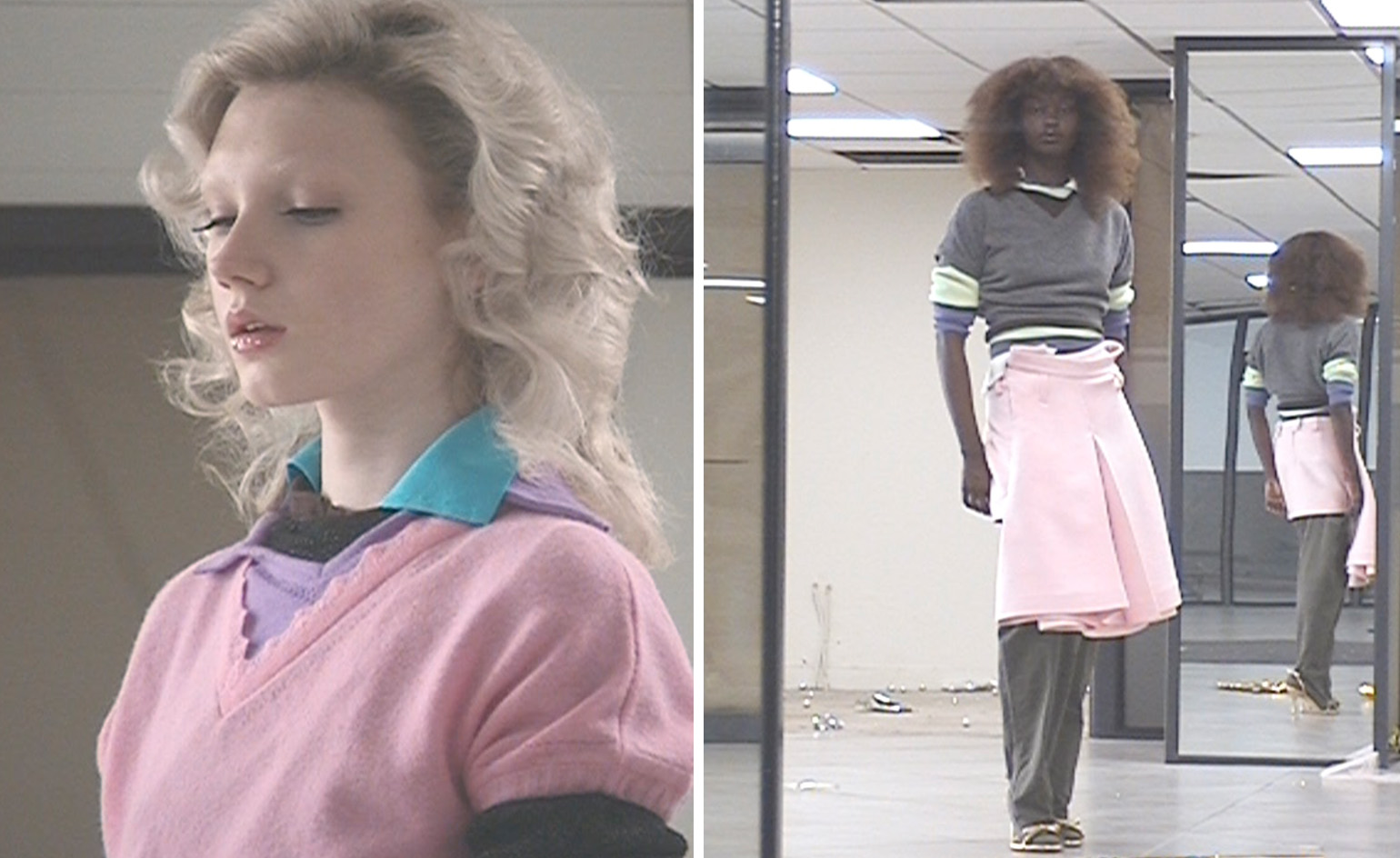 All-In is the Paris-based label making full-force fashion for main character dressing
Part of our monthly Uprising series, Wallpaper* meets Benjamin Barron and Bror August Vestbø of All-In, the LVMH Prize-nominated label which bases its collections on a riotous cast of characters – real and imagined
By Orla Brennan
-
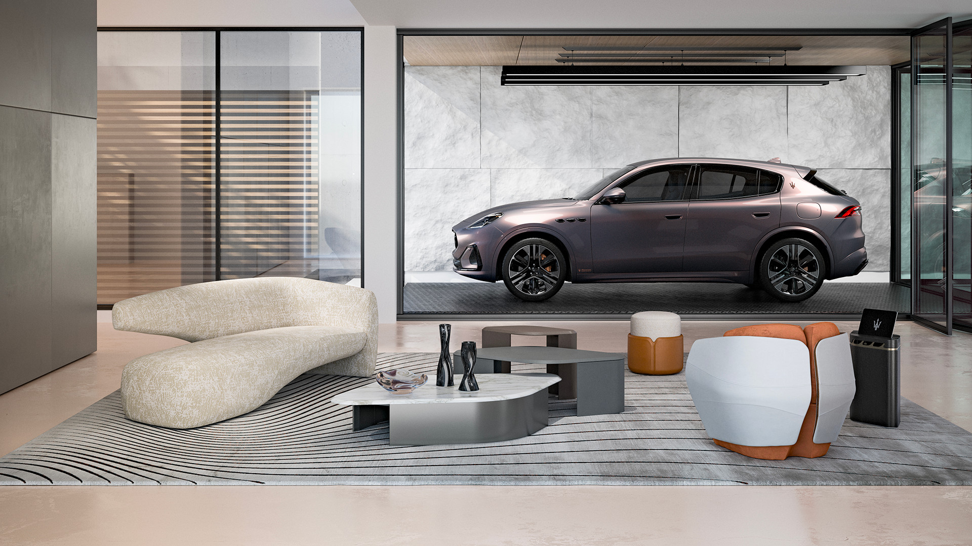 Maserati joins forces with Giorgetti for a turbo-charged relationship
Announcing their marriage during Milan Design Week, the brands unveiled a collection, a car and a long term commitment
By Hugo Macdonald
-
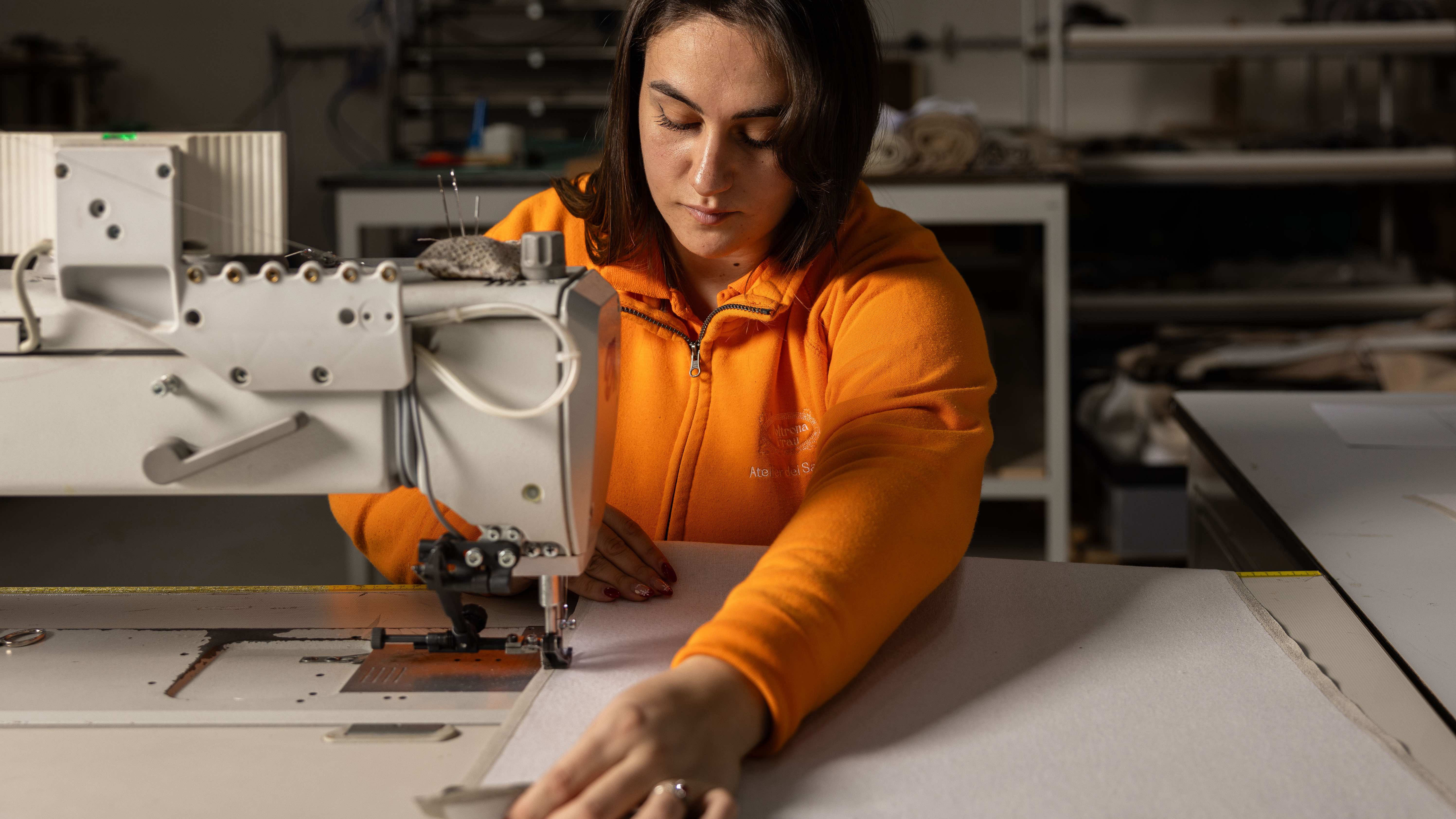 Through an innovative new training program, Poltrona Frau aims to safeguard Italian craft
The heritage furniture manufacturer is training a new generation of leather artisans
By Cristina Kiran Piotti