Tej Chauhan’s new ceramic watch for Rado feels ‘liquid soft’
The Rado True Square by Tej Chauhan in matt yellow explores the industrial designer’s futuristic visions of pop culture
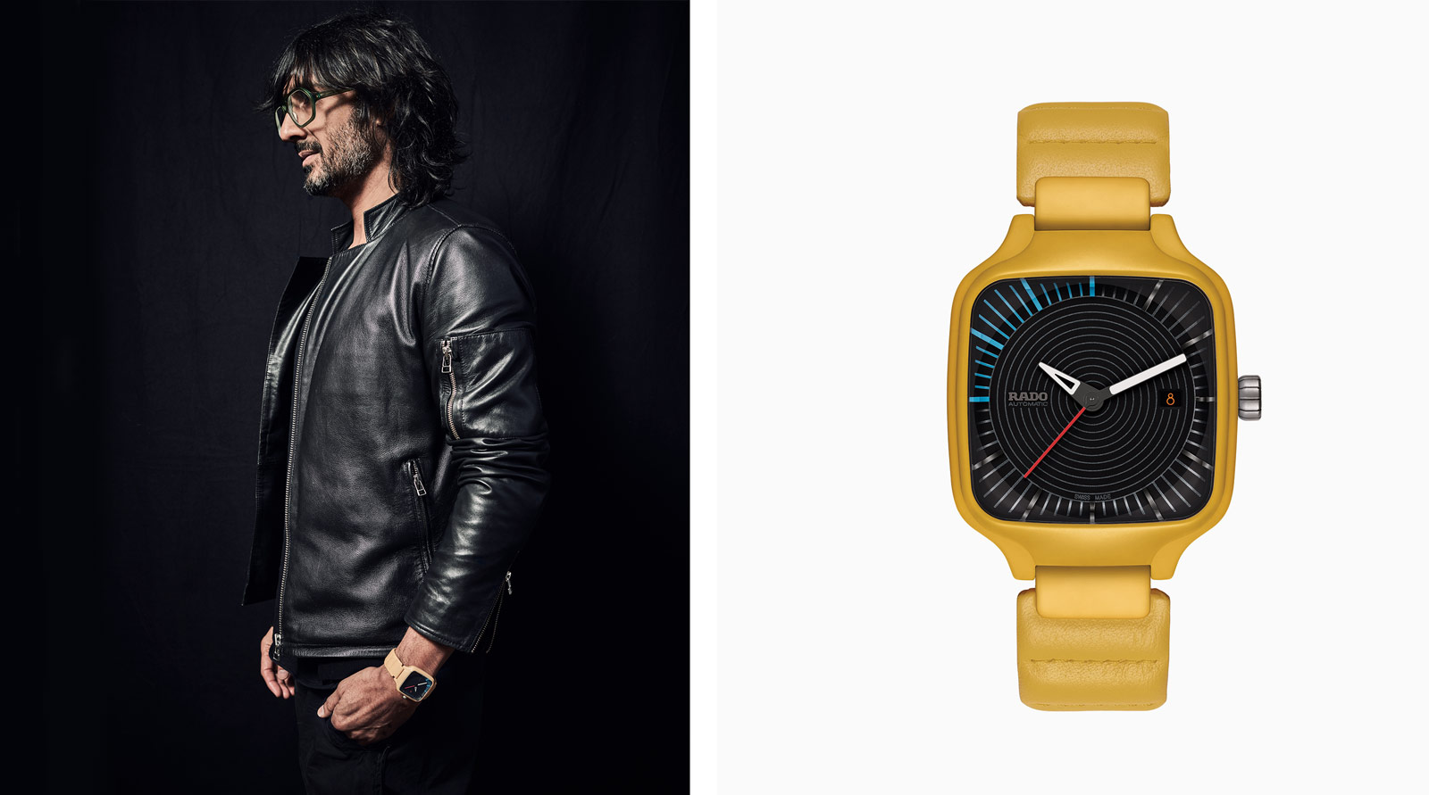
British industrial designer Tej Chauhan is the latest designer to collaborate with Rado; a natural choice, his often futuristic vision aligns with Rado’s design-first philosophy. Together with Rado, he has explored ideas of what the ‘new future’ could entail for the True Square watch, the first square timepiece to be made from high-tech ceramic. Here, he reveals what inspired him.
Wallpaper*: You are adept at recognising how good design can alter moods as well as efficiency, and effortlessly incorporate faultless functionality into this. How have you translated this philosophy to a watch?
Tej Chauhan: Function and insight are core to our design approach. The objective is always to create a joyful experience; to look at, to touch, and in function. In the case of the Rado True Square Tej Chauhan, I wanted the watch to engage one's attention visually, and then to feel amazing when picked up and worn. The padded leather strap is tactile and the rear case of the watch is designed to feel ‘liquid soft’; these qualities, combined with the unique lightness of the ceramic, complete this ‘trinity’.
W*: You have worked on a wide assortment of domestic, practical and technical items. What is it about watches specifically that appeal to you?
TC: These days we don't need watches to tell the time. It's a choice. I have always worn a watch, and I like the fact that it has been crafted for one clear purpose; the rest is about expression. It's a personal object, something which doesn't require a software update and that will never become obsolete – it will always have purpose. It may be cliche, but one day I will pass my watches on, in the knowledge that they will always have relevance and the additional benefit of being enriched by a past story.
W*: Where did the inspiration for the font on the watch face come from?
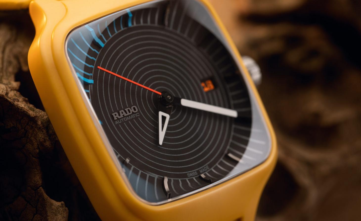
TC: The font on the date dial is actually part of the Tej Chauhan Ltd visual identity; it's part of our bespoke dynamic typeface. I chose to use it here as the numerals are all different, and the combinations lend a dynamic yet dependable energy. It's a pure expression of my studio.
W*: Why did the bold colour choice appeal to you?
TC: I wanted the collaboration to focus on two things: expression and communication. I wanted the watch to be distinctive, to draw attention, in order to present an opportunity to tell the story of Rado's high tech ceramic. The use of colour was core to this, and is a tool of our ‘Emotive Industrial Design’ approach. I loved this particular shade of mustard yellow, as it fits my classic sci-fi references and has a timeless expressiveness.
W*: How have you linked your own distinctive aesthetic with Rado’s?
TC: Our work combines our partner's DNA with our own – we calculate a balance in order to tell the right story. With our collaboration with Rado, the True Square case was a strong DNA element. We wanted to complement this with our Emotive Industrial Design approach in a way which would enhance and compliment both sides to create one holistic story, combining tradition, technology and feeling.
Wallpaper* Newsletter
Receive our daily digest of inspiration, escapism and design stories from around the world direct to your inbox.
Information
The True Square Tej Chauhan watch will be unveiled during Rado Virtual Design Week from 30 November – 4 December. Register for more information and to hear about the availability of the watch in late November from rado.com/en_gb
Hannah Silver is the Art, Culture, Watches & Jewellery Editor of Wallpaper*. Since joining in 2019, she has overseen offbeat design trends and in-depth profiles, and written extensively across the worlds of culture and luxury. She enjoys meeting artists and designers, viewing exhibitions and conducting interviews on her frequent travels.
-
 Tour the best contemporary tea houses around the world
Celebrate the world’s most unique tea houses, from Melbourne to Stockholm, with a new book by Wallpaper’s Léa Teuscher
By Léa Teuscher
-
 ‘Humour is foundational’: artist Ella Kruglyanskaya on painting as a ‘highly questionable’ pursuit
Ella Kruglyanskaya’s exhibition, ‘Shadows’ at Thomas Dane Gallery, is the first in a series of three this year, with openings in Basel and New York to follow
By Hannah Silver
-
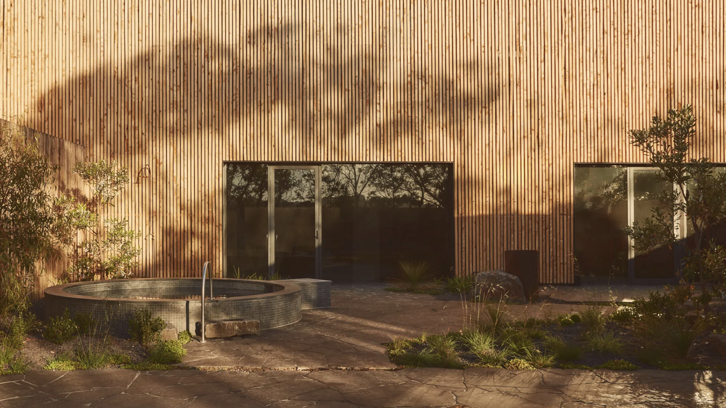 Australian bathhouse ‘About Time’ bridges softness and brutalism
‘About Time’, an Australian bathhouse designed by Goss Studio, balances brutalist architecture and the softness of natural patina in a Japanese-inspired wellness hub
By Ellie Stathaki
-
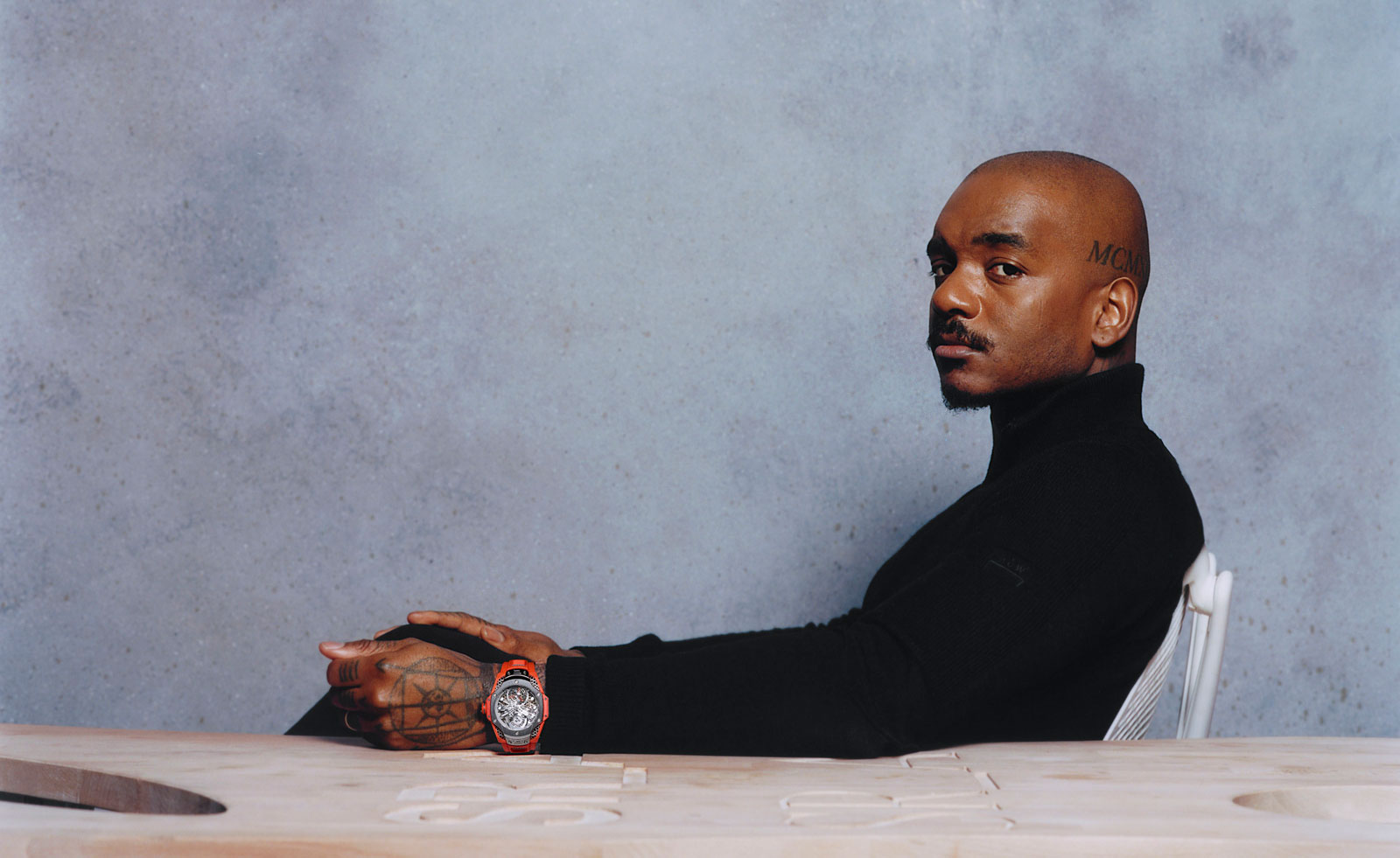 Samuel Ross unveils his Hublot Big Bang watch design
Samuel Ross brings a polished titanium case and orange rubber strap to the Hublot Big Bang watch
By Pei-Ru Keh
-
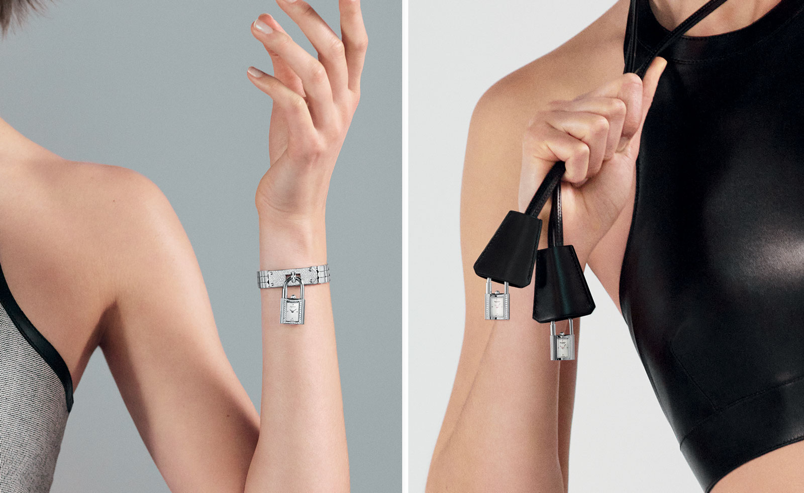 Playful design meets chic heritage in the Hermès Kelly watch
The new Kelly watch from Hermès rethinks the original 1975 timepiece
By Hannah Silver
-
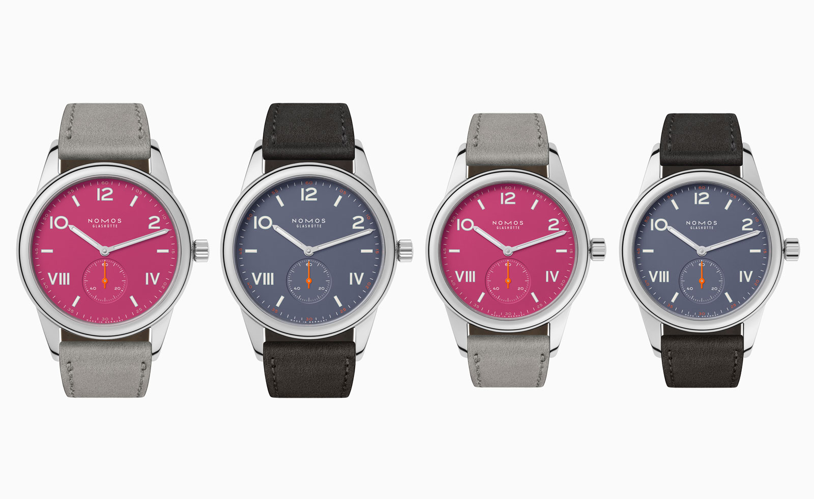 Discover the tonal new hues of the classic Nomos Club Campus watch
The Nomos classic wristwatch Club Campus now comes in two new collegiate colours. The perfect graduation gift from the Glashütte manufacture
By Hannah Silver
-
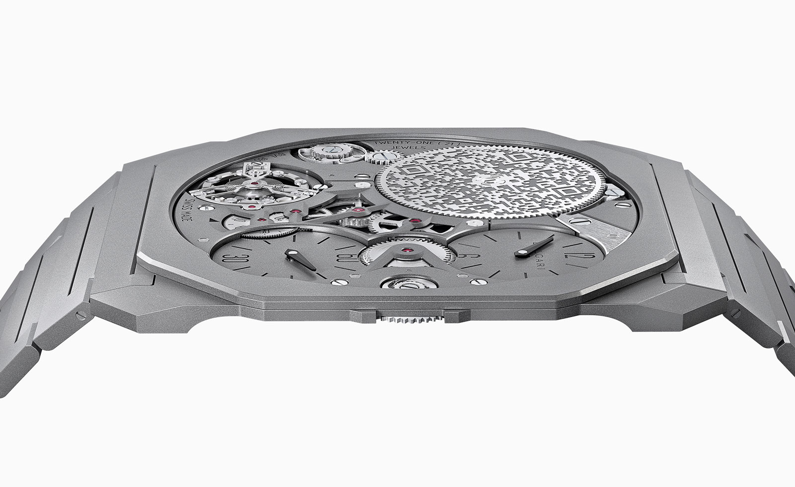 Bulgari unveils the thinnest mechanical watch in the world
The new Bulgari Octo Finissimo Ultra watch is a record-breaking feat of engineering
By Hannah Silver
-
 Breitling and Triumph unite on a racy new watch and motorcycle
1960s design codes are infused with a contemporary edge in the collaboration between Breitling and Triumph
By Hannah Silver
-
 Gerald Genta’s mischievous Mickey Mouse watch design is rethought for a new era
The Gerald Genta Retrograde with Smiling Disney Mickey Mouse watch pays tribute to Genta’s humorous design codes
By Hannah Silver
-
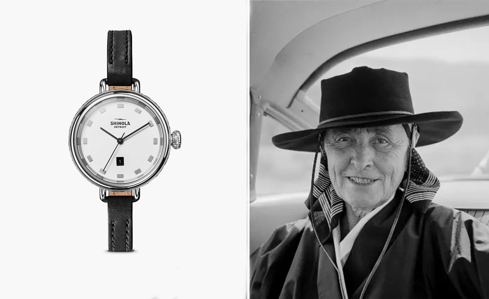 Shinola honours Georgia O’Keeffe with a new watch
Shinola Birdy watch stays faithful to the minimalist codes of Georgia O’Keeffe’s painting, My Last Door
By Hannah Silver
-
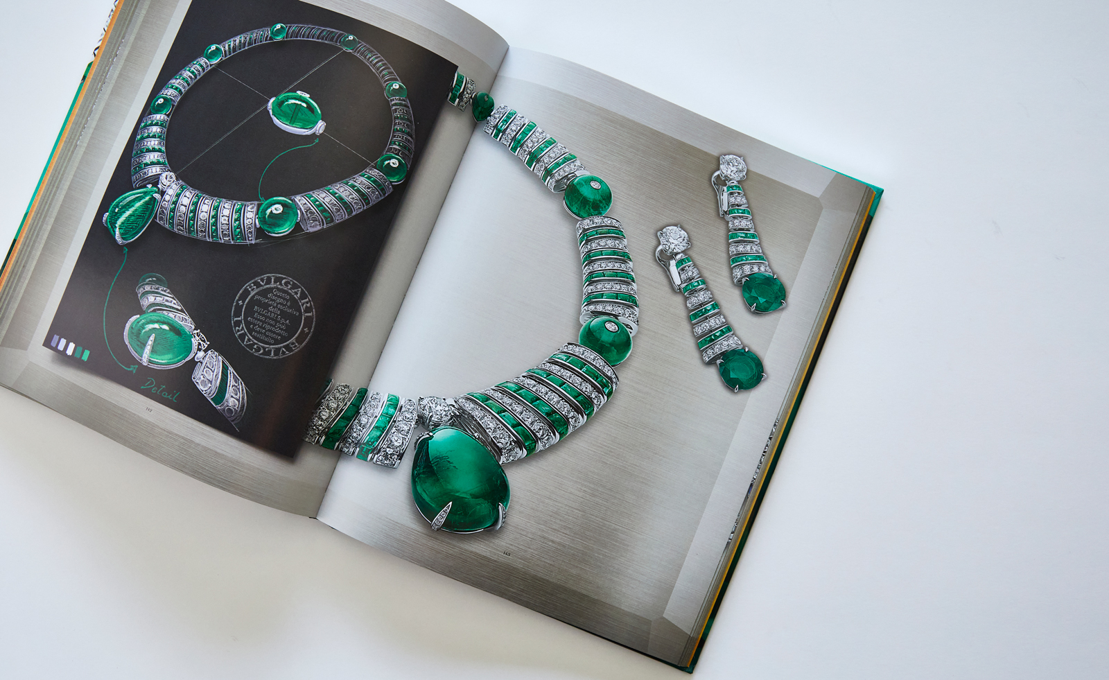 Bulgari’s new book celebrates women and high jewellery
Bulgari Magnifica: The Power Women Hold, published by Rizzoli New York, takes a closer look at the female muses who inspired the spectacular Magnifica high jewellery collection
By Hannah Silver