Snowflake generation: the evolution of Tudor
By artfully mining its heritage, Swiss watch brand Tudor has created a new design identity that’s all its own
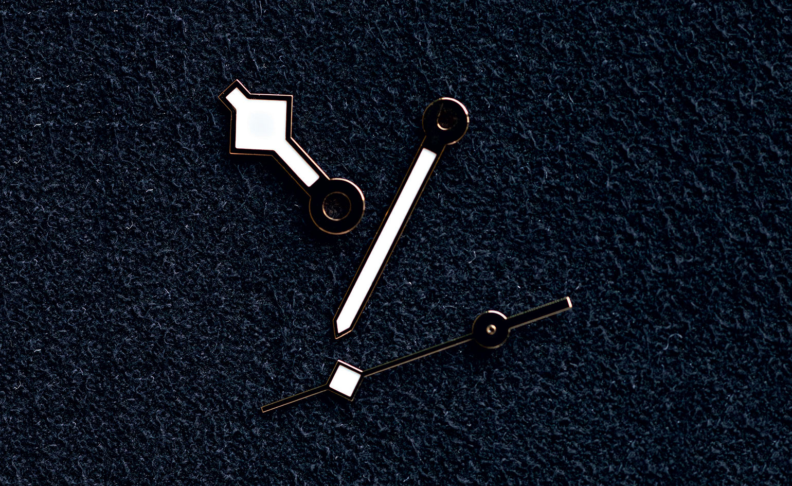
In 1969, unique ‘snowflake’ hands began to appear on Tudor’s Submariner diving watches. Today, the wide hands, resembling a magnified snowflake particle, are a powerful graphic signifier of a Black Bay, the brand’s biggest-selling design, and of Tudor’s wider resurgence. Others in the ‘snowflake’ series include the Black Bay Fifty-Eight and this year’s Black Bay GMT. The Pelagos steel bracelet models also take the snowflake hands, but the Black Bay owns them, so to speak.
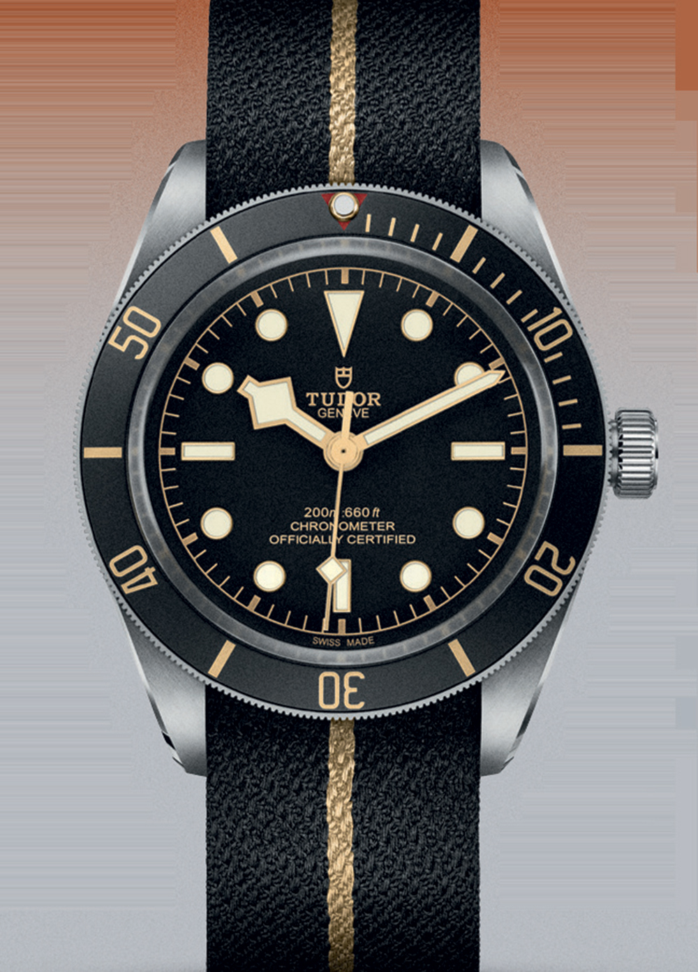
A 2018 Tudor Black Bay Fifty-Eight model with a Jacquard fabric strap by Julien Faure.
This quirky detail has been singled out as a mainstay of Tudor’s contemporary offering by Rolex and Tudor CEO Jean-Frédéric Dufour, whose vision chimes with that of Hans Wilsdorf, who established Rolex in 1905. Wilsdorf had long toyed with the idea of producing a watch ‘at a more modest price than our Rolex watches, and yet one that would attain the standard of dependability for which Rolex is famous’. In 1926, he acquired the exclusive rights to the Tudor trademark from Swiss watchmaker and dealer Veuve de Philippe Hüther and continued to make watches under that name. Wilsdorf, a savvy marketing man, waited for the right moment to implement his original vision of a more affordable alternative to Rolex. In 1946, the year after the end of the Second World War and with desire for luxury goods in an understandable slump, he launched the Tudor brand.
Early advertising campaigns, featuring a road builder and a coal miner, reveal Wilsdorf ’s economic target – the blue-collar worker. A Tudor watch was all about precision, robustness and desirability. In the late 1950s, Tudor began to focus on performance watches, auspiciously creating sports watches that was suited to everyday wear. It is the arena where it excels today. The current versions of 1970s Heritage Chrono and Heritage Ranger designs retain classic sporty appeal. Attempts at a sleeker, finer Tudor offering, such as this year’s unisex 1926, seem unconvincing in comparison.
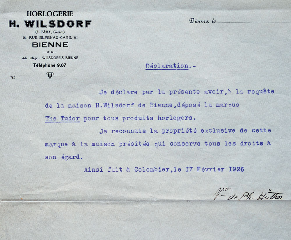
The archive registration letter showing Wilsdorf’s acquisition of rights to the use the Tudor name.
Tudor’s recent revival has been carefully engineered. While the brand has maintained a steady presence in France, Germany and Hong Kong, Tudor was pulled from major US and UK markets at the end of the 1990s as distributors focused on flashier propositions. But, mirroring its founder’s earlier response to more austere times, the brand was relaunched in the US in 2010 and the UK in 2014.
RELATED STORY
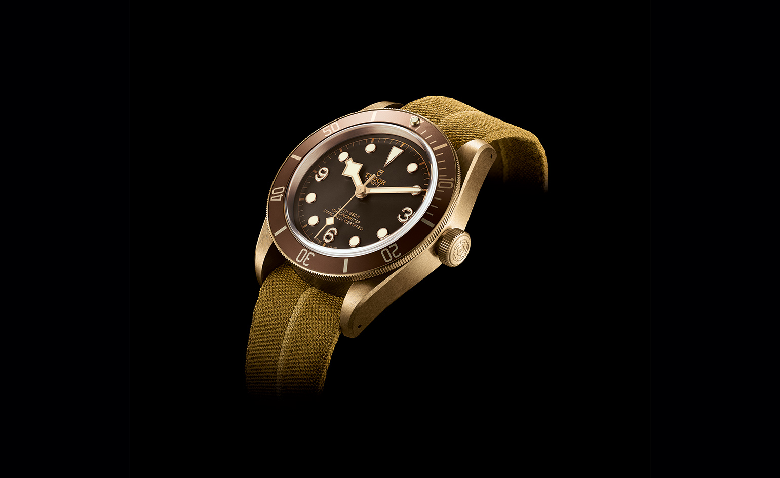
Now, it is presciently in tune with the market. Tudor watches are gaining traction with new audiences, from younger buyers to those who eschew conspicuous luxury for well-priced quality. And, they are increasingly appearing on the international watch auction circuit, which has traditionally been the preserve of ‘finer’ brands.
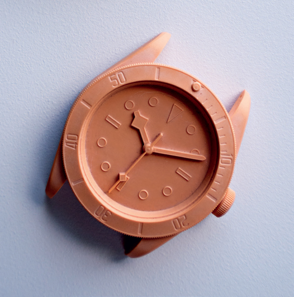
A hand-modelled Black Bay prototype.
Says Penny Morris, head of watches at Bonhams Knightsbridge, ‘Tudor has a long history and relaunching vintage-inspired models shows that it recognises this strength. Buyers want to know that what they are buying has a story. This drives young collectors, who perhaps may not yet have the disposable income to pursue watch icons, such as the Valjoux-based Rolex Daytonas, to brands such as Tudor, who are interesting in different ways.’
The ‘no-design’ approach of Tudor’s head designer Anders Ugarte suits the brief to a T. ‘It looks easy because you have a strong starting point,’ he says. ‘But vintage pieces have a strong personality, so you have to find the right contemporary progression.’ That could be a matter of altering a case diameter and height to achieve a slimmer or bolder silhouette. Matching the dial and bezel colours is another tricky area because, as Ugarte says, ‘each material means light and colour appear in different ways’.
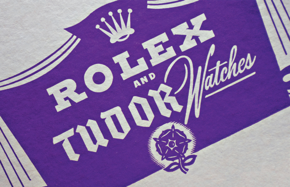
An early advertisement features the Tudor Rose emblem, which appeared in various iterations throughout the brand’s early history until it was replaced by a medieval shield in 1969.
This month, Tudor is launching a new watch. The brand confirms that it is based on a heritage piece but that it is not a Black Bay. Tudor collectors have a sharp instinct for these things, but for the rest of us, Ugarte only has this to say: ‘Whenever I look at the archive, I quickly forget the details. It is only then that I can start to build a new watch.’
As originally featured in the December 2018 issue of Wallpaper* (W*237)
Wallpaper* Newsletter
Receive our daily digest of inspiration, escapism and design stories from around the world direct to your inbox.
INFORMATION
For more information, visit the Tudor website
Caragh McKay is a contributing editor at Wallpaper* and was watches & jewellery director at the magazine between 2011 and 2019. Caragh’s current remit is cross-cultural and her recent stories include the curious tale of how Muhammad Ali met his poetic match in Robert Burns and how a Martin Scorsese Martin film revived a forgotten Osage art.
-
 All-In is the Paris-based label making full-force fashion for main character dressing
Part of our monthly Uprising series, Wallpaper* meets Benjamin Barron and Bror August Vestbø of All-In, the LVMH Prize-nominated label which bases its collections on a riotous cast of characters – real and imagined
By Orla Brennan
-
 Maserati joins forces with Giorgetti for a turbo-charged relationship
Announcing their marriage during Milan Design Week, the brands unveiled a collection, a car and a long term commitment
By Hugo Macdonald
-
 Through an innovative new training program, Poltrona Frau aims to safeguard Italian craft
The heritage furniture manufacturer is training a new generation of leather artisans
By Cristina Kiran Piotti
-
 Samuel Ross unveils his Hublot Big Bang watch design
Samuel Ross brings a polished titanium case and orange rubber strap to the Hublot Big Bang watch
By Pei-Ru Keh
-
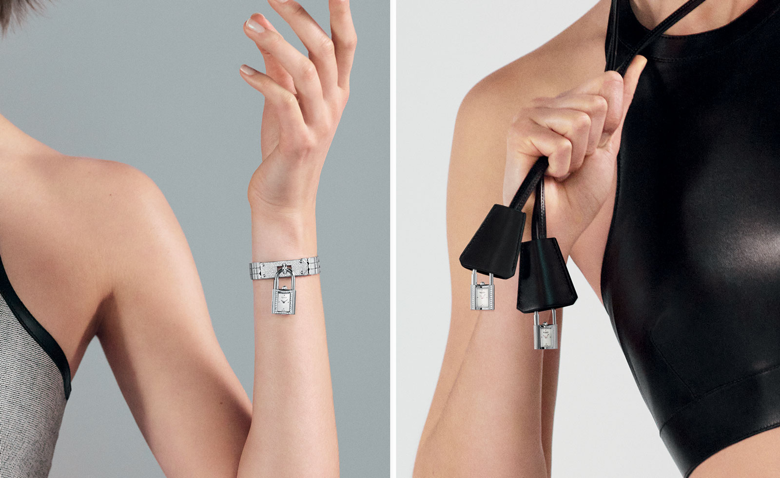 Playful design meets chic heritage in the Hermès Kelly watch
The new Kelly watch from Hermès rethinks the original 1975 timepiece
By Hannah Silver
-
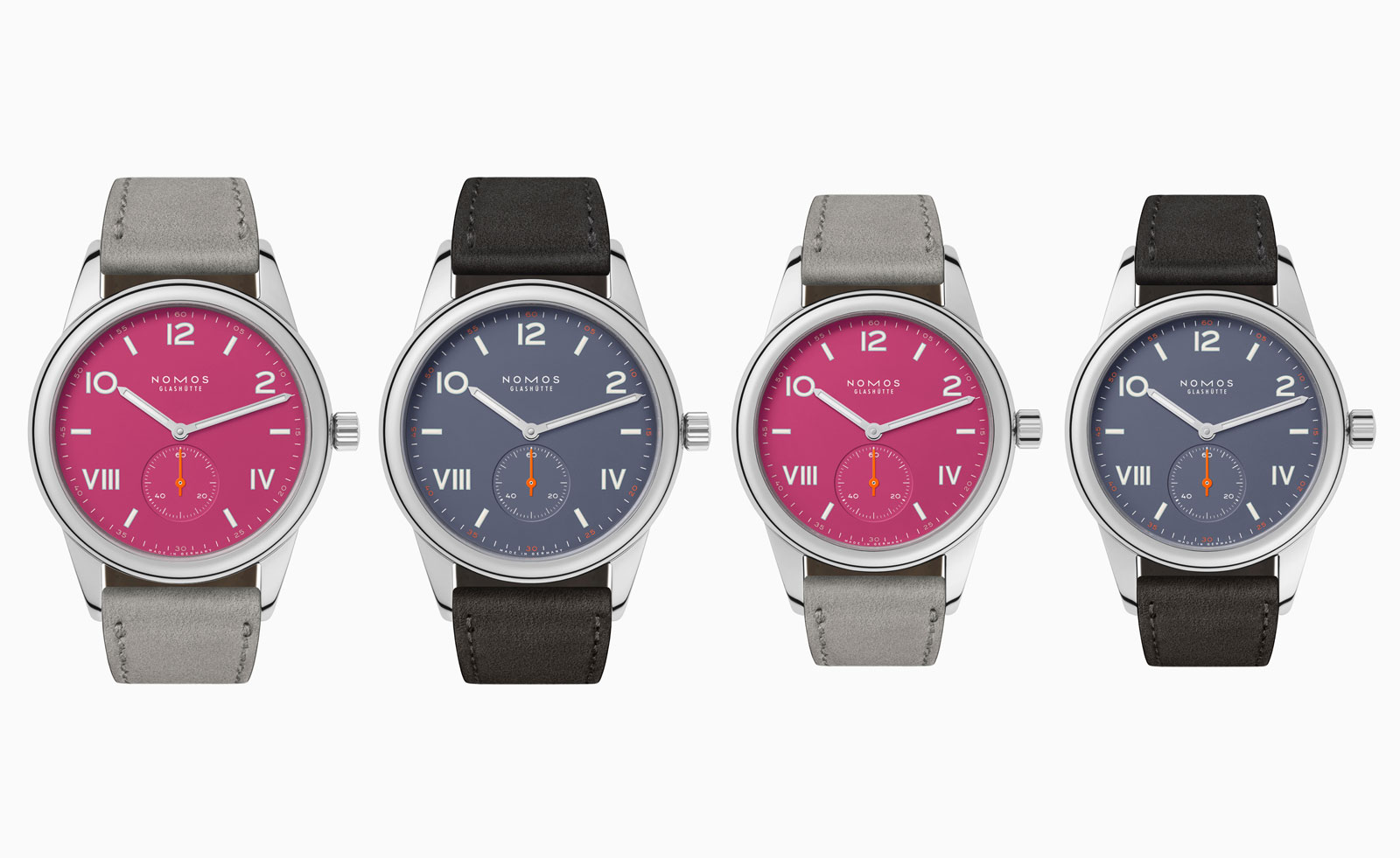 Discover the tonal new hues of the classic Nomos Club Campus watch
The Nomos classic wristwatch Club Campus now comes in two new collegiate colours. The perfect graduation gift from the Glashütte manufacture
By Hannah Silver
-
 Bulgari unveils the thinnest mechanical watch in the world
The new Bulgari Octo Finissimo Ultra watch is a record-breaking feat of engineering
By Hannah Silver
-
 Breitling and Triumph unite on a racy new watch and motorcycle
1960s design codes are infused with a contemporary edge in the collaboration between Breitling and Triumph
By Hannah Silver
-
 Gerald Genta’s mischievous Mickey Mouse watch design is rethought for a new era
The Gerald Genta Retrograde with Smiling Disney Mickey Mouse watch pays tribute to Genta’s humorous design codes
By Hannah Silver
-
 Shinola honours Georgia O’Keeffe with a new watch
Shinola Birdy watch stays faithful to the minimalist codes of Georgia O’Keeffe’s painting, My Last Door
By Hannah Silver
-
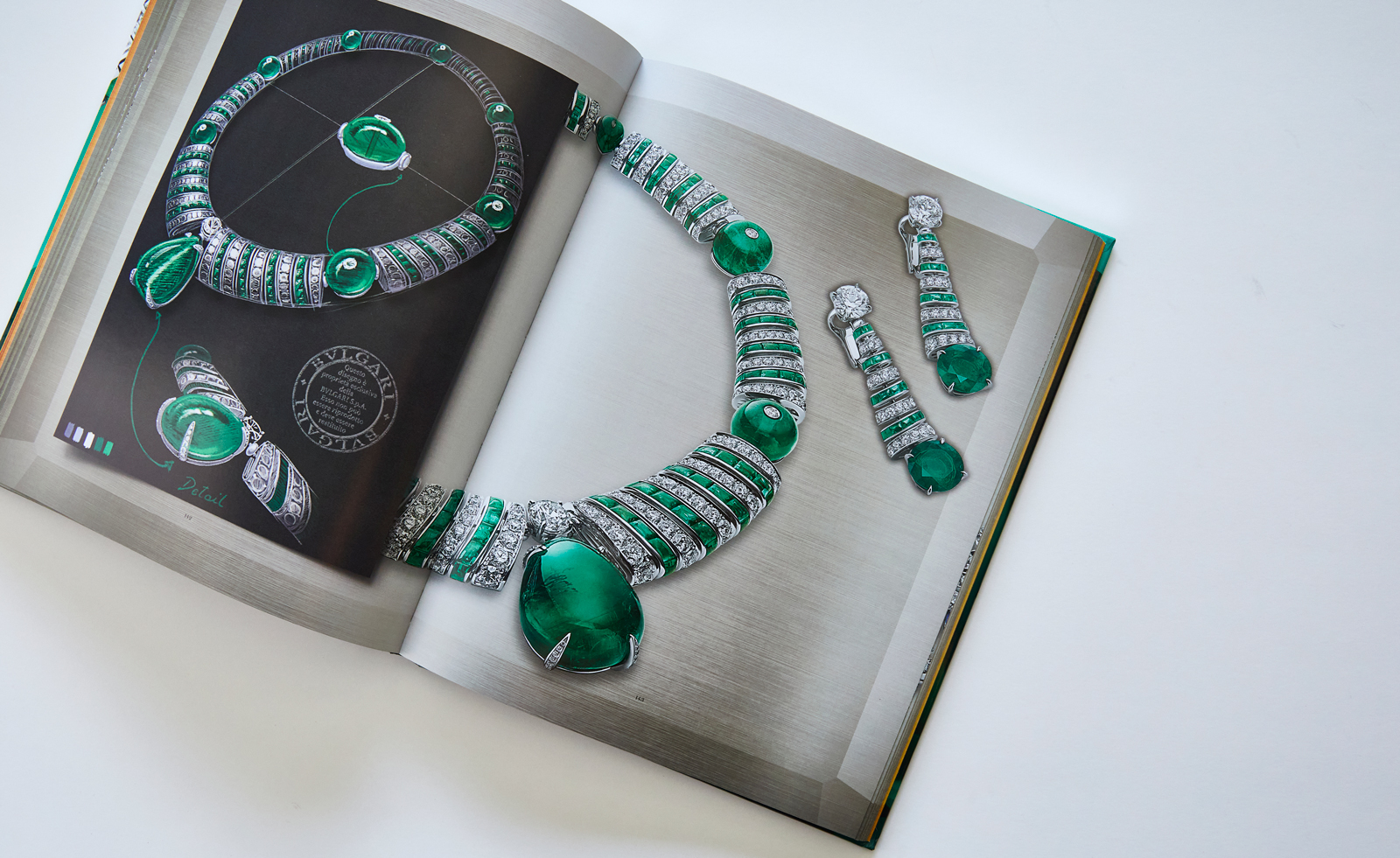 Bulgari’s new book celebrates women and high jewellery
Bulgari Magnifica: The Power Women Hold, published by Rizzoli New York, takes a closer look at the female muses who inspired the spectacular Magnifica high jewellery collection
By Hannah Silver