
Traditional watchmaking practices are subverted in a collaboration between avant-garde watch brand Hautlence and creative design agency Black Badger.
The Vagabonde x Black Badger watch utilises Black Badger’s James Thompson’s light-up skills. Known as the ‘Master of Glow’ for his creation of 3D luminescent composite Badgerite, here the bright colours make a sharp foil for the sleek black lines of Hautlence’s case. ‘When Samuel, Hautlence brand manager, showed me this model, I was struck by the empty space around the time display system,’ says Thompson. ‘Negative space isn't wasted space when you think architecturally. Here, it is the negative space that gives this piece all its character. That was the perfect canvas for me to add my personal touch.’

For the Hautlence team, the collaboration was a natural one. ‘When we decided to reposition Hautlence, we identified key elements that are really part of the brand’s identity, such as the TV screen-shape case, the play on volumes and three-dimensionality, the notion of kinetics, of space and movement, and finally – maybe even the most important – the wish to stay playful,’ they say. ‘We produce between 150 and 200 pieces per year, which allows us to cultivate the notion of fun. You can find all these elements in The Vagabonde X Black Badger watch. The meeting of two universes and two personalities around the interplay of volumes and contrast, the tension between black and bright colours, and the interaction between the positive and negative space, all this put together works well.’
A carefully considered design plays on contrasts throughout. ‘The design of the Vagabonde X Black Badger is based on contrasts,’ Hautlence adds. ‘The contrast of shapes, between the sharp corners and the rounded, almost organic ones; the tension between colour and light on the one hand, and black on the other; the contrast of using cutting-edge luminescent materials, but having the aesthetic of something closer to a 1980s arcade game. It is this delicate balance which creates a work of art.’
-
 A Xingfa cement factory’s reimagining breathes new life into an abandoned industrial site
We tour the Xingfa cement factory in China, where a redesign by landscape specialist SWA Group completely transforms an old industrial site into a lush park
-
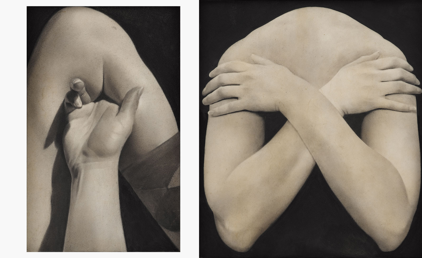 Put these emerging artists on your radar
This crop of six new talents is poised to shake up the art world. Get to know them now
-
 Dining at Pyrá feels like a Mediterranean kiss on both cheeks
Designed by House of Dré, this Lonsdale Road addition dishes up an enticing fusion of Greek and Spanish cooking


