
Audemars Piguet turned heads when it unveiled the latest model in the [RE]Master collection. First launched during the pandemic, the idea behind the [RE]Master line was to mine Audemars Piguet’s back catalogue for anything not a Royal Oak, and reimagine it for modern times. The 01 from 2020 was a lovely Selfwinding Chronograph inspired by a design from 1943 with an Art Deco dial and true-to-the period logo. Its follow up is something completely different.

For those who think the Audemars Piguet begins and ends with the Royal Oak, this Brutalist-inspired asymmetrical creation based on an original design from 1960 might come as a surprise. However, this design isn’t an anomaly. After World War II, round watches dominated the landscape, but Audemars Piguet continued to make shaped styles producing everything from square and rectangular designs to interesting takes on the cushion case, such as the Cioccolatone from the 1940s-1950s.
During the 1960s, it experimented with bold retro-futuristic asymmetrical cases, and this is the era from which the ref. 5159 comes. “Between 1959 and 1963, Audemars Piguet created more than 30 asymmetrical models, most of which were produced in less than 10 pieces,” says Sébastian Vivas, Audemars Piguet heritage and museum director. “[RE]Master02 is a fantastic opportunity to revive this forgotten golden age.”

It’s not really surprising that this watch came out of this particular period. This is the time of Le Corbusier and his béton brut style of architecture, and the angular concrete churches of Walter Maria Forderer. There is actually a Forderer-esque quality to the [RE]Master02 with its three-dimensional grid-like structure and playful manipulation of the dial space that changes shape and depth depending on the angle from which it is viewed.
The new [RE]Master02 really is a shifting visual feast. The case is made from Audemars Piguet’s newest alloy made from copper, palladium, and solid gold, that sits somewhere between a warm grey and a subtle pink. The case is either horizontally or vertically brushed, which, in combination with its hard angles, emphasises the shift in colour as the light changes. The dial colour is “bleu nuit, nuage 50” which was used for the first Royal Oak. It isn’t one single piece, but comprised of twelve triangles of different shapes and sizes, each of which has been given a linear brush, so the PVD-coated brass pieces look similar to wood marquetry. The logo is cleverly aligned so that the break between the two words hits the line of the crystal before it angles. The radial lines, that also function as hour markers , emphasise the lean shape of the 41mm case.
To follow up a fairly conventional chronograph is a bold move from Audemars Piguet but one that highlights that this is a brand that has always broken the mould.
-
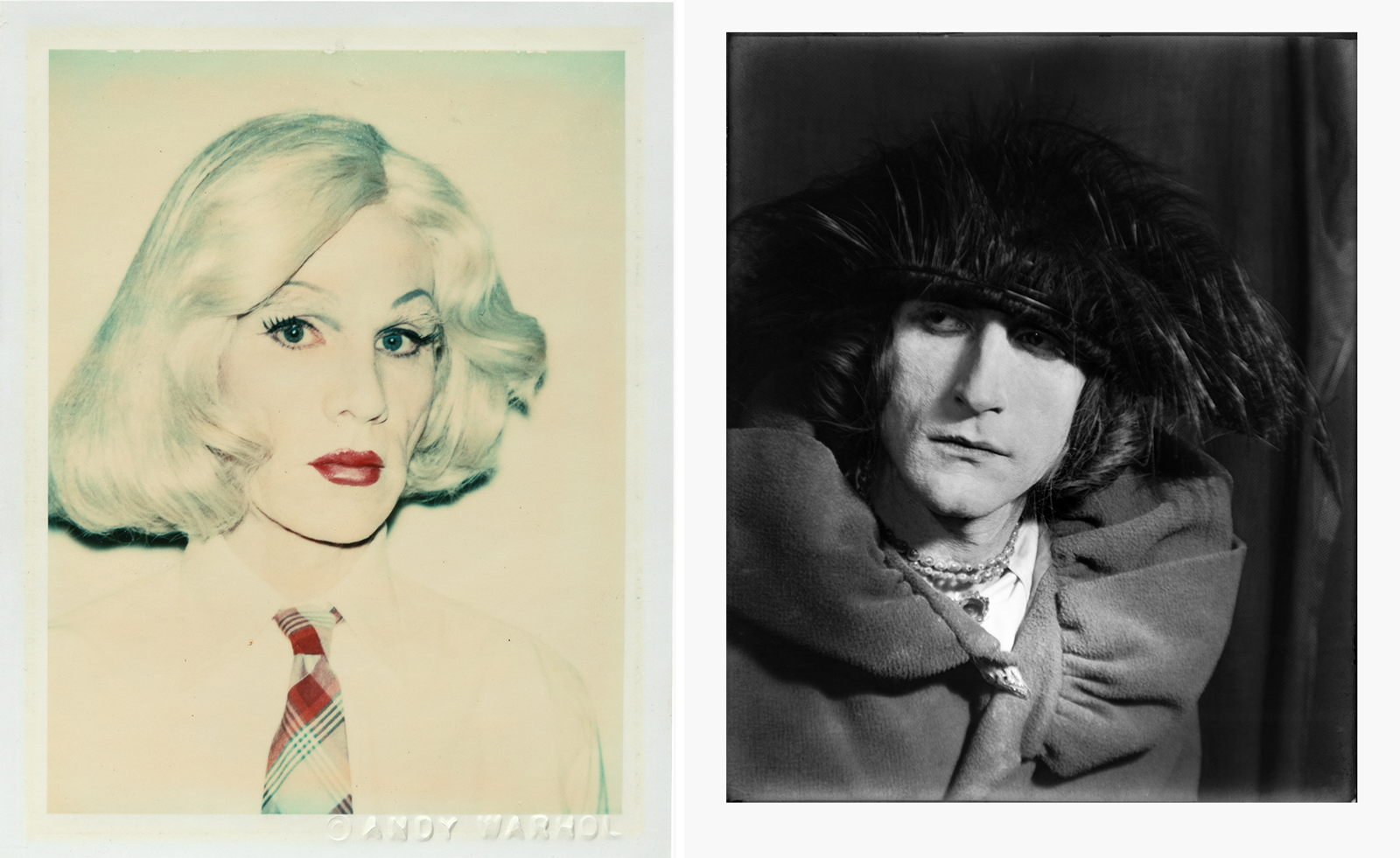 From Rembrandt to Warhol, a Paris exhibition asks: what do artists wear?
‘The Art of Dressing – Dressing like an Artist’ at Musée du Louvre-Lens inspects the sartorial choices of artists
-
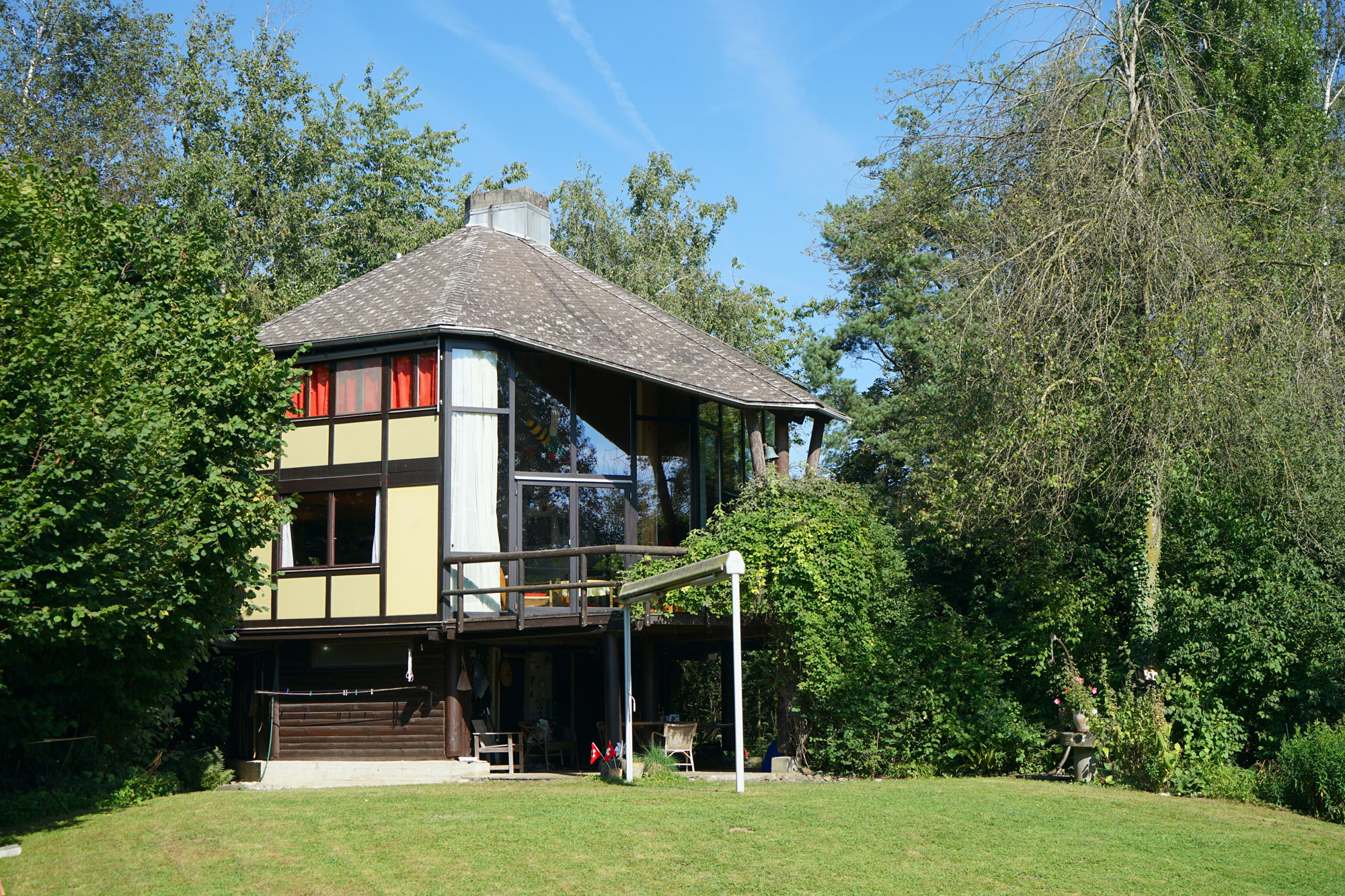 Meet Lisbeth Sachs, the lesser known Swiss modernist architect
Pioneering Lisbeth Sachs is the Swiss architect behind the inspiration for creative collective Annexe’s reimagining of the Swiss pavilion for the Venice Architecture Biennale 2025
-
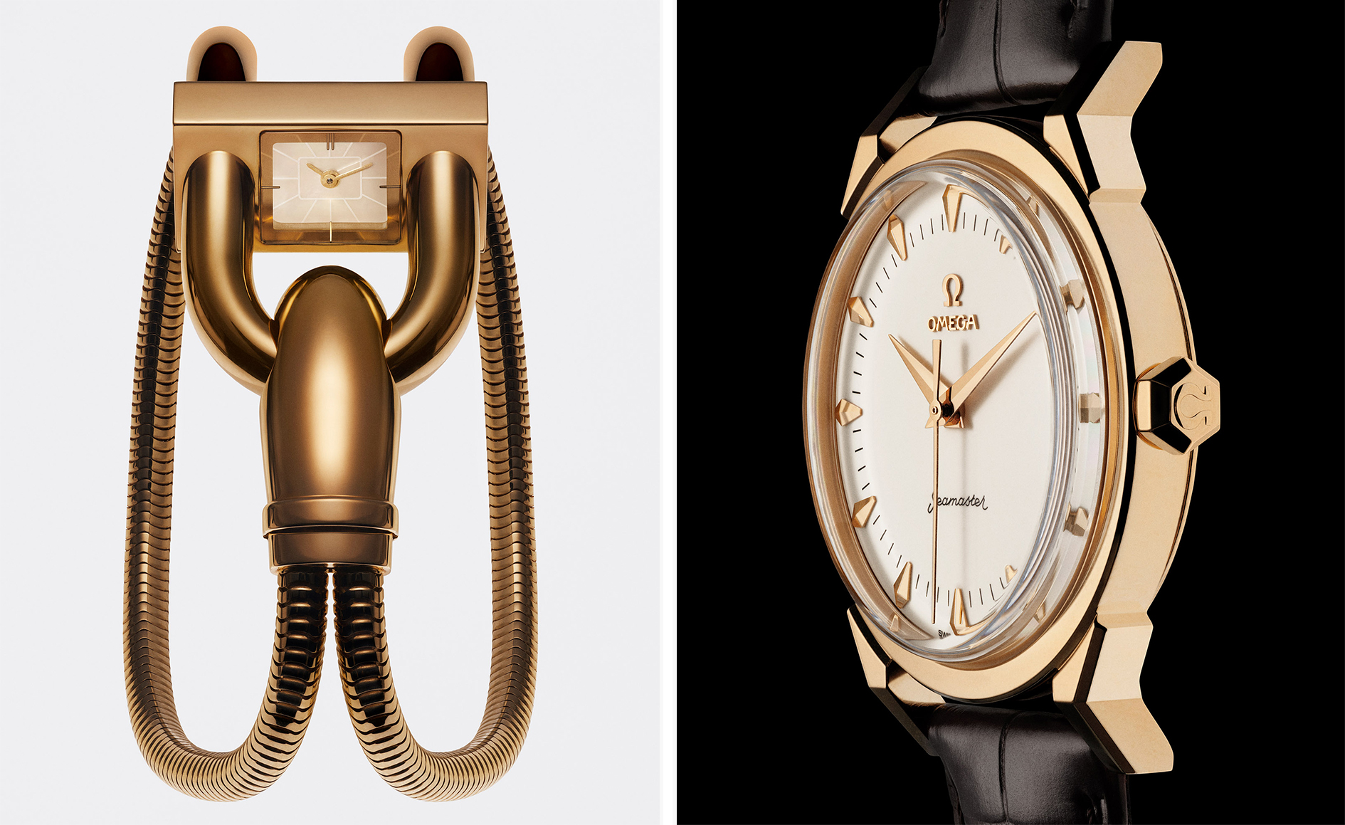 A stripped-back elegance defines these timeless watch designs
Watches from Cartier, Van Cleef & Arpels, Rolex and more speak to universal design codes


