Kettle Kids subverts classic watch boutique design codes with new London flagship
Kettle Kids has worked closely with Hesselbrand on a slick new boutique design in London’s Mayfair
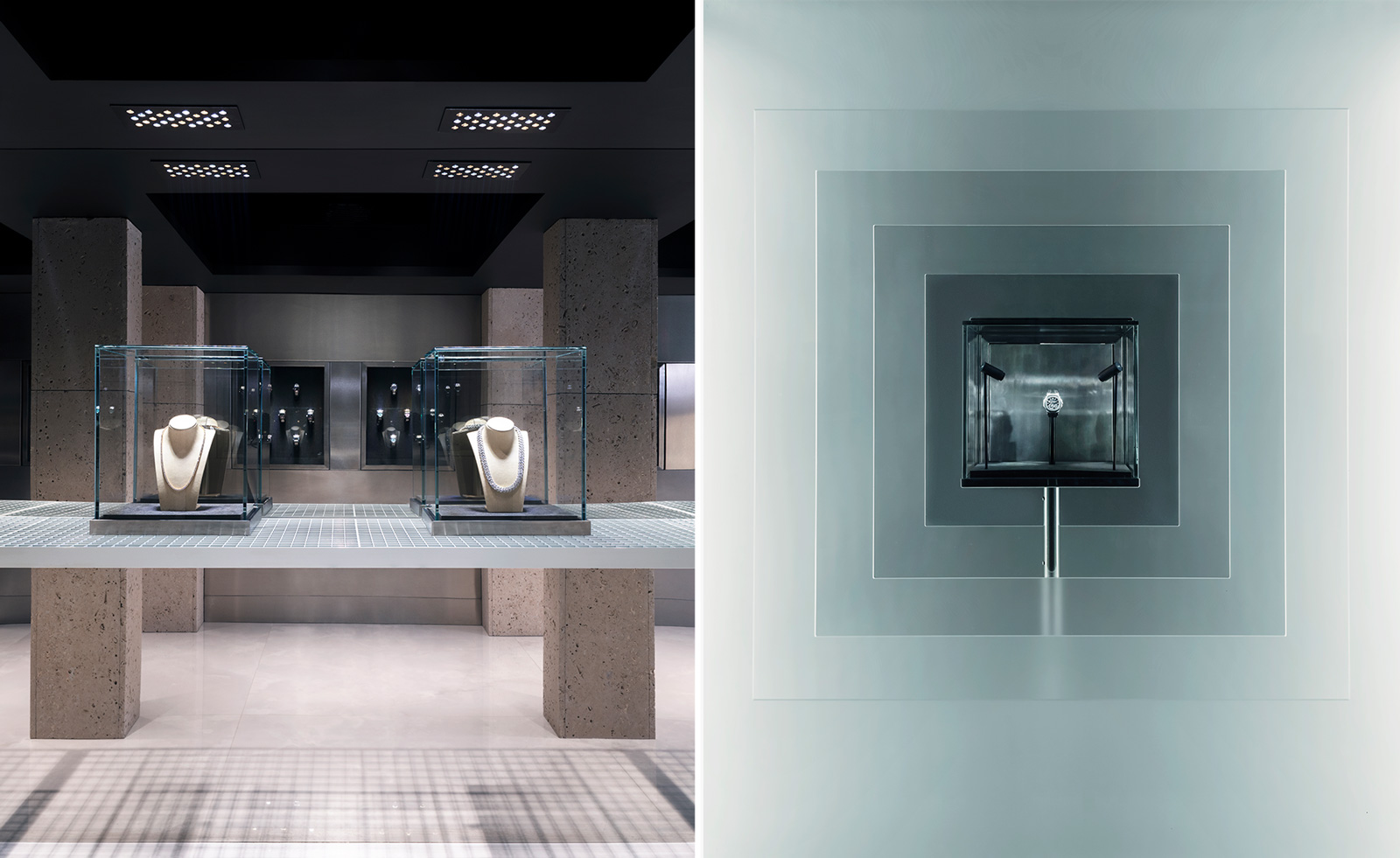
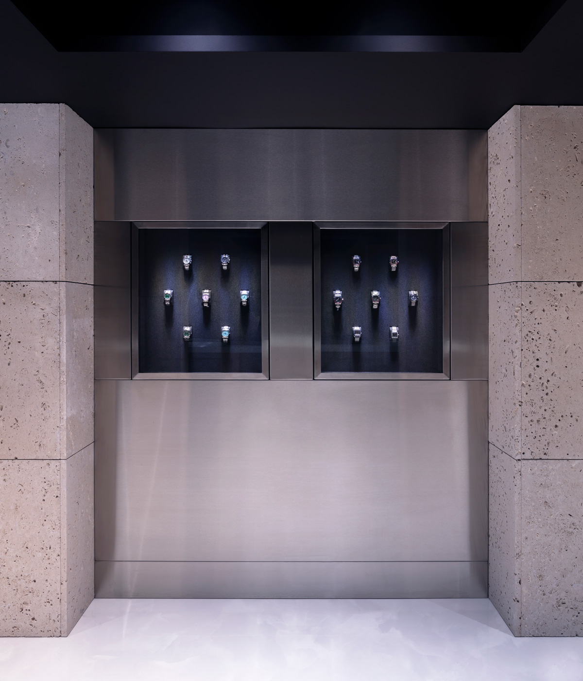
The traditional codes of jewellery and watch boutique design have been reconsidered with the opening of the Kettle Kids’ flagship London space, with classic and contemporary references intertwining in the design by Hesselbrand.
‘Today, most brands have strong visual identities but often struggle to translate them coherently into a space,’ say two of the Hesselbrand founders, Magnus Casselbrant and Jesper Henriksson. ‘As this was [Kettle Kids founders and brothers] Harvey and Jacob [Hutson’s] first retail space, we didn't just design a store but created a spatial identity for Kettle Kids. That meant designing a formal vocabulary and material palette, and how the brand manifests physically. We worked closely with Two Times Elliott, a London-based design studio responsible for Kettle Kids’ graphic identity. Through this collaboration, our material and colour research carried over into packaging and digital. The result is rare coherence across all media and disciplines.’
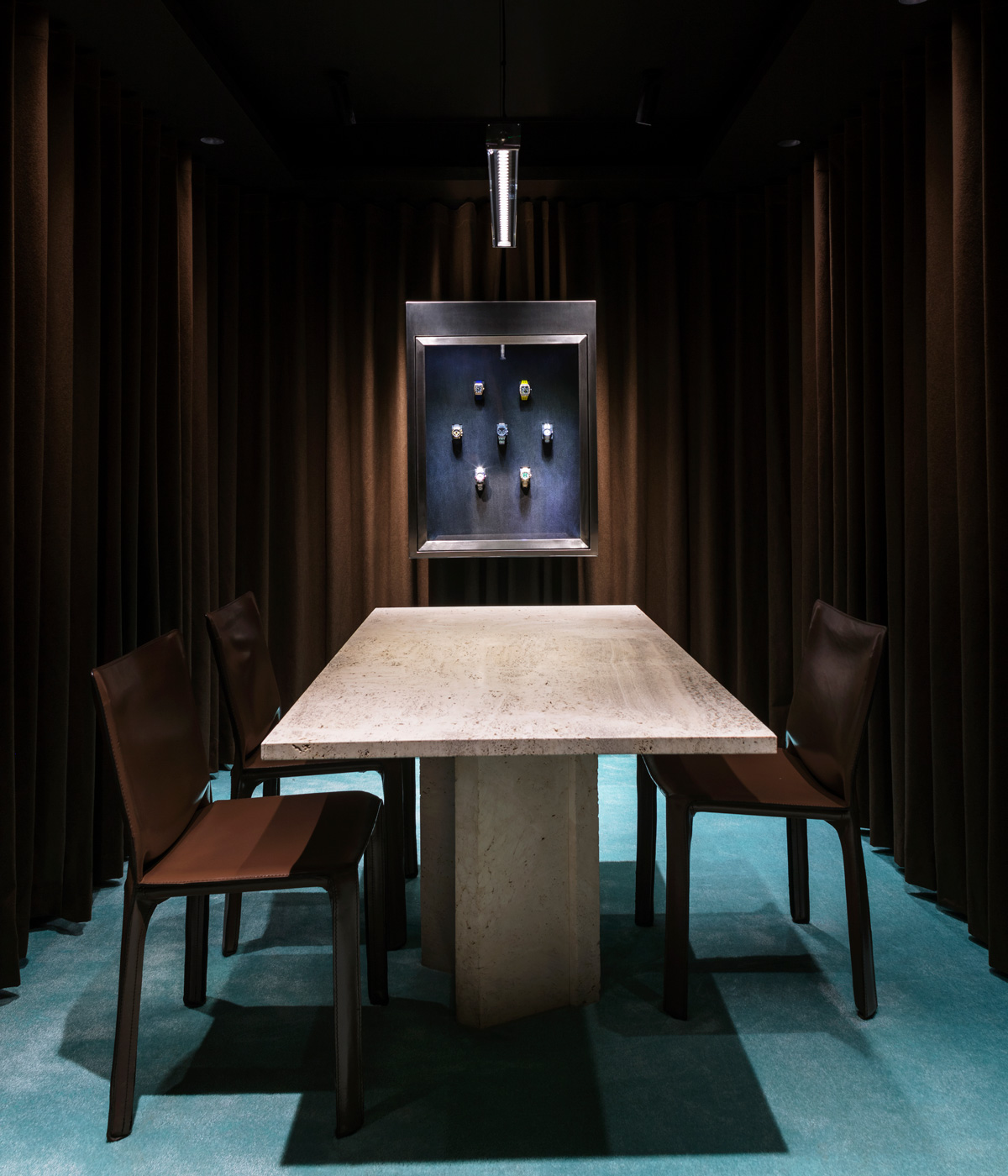
The intimate watch boutique encapsulates the Kettle Kids’ philosophy, nodding to their informal beginnings in 2017, which saw them build a tightly-knit online community of watch collectors, developed here into a prestigious and accessible watch collection. ‘Being in the world of Kettle Kids is like being in a Guy Ritchie movie; their history, the people they work with, and their clients are unlike anything else,’ the Hesselbrand team add. ‘The way they interact with clients is profoundly different from how people interact in traditional luxury retail. We were very inspired by this, and in our design we aimed to create a store consisting of different atmospheres for scenes from their “movie” to play out.
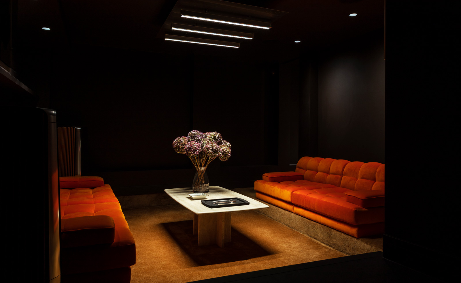
‘We wanted to make a space that immersed all senses; an environment you could feel immediately as you entered into it. We spent months experimenting with materials and building prototypes, trying out different combinations until we found a unique palette that reflected the energy and context of Harvey and Jacob. Ultimately, Kettle Kids is about people, and we wanted a store that felt great to be in, a place designed to interact in various ways.’
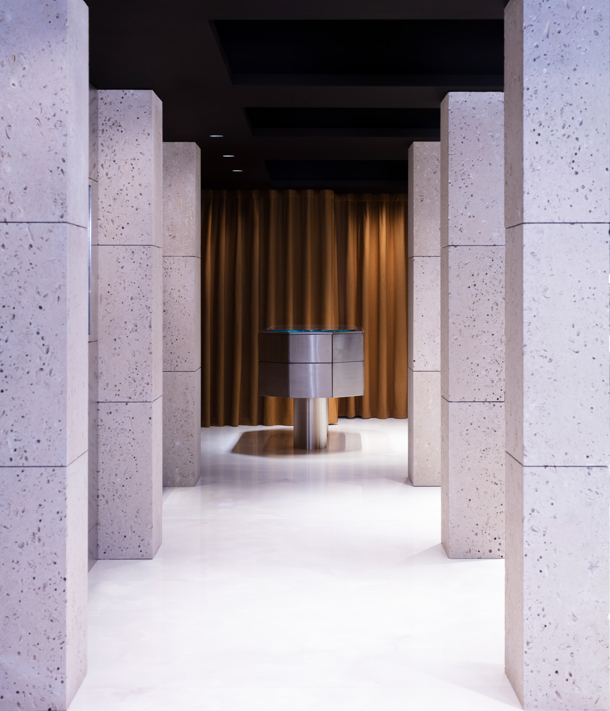
A juxtaposition of materials, such as the warm Portland stone combined with industrial steel grating, nods to the Hutson brothers’ own pairing of the local with the global. ‘What sets us apart is being a family business and selling some of the rarest pieces in the world,’ the brothers say. ‘We treat every customer the same and our clients are our friends. It is important to us to build long-term relationships with people, and as a result, they always come back for their next piece.’
For Casselbrant and Henriksson, eschewing traditional boutique design was ambitious but ultimately rewarding. ‘The immense amount of detailed design development that is required when you step outside of conventions can be challenging. You need to rethink how things are made, and who makes them. But this is eventually also the kind of challenge we enjoy; it is the gift and the curse pushing the boundaries of design. When we design retail spaces, we are interested in breaking down boundaries between the brand and the customer, creating an inviting atmosphere while still keeping a sense of exclusivity. It’s a fine balance to strike and requires creative solutions like the ones we deployed in the Kettle Kids flagship store. This new approach to luxury retail is something that many other brands can benefit from.’
Wallpaper* Newsletter
Receive our daily digest of inspiration, escapism and design stories from around the world direct to your inbox.
Hannah Silver is the Art, Culture, Watches & Jewellery Editor of Wallpaper*. Since joining in 2019, she has overseen offbeat design trends and in-depth profiles, and written extensively across the worlds of culture and luxury. She enjoys meeting artists and designers, viewing exhibitions and conducting interviews on her frequent travels.
-
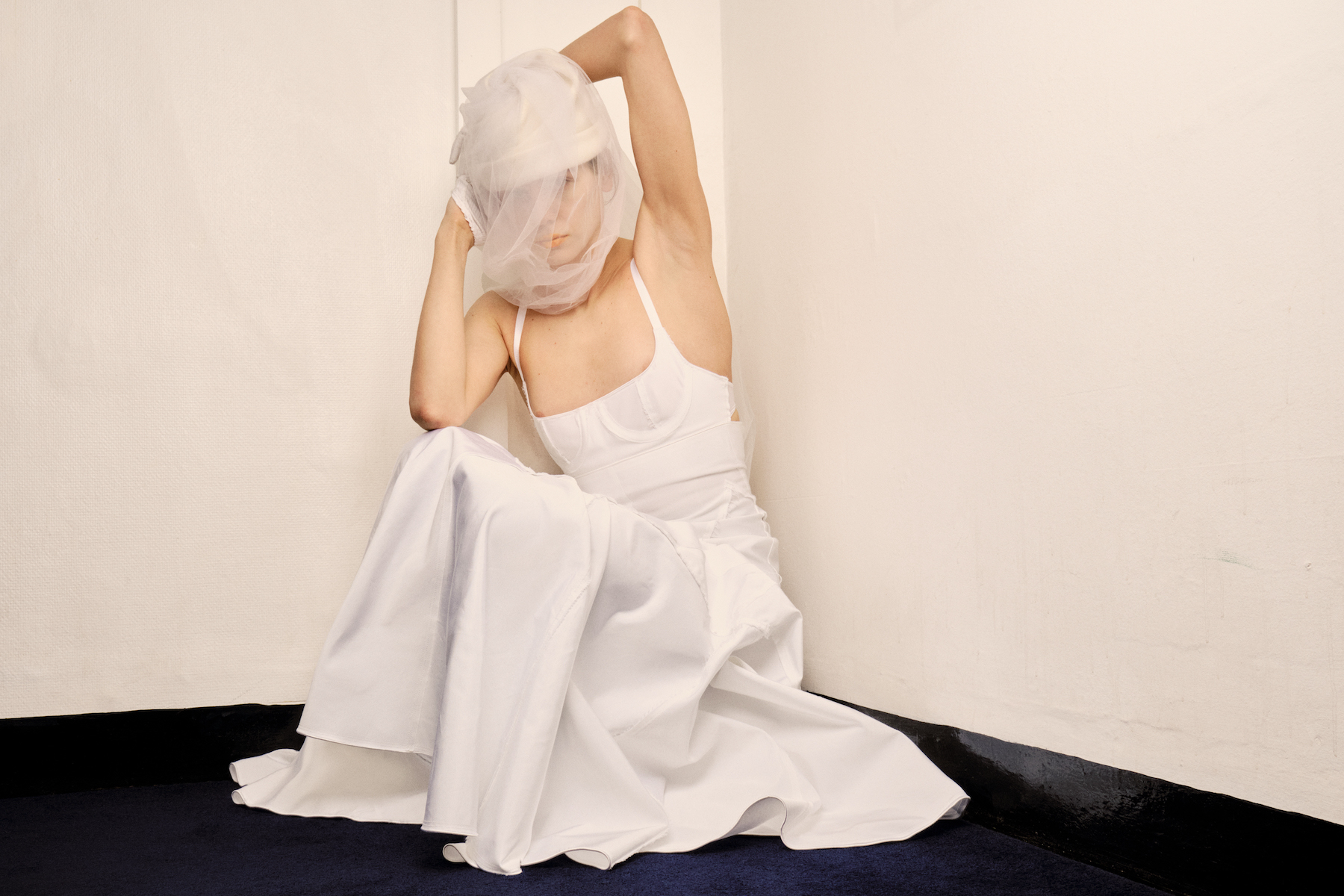 London label Talia Byre’s alternative bridalwear: ‘Have a white moment, but turn it on its head’
Talia Lipkin-Connor of London-based label Talia Byre eschews tradition with her first bridal collection, which sees archival designs reimagined in ‘lived-in’ shades of white
-
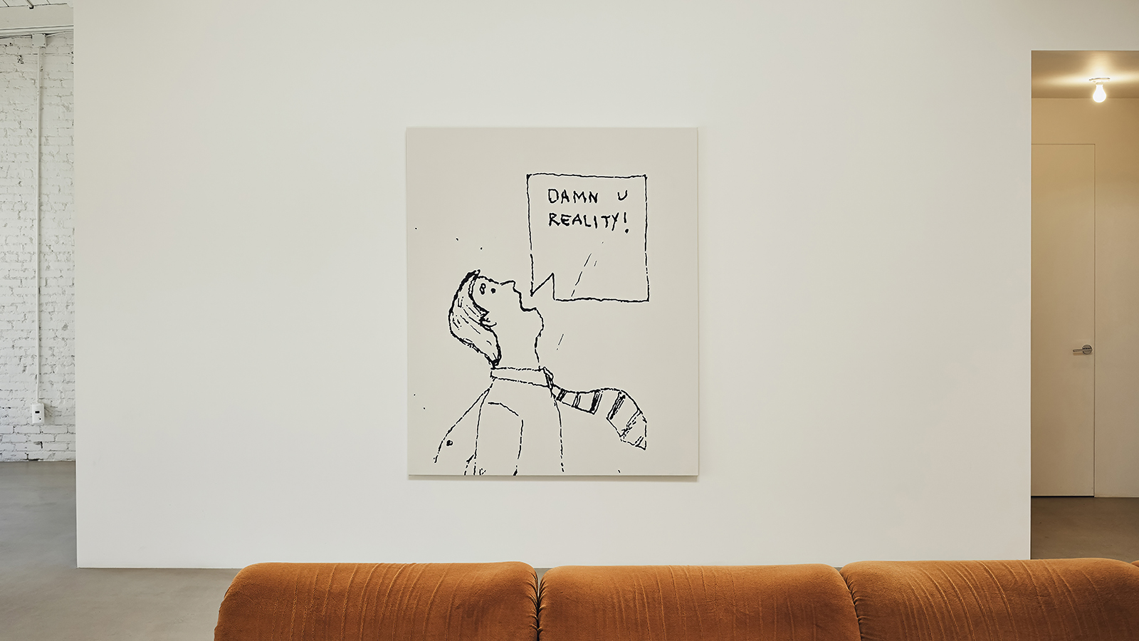 PlayLab opens its archive, blending workspace, library and shop in a new LA interior
Creative studio PlayLab opens its Los Angeles workspace and archive to the public for the first time, revealing a dedicated space full of pop treasures
-
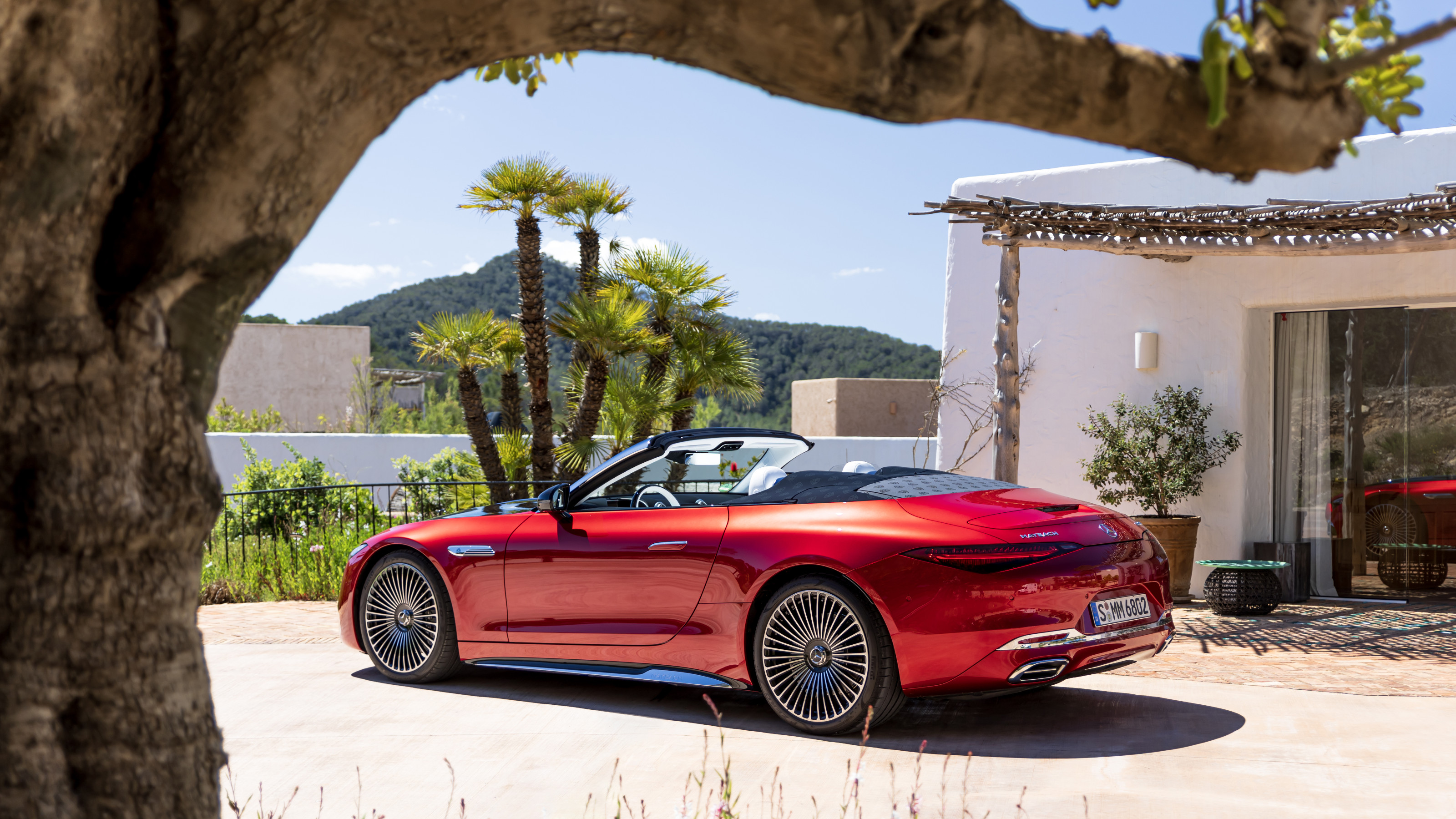 The Mercedes-Maybach SL 680 Monogram Series is an eyeful as well as a mouthful
Mercedes-Maybach’s first-ever sports car is comprehensively ‘wallpapered’ in the brand’s double-M design. We sampled this monogrammed machine on the coast of Ibiza