Reed Krakoff ushers John Hardy jewellery into a new era, and refreshes its New York store
The ‘Spear’ jewellery collection riffs on John Hardy’s signature handwoven chain, while the boutique nods to the brand’s Balinese heritage

A year since Reed Krakoff took over the creative reins at the Balinese-born fine jewellery brand John Hardy, its transformation now feels complete. Krakoff, the fashion designer and creative director formerly at the helm of Coach, his eponymous fashion label, and most recently, Tiffany & Co, has not only unveiled his first directional collection for the almost 50-year-old jewellery brand, but a new retail design concept and graphic identity as well.
‘The biggest defining characteristic of the brand is this incredible artisan community in Bali. We have around 500 artisans and everything is made starting with hand-carved wax, which almost nobody does these days – most people do 3D printing – and they really understand how to make jewellery extremely well,’ says Krakoff. ‘There’s a value to that artisanal feel. It’s worth having and worth keeping. It really feels special.’
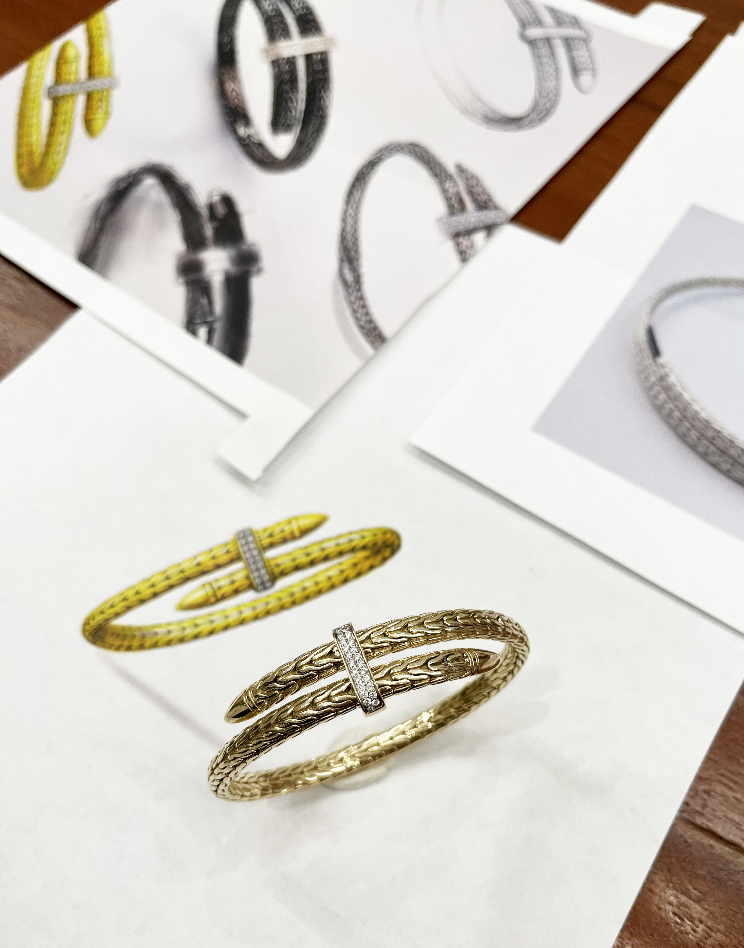
He continues, ‘I felt like the brand could be a lot more. It had built a nice business and a reputation but it was more in service of craft, in the sense that the making and the techniques, the markings and symbols used were all very traditional. It hadn’t really been looked at through the modern design lens. So the idea was to take this artisanal craft know-how and look at it through this idea of modern design.’
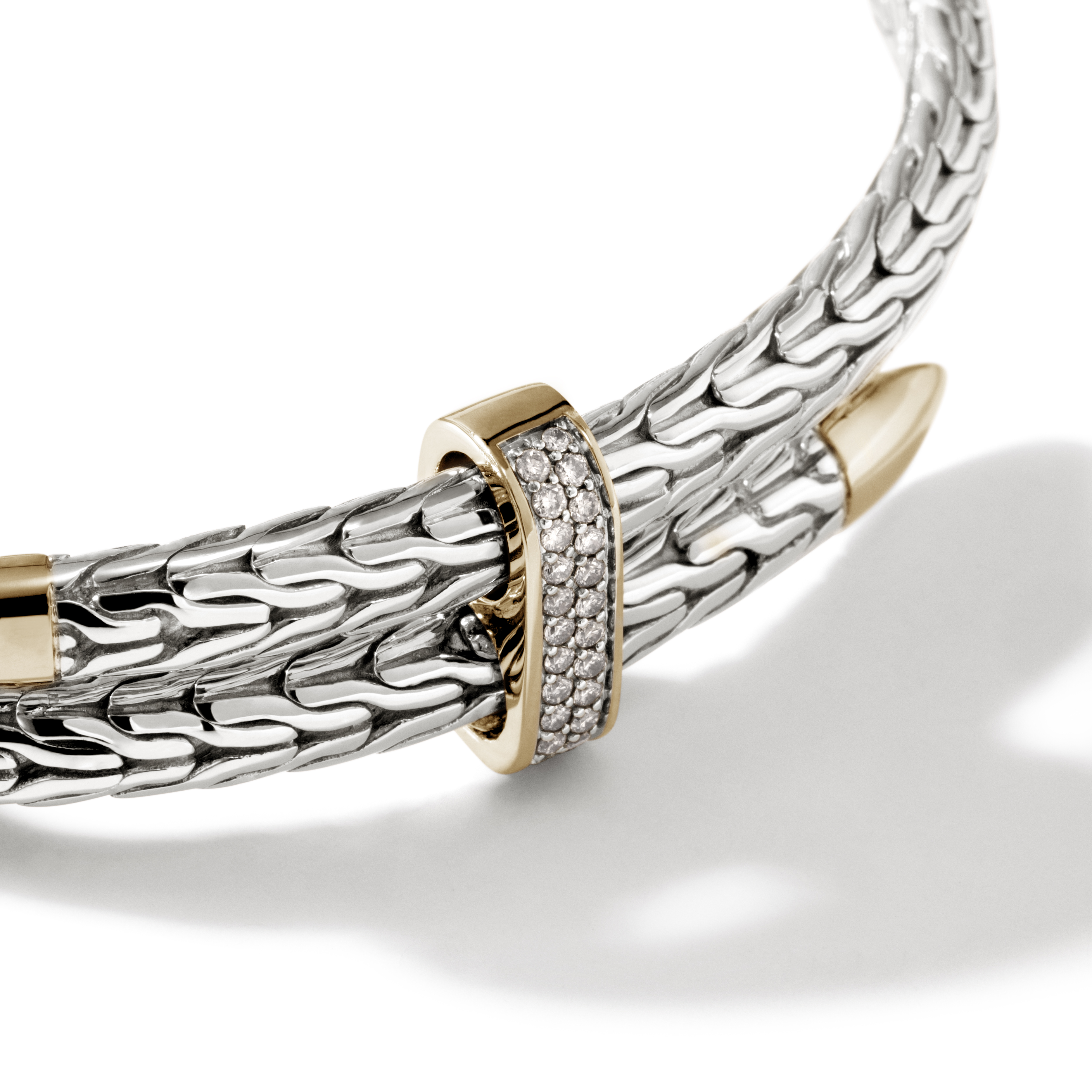
Krakoff, who serves as John Hardy’s creative chairman, marks the new creative energy now flowing through the brand with ‘Spear’, a dynamic and expressive jewellery collection that unites John Hardy’s signature craftsmanship with an individualistic, contemporary ethos. Featuring an innovative bypass silhouette that houses a titanium wire on the interior, the ‘Spear’ collection can be adjusted to flex with the wearer for enhanced functionality, sophistication, and ease. A clear evolution of John Hardy’s signature ‘Icon’ chain, it features the same handwoven chain weave, which is made entirely by a community of women in Bali. Available as both a bracelet and a choker in sterling silver and 14ct gold, and finished with a white diamond pavé-accented clasp, the design is fully adjustable to appeal to a wider clientele.
‘One of the important things about reworking a brand is making sure you embrace the part of the brand that distinguishes it from others,’ Krakoff says. ‘This idea of the handwoven chain is quite amazing, where no one does that, so the handwoven chain was the jumping-off point for this collection. The coil is actually a carved, articulated version of the handwoven chain. It’s a graphic interpretation of that and that’s all wrapped around this titanium coil so it has the flexibility and ease to fit in different ways. It references the “Icon” while taking it to a different place.’

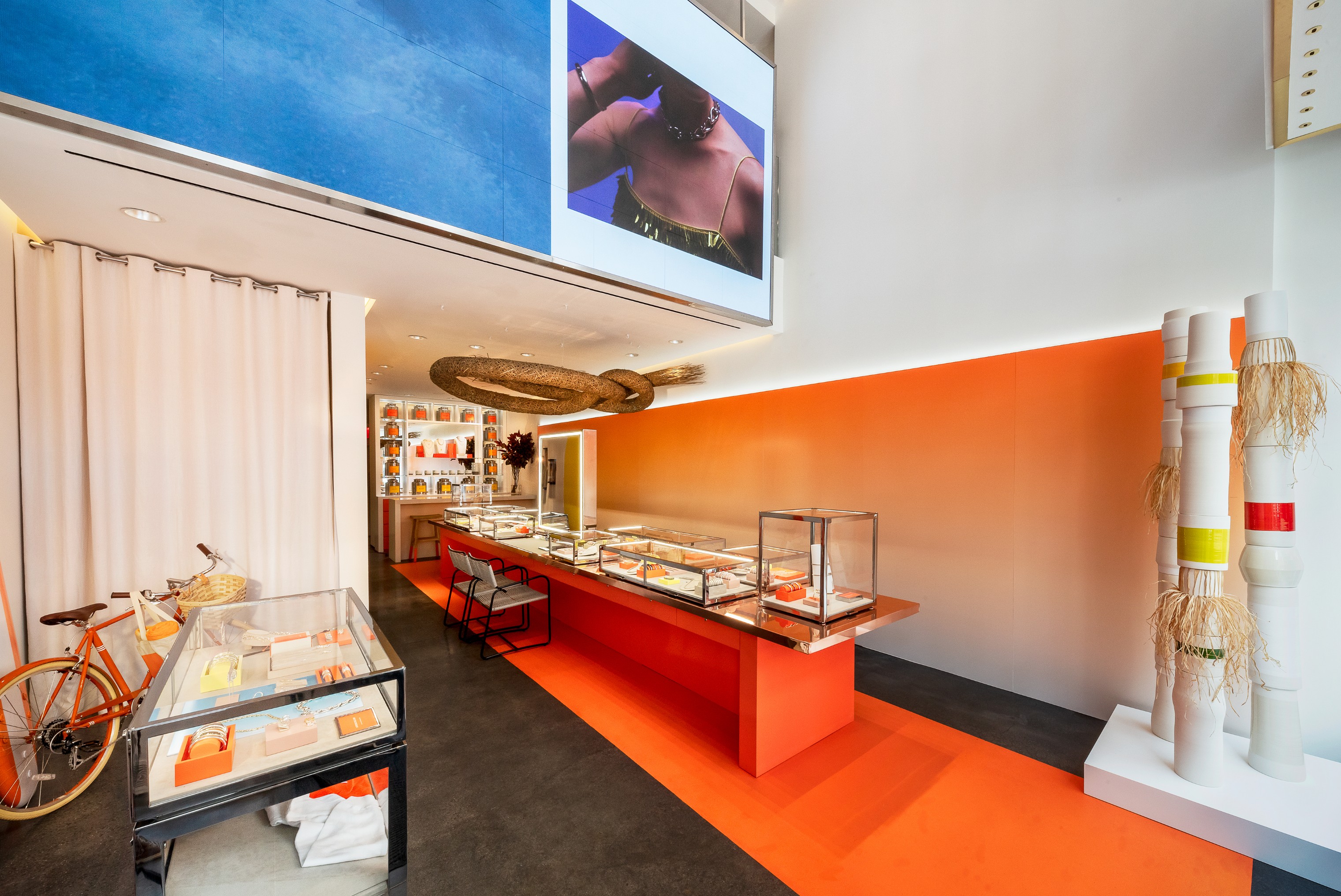
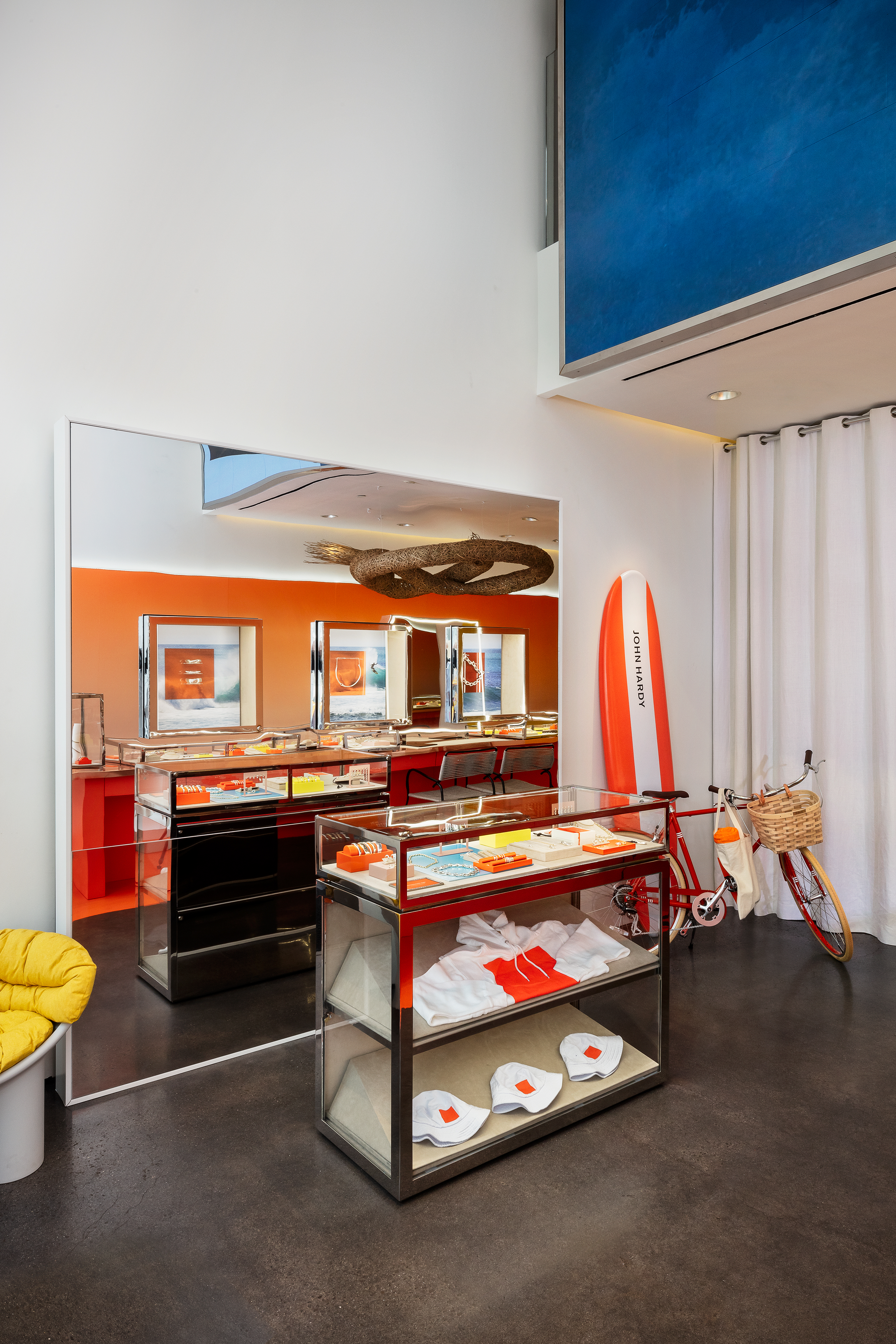
This sentiment carries through to the reimagining of John Hardy’s retail experience at its New York flagship in SoHo, which has also been newly refreshed. While still reverent to its Balinese roots, the brand’s heritage is expressed in store in a more abstract manner. Marigold, a nod to the daily offerings that Balinese people place as a symbol of gratitude, has been adopted as the brand’s signature colour. The boutique has also been redesigned to include an intricately woven bamboo sculpture that winds its way above the store in an abstracted interpretation of the hand-woven chain. Made by the Balinese artist Udianata, who created it in collaboration with numerous artisans from his village, this communal work also represents a key facet of Balinese culture, based on the belief that life’s challenges are borne more easily when faced together.
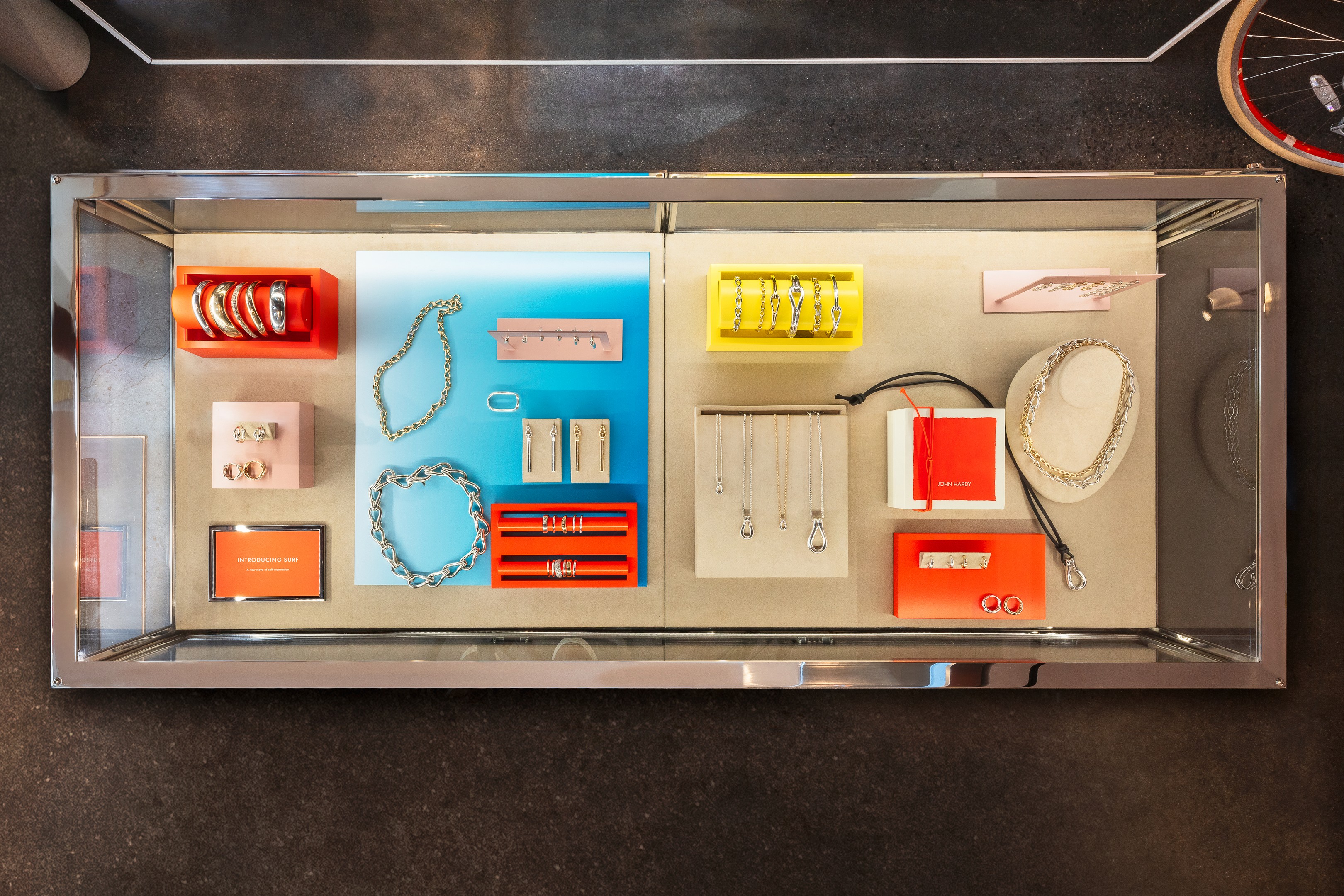
A tea-tasting bar, created in collaboration with Bellocq Tea, which offers tea blends created exclusively for John Hardy, such as Jasmine and Marigold Blossom Tea; Milk Oolong, Rosebud and Lemongrass Tea; Indonesian Breakfast Tea; and a caffeine-free Balinese Ginger Tea with Lemongrass and Chrysanthemum. The boutique’s modern homage to Bali is rounded out by the doorknob at its entrance, which is shaped like a Naga dragon, a mythical creature that symbolises prosperity and protection for the Balinese people and is a recurring theme in a number of John Hardy designs.
Wallpaper* Newsletter
Receive our daily digest of inspiration, escapism and design stories from around the world direct to your inbox.
John Hardy, 118 Prince Street, New York
Pei-Ru Keh is a former US Editor at Wallpaper*. Born and raised in Singapore, she has been a New Yorker since 2013. Pei-Ru held various titles at Wallpaper* between 2007 and 2023. She reports on design, tech, art, architecture, fashion, beauty and lifestyle happenings in the United States, both in print and digitally. Pei-Ru took a key role in championing diversity and representation within Wallpaper's content pillars, actively seeking out stories that reflect a wide range of perspectives. She lives in Brooklyn with her husband and two children, and is currently learning how to drive.
-
 Put these emerging artists on your radar
This crop of six new talents is poised to shake up the art world. Get to know them now
By Tianna Williams
-
 Dining at Pyrá feels like a Mediterranean kiss on both cheeks
Designed by House of Dré, this Lonsdale Road addition dishes up an enticing fusion of Greek and Spanish cooking
By Sofia de la Cruz
-
 Creased, crumpled: S/S 2025 menswear is about clothes that have ‘lived a life’
The S/S 2025 menswear collections see designers embrace the creased and the crumpled, conjuring a mood of laidback languor that ran through the season – captured here by photographer Steve Harnacke and stylist Nicola Neri for Wallpaper*
By Jack Moss
-
 Ulla Johnson’s collaboration with artist Julie Hamisky on the A/W 2025 runway is blooming lovely
Ulla Johnson and French artist Julie Hamisky have created 12 new jewellery pieces for the designer's A/W 2025 runway
By Hannah Silver
-
 Offbeat placing, diamonds and cool cuts: Shahla Karimi’s architecturally inspired jewellery
Fine jewellery is given a cool spin by the New York-based designer Shahla Karimi, who riffs off architectural references for her eponymous brand
By Hannah Silver
-
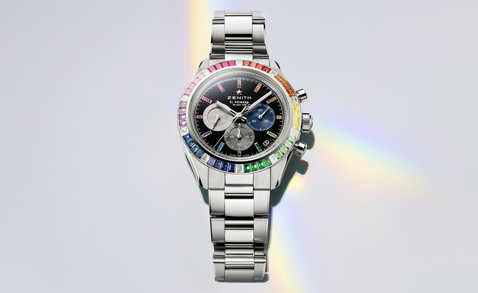 LVMH watch week 2025: everything we know so far
Our guide to LVMH Watch Week 2025, taking place in New York and Paris, starting 21 January; keep an eye out for our updates
By James Gurney
-
 Wallpaper* Design Awards 2025: JB Blunk rings are sculptures for the hand
The JB Blunk Estate has partnered with J Hannah on the reproduction of four special rings
By Hannah Silver
-
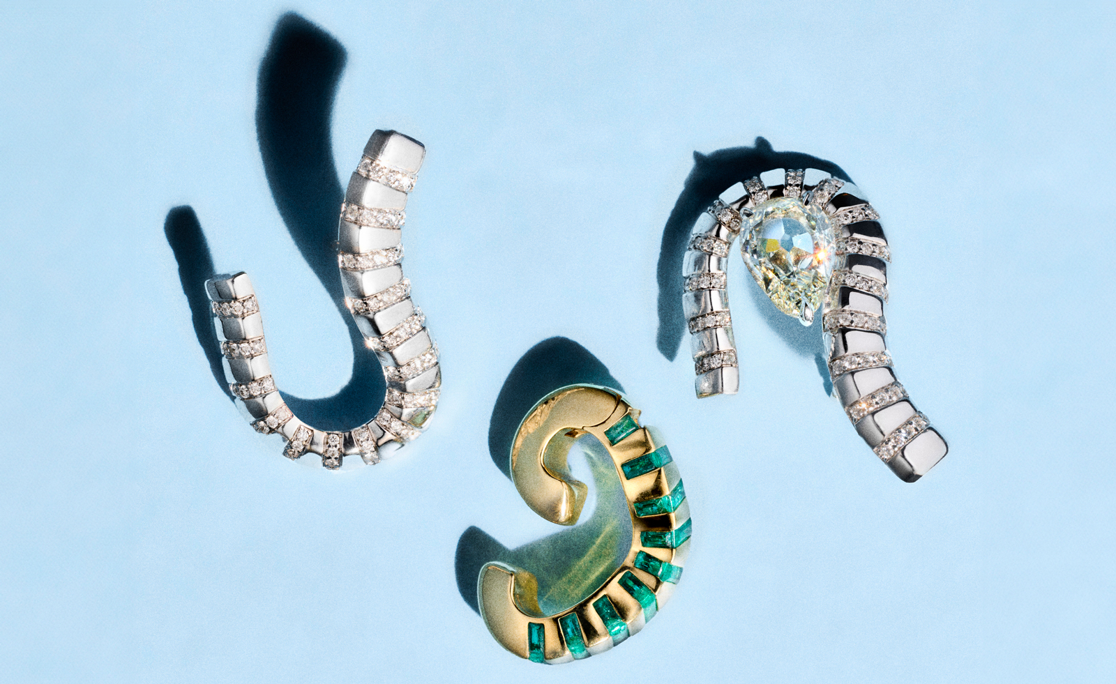 Dyne is a New York jewellery brand fusing fluid forms with futuristic flair
Dyne embraces striking materials and silhouettes for very modern jewellery
By Hannah Silver
-
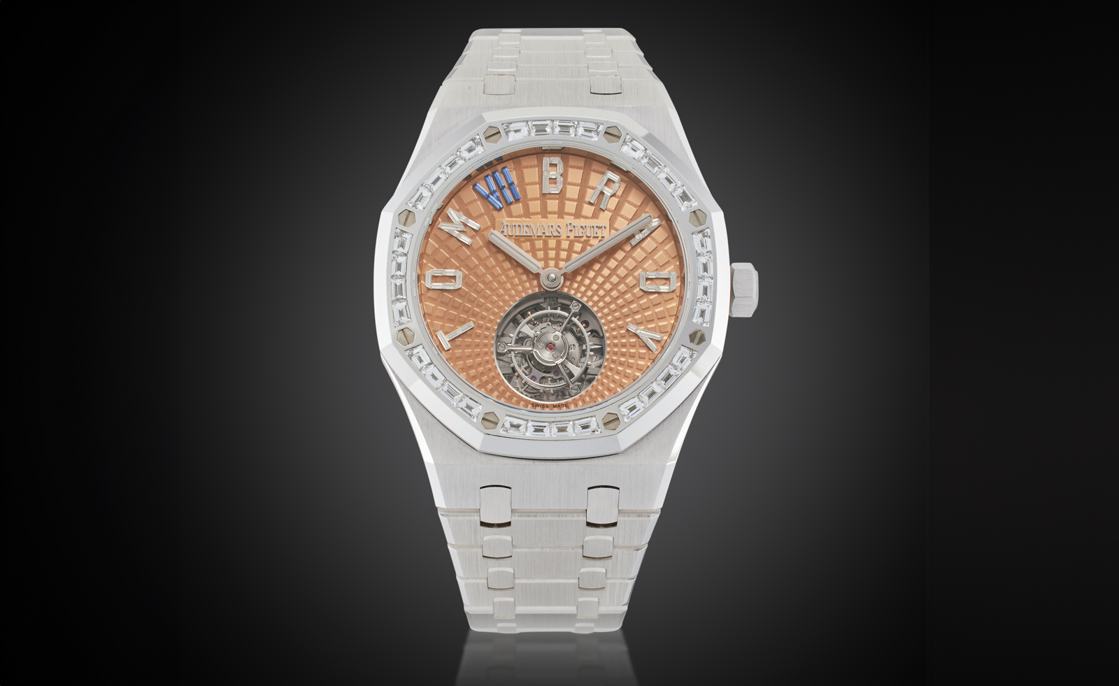 Tom Brady’s watch collection is for sale at Sotheby’s: here are the highlights
‘The GOAT Collection: Watches & Treasures from Tom Brady’ goes on sale at Sotheby’s New York on 10 December
By Hannah Silver
-
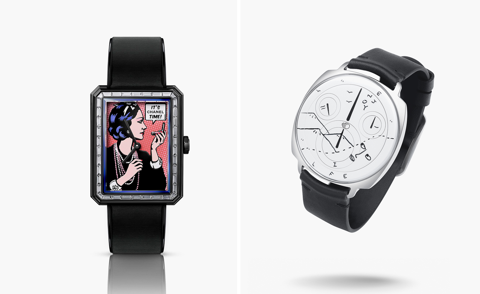 Time For Art 2024: ten unique watches to bid for at the charity auction
The Time For Art 2024 auction sees unique watches go under the hammer at Phillips, in association with Bacs & Russo, on 7 and 8 December
By Thor Svaboe
-
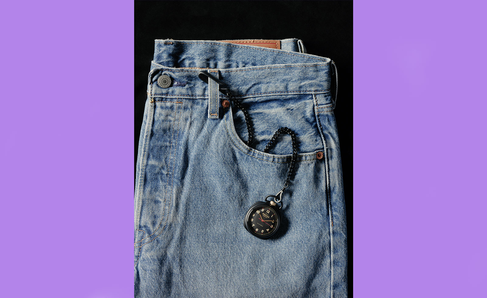 Shinola’s Elijah McCoy pocket watch pays homage to the pioneering locomotive engineer
Shinola continues its Great American series with the Elijah McCoy Mechanic 45mm pocket watch
By Hannah Silver